Posted by Karl Zipser on August 13th, 2007
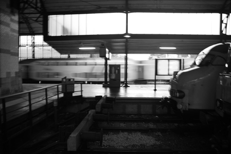
This photo of the train station in Haarlem has always caught my attention. In trying to figure out why, I noticed that the images contains blur in three flavors: blur because of movement, in the case of the passing train; blur in the case of an area out of focus, as with the distant cityscape; blur because of a translucent surface, as with the station windows.
Each of these elements of blur contributes to the impact of the image. The passing train is captured but transformed to something beyond our reach in the still reference frame. The sense of being inside the station is heightened by both the way the windows diffuse the light, and by the blur of the exterior space. The combination intensifies the feeling of being in a particular place at a particular moment, separated from the rest of the world by distance, glass, and velocity.
All of these elements of blur were unintentional. Their joint effect I only realized months after making the image, but the insight of the power of blur is something I can compose with in the future.
Do you have an example of blur in a photo which contributes to the impact of the image?
Posted by Steve Durbin on August 10th, 2007

I read yesterday in the New York Times about a show called “NeoIntegrity” at the Derek Eller Gallery, curated by the painter Keith Mayerson. What caught my eye was the charming manifesto Mayerson created for the show (not included in the article). It touches on many points often discussed here on A&P (but apparently still not settled!). Here’s the manifesto:
more… »
Posted by Sunil Gangadharan on August 9th, 2007
Every time I paint a face, I learn something about the person being painted and something about myself.
A face does not have to be stately or symmetrical, but it needs to speak to me. Oftentimes, I find expressions that I identify with or abhor in these faces. Ultimately, I think it is the expression and implied emotion that carries the painting more than anything else.
Sometimes, the texture of skin may be in synchrony with the emotions depicted while at other times in dissonance. The skin of an old woman’s face that’s wrinkled and leathery with creases might signal decrepitude while at other times the sadness in the eyes and the mouth of a smooth silky skinned prostitute might also signal the same.
This time, I did not want to end this with a question, but wanted to just show this painting that I did a week back. As usual, comments and thoughts most welcome. more… »
Posted by Steve Durbin on August 8th, 2007

OHIO TOWN – varnish on figured foam – 2005
You, especially if you patrol the aisles of building supply stores, have run across sheets of a light, pink material, used for insulation. Foamula is a common trademark.
more… »
Posted by Steve Durbin on August 7th, 2007
Posted by Karl Zipser on August 6th, 2007

Painting
From Life vs.
From Photos
The design of web-pages for displaying art is a matter of great practical as well as aesthetic importance. One design that I find striking, because of its boldness, is
Jannie Regnerus’ web-page. This page (detail below) is minimal to the extreme. It is so unlike what one is used to in a web-page that at first it seems confusing. But it is precisely this unusual quality that makes the layout a successful frame for Regnerus’ photography. One has the feeling of having left the noisy bustle of the internet and having arrived in a quiet place.

I say the design is bold is because, by departing from expectations, Regnerus takes a risk that visitors may be confused and leave the site before they see anything. For those visitors who do look more closely, the simplicity of the layout serves the intended role of providing a quiet context for the artwork.
Is minimalism inherently good for the internet?
Is Regnerus’ site a model for other internet sites?
First posted April ’06 [note some interesting comments there by Arthur].
The minimal approach, Regnerus’ model in particular, has influenced my thinking about website design; the Art & Perception layout reflects this. Could we use more eye-candy? My thinking is that the minimal layout allows the latest post define the site visually — ideal for an art site, as I see it.
Posted by Steve Durbin on August 4th, 2007
Certain artists are unable to develop because they are disconnected from history. To me development is paramount. I think that development and humility go hand in hand.
-Sean Scully
Do we expect, rather, that successful development demands arrogant self-certainty? On reflection perhaps not, for arrogance implies that an artist knows dogmatically how to proceed, while humility involves productive acknowledgment of deep uncertainty.
-David Carrier, in Sean Scully