Posted by Jay on March 14th, 2008
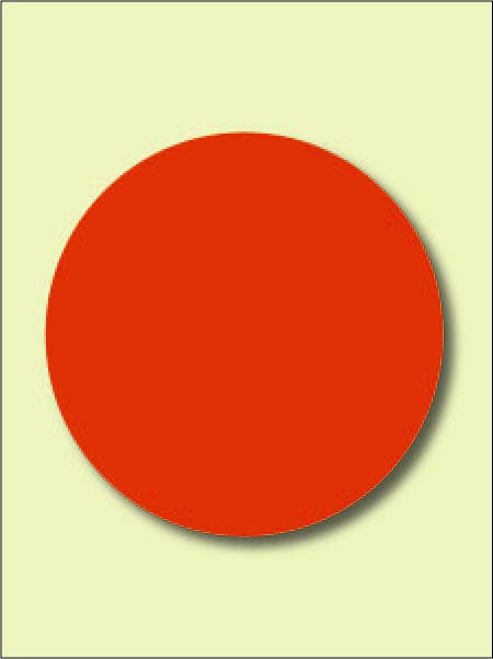
Below is a sketch for a plain and simple red circular object that I plan to make when the weather improves. My ambition is that it will hang in a state of minimalist implacability.
Why do I plan to do this? It has been on my mind for awhile and represents my usual mixture of ambition and sloth. Also it is in some respects a response to recent discussions of “perfection” and “beauty”. I’m looking to make something that is ambiguous in reference to either term.
How so? A circle is the simplest of shapes and admits to no variation except the extend of its radius. As a geometrical figure with infinite degrees of symmetry it is perfect. As for beauty, the usual comparisons of more or less, better or worse that inform the word do not apply – there are no better circles. Moreover, one can make a circular object quite simply and with a high degree of uniformity thus bypassing most issues of facture.
The chosen color refers to conventions surrounding love and pain which both tend to employ a blood red. This started out as a pie chart with a dividing line, but a deepening realization of the inextricable commingling of both sensations in the human condition made the line superfluous. I find no comparative value in this choice as the red simply suits the subject.
So there it is: The Ratio Of Love And Pain. How would you propose to critique it?
Posted by Birgit Zipser on March 14th, 2008

Who are some of the role models in NYC? more… »
Posted by Steve Durbin on March 11th, 2008
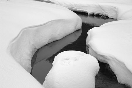
Natural black and white minimalism as well. To a certain extent, photographers choose (or are chosen by) their style when they choose their subject. Of course, the way of framing the subject plays an essential role. But in landscape photographs larger than minute details, it’s hard to find an uncluttered field of view. Winter simplifies.
Since I seem to have a natural inclination toward abstraction, you can well imagine I was delighted to find these snow forms in the wandering branches where the young Gallatin River is still figuring out where it belongs. I was also delighted to be on a pair of broad back country skis, a rental substitute for my 15-year old kit that had finally broken multiple places in every component, to the point it really was not usable even by an anti-gear guy like myself. The new skis allowed me to move easily along and among these streams, despite the deep, soft snow. I would gladly have spent all day there, had I been free.
more… »
Posted by June Underwood on March 6th, 2008
At the request (advice/direction) of my oil painting instructor, Jef Gunn, I have gone out on the streets of Portland to paint. Luckily the weather has been relatively decent, although cold if one is catching morning shadows. But the experience has put me in the midst of the community, and a grand experience it has been.
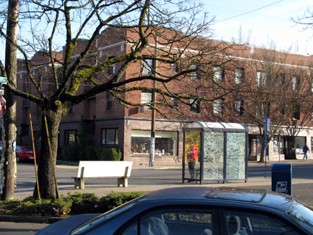
I am discovering that one of the most fulfilling aspects of painting is having the casual onlooker weigh in, discuss the weather, make silly comments or just say “hi.” I didn’t realize until the Basin experience how much having a bit of interaction with the community could mean to me. The Portland pleine aire work that I’ve been doing verifies that social contact enhances the pleasures for me of slapping color on board, smooshing substances around until they come to mean something, and personal ruminations about the view.
more… »
Posted by Steve Durbin on March 4th, 2008
Seems like everybody is making a book these days. Lower prices and improvements in quality have made publish-on-demand an intriguing proposition. Reviews are mixed, but I’ve reached the point where I’m interested in giving it a try. Since I tend to work in projects, there are several bodies of work that are candidates for books. I’ve decided to look first at the smallish number of images in the set I’ve called Winter Water, some of which have been placed on my not up to date web site, or discussed here and there on A&P.
A book is necessarily presented as a linear sequence of pages, though a reader (is it still a reader if there are only photographs?) may not follow that order. Nevertheless, assuming one image per page for maximum resolution, it’s an interesting question to consider what sequence might work best. It’s akin to hanging pictures in an exhibit. As I am neither illustrating a narrative nor providing a guide to Pine Creek Falls in Paradise Valley in late November, I am not bound by the order in which the photographs were made or the physical layout of the falls. Considerations include interesting pictorial relationships, pacing, and the overall impression desired. None of these is at all well-defined, and I come up with a different order every time I sit down to it. I make no claims for the latest version shown below; in fact, I’m asking for your help.
more… »
Posted by Angela Ferreira on March 2nd, 2008
After some research in the private art market, I came to conclusion that the most profitable works are commissioned portraits. My dilemma was how I could make contemporary portraits that would be in the ultimate fashion, to meet the taste of the possible new generation clientele? My concern was also not to fall within the ‘so boring’ repeatable or traditional portrait style methods but to offer something new, exiting and creative.
I made an absolutely big research into black and white photography (forever in style), interior design, cat walk color trends, women magazines and lady’s shop windows.
These ‘new age’ portraits are in a style that I am willing to explore further. I have worked from real photos of myself and female friends, in high contrasting tones; adding hair extensions, exaggerating eyelashes, bighting clothes and painting them sexier than ever…
They offer a post-photography period, where the real pictures, each one of them are transformed into an individual piece of art for your eyes only. Enjoy!


more… »