I’ve often been asked whether there is any relation between my interest in art and my work in artificial intelligence (AI). At a practical level, where my work is aimed at making computers more “intelligent,” I’d say the connection is tenuous at best. But at a more philosophical level, AI is essentially cognitive science, which like art is intimately concerned with human perception. Questions about how visual perception works, from retinal stimulation to conceptual understanding and emotional response, are not only central to cognitive science, but probably its best-studied example. I think learning about the psychology of perception can be of value to artists, though certainly many care for it not at all, even if, through training or intuition, they are using its teachings anyway. I think a more explicit knowledge becomes especially useful in applied areas, such as how to design a pleasing and useful object of some sort, or how to alter a graphic or put words with it to achieve some desired effect.
Archives for April, 2008
Spring Fever
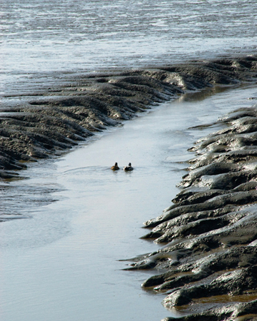
Low tide uncovers mud flats with their extant waterways, the so-called ‘Priele’ at the Nationalpark Wattenmeer, Wilhelmshaven, Germany. ‘Priel’ may be related to ‘Prill’
a word in English brought over from the Watternmeer .. together with other words reminiscent of some landscape of ooze and sandbanks with marshy regions behind (Some Etymologies).
Courtship in mudflats involves:
Mud Swimming
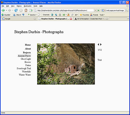
Web site design
It’s approaching two years since I first created a web site, and I’ve decided it’s time for a makeover. With my original site, adding a new image required also creating a thumbnail version and editing a file. I was running out of space in the navigation area to list more projects. And on a new monitor I was distressed to see how garish the banner color became. So I’m re-building. I want the new design to be: 1) simple and flexible for me; 2) simple and easy to use for the viewer; and 3) responsive to browser settings such as window and text size.
Critiques: Some Thoughts
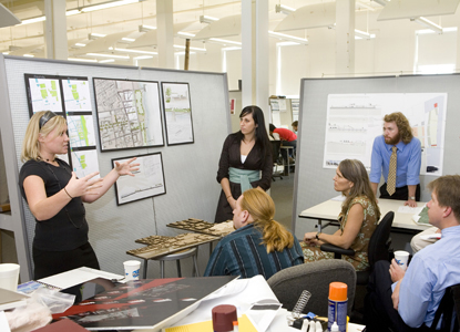 Architecture Students Present their designs at the Savannah College of Art and Design
On the Ragged Cloth Cafe blog, I wrote about the nature of critiques, mostly summarizing James Elkins’ Why Art Cannot Be Taught; I won’t go into his ideas — you can read a summary on Ragged Cloth if you are interested — but I have been evolving my own thoughts on the subject.
Last Tuesday, in a painting class, the instructor failed to show. We were scheduled for a long critique session, and, being self-sufficient and interested in each other’s art, we continued with the critique ourselves. The critiques in this class had always been group affairs, ones in which the instructor led but did not direct the conversation. So we could easily emulate his processes.
Elkins’ speaks of critiques as fraught with dangers, having multiple ways to can go awry, and he loves the fascinating explications of human nature and thought in action which critiques provide (which is also why they are fraught with dangers).
Some of the danger, as I see it, lies in the fact that while the artist wants information that will help improve her work (and also is hoping to impress the viewers with her artistic abilities and insights), the “panelists” — students or professionals in the field — are almost always struggling to explain what they are seeing. If the panelists (in our case, the other students) are to be successful, they must have insights into the work they are looking at, and then find ways to articulate those insights so that the artist will benefit. It’s a struggle on both sides, since the artist has to be totally alert to the thoughts of the panelists — sorting out, when comments seem confused, whether the speaker are struggling to find her idea, struggling with expressing the idea, or struggling with explaining the idea in terms that will benefit the artist.
And when comments are not confused and the panelist clearly states an opinion or question or makes a comment, the artist has to sort out whether the comment comes out of a concern which the panelist has with his own work or obsession or whether it is truly applicable to the art that is being presented. Other kinds of interface problems can occur — the panelists may get off course and meander into digressions; they may find themselves hostile or overly sympathetic, and so forth.
All this is outside the sometimes awful experience of attack critiques, those legendary events that leave the artist a quivering heap of jelly. I think they arise not out of art or articulation or ideas, but an entirely different culture and one that I haven’t encountered.
Nevertheless, critiques, as I know them, are a substantial and important part of my art education.
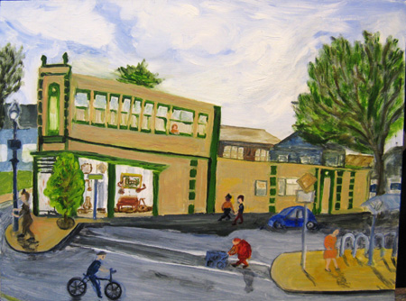
In this critique, I limited myself to three works, a “straight” naive/realistic painting of a nearby street scene, a more complex and abstracted view of a warehouse area from above, and a semi-abstract “forest” scene.
Hawthorne & SE 20th, Mid April, 12 x 16,” oil on board
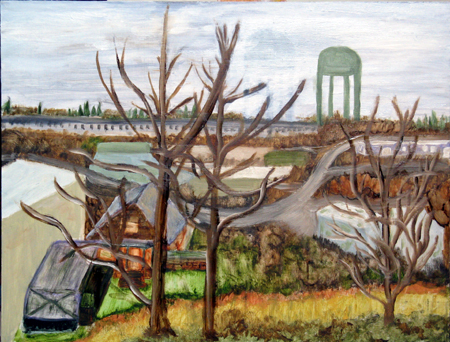
McLoughlin Warehouse District, Mid April. 12 x 16,” oil on board
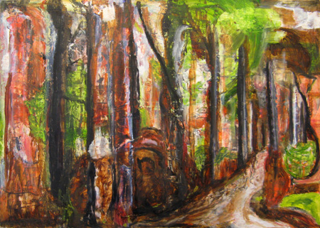
Forest Scene, mid-April, 12 x 16,” oil on board
I was interested in people’s responses to three very different kinds of paintings, all done within a couple weeks of one another. I was particularly interested in this group’s comments, because they are very articulate about what they see. I am somewhat intimidated by their ability to explain what they see, what they like, and how they read a canvas. So I am learning as I listen to them, not just about my art, but about talking about art in understandable ways.
The responses to the three pieces were that they enjoyed the corny street scene, that the colors in the warehouse piece were good (the reproduction here doesn’t do them justice) and that the composition in that one was excellent (they liked the water tower, just as they liked the old lady crossing 2oth Street), and finally that the last was puzzling, interesting, weird, Hansel-and-Gretel-ish,or maybe smelt of Hieronymous Bosch. At any rate, the last, for them, seemed to be coming out of some inner state, whereas the other two were evidences of external scenes. There were other comments but these are the ones that I remember most clearly.
But what the group really wanted to know was where I was going in terms of this last piece. Was this a direction I intended to pursue? What would I be painting next?
I talked for a while, and then realized that the the group consists primarily of abstracting landscape painters — people who take their references from landscape and then work those references into abstractions. Here’s David Trowbridge’s work. David is an accomplished artist, currently exhibiting in downtown Portland, whose work I admire. It is fairly representative of the working process and product of most of the group members.
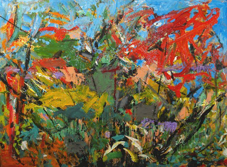
David Trowbridge, Sheffield XI, acrylic and spray paint on plywood, 35.5 x 48″
So when I debriefed myself about the nature of the critique, I had to consider that the abstract attracted the panelist’s attention most because they themselves did art like that. And the questions about where I was going from there were both out of thinking this might be a new path for me, but also a function of knowing that the class was coming close to its conclusion. We were all going to have to decide “where we were going.” I did ask directly and firmly, at least twice at the conclusion of the session, what suggestions they would have for me. They had none.
So my question is, what kinds of critiques have you had that left you with interesting debriefings? Why were the critiques useful? What unanswered questions were there? Do you believe in critiques — if so, what are their limitations?
The fourth state
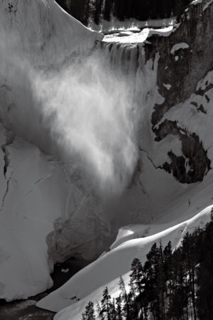
While reworking and sequencing my Winter Water project, I realized that, for a photographer as well as a physicist, snow, ice, and liquid are very distinct states of water, with distinct texture, tone, and shape. Perhaps because those photographs had no sky, I managed to completely forget about the vaporous state. Last Monday, however, I was vividly reminded of that glorious phase while biking through Yellowstone. Roads were clear but cars not yet allowed, so I had it almost to myself: only a half dozen other bikers all day, and a few service vehicles per hour. Fortunately I had a late start, so by the time I reached the Lower Falls it was well on in the afternoon. The westerly light left the falling water in shade while illuminating the mist.
Kids’ Art
Birgit’s post brings up some troublesome memories.
My three boys, in their earlier years, drew a lot. Much of it consisted of takes on what they saw in the media with some creative things here and there. In the late nineties I began to eye these drawings, curious about their potential as subject matter: what if I projected them on boards and applied paint..?..
I felt a need to ask permission of the boys. Theirs was a “whatever” attitude, most of the drawings beyond memory or caring. I tried to find examples that didn’t include Stars Wars episodes or Batman, and which had the aspect of a personal narrative. There were, among the hampers full of these things, a limited number that were fairly well composed.
How to paint the images? Most had few spatial cues, with elements positioned where space allowed. The boys were not colorists by nature, so I had little to go on in that regard. Should the cast of characters occupy some sort of floating world, or should they be grounded in some fashion? I labored through a dozen or more attempts in a quest to find common ground between the originals and my own ideas.
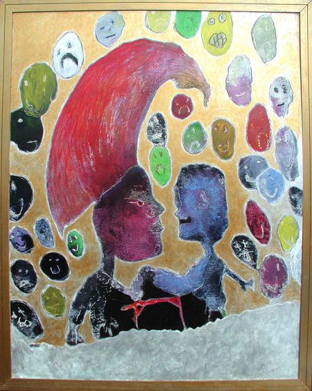
One of the few that emerged as a somewhat satisfactory composite was this depiction, by Bret, of two characters engaged in a public arm-wrestling match. I scored a masonite surface with a Dremel and rubbed in the color. The negative spaces were given a gold finish. The painting is about four feet long.
a child’s horse
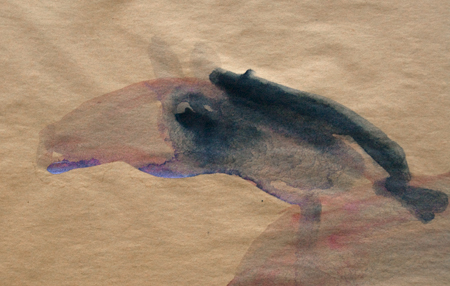
This horse is the earliest painting by Karl that I treasure. The cheap acid paper has darkened with time. The purple/maroon colors have faded. Time to archive the horse as a digital print. Taking the frame apart for the removal of the glass, I noticed that the paints were absorbed on the foam board backing so that I now the original painting plus a print of it.
Was the hand of the small child directed by something bigger than himself to paint the lines of the horse’s head given his tender age? The lines makes me think of Zen. more… »