[ Content | Sidebar ]

Archives for May, 2008

Painting Portland: McLoughlin Boulevard

You must forgive me if my language about SE McLoughlin Boulevard is a bit crude. I refer to the Boulevard, actually a long strip of sleazy or derelict buildings, warehouses, and defunct businesses, as “the armpit of Portland.” It is fairly unsightly and often smelly.

McLoughlin Boulevard was originally US Route 99E, part of the major north-south Pacific Highway through Oregon’s Willamette Valley to California. US Route 99E had its heyday just after WWII until it was eclipsed by Interstate 5, finished in 1966. Thereafter, the Boulevard, demoted into Oregon Route 99E, declined as Portland grew. The decomposition of the Boulevard, helped along by the curbing of the highway which restricted access to businesses, was accompanied by its enclosure by warehouses and industrial compounds, all gone slightly to seed. The farmland and residences that had been behind its initial length of business ventures got pretty much decimated over the years by other kinds of cheaply built warehouses and small factories.

I first learned about McLoughlin Boulevard because, when we moved to Portland 18 years ago, the Pendleton Mill End fabric store was located along it. I would take the bus to the Mill End store; to return home, I had to cross 8 lanes of heartless traffic and wait for the return bus in front of The Odysseus, a saloon and strip joint. I avoided looking at the patrons — and they avoided looking at me!

It was that kind of street — an American urban highway that makes used car lots look good.

Still, however sleezy the street has become, it still speaks to my love of urban archeology and history. Jer and I have been investigating the Springwater Corridor bicycle/pedestrian trail that has a new bridge over SE McLoughlin. The Trail runs along Johnson Creek, a major urban creek wont to flood in the wet season and stink in the dry. But between the creek and the biking trail, there is a pretty wondrous set of scenes through the Portland cityscape, including McLoughlin Boulevard.

mcloughlinebikeoverpassw.jpg 
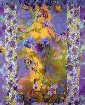
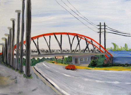
Springwater Trail over McLouglin, Oil on board, 18 x 24″
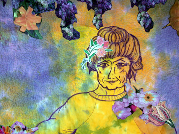
more… »

A Moment of Gloaming

A light was burning in my workshop this last evening and there was something so Cotswoldish about the whole affair that I grabbed my camera in a race with the dwindling light.

garage-in-gloaming-processed.jpg

I set the dial on aperture priority to avoid a flash exposure and the result was a little smeared. I can’t make up my mind about it. On the one hand it creates a sense of remove, but on the other, it appears simply blurry. Maybe a foggy quality would be better. What do you think?

Stone soup

When I started my Patina project on weathered auto paint and rock surfaces, I originally had in mind flat surfaces with intriguing designs and colors. But rocks aren’t smooth, so I soon began photographing rocks with some three-dimensionality, playing with the ambiguity between tone and color as surface properties or caused by orientation to the light.

12818b-450.jpg

Last week, just back from photographing a favorite rock face, a number of ideas relating to that work seemed to be coming together. Unfortunately, working with the images (just a little) since then, the ideas have muddled themselves rather than resolving. Despite some enticing ingredients, the fine soup is still mostly in my imagination. Here’s what’s stirring in the pot:

more… »

Le Géranium

Please help characterizing the genius of Henri Matisse’s painting from 1910.

matisse.jpg
Le Géranium made news because of its high price at a Sotheby’s auction on May 7, 2008.

Saving my screenshot as ‘for Web and Devices’ made the colors more brilliant. Has anyone seen the original? How bright are the colors?

What to do? Recycling, renovating, newly constructing?

squirrel.jpg

more… »

He colors me, he colors me not, …

Often our lives are made more difficult by greater choice. In photography, the choice of color vs. monochrome was not necessarily easier in the past, but at least it had to be made by the time film was in the camera. With digital capture, you can change your mind at any time. Some photographers, as far as I can tell, use only color; a far smaller number are all about black and white. Some, like myself, dither. Not to complain, but this is a constant issue in ways it wouldn’t have been before. Reminded of it by both the previous post and recent experience, I here present the latest dithers. Prepare yourself: I’ll be asking for opinions…

12340-450.jpg

more… »

Comparing Media: Intaglio, Quilting, and Language

In a recent critique session of quilted art, conducted by two “fine” artists, I found myself having a “eureka” moment. Then, a few days ago, Jay and Melanie’s discussion of Jay’s intaglio technique on board and foamcore (published prior to this post) pushed some of my insights a bit further. All this was added into a melange of thinking I’ve been doing about where I am in relation to quilted art and painted art.

The eureka moment came through the phrase used by one of the fine art critics: the phrase was “working the surface.” “Working the surface” in the traditional fine arts means adding, deleting, scraping, underpainting and overpainting, sanding, gouging — all the kinds of things one can do that either uncover and/or add to a planar surface. It seems clear to me that Jay’s process of working his boards and foamcore are fine examples of “working the surface.”

With quilted art, “working the surface” seems to show up in two ways. One is what is called “surface design,” which basically alters the flat plane, by dyeing it, laying rust on it, discharging (bleaching) it, monoprinting on it, and even digging into it, tearing and unraveling the threadwork. This work sometimes adds texture (especially with elements applied to the surface (applique) or taken away from it (“cutwork” or just plain gouging holes). These kinds of working of the plane are singular, patterned for the effect in a particular work, not meant to be turned into a commercial design for fabric (the original use of “surface design” had a strong commercial element.) The other part of working the surface with textiles is the work of embroidery and quilted lines that make for a frieze effect; when stitches are pushed through the two layers of fabric and the in-between batting or wadding, the stitched line makes an indentation, beside which the surface becomes raised by the pushed-aside materials.

I have never heard the phrase, “working the surface” applied to quilted art before, but when I heard that and then saw the intricacies of Jay’s working of his surfaces, I realized that the language may give me new insights into what can be done with quilted art.

At the critique, the guest “critics” (very kind observant folks) looked at two pieces I had brought, comparing them.

The first was one you’ve seen before: Mrs. Willard Waltzes with the Wisteria, 76 x 61″, 2003, hand dyed and painted cotton, embroiderie perse with computer-generated prints, and dyed overlays.

mrswwaltzesw.jpg

mrswwaltzesdetw.jpg detail

more… »

css.php