
Tittle: Rebirth Net
Size: 76×61 cm
Medium: Oil on canvas
a multi-disciplinary dialog
Tittle: Rebirth Net
Size: 76×61 cm
Medium: Oil on canvas
One of our shticks at A&P (in a good way) has been our interest in learning about perception through findings in neuroscience, psychophysics, and related fields, as well as through introspective observation of our own seeing and art-making. Though this interest is not unique to A&P, it certainly isn’t very common, either. So I was delighted to come across two examples in a day of cognitive science finding mention in current art criticism at a rather higher level of visibility. It was especially nice that these references truly illuminated the discussion of the art viewer, in one case, and the artist, in the second.
Until I can get it through my head how to place images in comments I’ll have to post.
I found a jar and it says: Utrecht Linens Iridescent Silver. Otherwise Iridescent Gold. The ingredients label mentions coated mica, which I understand involves an application of titanium.
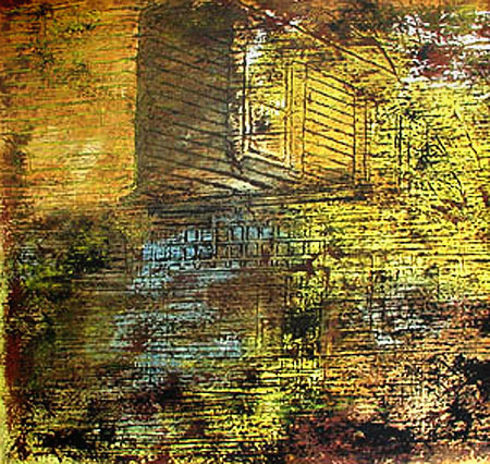
For Birgit here’s a closeup of that house:
I dug around, looking for ways that the gold had been applied.
Karl recently asked if gold still has a place in art. Frank Lloyd Wright thought it did in architecture and tried to persuade the Kaufmann’s to gild Fallingwater. It would have been something to see, but a headache all around.
Out of curiosity I introduced some gold effects into a stock image of Fallingwater.
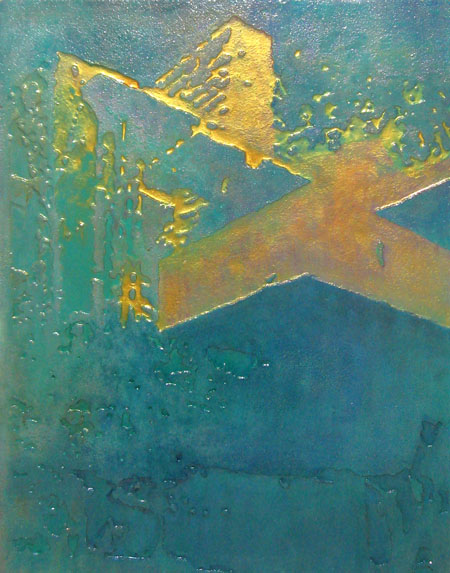
The gold is straight out of a jar. Utrecht Linens sells a water based gold luster that goes on like paint. In this case I mixed it with clear medium, allowing a bit of under painting to come through. the theme of the image dictated that forms and colors be simplified, although I can imagine something more complicated working as well.
Lawrence Weschler has a delightful article in the Virginia Quarterly Review on the work of the young twins Trevor and Ryan Oakes. They are very original and persistent thinkers about how we see and the consequences for art. For example, though we’re seldom aware of it, our nose intrudes in almost half the visual field for each eye. This may be subliminally responsible for the claimed common appearance of roughly triangular shapes in the lower parts of pictures. (I haven’t attempted to confirm this, but it’s something I’ll be looking for in future, especially in abstract art; ask me again in six months.)
Most of the article is about a novel approach to rendering perspective, something that June particularly has discussed on A&P. Her prime example of Rackstraw Downes is another artist especially concerned with the wide peripheral vision, like the Oakes twins. The technique is essentially spherical projection combined with independent focusing of the artist’s two eyes, one on the scene being depicted and one on the paper being drawn on. The brain’s binocular vision, attempting to deal with this abnormal input, essentially overlaps the two views, so that the artist can “simply” trace with a pencil the scene that appears to be on the paper. I’ve tried this enough to see how it works, though it would clearly require practice and patience to keep it up. And it can only be achieved for a smallish angular range. So the brothers constructed a frame (see the article) which allows them to build up a panoramic image by building it up bit by bit.
Kazimir Malevich painted his Black Square in 1915, and it was soon followed by White on White. I had thought this was pretty radical, but I’ve just been reading of three earlier works along similar lines, created by Alphonse Allais in the 1880’s. Alas, no images seem to be available on the web, but I’ve approximately re-created them from descriptions in Kirk Varnedoe’s Mellon Lectures.