Posted by Hanneke van Oosterhout on January 17th, 2007
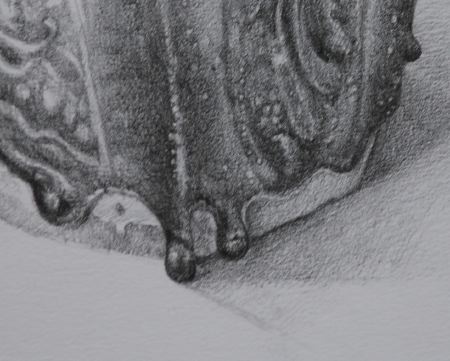
I’ve gone further with this painting (which we saw at earlier stages before). I’ve been thinking a lot about your suggestions from last time while I was painting. What do I need to do to finish the picture? Any suggestions? For reference, the cloth is about 25 cm wide at its widest point. Here are some details of the picture: more… »
Posted by Hanneke van Oosterhout on January 13th, 2007
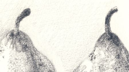
Here are the drawings I have been working on in the new year.
more… »
Posted by Hanneke van Oosterhout on January 6th, 2007
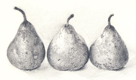
I decided to start drawing again on a serious basis and I today I wanted to try to capture the texture of these pears. I wanted to see if I could make come out in the drawing the complicated texture these pears have. I think got some of the feeling of these slightly shrunken and beaten up pears. The challenge is to capture that without paint. I wanted to see if something that I could paint I could also do it in pencil.
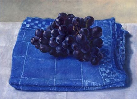
Posted by Hanneke van Oosterhout on December 23rd, 2006
Many people think of underpainting as a working in monochrome — either in grays, or browns. Artists of the past like Jan van Eyck used very colorful underpaintings. The usefulness of this I see in my painting of grapes.
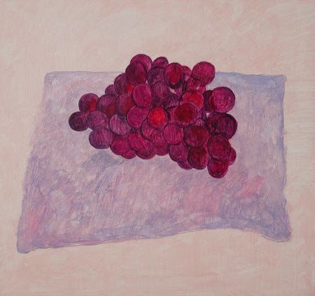
I was painting these grapes from some dark purple-blue grapes in my studio. I made the underpainting much more bright, and warm, than real grapes, as you can see in the picture above.
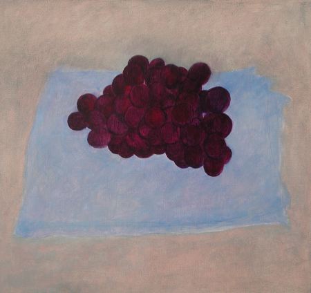
When the first layer of oil paint was dry, I began overpainting, putting darker shadows over the grapes to make the colors more realistic, darker and cooler, as you can see above.
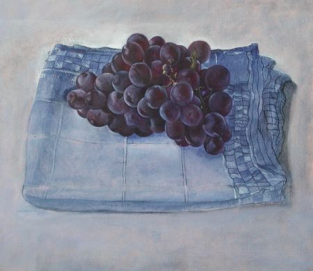
Here I have gone further with overpainting in another session. Now the grapes have a realistic color, but the brightness of the underpainting color shows through and gives life to the colors. If I had started with dark gray grapes, instead of a colorful underpainting, the colors would be dead when I did the overpainting. This this picture is not quite finished in the cloth. Here is where I left it yesterday afternoon.
Any suggestions?
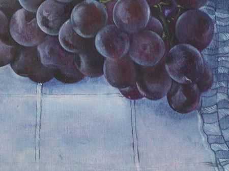
(detail requested by Steve)
Posted by Hanneke van Oosterhout on December 9th, 2006

Painting
From Life vs.
From Photos
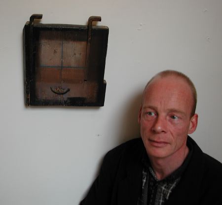
Maurice Ploem found the “official gallery circuit” to be empty and sterile, so he started his own gallery in his home in Haarlem’s Proveniershof.
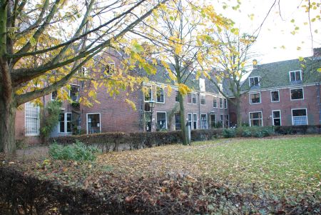
Maurice’s gallery, called De Provenier, is to the left of center in the photo above. Maurice wanted to provide exhibition opportunities to good artists who had not yet become “famous.” I had my first show here in the year 2000. I have another exhibition starting next week.
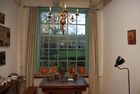
Maurice works in a broad range of media — bronze, oil on canvas, painted wood. He says of his gallery: “Here one can see how work looks in a home environment.”
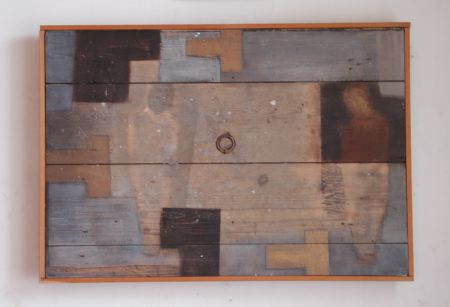
Above is an example of one of Maurice’s painted wood objects. He was inspired to make pieces like this when he was sitting by the fireplace on a cold December evening. He picked up an old piece of wood to throw on the fire. Looking at the object in his hands, he said to himself, “No, I’m not going to burn this.”
. . .
Does it make sense for an artist to show work in a gallery like Maurice’s, or is it better to stick with traditional galleries?
Posted by Hanneke van Oosterhout on November 18th, 2006
Posted by Hanneke van Oosterhout on October 25th, 2006

Posted by Hanneke van Oosterhout
This still life is about 13 cm wide. I painted everything from life. I drew directly on the panel with charcoal, then pencil. Then I made an under painting in acrylic in one day. I made the over painting oil in two days, one day focusing on the berries, the other on the cup. I think this is a good picture. Please tell me what could be done better. Photographers, have you any insights for me?

