Posted by Jay on March 9th, 2010
It’s a nice coincidence that Steve and I should both be showing in libraries.
My son Matt, an employee of the Cleveland Heights/UniversityHeights Main Library, passed on the news that the library had prepared some gallery spaces in the old YMCA building across the street. I was urged to contact the appropriate people to get in line as an exhibitor. Before long I was summoned down for a confab to learn that I had a one man show in the offing and a month to get it together.
I had a few thematic options available including the chains, ladders, plastic, plaster and the various oddiments that have appeared on this site. However, some factors constrained my choices. For one, all available walls are equipped with hanging rails which limit the weight of mounted objects and which tend to be visually compromising. Furthermore, the one dedicated space has a low ceiling, limiting vertical dimensions. The other two spaces are a short wall in the computer room and a reading room which turns out to be the best exhibiting area. These are busy and I had to take into account their public nature. I didn’t want to install anything that would tempt people to mess around. On the plus side there is a lot of track lighting.
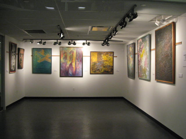
View of main gallery
more… »
Posted by Jay on February 13th, 2010
The dreamings of the Australian aboriginines represent a kind of art that goes to the core of their identities. To the extent that that represents any kind of an accurate description, allow me to state that these images are at something of an opposite extreme in that they play around loosely with important documents.
My initial impulse in doing maps was to effect some sort of transformation. A road map tells you what you, in your car, need to know about getting around. How about if the map were treated as a template through which other concerns were granted expression? There’s a lot to think about and do in this department and I feel that I have gotten so far as to dip my little toe so far.
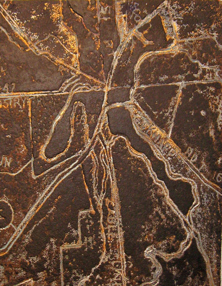
This object is a straight-out gouge into a piece of particle board. It is derived from a map of Peninsula, Ohio, a picturesque village with bars, gift shops, but no place to buy a toothbrush. I was looking to produce the effect of a rather rusticated brass plaque.
more… »
Posted by Jay on January 21st, 2010
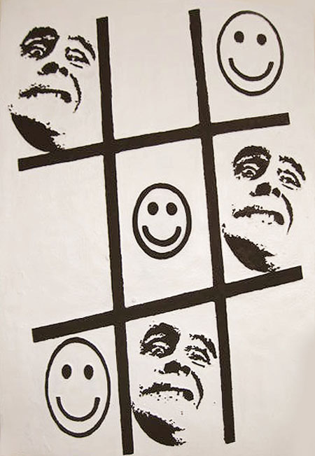
Tic Tac Toe was a mess. This 40″ by 56″ foam painting was colorful, but wrongly so. The smiley faces were in yellow, the mugs in violet and the grid in a mixture of the two colors, all set upon a motley background pretending to whiteness. With nothing to lose I blanked out the ground and blackened the figures. Most of the distractions are gone, allowing the basic question to be asked.
 more… »
Posted by Jay on January 7th, 2010
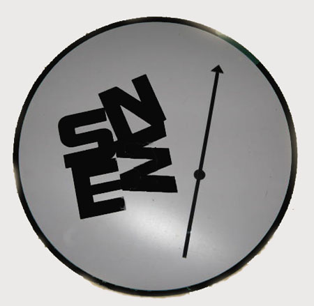
Parked about the place, doing a slow burn, has been a dubious project. It is a deconstruction of sorts wherein an ordered and functional format is scrambled.
It contains the elements of a compass including a round face. The letters designating the cardinal directions, however, are congregated in a pattern that is more self-referential than indicative of a greater orientation. The needle sits idly by, with no particular functional opportunities, or sense of direction.
 more… »
Posted by Jay on November 17th, 2009
Months have passed since I posted anything. Like others I have been distracted by a number of competing priorities, but have kept my hand in as much as possible.
The affair with plastic as a medium continues – in fact has perhaps gone over the edge a little bit – as I buy all manner of absurd plexiglass which now threatens to take up all available space.
My initial work with plastic in trying to put out a clean product, continues. Added to this are experiments with a happy-go-lucky kind of drape forming, which is something of an antithesis, or complement, to an otherwise obsessive concern for smooth surfaces and clean edges. The drape forming is a primitive exercise in laying plexiglass sheeting over a variety of shapes and blasting it with a sizable propane burner. The plastic sags and bubbles in the flame and assumes some semblance of the underlying structure.
In this instance I obtained a waffle pattern from an old louvered door. Some colored varnish was dropped into the grooves. When this had hardened I then painted the back in silver. While nothing in particular was anticipated with the exercise, I found a hybrid effect that recalls a sort of medical metallica interspersed with a sense of bubble-wrapped bodily fluids. Sometimes keeping to an intended path and not being drawn off by such happenstance can be most difficult.
more… »
Posted by Jay on August 27th, 2009
I’ve shown the likes of these previously. The going has been slow as I have had to sort through a lot of possibilities and pick up some skills. One thing remains unchanged as I am still stacking balanced elements on a common axis.
The summer a year ago I had stepped back from a somewhat futile campaign in which I had played around with wood lath. The results were fairly weak, but some directions were indicated. Then I discovered plastic with its many options. In fact, I have found that the variety of visual effects – transparencies, mirrors, colors – can resemble a candy store and I have had to restrain myself.
more… »
Posted by Jay on June 24th, 2009
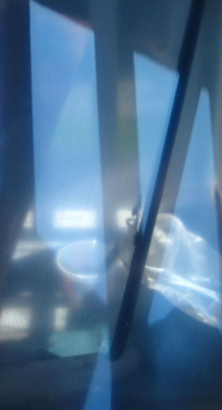
As many of you know, I have this thing for low solar angles. This is a sheet of acrylic in its protective layers that I casually placed on the back porch. It reflects little while transmitting a softened and generalized view of things beyond, including the combined image and shadow of a mop handle. The nice blue is the color of the protective material. Really, no issues to discuss – I just thought you’d like to see this.