Posted by Sunil Gangadharan on November 29th, 2007
Anita Shapolsky gallery last month hosted a very eclectic exhibition titled ‘Writers who paint’. Among others, it had under its purview artworks by accomplished writers like Jonatham Lethem, Jack Kerouac, W. B. Yeats and Aldous Huxley. I thought the idea was a very cool one, firstly, you had insight into their minds through their writing and now you could explore their paintings, drawings and other objects of their visual imagination through the lens of the individual’s written words. It is precisely for this reason that I think that the artist blogs are a new form of a self-portrait that an artist can develop temporally…
Of course, some of the few art blogs that seemed to cover this event seemed to think otherwise. The comments were very telling of the age of specialization we live in and what happens if we transgress even a little bit from our supposed spheres of expertise.
“Writers should stick to their areas of competence”
“Writers doing art results in art that is just not good”
“More bad art strung together upon a theme”
“Cult of the celebrity in overdrive”
“While you can accidentally take a good photograph, it takes years to become a good photographer”
While I think that the wisdom of the online crowds is a marker for the current times, reading some of these comments gives one a view that unless one is specialized in the arts (like an art degree or is a full time artist), there is a danger of their art being perceived as inferior to full time artist. What happened to the age of renaissance men and women who could dabble in multiple fields and excel at many of them? Are the lanes leading that great town called Specialization getting so narrow that only people with the right calling cards and pedigree are offered entry at the appropriate tavern houses along the way?
I am most interested in your comments.
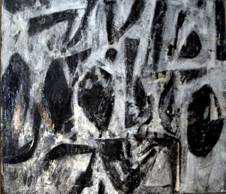
Weldon Kees, ‘After Hours’, Oil on canvas, 33″ x 43″
Posted by Sunil Gangadharan on November 21st, 2007
While I had always harbored an unexplained inclination towards abstraction, it is only recently that I have started to explore this form a little more in detail. Part of the exploration involves trying out hitherto untried (at least by me) combination of materials on masonite. Here are two paintings that I attempted recently using a combination of wet gesso, Indian spices and acrylic.
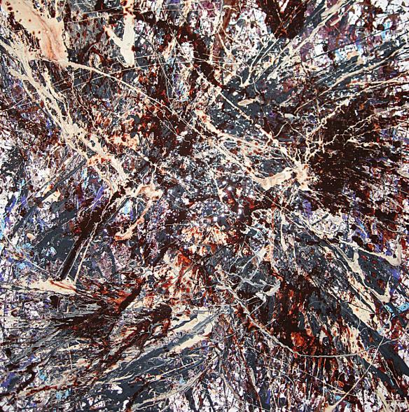
Sunil Gangadharan, ‘Untitled_111007’, Acrylic, Indian spices, latex based housepaint and gesso on dricore, 24″ X 24″
To achieve the dynamic effects and an impasto finish, it was imperative that I work wet on wet – which also meant I could not mull too much on the outcome, just add the colors and the paints as relevant and then stand back and ponder the results…
Pure abstraction is somewhat akin to nature, random interplays of relevant forces that yield unpredictable patterns, moods and feelings.
At certain points during creation of these paintings, I felt some of these interplays intensely.
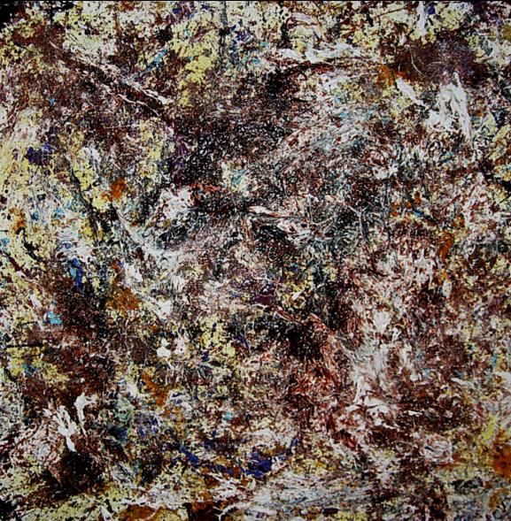
Sunil Gangadharan, ‘Untitled_111707’, Acrylic, Indian spices and gesso on dricore, 24″ X 24″
Posted by Sunil Gangadharan on November 8th, 2007
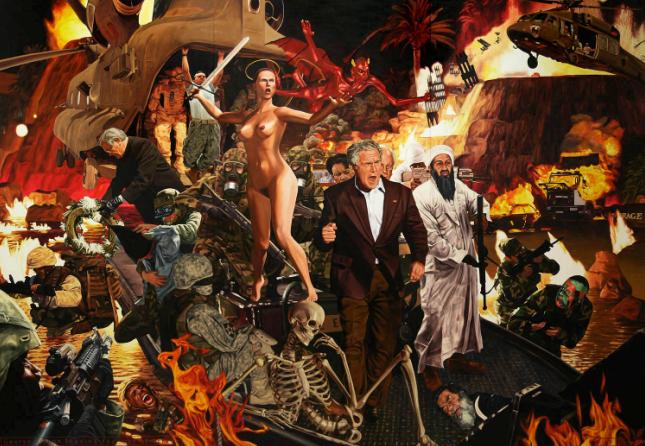
Jeffrey Isaac, ‘George W. Bush leading the war of terror’, 2007, oil on canvas, 250 x 360 cm.
I have been following Jeffrey Isaac‘s paintings for some time now (about a year actually) and a little while back (in an effort to understand some of his works), I had an e-mail conversation on motivations behind his art, his style of oil painting, his choice of subjects and his views on art. The conversations led to the following dialogue (you may call it an interview), presented here.
Some of this is stoked by a particular interest I have had in hearing social commentary from US artists who live outside the States and Jeffrey is an example of such an artist. Sometimes the commentaries developed are richer due to a melding of cultures and as a result their art tends to reflect inherent local perceptions to global social issues. more… »
Posted by Sunil Gangadharan on November 1st, 2007
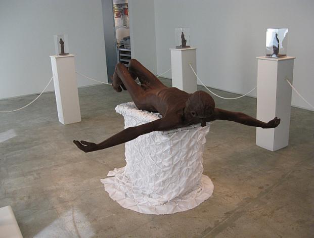
Cosimo Cavallaro, ‘My Sweet Lord’, Chocolate, 72″ X 72″ X 24″
A while back we had a posting about a Jesus sculpture made of chocolate on this forum and the discussion that ensued was quite lively. Today is All Saints day and to commemorate the occasion Cosimo Cavallaro, (the artist behind the controversial Sweet Jesus) decided to build upon the original theme by adding a phalanx of chocolate Saints around a prone Jesus. I went by to look at the exhibit over at the Proposition yesterday. A delicious smell of chocolate pervaded the air in the gallery and if I were blindfolded, I might have guessed that I was in some kind of a Belgian chocolatier’s atelier. The atmosphere was almost church-like and had it not been for the fact that the chocolate Jesus sculpture was nude, this could pass for a religious tableau. The saints themselves were carved very intricately and were housed in little glass cases (the saints were fully clothed).
This show is very different from the first which consisted of a single sculpture of the nude Jesus. That seemed to incite more controversy than any critical dialogue. The setup in this exhibit is a bit more intriguing – eight saints on pedestals that are connected to each other with white nylon cord encircling a nude Jesus supine on an embroidered silken round table.
The nylon rope stumped me – was it meant to signify that the saints were in some kind of a ‘circle of trust’ or was it meant to keep curious onlookers from approaching too close to the prone Jesus…
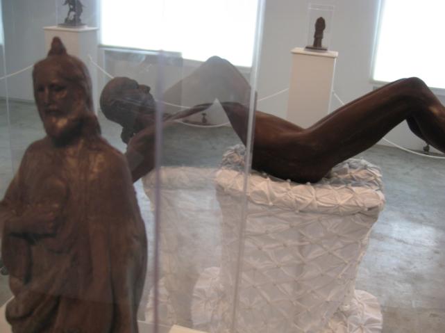
Cosimo Cavallaro, ‘Saint Jude’, Chocolate, 6″ X 12″ X 6″, ed. 400
Also, I was not sure why Jesus was lying down as opposed to being shown in the crucified pose? Was the weight of controversy of the first so much that he is forced onto his back…? One does not know the answers to these questions, but the exhibit was surely an interesting one.
Of course, Cavallaro is best known for his quirky work with food as art: Efforts in the past include repainting a Manhattan hotel room in melted mozzarella, spraying five tons of pepper jack cheese on a Wyoming home, and laying about 300 pounds of processed ham on a four-poster bed.
I will be interested to know your take on this…
Posted by Sunil Gangadharan on October 25th, 2007
When artists decide to pursue different specialties of an art form (like portraiture or landscapes or still life in the case of photography) or try their hands at disparate art forms (like sculpture, music, painting, photography etc), they may sometimes be admired for their versatility but more often be considered dilettantes – dipping their inks in one bottle and using the still-wet pen to delve to other pastures.
Some people believe that artists should aim for clarity, focus and depth in ones work rather than develop a host of talents none sufficiently honed.
What kind of an artist are you? Do you subscribe to the view that one must focus ones actions in a chosen, preferred form while sharpening and contributing to the same? Or – Are you the one who likes to dabble in multiple art forms because you would rather choose the best possible (expressive) mode that develops your idea to the fullest?
Sunil Gangadharan, ‘Untitled’, Charcoal, ink and ballpoint pen on Strathmore paper, 9″ X 12″
Posted by Sunil Gangadharan on October 18th, 2007
Some time back, I talked here on A&P about image appropriation and artists re-interpreting works of others to produce newer work. This week, I found myself in Gramercy looking over works of Sherrie Levine at Nyehaus. She has made a career that involves pure appropriation and raises questions on the nature and context around her appropriated perspective of original artworks. In her works, she transmogrifies an original, sometimes iconic piece of art into a somewhat exact replica subverting some form or theme in it to produce her own works. In a world of copyright protection, Sherrie’s works seems to be an in-your-face holler which screams that a piece of art once made may be the sole property of the artist and but it is available for further manipulation, exploration and expansion as soon as it is in the public realm. Although I will not quote the exact prices for the works at the gallery, I found most of the works that were priced in six figure ranges to be sold.

Sherrie Levine, ‘Fountain (After Marcel Duchamp)’, 1991, Bronze, 14″ X 24″ X 14″
Oftentimes, I use ‘found’ images on the web. Even if I hate the use of the word ‘found’, I guess it seems appropriate for this discussion. I download them to my hard drive and let it sit and simmer for a period of time. I then permit my mind to lose/forget some of the image identifiers like who the image refers to, what was being conveyed in the image or where the image was taken etc. Three or six months later, I look at these images, re-interpret a select few in a social context that I find appropriate and paint from the image. In most paintings the contextual underpinning behind the painted face and original image do not have any parallels save the fact that the features match each other (to a certain degree). I continue to do so because the plethora of ‘found’ faces that I find online and off (magazines, books, sometimes my photographs etc.) gives me a vast sea of moods, expressions, emotions and countenances that I can then subvert to develop new perspectives (which may not have been intent of the original). Recently, I found a comment on my blog on this practice that asked me a question: “Is that right? Is this allowed?” Even if I can glibly point people who ask me questions like this to the works of Sherrie Levine, Joy Garnett and Richard Prince, the real truth is that I am still searching for the answer. Comments?
Of course, here I am reminded of a one liner I stumbled upon online:
“Some people do, others Duchamp”.
Posted by Sunil Gangadharan on October 11th, 2007
At my solo show (here), I happened to notice something about the way people react to the baggage that comes with art. I decided that contrary to popular practice, I was going to add a little blurb to each of the 10 paintings displayed at the gallery in addition to details like size, medium and title. The blurb ran from about 50 words for some paintings to about 150 words for some others. In most cases, the blurb tended to explain the social situation that compelled me to attribute that particular face to a particular facet of social reality. Gallery purists might shake and shudder at the fact that I had sunk to lowbrow levels by condescending to add blurbs next to paintings when it was supposed to be the other way; just view the painting and let the opinions garnered by the visual experience play out in the viewers mind rather than distort/subvert the whole process by an artist supplied opinion.
Surprisingly most of the gallery viewers reacted in a very positive way and were very happy to actually note that I had taken the trouble to write the context behind the painting.
As an example, I had the following blurb next to ‘Stomach Clock‘.
It is estimated that 33 million Americans continue to live in households without an adequate supply of food. According to statistics from the Bread for the World Institute, 3.5 percent of U.S. households experience hunger (9.6 million people, including 3 million children.) Children are a disproportionate share of the poor in the U.S. Although they are 26 percent of the total population, they constitute 39 percent of the poor.
My question to you is as follows: When would you consider putting a blurb next to your works? Never, sometimes or all the time. Why?