Posted by Angela Ferreira on June 15th, 2008

Looking back through the years, I do not remember when I started painting with oils and watercolors… maybe I was about 13. To be honest mostly of I know today has come from my own experiences of try and error.
To me, making a painting was never an issue but something that happens naturally with whatever materials come to my hands. Oils are my favorites, but recently I’ve been painting in a very quick method and found out that a mixture of acrylics, oils, glitter and others mediums work better for my new style.
In the past 3 years I decided to do a Fine Art degree as a nice “add on” to my previous qualifications. To my disappointment, I have learn nothing new but of a chaotic, hypocrite and delusional world from the Art teachers.
If you an artist with already some success and experience I recommend you to aim higher and not to go back to an educational institution. You see, despite your good intentions you setting yourself back and giving your own murder sentence to the chances of being ‘stepped on’ and muffled by the tutors, who also called themselves artists. You must have no previous artistic experience because no matter how you try to please and befriend this so called “artist teachers” you will always be seen as a threat rather than a student.
Unfortunately we live in a world that demands all this qualifications to be taken seriously. I have learned from my own mistakes, maybe because I was a bit naïve, full of dreams and hopes that a new qualification would push my career further, but realize that I brought this to myself to the point I had nothing but verbal abuse, bullying, harassment, intimidation and discrimination from lecturers. In the end I felt from as high I dreamed and have gain nothing but a new pretty BA words in my cv and an awful demoralizing experience I must rather forget!

More new painting in my redesigned website www.magicpaintings.com
Posted by Steve Durbin on May 25th, 2008
It appears I’ll be making good on my recent threat to re-activate my dormant Sourdough Trail project. But never fear, I do not intend to flood A&P with posts on that topic. In fact, because, through A&P, I’ve realized how blogs can be useful, I’ve decided to create a new one specifically focused on my project. I’m in no way attempting to create a popular or active site; I simply think the blog structure is appropriate to the nature of what I’m doing, namely a variation on the psychogeography project discussed here a few months ago (and which I still hope to carry out this year). This one has similar concerns, but will be in a familiar rather than a new setting, and will be over a longer time scale, months rather than days. In essence, I want to observe how my sense of that particular place evolves and how it relates to the photography I do there. But if you want to know more, visit Along Sourdough Trail.

more… »
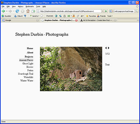
Posted by Steve Durbin on April 22nd, 2008
It’s approaching two years since I first created a web site, and I’ve decided it’s time for a makeover. With my original site, adding a new image required also creating a thumbnail version and editing a file. I was running out of space in the navigation area to list more projects. And on a new monitor I was distressed to see how garish the banner color became. So I’m re-building. I want the new design to be: 1) simple and flexible for me; 2) simple and easy to use for the viewer; and 3) responsive to browser settings such as window and text size.
more… »
Posted by Karl Zipser on August 6th, 2007

Painting
From Life vs.
From Photos
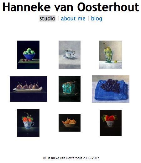
The design of web-pages for displaying art is a matter of great practical as well as aesthetic importance. One design that I find striking, because of its boldness, is
Jannie Regnerus’ web-page. This page (detail below) is minimal to the extreme. It is so unlike what one is used to in a web-page that at first it seems confusing. But it is precisely this unusual quality that makes the layout a successful frame for Regnerus’ photography. One has the feeling of having left the noisy bustle of the internet and having arrived in a quiet place.

I say the design is bold is because, by departing from expectations, Regnerus takes a risk that visitors may be confused and leave the site before they see anything. For those visitors who do look more closely, the simplicity of the layout serves the intended role of providing a quiet context for the artwork.
Is minimalism inherently good for the internet?
Is Regnerus’ site a model for other internet sites?
First posted April ’06 [note some interesting comments there by Arthur].
The minimal approach, Regnerus’ model in particular, has influenced my thinking about website design; the Art & Perception layout reflects this. Could we use more eye-candy? My thinking is that the minimal layout allows the latest post define the site visually — ideal for an art site, as I see it.
Posted by Steve Durbin on February 3rd, 2007
Art and Perception is being visited by more and more people, presumably looking for thought-provoking conversations about art. Many of them come back for more(!), so by that measure we’re creating interesting content. And when I say we, I’m counting commenters as well as post contributors. The comments are, in fact, the life-blood of the site, in my opinion.
So it may be time to think about ways to make more of the most interesting content more easily accessible to everyone. That would require some change to the site, so everyone’s input is needed, including any readers who haven’t posted or even commented before. We do have a category system, which could use some work to improve its visibility and usefulness. But that seems to work better for narrow topic areas, whereas people coming to the site may be more interested in some diversity and serendipity potential within broad topic areas. Think of a well-honed medium like newspapers with sections for main news, local news, sports, classifieds, etc.
more… »
Posted by Karl Zipser on January 23rd, 2007
[update: Here I use Art & Perception’s Theme files, but with the basic Sans-Serif font. You can compare the two sites to see which is easier to read. On many systems, both should be easily readable.]
[update 2:. . . more… »
Posted by Karl Zipser on January 22nd, 2007
Inspired by our previous discussion, I prepared an art studio/blog layout.
more… »