[ Content | Sidebar ]

Archives for still life

A question of viewpoint


plein air landscape painting
Painting From Life vs. From Photos


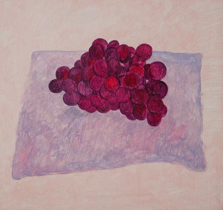
Hanneke can’t post today and she asked me to fill in for her. I wanted to remark on an interesting trend in some of the comments about her work. For example, looking at an image of Old grapes, new painting, Colin Jago wrote “I seem to be looking down on the grapes and up at the glass.”

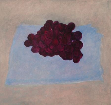
For Colorful Underpainting, Steve wrote “my first impression was that the cloth was somehow mounted on a wall. The bunch of grapes and the way they rest on it make this interpretation virtually impossible, of course, but I still don’t feel the correct perspective as strongly as I would like to.”

Hanneke paints her still life paintings “from life” and she tries to paint what she sees. Is she trying to show multiple viewpoints, or to produce distortion in perspective? Not intentionally, she has said. But is she doing so unintentionally?

Let’s take a look at Hanneke’s imaginary still life drawing and see if can find out more about the viewpoint issue.

In this imaginary still-life, the vessel is seen directly from the side, but the table top and fruit are seen from a different perspective, from above. We seem to look down on the table top while looking at the vessel from the side. This merging of different perspective points lends an interesting quality to the imaginary drawings. More examples of her “multiple viewpoint” imaginary drawings are here, here and here.

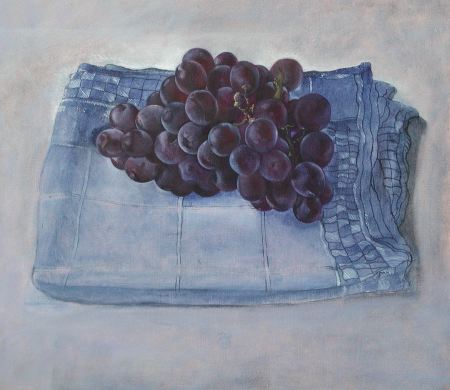
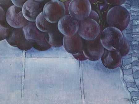
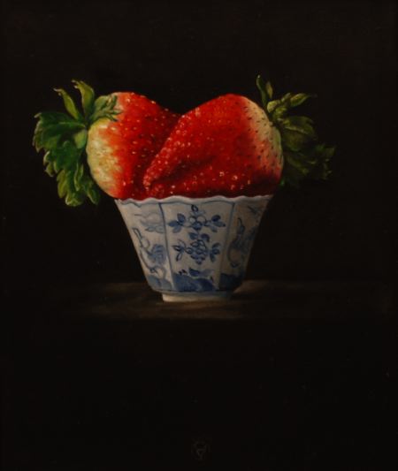
Let’s compare this to a drawing made directly from a real still life the same week when she made the imaginary drawings:

Do you see the difference? In this drawing from a real still-life, multiple viewpoints are not manifest. The fruit and the vessel are both seen from the same viewpoint.

I think that Colin and Steve are on to something with their comments about Hanneke’s painted still life work. In the “from life” still life paintings, the perspective may be technically correct, but she sometimes manages to produce a feeling of different viewpoints nonetheless. Would it be interesting if she tried to bring this difference in viewpoints more explicitly into her “from life” still life paintings? Or, should she work to correct the apparent flaw when it occurs?

Colorful Underpainting

Many people think of underpainting as a working in monochrome — either in grays, or browns. Artists of the past like Jan van Eyck used very colorful underpaintings. The usefulness of this I see in my painting of grapes.

I was painting these grapes from some dark purple-blue grapes in my studio. I made the underpainting much more bright, and warm, than real grapes, as you can see in the picture above.

When the first layer of oil paint was dry, I began overpainting, putting darker shadows over the grapes to make the colors more realistic, darker and cooler, as you can see above.

Here I have gone further with overpainting in another session. Now the grapes have a realistic color, but the brightness of the underpainting color shows through and gives life to the colors. If I had started with dark gray grapes, instead of a colorful underpainting, the colors would be dead when I did the overpainting. This this picture is not quite finished in the cloth. Here is where I left it yesterday afternoon.

Any suggestions?

dscn2912-450.jpg

(detail requested by Steve)

What does it take to be a dealer?


plein air landscape painting
Painting From Life vs. From Photos


Still life by Hanneke van Oosterhout, detail

Last Friday I helped Hanneke and Maurice set up the exhibition at Galerie de Provenier. While doing this, I started to ask myself, “What does it take to be an art dealer?”

more… »

Jannie Regnerus on Hanneke van Oosterhout

Artist and writer Jannie Regnerus has collected three paintings by my partner, Hanneke van Oosterhout. I went to Jannie’s house today to make a photograph of one of the paintings and to see if there was any chance that she would consider reselling them.


KARL ZIPSER: What do you think about these paintings you bought?

JANNIE REGNERUS: I like the intimacy of the painted objects. They have been cut off from their former lives as useful or functional things — especially the ginger pot. The ginger pot whispers its own history and has its own universe. The pears have a different feeling, they are sensual, almost like human bodies. And the strawberries have some humor because the proportions are confusing, the giant berries in the tiny cup.

KARL ZIPSER: Don’t you find these pictures a bit too dark?

JANNIE REGNERUS: I like the way the objects sink within this black background. They are very silent, but also very strong. I like these better than the paintings with the light background. Hanneke is very good in this dark and intimate night atmosphere. l like the tempered light, the sun has set, this is the best time for objects, they become more mysterious than they are in the broad daylight.

KARL ZIPSER: Would you sell these paintings? Perhaps you could buy something different, like a new stereo system?

JANNIE REGNERUS: Of course not. I bought them because I love them. I saw them and I wanted to have them close by. I didn’t buy them as an investment. When people come to my house they also want them. Hanneke made one picture for friends of mine who saw her work here. Every time I visit Hanneke’s studio I see new things, so it is very difficult for me to go there.

KARL ZIPSER: But you don’t like everything she makes.

JANNIE REGNERUS: Sometimes she works too long on a painting and I think that I liked it better at an earlier state. That is normal, it happens to me, I think it happens to every artist sometimes.

KARL ZIPSER: I agree, working too far is often a danger.

JANNIE REGNERUS: So Karl, what will be the prices of Hanneke’s paintings in the exhibition that begins this Friday?

KARL ZIPSER: That is an interesting question.
. . .

Hanneke’s show opens 15 December in Haarlem at gallery De Provenier (which does not have its own website). What will be the prices? Which pictures will she select for the exhibition? Will she, should she, sell on-line as well? All of these questions are unresolved. Hanneke will discuss the progress of the show on her own site.

Old grapes, new painting

more… »

A painting a [in several] day[s]

Recently we looked at one of Hanneke van Oosterhout‘s finished still life paintings. There were a number of excellent critiques. The painting was already sold, however, so comments could have no further impact on that picture.

Now Hanneke is in the progress of making another still life. It is not yet finished, which means that your comments could help her make this painting better.

We can follow the painting’s development over several days. more… »

Robust colors

In previous critiques here on Art & Perception I referred to a lack of “robust colors” in some paintings. I wanted to show some positive examples of what I mean by “robust colors.” These still life paintings by Gautam Rao are just what I had in mind.

more… »

css.php