[ Content | Sidebar ]

Archives for work in progress

Holding the Knowledge

I have just finished an intensive (and intense) 5-day workshop in plein air landscape painting. Later, I may indulge myself and talk about the entire process and the 3 locations we painted at, but for this post I’d like to pose a question which comes out of just one location. The question I’m posing is how does one transfer the knowledge gained in doing one piece of art to her general practice? More specifically, how can I hang onto the insights that my instructor helped me gain and use them when I’m working on my own?

The specifics: On Wednesday we painted at the Willamette River waterfront, in a piece of waste ground, just to one side of the Interstate 405 (Fremont) Bridge as it rises over the river. One humongous stanchion was no more than 10 feet from my painting spot. The roar of the traffic was absolutely constant; it was only maddening if you tried to talk to someone. The field was dusty but large, the sun quite warm, the wind constant, and although there were city amenities beyond us on all sides, a chain link fence and heavily trafficed road cut us off. It was a total enveloping environment, not necessarily unpleasant if you sank into it.

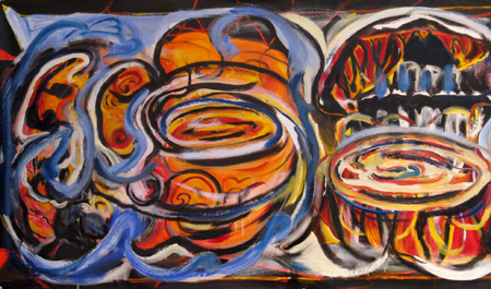
That was Wednesday. On Thursday and Friday, we moved the art school’s painting studio and worked on projects based on one of the plein air pieces. I chose to enlarge upon images and ideas that I gathered from the Under-the-Underpass experiences.

apfremont2.JPG

Fremont Bridge 1, photo, June 2008

more… »

Comparing Media: Intaglio, Quilting, and Language

In a recent critique session of quilted art, conducted by two “fine” artists, I found myself having a “eureka” moment. Then, a few days ago, Jay and Melanie’s discussion of Jay’s intaglio technique on board and foamcore (published prior to this post) pushed some of my insights a bit further. All this was added into a melange of thinking I’ve been doing about where I am in relation to quilted art and painted art.

The eureka moment came through the phrase used by one of the fine art critics: the phrase was “working the surface.” “Working the surface” in the traditional fine arts means adding, deleting, scraping, underpainting and overpainting, sanding, gouging — all the kinds of things one can do that either uncover and/or add to a planar surface. It seems clear to me that Jay’s process of working his boards and foamcore are fine examples of “working the surface.”

With quilted art, “working the surface” seems to show up in two ways. One is what is called “surface design,” which basically alters the flat plane, by dyeing it, laying rust on it, discharging (bleaching) it, monoprinting on it, and even digging into it, tearing and unraveling the threadwork. This work sometimes adds texture (especially with elements applied to the surface (applique) or taken away from it (“cutwork” or just plain gouging holes). These kinds of working of the plane are singular, patterned for the effect in a particular work, not meant to be turned into a commercial design for fabric (the original use of “surface design” had a strong commercial element.) The other part of working the surface with textiles is the work of embroidery and quilted lines that make for a frieze effect; when stitches are pushed through the two layers of fabric and the in-between batting or wadding, the stitched line makes an indentation, beside which the surface becomes raised by the pushed-aside materials.

I have never heard the phrase, “working the surface” applied to quilted art before, but when I heard that and then saw the intricacies of Jay’s working of his surfaces, I realized that the language may give me new insights into what can be done with quilted art.

At the critique, the guest “critics” (very kind observant folks) looked at two pieces I had brought, comparing them.

The first was one you’ve seen before: Mrs. Willard Waltzes with the Wisteria, 76 x 61″, 2003, hand dyed and painted cotton, embroiderie perse with computer-generated prints, and dyed overlays.

mrswwaltzesw.jpg

mrswwaltzesdetw.jpg detail

more… »

Styles for seasons (updated)

About five months ago I described my indecision regarding goals or approaches in my horse project. I can now happily report that I’m still unresolved. It appears that simply making lots of photographs doesn’t necessarily result in refinement. I’ve decided to consider this a good thing, since that’s how it is, anyway. Perhaps one lesson can be drawn: to every style there is a season. Lately in Montana the season has been winter, and a look noted earlier has remained prominent, namely one featuring the texture of snow, especially falling snow, sometimes combined with motion-related texture.

11088b-fb_horses_snow.jpg

more… »

Take three

I’ve just returned from a trip to the Colorado Plateau, my third since getting my camera. The canyon and mesa landscape is amazing, but most of my interest lately has centered around the ancient remains of human habitation, and their relationship to the landscape. I’ve focused on the small settlements and structures, and haven’t even been to larger sites like Mesa Verde in many years. My reasons: the small ruins are not on maps, there are no crowds, and the hiking and searching for them is a large part of the enjoyment.

11761-450.jpg

more… »

It’s Never to Scale…

This is a long tale and tail, as you will see. It has several segments.

ntsbeginning.jpg

more… »

Horses of a different artist

11009-450.jpg

It should be no surprise that in Montana, even in Bozeman, there’s no shortage of artists painting, drawing, sculpting and photographing horses. Which is a delight for me, engaged as I am in such a project myself (posts here and here). That gives me a keen interest in how others have responded to the subject, and enhances my appreciation of their work.

So it’s shocking to me that, before yesterday, I hadn’t thought for a long time about Deborah Butterfield. Two years ago I first saw her horse sculptures at the Yellowstone Art Museum; they had the force of revelation. I remember walking into the room and having to sit down (on a fortunately placed bench) to gaze at the horse there, one of her newer ones in patina’d bronze cast from driftwood. Without any knowledge of Butterfield, her technique, or the subject, my overwhelming impression was that this was a person who understood horses. What they are inside, and how they are put together, in both a physical and a metaphorical way.
more… »

Where I Live: perceptions & preconceptions

I’m maundering around Robert Irwin and the concept of perception. It was the Oct 14 NY Times article on Irwin that got me thinking — again — about what and how and why we perceive.

Irwin, in one of his exhibits, made a small but significant change to a San Diego Museum room that overlooked a wide view of the Pacific ocean. His exhibit consisted of cutting three rectangles into the existing windows. The Times quotes Irwin, “At first I didn’t realize the glass was tinted….So not only did my holes let in air and sound, adding another dimension to the experience, but they made everything seen through them appear in greater focus.” The reporter adds that Irwin “opened the window, that age-old pictorial device, letting in a cool rush of reality.”

Alternatively, I think I spend much of my time in reality. So, to reverse Irwin, I’ve been painting “stuff” around my neighborhood base. No sweeping views of vales and rivers, of volcanoes and archaic structures. Instead, I’m trying to perceive, in a painterly fashion, the place I spend most of my time. As usual for me, it consists of much that is “natural,” that is, growing things.

As usual, it’s outside, where I can enjoy the sun (when it shines) and the air and light.

paintingsvwtree.jpg 
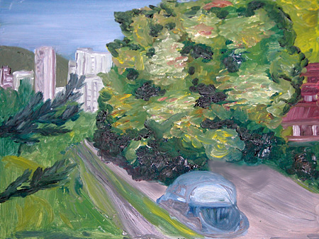
Volkswagen and Horse Chestnut tree, 12 x 16, Pleine aire

more… »

css.php