Despite recent posts here on the subject of art about art, by Leslie and by Karl, I hadn’t thought of the question in application to myself. Then I remembered that I did indeed have some photographs of art, at least if the gentle reader allows graffiti to be considered art. In any case, I was definitely interested in the personal expression represented by the graffiti. I was also interested in the setting, a half-underground concrete parking structure, and especially in the lighting, a mixture of glaring incandescent light and early morning daylight.
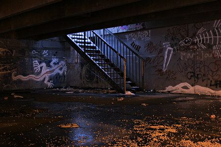
I made these images nearly a year ago, but still haven’t arrived at a presentation I’m happy with. I’m curious what you think of the following pairs of images. The first pair pits color against black and white. The color version shows the different tints of the two light sources, but the blacks feel richer to me in the monochrome image. Do you have a preference? For what reason?
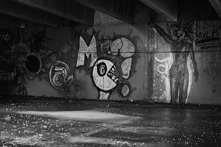
The next image I show in a lighter and a darker version. I like the high contrast of the first, but it may give the impression of a more brightly lit setting than it actually was. How does it seem to you?

I guess the real reason I’m not satisfied is that I’m not sure what I’m saying with these and my other similar photographs. Are they about the graffiti, is that where your attention mostly remains? Are they about the abstract tones, the play of light and dark, and if so, is that pleasing? Do you detect a political or social comment lurking in the shadows?

Steve,
I think you have got the right question — if you knew what you were saying, the decisions would come more easily. But aside from the obvious subject matter, I don’t see a lot of carry-over from one of these to the other.
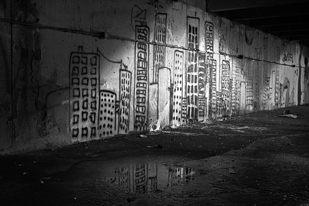
The first one, with the city buildings, was a formal design to my mind; the semi-circle of light with the verticals of the graffitti buildings was very pleasing, particularly with the reflection in the puddle, just off center balanced by the smaller version of the lit portion on the right. It’s an abstract in which the graffiti serves the design.
The second one, though, is for me about the eeriness of the scene — and so it’s the odd colors that really prick my interest. After looking at the colored one, the b/w seems flat, although it works better if the colored one is completely out of eye sight. The lines converge in the b/w where as the colors of the light bounce off one another in the other. Maybe it’s a greater sense of menace. The less contrasting one seems to be more about the graffiti itself.
In the last one, the greater contrast gives it greater depth and the light source, because of the reflections, appears to be from a variety of sources. That isn’t exactly what I mean, but there’s something about what happens to my sense of the light in the more contrasting one. It also feels more political or like it has social content, although when I look at it I’m hard pressed to say what that content is. William Blake meets pac-man or some such….
Steve,
There is a lot of material in your post. For the moment I’m commenting on the front page alone.
I think that photography of art is a fantastic thing, because one goal of art is to transform the space we live in, and one goal of photography is to record the space we live in.
I’m no more going to say that graffitti is art than that oil painting or pen and ink drawing is art. It depends on the work itself. The mural that you photographed is not in itself a great masterpiece. However, the photograph transforms it into something special. The lighting, the perspective put on the fronto-parallel mural, the reflection in water, all these things turn spray paint on a concrete wall into magic. I think the pool of water is the “keystone” of this artwork.
One thing I’d like to see in a photo like this is how people could fit into it. Not that this photo is lacking. I’m just curious because I have noticed that people look different, transformed, when they stand in front of or besides certain artworks. Photography seems the perfect medium to explore this.
Steve,
I refuse to be a gentle reader, and of course graffiti is art.
And a quality of graffiti that I find so remarkable is how it fills spaces that are so often remote, subterranean. Who? How? With what light source to work by (like Michelangelo with a candle on his forehead)? Did they consider that it would be viewed only briefly by others going 40 mph on their way to work?
An aspect of your work that is enticing is how you reference the space Outside of your Interiors. Which brings up an interesting, and I think important, issue: how one manipulates an image to highlight the interior-exterior relations. Personally, I am disappointed by images that seem enhanced for the more Glorious Moment. Instead I prefer sensing that what is is what is; That the Tangle be included (Brigit’s Beaver image).
Steve, I think you should pursue an exhibition. The possiblilities!? For example: why not show Two Works side-by-side, an interior from the Ghost series alongside the color image of the Stairs piece above. The potential: wood/contrete, private/public space, decay (I love the debris in the urban Stairs, whereas I found the nearly swept conditions of Ghost, beautifully unnerving), etc.
When? Where? Don’t wait. How about this: say to yourself that I will find a place to show them in the next 24-36 hours (if you do this please take a photo and post; I would be curious as to how it transpires).
The first picture looks like something out of a fairy tale.
The two photos in the first pair are very different. In the monochrome picture, my eyes are drawn straight to the bright light on top of the steps. In the color picture, my eyes follow a circle from the orange in front to the lovely red stripe on the left dragon to the squid (?) on the right bottom and then coming back to the orange in front. The blue steps are only passed by but do not arrest my vision. The skeleton fish on the right wall recedes into a more mysterious distance.
How do I explain my initial feeling of a faint menace? I assume that feeling has to do with my not being part of the graffiti culture. Having studied the picture now for while, I have grown fond of the creatures depicted here, the red-striped dragon, the resting squid topped by the flying fish. The scene now reminds me of a party held at a private school in a dilapidated mansion on the elegant Long Island North Shore that little Karl and Nina went to. The principals were artists. The huge paintings in the entrance hall made by children were GRAFFITI. Perhaps, we should get some music and visit your graffity creatures and dance there? Do you think that Doug would come?
In the second photo pair, the lighter one has greater depth. I am intrigued by the head of the tall figure to the right. Is that a lion’s head?
Looking at the pictures, I do not think of a social or political context. I think of children. The first picture is a magic city that they live in. The second one shows their playmates. I don’t understand the last two pictures. I wish my eyes were more directed to move along the wall from the left to the right to make out what these creatures are.
Steve–
I live in a fairly urban area, I see graffiti all the time, and I do believe that it is art. What I love about graffiti is the sense that the artist is simply using the materials available to him—there’s a thought of an inner city youth, low-income family, but with this passion, desire and drive to create art, so he utilizes what’s available to him. A can of spray paint is cheap and abandoned buildings and blank concrete walls abound.
I would love to try to capture a work in progress, and photograph that. There would be a real story there.
I find your images to be very beautiful, and not so much for the graffiti, but for the light. I love the play of light and shadow on the wall in the first photograph, and like Karl, the reflection in the puddle makes the image for me.
The next set….I’m really drawn to the color version. I love how the color of the light changes with the contrasting light sources. The graffiti isn’t central in this image–the color or the b&w–it seems to be more about light and space and perhaps the notion of hope.
The last set….I prefer the brighter version. My eye is drawn to the contrasting tones of light and dark.
They all are incredible, and I’d love to see more. I don’t feel that the photographs are about the graffiti so much though, they seem more about light, space and perhaps hope within abandonment….and the graffiti just serves as a backdrop to these things.
Steve, in the examples you show here, I prefer the b&w, and the brighter version.
What attracts me about all of these is the way in which different levels of reality interact. This probably occurs more in the photographs than it would seeing these places in person, because in person you know what is 3d space and what is image, but in the photo it’s all image. As far as I’m concerned, with this subject matter, the more ambiguous the relationship between these two things the better.
I think graffiti can be viewed as art, but I wouldn’t probably look at it that way if someone graffitied my car or apartment. Then it would feel like vandalism.
I like D’s idea for a show. The two bodies of work would play off each other well.
Steve,
I tend to like the black and white ones as well, and the thrid image stillr eads as mysterious and dark in the brighter version (just easier to read. Althought that orangey red in the foreground of the color one is pretty creepy (in a good way). I can picture color working in interesting ways when the graffiti itself has color in it.
Graffiti is art in my mind, although as a teacher of the late teen/early 20’s age group I get a little tired of all the graffiti doodling that ends up in their sketch books. So much of it is visually dull. But there’s tons of mediocre art in other forums out there. Who’s to say the gallery system has the monopoly on all the bad art :)
As Karl and Chantal suggested, I think it would be great to photograph people creating or viewing or hanging out around the graffiti. I’ve been back several times, but never seen anyone there, though there is evidence of transient use. The absence of people is perhaps part of the link to the Ghost Light series that D. brought up, a fascinating connection. Another link is the faint eeriness or menace that June and Birgit mention. Both settings are abandoned, but occasionally visited sites. I hadn’t thought of it before, but the cleanliness of the ghost town interiors implies such attendance, just as does the trash in the parking structure. I think D. and David’s thought of combining them in a show is excellent. I don’t think I can react with D.’s suggested speed, but maybe I’ll see if I can make prints for my office, where I sometimes get comments. And I am pursuing a show possibility for the Ghost light series; I’ll run the others by the gallerist to see if she likes the interaction.
Birgit, thanks for the detailed description of how the color affects you in viewing the image, that’s very interesting to me and I seem to find the same thing myself, now that you mention it. By the way, the head on the figure has lion-like hair, but otherwise looks like a person. I don’t understand all the pictures myself, but I still found them intriguing.
Chantal, you’ve hit the nail on the head about how I’m drawn to “the play of light and shadow.” That’s another connection with the Ghost Light series. I guess I was aware of this in a general way, but you folks have really helped me see it more clearly. Thanks to everyone else for helpful comments. Keep those thoughts coming!
Steve,
This comment is about the off-front page part of the post, to begin with.
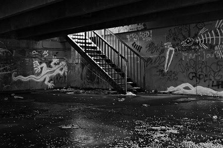
In the first pair, I prefer the black and white image. The color image has strange lighting. It looks like the set of some action movie where some stylish bad guy is about to come down the staircase. Nice, but that’s not going to happen. The black and white brings all the disparate elements of the photo into a dialogue about texture and surface which is quite interesting. I can relate the floor patter to the walls, for instance, but in the color version I don’t think of this.
In the second pair, I like the first image. I don’t get the impression of a brightly lit setting, it seems shadowy and dark. The second image seems weaker in comparison.
As for the artistic statement, I find the first image (on the front page) by far the strongest. It has something special to it that the others lack, despite their greater structural complexity. Perhaps there is just too much going on in #2-4. Also, the graffiti is best in the first image. That could be an important factor.
There is a political sort of quality to the first image, but it is not heavy handed or pedantic. It is more of an aura.
I think if you are going to have pictures with graffiti, then the art is an important subject, whereas the tones and lighting are supporting characters — essential, but not the focus. Of course, if you chose abstract graffiti, it might be different.
Overall, I find this a fascinating subject. We don’t have that much graffiti here in Haarlem, but there is some and I’m going to take a closer look next time.
Steve,
I keep looking at your front page photo and I think I understand why the water is so important. The water reflects the “buildings,” obviously. What I noticed a moment ago is that the reflected “buildings” look real. They are framed by the edges of the puddle (the oddest frame I have ever heard of). If the reflected buildings are almost real, it imparts a hint of that reality to the mural — I speculate. When I cover over the puddle, the mural loses some of its fascination.
If there is anything to this reasoning, it suggests that the specific nature of the graffiti is important. Let’s note also, this mural really is more of a mural than graffiti.
Karl,
Yes, the city scene is more like a mural, but most of the walls are a more chaotic mix of images and words. I love your observation about the puddle. Since we expect the reflection in a puddle to be imperfect, the fact that the original subject is an illusion becomes less noticeable, and we accept it as real.
Interesting that the very color which differentiates areas of the image and helps Birgit’s eye move in a directed way, for you disturbs a relationship that is more apparent in the monochrome version. This nice example not only illustrates the truism that different viewers appreciate differently, but show us more precisely how they differ (in the case of you two).
Steve,
One possible theme for an exhibit could be (1) to show the flow of light in the monochrome ghost series and (2) to illustrate how the flow of light is dependent on color by showing the graffity pictures in monochrome and color.
The graffiti pictures may be the perfect choice to illustrate the difference that color makes because of the sense of menace some of us, who are too remote from the inner city culture, feel It looks like the set of some action movie where some stylish bad guy is about to come down the staircase .
Steve,
I think I’m becoming a fan of your work… No, I definitely am.
I’m going to answer your questions indirectly therefore. I’ll tell you what works for me. That way you can decide which rendering is best.
What I like about your work is that it stimulates my imagination. Like Birgit, in that staircase, I saw the set of an action scene, for example. I was haunted by the next moment. So the way to decide which is best is: Which one is asks the stronger question? Don’t give the game away. Let your viewer finish it.
Does the color in the color version help that? (I think not.) The greater contrast in the first of the second set? Better or not? Well, the way the light part glows around the Medusa figure is damn spooky. (I like that.)
You have an eye for mystery and ambiguity. You are beyond technique with an eye before the world and the means well behind you.
Great stuff, man.
S.
For me, the most thrilling aspect of the creative process is when decisions are based on the “life” of the work and not the formal qualities of “art”.
Of this series, I favor the color print for two reasons: it captures the contrast of the two different light sources and feels more specific to the experience as “contemporary”.
And I think the idea of showing your work at work is great. Maybe an Opening during coffee break?
So far, we are evenly split.
Monochrome: David, Leslie, Karl, Rex (? Color does not help)
Color: June, Birgit , Chantal, D.
Rex, thanks for your comments. You’ve identified something I’ve been thinking about more and more, the idea of story. Sometimes that can arise from presenting a (potentially) dramatic moment. I think it can also arise from depictions where you can easily put yourself in the scene, and then the natural human inclination toward story takes over, we naturally ask ourselves “what happened here?” or “what’s going to happen next?” Especially if the scene is a little odd, putting one off-balance, leaving one wondering…
Birgit,
I just saw your tally — thanks for doing that. More important than the count is, I want to go back and get a sense of why color was or wasn’t favored, and what else it may be related to for different viewers. Thanks again for your detailed comment about that.