Posted by Rex Crockett on September 29th, 2007
I haven’t read Stephen King in a while, but I recently picked off a random shelf the last of his Dark Tower series — The Song of Susannah. I was intrigued enough to start reading. King has in the past written many nice essays on the subject of writing. The introduction to this book is no exception.
What caught my eye and what I’m relaying here is germane to all the arts, so I thought I’d bring it in.
From “On Being Nineteen (And A Few Other Things)”
I think novelists come in two types, and that includes the sort of fledgling novelist I was by 1970. Those who are bound for the more literary or ‘serious’ side of the job examine every possible subject in the light of this question: What would writing this story mean to me? Those whose destiny … is to include the writing of popular novels are apt to ask a very different one: What would this story mean to others? The ‘serious’ novelist is looking for answers and keys to the self; the ‘popular’ novelist is looking for an audience.
It is no stretch to extend this to other arts. I know what kind of artist I am. Which kind are you?
Posted by June Underwood on September 28th, 2007
As an oil painter who tends toward “moosh” rather than clean graphic edges, I have found myself pondering the stitched line intrinsic to my quilted paintings. They change the moosh that I so often fall into, adding a different set of visual ideas.
So, if you’ll forgive me, I want to explore notions of line — line mostly as it is generally described and discussed in design classes, but more particularly as it works in quilted art. [ed. note: This turned out to be more of an essay than I had intended. If you wish, you can just look at the pretty pictures.]

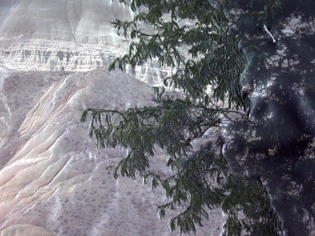
Painted Hills Bluff, detail (Work in Progress)
Line is important in design, particularly, of course, in drawing. It moves the eye, evokes feelings, defines or suggests shape, can make value and depth, and can be varied to vary its expressive quality. In quilted art, line functions in all these ways, but can have a weight and value different from that found in drawing and is far more inportant than line is in painting. In conventional photography, line seems to have minor function, but art photography often makes extensive use of line.
more… »
Posted by Sunil Gangadharan on September 27th, 2007
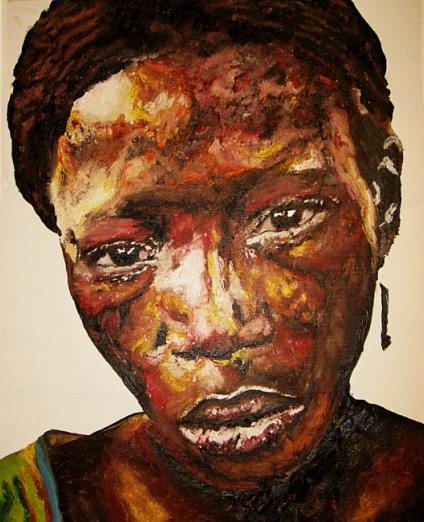
Sunil Gangadharan, ‘Battery’, Oil on masonite, 40″ X 44″
I have been exploring new ways of laying a face to the canvas and a technique that I am recently starting to understand is to pattern splotches of color rather than create defined areas of light and dark. It is a time consuming technique even if it looks very random. Previously, the light / dark areas seemed more deliberate and planned with the result that some of my older paintings had ‘islands’ which accentuated the lighting and lack of (no, I am not complaining, only comparing).
In this technique, I did not try and consciously paint ‘islands of light’. Rather, I developed the effects of light from using results of a higher valued hue playing on the transparency of the white ground overlaid with lower valued hues and thicker splotches of paint for completion of darker areas. So here are two new paintings and no contortional contretemps (as June playfully referred to questions/issues raised as a result of my posts).
Comments are most welcome.
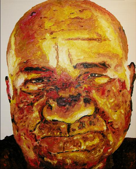
Sunil Gangadharan, ‘Belphegor’, Oil on masonite, 40″ X 44″
Posted by Steve Durbin on September 25th, 2007

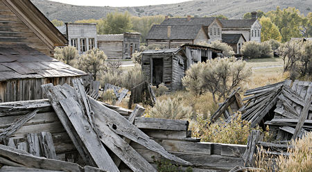
Another re-visitation in my recent tour was the Montana ghost town of Bannack, where I have photographed my Ghost Light series. Although I’m not sure a project ever really ends, it does go through phases. I feel this one is nearly dormant: I still enjoy the location, I find photographs I want to make, but there’s a sense of approaching completion. The initial vision was about spaces and light and the stories suggested there (someone wrote me she kept looking at one of the pictures while, in fact, writing a story). Now I’m filling out with additions that make a more rounded view of the place, but may not advance the key ideas much.
more… »
Posted by Hanneke van Oosterhout on September 24th, 2007

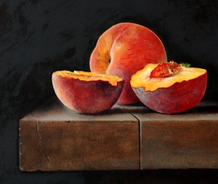
I’ve been doing a lot of painting and now I am preparing a website for the images. Here is one that was photographed today. Comments?
Posted by Birgit Zipser on September 22nd, 2007
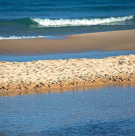
Inspired by textures of rock and water, I studied beach texture at a popular creek flowing into a Great Lake.

I mostly came early in the morning, not to inconvenience little people playing at the creek. But one morning, there was a retired person from Arizona reminiscing about his favorite childhood haunt. more… »
Posted by Jay on September 21st, 2007
People on this site take their photography seriously.
Me, I play around. I take my camera to a tidy little pond with a walkway in a nearby metro park, where I capture whatever the season and the light permit. Photographing the plant life there is somewhat like shooting fish in a barrel.
There are things that I forswore, but now I swear I do. I once considered the extent of my cunning to constitute the limits of my accomplishment, and looked askance at any number of the tools that I now unabashedly employ. And the images that I bring back from the pond are increasingly subjected to my ever laxer and self-indulgent propensities. Instead of rolling up my sleeves on location and really getting into the moment, I point and shoot and place my faith in the little Photoshop of horrors. This sort of thing was not supposed to happen – my parents raised me better than to click like that.
more… »
