Posted by Steve Durbin on June 30th, 2009
 1
1
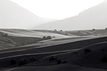
I occasionally worry that my tendency to analyze—some might call that an understatement—could be a negative influence on my work, causing me to lose spontaneity or fall into one rut or another. But I’ve now proven to my satisfaction that any effect is both unconscious and ineffective. Here’s how it happened.
more… »
Posted by Angela Ferreira on June 26th, 2009

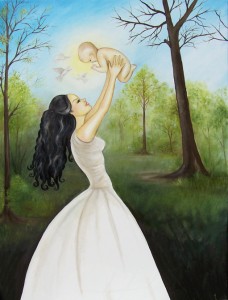
Uncondiotionally 2009
Tittle: Unconditionally
Size: 102×76 cm
Medium: Oil on canvas
Don’t know if you all read on my web biography that recently I have embarked in a deep and personal spiritual journey that has opened a door to the ethereal world of Reiki and crystal healing.
Through meditation and welcoming my Spirit and Angels to guide me through my work I have learned to give Reiki to my paint tubes and canvases before I start a painting.
My intentions are to create more than just a painting, but share a healing experience through the vision of the Divine irradiating a sense of peace and love of nature.
I am not sure if you all seen the film ‘The Secret’ but there is a very interesting part about a Feng Shui consultant working with a painter and how his works become the reality in his life through the law of attraction.
What are your intentions in your creations? Are you attracting what you want into your life through your works? Are you really showing your world and the true inner self?
What do you really want to achieve?
Your true self is how you feel yourself when nobody’s watching. It is where your deepest thoughts live. It is what you ultimately think of yourself, how you treat yourself and what you fear others might see inside you. It is your most native and real personality, your true Spirit!
Once you change the way you feel about yourself and evoke it into your works, the law of attraction will change your life. You are the magnificent creator of your own reality!
Posted by Steve Durbin on June 25th, 2009

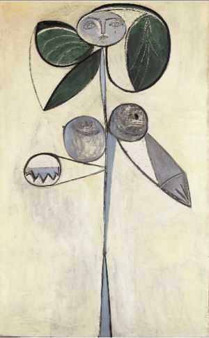
Even if you don’t care greatly about Picasso, I recommend the Charlie Rose interview with Françoise Gilot, who lived ten years with the man. A talented artist herself, and very independent-minded, Gilot frequently discussed art with Picasso. Much of what he said about how he worked has come to us through her. For example, regarding the rather complex, high cubist paintings, he said than in the “early stages” there were almost no “references to natural forms…I painted them in afterwards.” Braque had a similar working procedure. Rather than abstract from an initial representation of a scene, these cubists–at least for a time as their approach evolved–roughly laid out their abstract, faceted spaces and forms, then filled in enough clues to suggest the subject. Those clues could appear in rather disconnected spots. I believe it was the dealer Kahnweiler who said they had developed a way to free objects, showing that they existed without showing where they were located.
more… »
Posted by Jay on June 24th, 2009
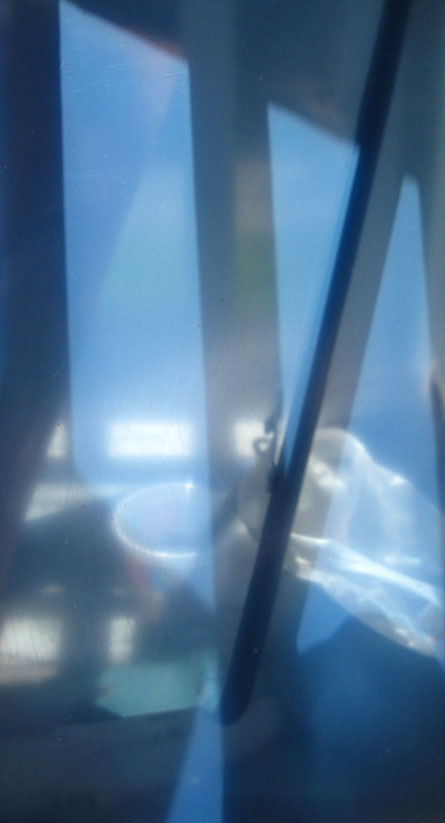
As many of you know, I have this thing for low solar angles. This is a sheet of acrylic in its protective layers that I casually placed on the back porch. It reflects little while transmitting a softened and generalized view of things beyond, including the combined image and shadow of a mop handle. The nice blue is the color of the protective material. Really, no issues to discuss – I just thought you’d like to see this.

Posted by Jay on June 21st, 2009
This touches lightly upon some of our prior discussions.
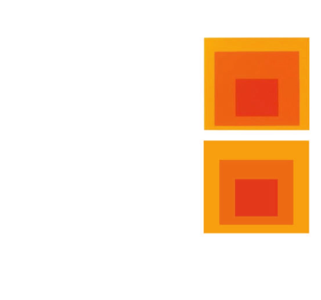
I wanted to compare an Albers “Homage To The Square” iteration to a similar, but mechanical version as rendered in Adobe Illustrator.
The Albers image was chosen because it appears that he was trying for a gradation in a single hue. I lifted from a site where it is being offered as a poster. Therefore, it may be chromatically inaccurate – but what hey.
I created a replica of the outer limits and the innermost rectilinear shape in their respective relationships. I then sampled the poster for the colors of the outermost and innermost elements and then blended the elements, calling for one interim shape.
Obviously the interim shape is at issue. The Illustrator version splits the difference in size between inner and outer, as it does the color. Not so with Albers who made the interim more imposing in size and saturation, and to my eye it looks a whole lot better.

Posted by Steve Durbin on June 17th, 2009
How do we actually look at pictures, and how does that affect what we see in them? I started thinking about this again when I read about the Kuuk Thaayorre, an Aboriginal society in northern Australia. Lera Boroditsky (mentioned previously on A&P) reports on The Edge that their language and culture describe space and spatial relationships not in body-relative terms, but in absolute, land-fixed terms (I wonder if this is true for many Aboriginal langiages). When given a sequence of picture cards (showing a banana being eaten, or other obvious process) to arrange in time order,
Instead of arranging time from left to right, they arranged it from east to west. That is, when they were seated facing south, the cards went left to right. When they faced north, the cards went from right to left. When they faced east, the cards came toward the body and so on. This was true even though we never told any of our subjects which direction they faced. The Kuuk Thaayorre not only knew that already (usually much better than I did), but they also spontaneously used this spatial orientation to construct their representations of time.
more… »
Posted by Angela Ferreira on June 16th, 2009

Running Free by Angela Ferreira
Title: Running Free
Size: 102×127 cm
Medium: Oil on canvas
 1
1