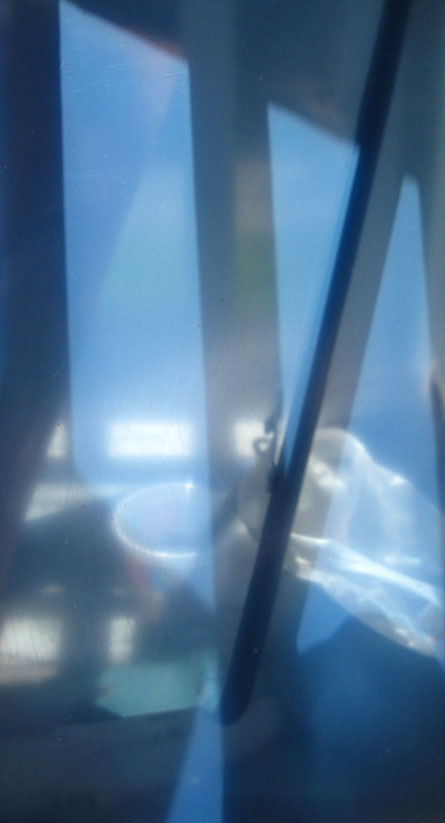
As many of you know, I have this thing for low solar angles. This is a sheet of acrylic in its protective layers that I casually placed on the back porch. It reflects little while transmitting a softened and generalized view of things beyond, including the combined image and shadow of a mop handle. The nice blue is the color of the protective material. Really, no issues to discuss – I just thought you’d like to see this.


Jay,
How beautiful!
On my labtop, I cannot see the entire height of the image. But when I click on it, it shows up fully – computer miracles.
Birgit:
Same here – didn’t know.
The image behaves normally for me. Did you scroll down in the browser? Probably the image is cut off when viewing the blog page with your wndow height, but when you click to view the image alone, it is automatically re-scaled to fit the window (a click then enlarges to full size).
Jay, are those parts of the protective sheet that look like a pair of hands reaching for the broom or a door handle?
Jay,
Have you, by any chance, laid in a stock of rose-coloured Plexi?
Steve:
As in the protective sheet acting proactively…
Funny you should ask – I do have pink sheet. House of Plastics creates fixtures for Victoria’s Secret in a kind of noncommittal transparent pink. I have some of that around. I’ll get out a chunk and take a picture if such a thing is to your taste.
I was more wondering if it was your taste, following Picasso. After that you’ll be chopping it into cubes…
Steve:
Now you’ve got me going. I’m figuring out how to drape form and might now create rudimentary lingerie in transparent pink. A cross between Brunhilde and a pink Cadillac perhaps.
Thanks Jay! Don’t know if it is your intention but this creates a unsettling effect due to the fact that I feel that I dont know where I am standing. Powerful I like it!
Angela:
And thank you. It could be the combination of shadows and the vague see-through effect The shadows of the railing establishes one plane, while the mop handle image and shadow seem to fall on another. The various objects are stacked both vertically and horizontally in a manner that seems to be influenced by the skewed perspectives generated by the shadows. Puts me in mind of the diagram that Steve found, where colors are dramatically influenced by their neighbors.