Posted by Angela Ferreira on March 28th, 2009
The weather is been fantastically good, so in order to give an art lesson outdoors to the kids and enjoy the sunshine, I have taken them outside in the school playground/pound area for painting.

By dipping a paintbrush in the water pound, and mixing it with soil, you can create beautiful earthy shades, pretty much the same principle as watercolour.
By breaking grass and smudge it on paper you can make a shade of green, and by using a burned wood stick you can create some chalky black. Using only these natural pigmentations from nature you can create 100% organic art on recycled paper.


I have made two organic sketches, one that I prepared at home in my back garden and another one I used for a quick demonstration how it works for the kids.
Here are some of the results:

Age 9

Age9

Age9

Age 10
For more school art lessons check out my blog at Life of a Mother Artist
More to come…
Posted by Birgit Zipser on March 27th, 2009
Walking to work I came across these beautiful waves and snapped them with my new point-and-shoot camera. I bought this lovely little Leica when I started walking to my day job because carrying a heavy DSLR camera in addition to my laptop on this 4-mile round trip had made me feel like a pack-ass. 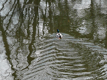 more… »
Posted by Steve Durbin on March 24th, 2009
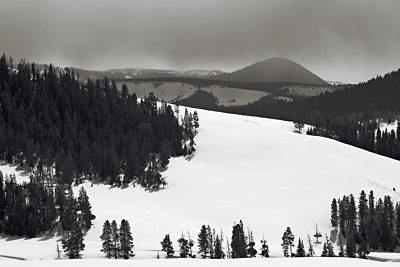
June’s recent post about trying to gain a sense of personal expressiveness in one’s landscapes—which, on the face of it, are more about the place out there than the one in here—set off resonances. All the more so as I had just returned from a day in the mountains where I had gathered one of my more coherent set of photographs in a mode (style?) I feel I’ve been seeking for some time (all in one 10-minute stint, the only halt of the trip). And then her mentions of Wood and Hockney added to the echoing cacophony.
 1
1
more… »
Posted by Karl Zipser on March 23rd, 2009

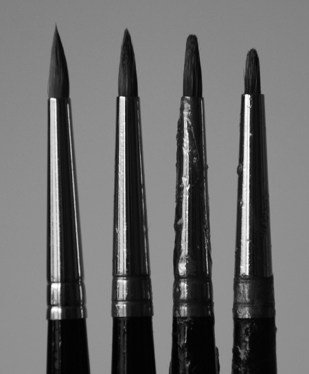
Sometimes when I am painting with brushes that are a bit worn out, I have the feeling that it doesn’t matter so much if the tips are worn away. But then if I take a brand new brush and start using it, my whole perception of what is possible, what is acceptable, changes. I know that I shape my brushes through use, but I also have come to understand that my brushes shape me.
There is a widely used saying (it goes like this)
If your only tool is a hammer, everything looks like a nail.
which I think is very deep. I think that when we pick up a tool and use it a lot, it actually becomes a part of us from the brain’s point of view. It becomes part of us in a simulated physical sense, like a violinist’s bow becoming an extension of his right arm; and it also becomes part of our psychology, this perhaps in a less obvious way.
I’m coming back to blogging after being away for more than a year. When I got back into it, I noticed with amusement that I tend to phrase my thoughts in terms of blog posts or blog comments. A blog is a sort of tool, isn’t it?
I would like to hear your thoughts on this topic of being shaped by your tools. Do you believe it happens? What are your tools? How do they affect you? And finally, what are the implications of this? How should we select the tools that will shape us?
Also by Karl:
Posted by June Underwood on March 21st, 2009
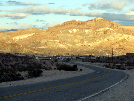
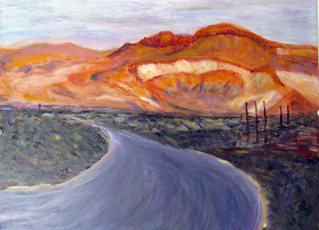
And now, at this point (day 30) in this particular residency in Beatty, Nevada, I am pondering a conundrum about my own landscape work. I haven’t quite enough distance to say for certain [pun recognized after it was made] but it seems to me that my interest in context and a sense of place interferes with my achieving a stylistic breakthrough, particularly with the set pieces that I love, like the mountains around Beatty.

As my colleague and friend David T would say: if he walked into a gallery with my landscape paintings, he wouldn’t think of them as being “by June Underwood,”just as “nice” (not a compliment) landscape paintings.

more… »
Posted by Jay on March 20th, 2009
My sojourn has kept me away from these pages a little, but something a bit parallel has come up.
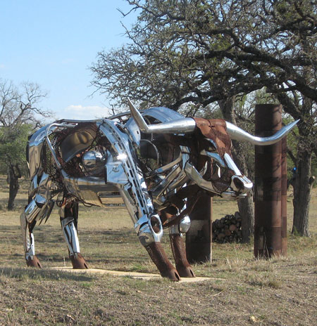
Outside of Johnson City is a sculpture of a bull, beckoning the wayfarer to a park that time did not allow us to visit. It is something of an opposite to the West Yellowstone bison in that the bull is a reinterpretation of the internal structure of such a beast, rather in the spirit of the horses that we have discussed. There is a lot of motorcycle glam in this work, which means that attention has been paid to chromed surfaces – but not so much in a spirit of depiction. Facture, fit and finish in this piece is at an industrial level.

In this case it’s a question of integrating pieces parts into a convincing representation, finding the bull in the Hog.
Posted by Steve Durbin on March 17th, 2009
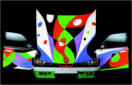
This morning’s New York Times had an article and slideshow on BMW’s painted by more or less famous artists. My favorite is the design by Cesar Manrique, shown here a bit smaller than in the slideshow:

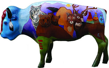
Now it may seem a long way from the Le Mans of Hervé Poulain or even from New York’s Grand Central Terminal, but the small Montana town of West Yellowstone (as the name suggests, just west of Yellowstone National Park) did a similar thing a couple years ago when they commissioned local artists to paint life-size bison sculptures that were placed around town.

Especially interesting here, from an artistic point of view (but I don’t neglect the relevance, especially these days, of the commercial significance), is the reversal of the common problem of representing 3-D space in a 2-D painting. Here the painter’s 2-D mindset must deal with the 3-D-ness of the sculptures. That means not only non-flatness and the volumetric cues, but the fact that the surface is not simply a distorted rectangle, but wraps around and contacts itself in multiple ways.
more… »


 1
1