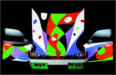
This morning’s New York Times had an article and slideshow on BMW’s painted by more or less famous artists. My favorite is the design by Cesar Manrique, shown here a bit smaller than in the slideshow:

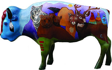
Now it may seem a long way from the Le Mans of Hervé Poulain or even from New York’s Grand Central Terminal, but the small Montana town of West Yellowstone (as the name suggests, just west of Yellowstone National Park) did a similar thing a couple years ago when they commissioned local artists to paint life-size bison sculptures that were placed around town.

Especially interesting here, from an artistic point of view (but I don’t neglect the relevance, especially these days, of the commercial significance), is the reversal of the common problem of representing 3-D space in a 2-D painting. Here the painter’s 2-D mindset must deal with the 3-D-ness of the sculptures. That means not only non-flatness and the volumetric cues, but the fact that the surface is not simply a distorted rectangle, but wraps around and contacts itself in multiple ways.
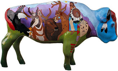
Painters can deal with this problem in various ways. For example, they can 1) generally ignore the issue, treating each side of a scupture as an independent canvas; 2) use an abstract design not depicting any sort of scene, which therefore doesn’t really have matching issues; or 3) work with the novel situation in a synergistic way. I think the image above, by Native American artist DG House, is one of the best examples of approach #3. The depicted animals, fairly flat but with slight indications of volume and major features, seem to nestle well within the protective bison shape where they are inscribed. Though there is some indication of landscape with horizon, it is quite subdued and has no problem existing on both sides (see below for the verso). In fairness, her style adapts well; this is not so different in general look from many of her paintings.

Have you seen other examples of this sort of project? If you had to put a 2-D image on a 3-D object, what would you choose to do?

Steve,
Angela posted about this some time back, To paint or not to paint the sides of canvases. The question is, should the image on the front of the canvas continue on the sides? Angela thinks it should. It seems her images are not visible today, but hopefully they will reappear soon.
Steve,
Portland did the same thing with cows, I believe, and it may have been Kansas City that had pigs everywhere. It must be a kind of fad — and not too expensive for the sponsoring entities.
But your question stops me completely. I have enough trouble dealing with 3-d, let alone wrapping a 2-d image around a 3-d object.
We have been watching all kinds of strange videos left here by our hosts, many of them on sculpture. There’s guy at the Salton Sea who is building a mountain with Christian symbolism all over it. Part of it fell down.
My favorite “sculptures” turn out to be buildings, done by people who are not necessarily architects, but who get obsessed with an idea and manage to find a way to carry it out. Things like tiling the entire house. Or making “wedding cake-like” plaster walls and fountains and chimneys, and putting flowers into the plaster.
In fact, at the Amargosa Opera House, the “house” has a painted audience. The Amargosa Opera House is a place at the foot of the Amargosa desert, (part of the Mojave), a long deserted hotelish sort of place that a ballet dancer rented and turned into her private dance hall, and then she painted her audiences (perhaps because the place she inhabited didn’t provide live ones). She is now about 80 but still performing; we are going to see her next Saturday. So this performing arena has, painted all around it, human figures,dressed in fantastic clothes, watching the stage. She has even painted the ceiling.
What that has to do with 2-D on 3-D, I’m not sure. But I think there’s some connection. I’ll let you know.
Karl,
Picture edges represent a much simpler problem, being small in area and not actually wrapping around to touch each other (except at the very corner). But I seem to remember that you yourself were concerned with Greek figure painting on pottery. Can’t find a post on it, though. However, along those lines, the world-famous ceramist Rudy Autio (from Montana!) did quite amazing figures on vessels (see this one and more here).
June,
People do strange things out in the desert… You’re making me miss it.
Here’s the vase link.
Actually, if you view a painting from anything other than straight on (and even then) you are viewing it as a 3-d form. The curious thing is how strong our instinct is to ignore this and treat a slanted view of a 2-d image as a direct on view.
Decorative or artistic?
Is there a difference between kids painting their beetles or famous artist painting their BMWs?
Are the painted bisons fun or are they kitsch painful to observe?
Karl,
Thanks, I guess I saw that, but was mislead by the Winkleman in the title, and didn’t read it all.
Actually, I was thinking the opposite thing about viewing a flat image while watching a video on our TV from about a 45-degree angle. But the actors etc. did not seem thin. If I had been interpreting them as 3-D objects, they would have been thinner because their form took up less of an angle in my field of view.
Birgit,
I think the artists in both cases thought seriously about the artistic challenge of dealing with the whole object, so for me that takes it beyond merely eye-catching decoration. Some of the bison I do find on the kitschy side, but they’re all worth looking at. I like that the project gets artwork out in public where it garners a lot of attention from both public and businesses.
Steve and Karl,
An artist from Portland, whom I respect a lot, recently exhibited three of his large paintings as surrounds — mounted them on screen-like devices so you walked into them.
I wasn’t there to see the exhibit, but had seen all three paintings as straight abstract landscapes — for me, they were abstract paintings; I only call them “landscapes” because that’s what he said he was doing. I liked the paintings straight on.
However, I was sent a photo of the 3-sided exhibit, and “bingo!” Those abstract pieces became landscapes. It’s hard to explain how this could happen — and since I didn’t see anything but a photo of exhibit, it may be a photographic trick. But I’ve always been impressed by his work and his insights, and I suspect that he’s been seeing his work from a different angle than any of us were. The photo I was sent totally flabbergasted me because I thought I knew the paintings well.
June,
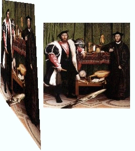
Here is a famous example of this sort of thing in a painting by Holbein. There is a skull in the painting, but to see it normally you would have to stand under the painting and to the side.
Yes, we don’t notice the skull from most angles because it is represented as if it were a painting on a plane that is very skewed to the main picture plane. From a certain viewpoint, the pre-interpretation image is such a good match for the known skull shape, our perception jumps and we see it as a skull. I’ve always thought this would be clever if it didn’t obtrude so much in the normal view of the painting. We can’t tell what it is by looking straight on, but we know it’s something weird.
That’s mighty impressive! Thanks, Karl. Somehow, in my art education, I missed this particular painting, and particular insight into painting. I like it.
June,
here is a transformed version of the Ambassadors by Holbein:

I love The Ambassadors! As a psychologist, whenever I see a painting, I think about what the artist of that painting was like. Seeing this picture, tons of mysteries were opened up, and as I stared at the image, I wondered how Hans Holbein thought, and what kind of man he was.
I was surprised and honored to read your description of my work. I was conscience of the placement of the images and was determined to make this piece work as a compliment between the exquiste sclupture and my painting.
Sincerely,
DG House