Posted by Steve Durbin on March 17th, 2009
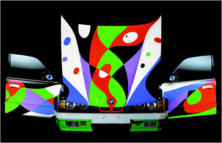
This morning’s New York Times had an article and slideshow on BMW’s painted by more or less famous artists. My favorite is the design by Cesar Manrique, shown here a bit smaller than in the slideshow:

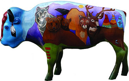
Now it may seem a long way from the Le Mans of Hervé Poulain or even from New York’s Grand Central Terminal, but the small Montana town of West Yellowstone (as the name suggests, just west of Yellowstone National Park) did a similar thing a couple years ago when they commissioned local artists to paint life-size bison sculptures that were placed around town.

Especially interesting here, from an artistic point of view (but I don’t neglect the relevance, especially these days, of the commercial significance), is the reversal of the common problem of representing 3-D space in a 2-D painting. Here the painter’s 2-D mindset must deal with the 3-D-ness of the sculptures. That means not only non-flatness and the volumetric cues, but the fact that the surface is not simply a distorted rectangle, but wraps around and contacts itself in multiple ways.
more… »
Posted by Birgit Zipser on October 24th, 2008

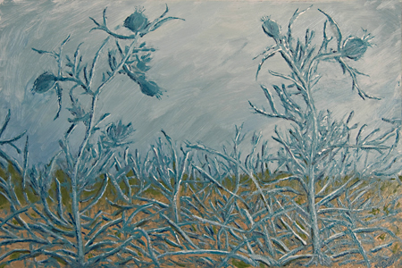
Pitcher thistle in oil and as photo.
more… »
Posted by June Underwood on October 16th, 2008
[Note: This post also appears on my personal blog, southeast main. Jay has persuaded me to cross-post as an efficiency matter. I find it changes my thinking to do it this way, which is a different, but also interesting, topic. Hi all — I’m glad to be back.]
I’m thinking about edges. I have a theory — or rather a “notion,” (which is a theory that is so diffuse it has no edges) — but anyway…..
My theory is that a lot of textile art maintains its textilishness via its edges. And this is in spite of the hand-dyed fabrics, surface design with fuzzy results, sheer fabrics, and other fuzzying techniques of contemporary textile artists. The edges of quilted art are often delineated by the quilting ; sometimes they are even more clearly portrayed with zigzag applique. Applique by itself lends itself to clean edges, as do commercial fabrics. Piecing fabric together gives a seam line, which makes an edge, even when the fabrics are close in color and value.
The clarity of edges in textiles tends to pull the textile toward something I think of as “good design” such as can be seen in magazine ads and hard-edged abstract art. This clarity has a certain appeal –it’s clean, not mushy, not sentimental. Clarity has a sureness of feel about it (which is probably why it’s so popular in advertisements). It’s also good for a certain kind of whimsicality, of child-like sensibility. The “faux representational” look in textile art often derives from its clear, often hard, edges.

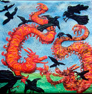
Arabesque, 40″ x 40″, hand-dyed cottons and silk hanks, appliqued and machine quilted
more… »
