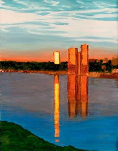
This painting captures the sunrise at the Hudson River in Manhattan. At 7:00 am, April 4th, the rays of the sun bounced off the buildings on the New Jersey side and then reflected within the Hudson itself. The early morning sun produced a different lighting than the midday sun in my Sleeping Bear Dune picture. In my Dune picture, the light across the picture is quite flat. Contrast is achieved by using bright complementary colors, red and green, blue and orange.
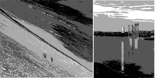
Here I am comparing these two paintings posterized to level 4 in black-white. The early morning picture of the Hudson River (right panel) has a more extensive differences in tone than the midday picture of the Sleeping Bear Dunes (left panel).

Yesterday, I looked at light and color combinations in various paintings at the Metropolitan Museum of Art. Many paintings showed pronounced differences in tone while others made more use of complementary colors.
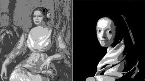
An example of a painting with a pronounced difference in tone is Vermeer’s ‘Study of a Young Woman’ (right panel). There is no point in showing the painting, copied from the MET website, in color. The cloth worn by Vermeer’s young woman is a lovely cool light blue, not grey as the website shows. The photo of Vermeer’s painting, like that of my painting, is posterized to level 4 in black and white.
Renoir achieves contrast in his painting of Tilla Durieux (left) using vivid complementary colors which is again not obvious from its poor color of the photo on the MET website. The wall behind Tilla is vivid red and green. Likewise, her clothing and rose repeat the bright red-green colors.
Thus, it seems that, in case of even lighting, complementary colors can make a painting more interesting.


The morning sunlight off the building almost gives me pain in my eyes, it seems so bright. I have the instinctive feeling that I should turn away and look elsewhere, but I keep returning to that bright rectangle. And yet, in the monochrome version, the building is hardly noticeable. I find the dune painting more dramatic in the monochrome. Walter Bartman always said, “Diagonal compositions are more dramatic.” I guess he was right. But also, the dark at the top of the painting comes across as looming clouds, quite a different feeling from the distant surface of the lake, which is what you depict in the original painting.
To summarize,
drama in a painting is introduced by differences in tone, warm contrasting cool color, diagonals, complementary colors and yellow.
It is interesting, as you point out, that the yellow seems so bright while it is rather week in monochrome. Yellow is a remarkable color. You once mentioned that Van Gogh uses it a lot. Also, as Rex pointed out “So we have here yellows in the upper tones, and these hold saturation when diluted (unlike blues)”.
Talking about Van Gogh, the New York Times has an article today about a Van Gogh exhibition in Denver. Looking at the slide show, I was surprised at the dark blue color of the wall against which the paintings were hung. I thought that museum walls were generally painted a lighter, more beige kind of color.
Not to forget:The morning sun reflecting off the New Jersey building can be very bright. Which buildings stand out more depends on the time of the year/angle of the sun.
An additional feature introducing drama in a painting could be the contrast of different objects, showing some as strong and others as weak. There was some objection to the ugliness of the firs in the painting A Tent in the Rockies. But perhaps the decrepitude of the firs makes the tent appear stronger, more remarkable, more harmonious. The same type of contrast could provide drama in my dune painting, namely the struggle of the worn-out people versus the fierceness of the landscape.
In the two paintings under discussion, there is a very different approach to light. Which of these do you prefer? Do you see a benefit in focusing on one or the other?
The benefit from a sun low in the sky is that it defines shadows and allows reflections.
I am slowly learning that shadows help to define form from drawing the human figure in a class where I am supposed to define form using charcoal and white pastel before drawing a line. By contrast, my other instructor teaches me to draw lines and details; she likes Poussin about whom wikipedia says that he “favors line over color”. It is fascinating to be exposed to teachers of such different preferences.
My next two paintings will be vaguely based on photos taken at 3:30 pm (not much shadows) and 5:30 pm (more shadow) in midsummer.
Grasping the lighting in painting is still difficult for me. Is it because I spent much of my childhood walking on a linear dike along the North Sea that I made me see things flat, 2-D?