 1
1
I occasionally worry that my tendency to analyze—some might call that an understatement—could be a negative influence on my work, causing me to lose spontaneity or fall into one rut or another. But I’ve now proven to my satisfaction that any effect is both unconscious and ineffective. Here’s how it happened.
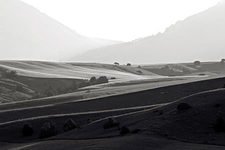
Last early Sunday morning I went wandering about the northern Gallatin Valley, which is to me what Hockney’s East Yorkshire is to him, namely the local cultivated landscape. I was well past halfway through when the idea come to me that I had been photographing with an eye to flat patterns of tone, broad swaths of dark and light, with accents here and there. Gone was the three-dimensional landscape, extending into deep space. I was succeeding in the effort commented on last week: I was thinking about the two-dimensional picture, and without even remembering to try.
 2
2
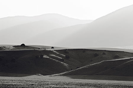
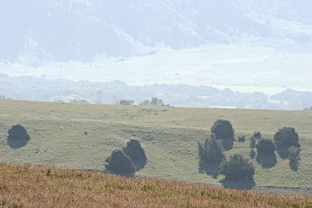
That’s the thought I still had with me two days later as I sat down to process images at the computer. But as I worked, the realization slowly grew that I had not only not abolished projective space, I had even enhanced it beyond the usual. The bright, hazy air between the foreground and the Bridger mountains, lit from behind, produced a tremendous aerial perspective, which seemed to be strengthened further by the relative unformity of the recession in bands moving up the picture.
 3
3
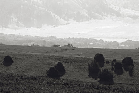
I found this light-space effect particularly interesting because it seemed to be the opposite of what I had thought of as convention that light could highlight an important foreground element, which then stands clearly forward of a darker background. Looking into that a bit, it appears that landscape masters such as Poussin and Claude Lorrain were actually more subtle, typically using light more surgically to create a receding succession of brighter areas.
 4
4
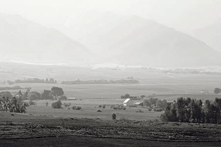
Notice that in these photographs, the mountains are not so far away as they were for June in the desert, and I had no missing middle distance problems, although there were some hidden stretches in the first three images. Rather, it is the mountains that almost disappear, remaining just faintly there like a Cheshire grin. You don’t so much see the mountains as the air before them. (Hockney, by the way, seems to eschew aerial perspective altogether, along with other familiar methods.)
 5
5
So much for knowing what I was doing. But that begs the question of whether my current understanding is any more accurate. Do these photographs in fact give you a sense of depth as strongly as they do me? And do you sometimes change your mind completely about how you think your artwork works?

Steve,
These are marvelous! The geometry of the slopes, the textures, the light and shadow. Within a given picture, the interplay of light and shadow is fun to follow back and forth. I particularly like the first three because of their greater simplicity (?) of shapes. In the first two pictures, the intersections of the diagonals add drama. The third picture is romantic. After following the slopes of the first two from the right to the left and back again, the third picture lets my eyes rest.
Remembering about your recent discussion with George, how much of the difference in light/dark variation is due to illumination and how much to color?
Birgit,
I almost always convert the original color image to black and white using equal contributions from the red, green, and blue components, so there is no color bias. Therefore the tonal variation you see is due only to lightness variation in the original scene. In any case, the original colors are all quite low in saturation, not too far removed from grays.
I also have a preference for the bolder, more abstract pictures. The later ones are less dramatic because our view of the topography lacks the large gaps across which big brightness changes might occur.
Steve these are fantastic, what a place to go and photograph.
The way the background fades into the light is lovely. Like Birgit I was captivated by the 3rd picture, the background is almost an illusion that could be detached from the foreground, almost like two pictures put together. How interesting!
I have to say the last one is my favourite, with the little white house striking up with light! I could almost see a rainbow between the montains.
Is there any possibility to see them in colour? That would be a delight!
Angela,
Here’s #3 in color. There was some lovely red in the foreground grasses. Because of the ridges, there actually is a gap in distance between the far background and the middle ground, and also between middle ground and foreground.
I just wanted to let you know about a new forum for artists as well as musicians, fashion designers, and filmmakers, http://www.PutItOn.com. As an artist I think that the mission is really great. The site gives you a free gigabyte of space for portfolio, there is no commission taken for sales, audio and visual works can been streamed in their entirety, you can create live personal broadcasts for your followers, and anything you write will be translated into 10 languages. So check it out!
Steve:
Allow me to add to the chorus. These images are both strong and delicate. They put me in mind of stage sets I have seen and by extension the drama. The treatment of number three animates the vegetal as the bushy foreground trees appear to me as so many leafy and grazing bison. The bright and distant land the breaks beyond the ridge line puts me in mind of Moses and what he must have seen as he gazed upon the promised land.
Jay,
Thanks for your comments. One of the pictures in my mind, which I always look for when I’m in a certain part of Yellowstone is one of bison on a hillside with a number of large bison-looking boulders. When seen at a distance, I’m sometimes fooled.
P.S. Sorry for the low activity lately. Much to post on, but very little time…
Steve:
Seems like everyone is in the same boat.
Yup, just came back from Germany and am catching up.
I first viewed the colors of #3 on my MacBookPro laptop, then in a slightly brighter version on my monitor and again on the laptop.
The more faded colors, as viewed on my laptop, give me the shivers – warm foreground, duller middle ground and the faint greenish meadow framed by mountains – wow!
Steve,
I’m coming to comment late, but I want to echo the comments about the way you’ve captured light and space in these photos. One common tactic that painters sometimes use is to digitize and turn their work into B/W in order to see if they’ve organized their values in a way that pleases them. Here, you did so. And the light behind (or what we read as behind that is really on the top) is a marvel.
I actually like the first photo the best, but then, I look at the others and keep returning and returning to all of them. This week, as I was painting, I made a conscious effort to paint in the deepest darks first, and then move from there into the rest of the space. I wonder what would happen if I turned images of those paintings into b/w images — was I able to stay true to the values I was thinking of? Because I was painting trees, much of the light lies behind the primary subject; the sense of space isn’t as complex as yours (sometimes in the paintings, I had simply the front and the back) as the space isn’t as deep. But I might have to try playing in this way. Birgit’s play inspires me.
Steve,
How do you get the tones when you go from color to black and white? My paintings appear monochrome brown when I “desaturate” them in Photoshop 6. I tried to find another Photoshop means of taking out the color but failed to figure it out. Seems like you know the secret.
June,
The slight color of these images, historically produced by chemical “toning” in traditional black and white photography, is a separate and final step after working with the image in neutral grays. I imagine most any capable image processing program allows mapping from black and white to color with various controls. I adapt the toning to the subject and my sense of things; it’s not necessarily a desaturation of realistic colors.
I also find that a straight desaturation rarely gives a satisfactory grayscale rendering. The objective rendering of the camera sensor doesn’t align well with one’s subjective visual perception. Not that I’m aiming to match some remembered perception (I don’t think that I could even do that with any accuracy). Rather, I’m making a new thing that is influenced by memory and by many things besides.