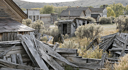
Another re-visitation in my recent tour was the Montana ghost town of Bannack, where I have photographed my Ghost Light series. Although I’m not sure a project ever really ends, it does go through phases. I feel this one is nearly dormant: I still enjoy the location, I find photographs I want to make, but there’s a sense of approaching completion. The initial vision was about spaces and light and the stories suggested there (someone wrote me she kept looking at one of the pictures while, in fact, writing a story). Now I’m filling out with additions that make a more rounded view of the place, but may not advance the key ideas much.
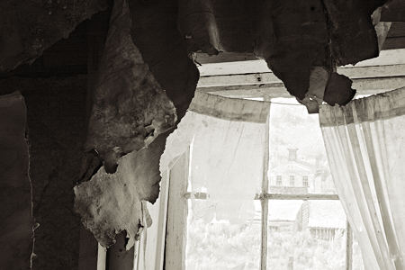
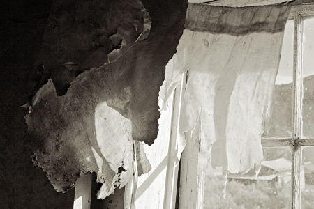
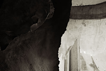
So rather than views of rooms, doors and hallways, it’s mostly details. Often ones tending toward the abstract, though as you can see, I’m not sure how far to go that direction. Do you have a preference among these versions of the same window shown in my first A&P post?
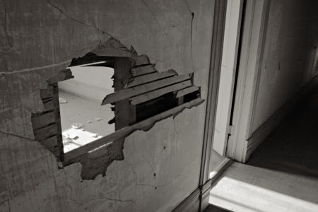
The next does include a doorway, and is similar to one taken last year that is on my web site. But this time I deliberately made the viewpoint looking down, so the door frame is off vertical; the intention is to add to the sense of oddness and dislocation of this abandoned place.
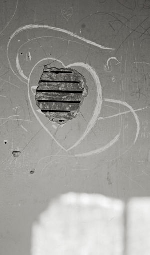
I have mostly ignored the graffiti, which is generally not too prominent, and in fact can add interesting texture to blank walls. But the graffito below is unusual for its use of a sign of age, and its light-hearted curves.
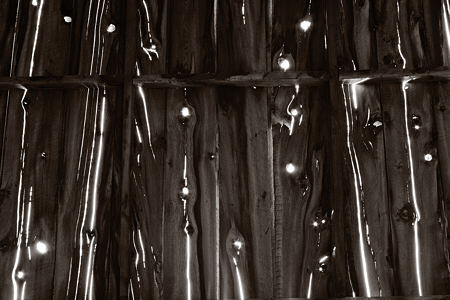
I like this shed roof because it seems to have two sorts of musical rhythm, one with a beat at the board spacing, the other based on the lines and spots of blinding light, which also suggest a staff and notes. It doesn’t fit so well in the project, as it is not a living space, but I’m not drawing hard lines for now.
Perhaps it’s harder to finish a project than a single work, or at least harder to know if it is finished. Mostly, I imagine, one just goes on to other things. But there’s always the possibility of going back. I recently came across a nice example of that in Joanne Mattera’s Cera series of encaustic paintings, which she worked on in 1995 and again in 2001. They don’t seem to be on her web site, but are referenced in a blog post. (Coincidentally, I discovered Mattera was visiting Bozeman and met her yesterday.) Have you ever returned to an extended project after a long hiatus?

Steve, I think all of the “window” shots have merit but for different reasons. What I really like is the first photo in this post, the way one’s eye moves from front to back taking in the different stages of decay. It’s very intruiging, was this done intentionally?
The doorway shot doesn’t do much for me, I think because I am given two ways to look through the wall, so I don’t feel too thrown off visually.
But I do like the last shot very much; it’s like a reading an unknown language.
(This is Tree, by the way)
The diagonals do move the eye. In photographs, we have the expansion of the foreground, rather than its Cezanne-like compression.
I, too, like the rhythm of the graffiti. The last picture is wild.
Kimberly/Tree,
Yes, I like how the boards help move the eye around. It wasn’t fully realized when I shot it; I think it works better in this crop of the original. Thanks for your comments, that’s interesting about the two ways of entering the room, and I love your language analogy.
I’m not sure when Tree became Kimberly, but in geology the K/T boundary is when a meteor struck and wiped out the dinosaurs. I’m wondering if that’s why we had site problems last week…
Birgit,
Sounds like you’ve been reading Loran. I’ll have to look at some Cezanne with your comment in mind.
I take wild as a compliment — whether you meant it that way or not.
‘Wild’ is meant as ‘exciting’.
Steve, I know nothing.
I prefer the first window photograph. It says more than the second one and even more than the third, which is not very clear at the first glance.
I think that the first one is static while the second is dynamic. So i’d say that if i am to learn about such an abstract, new environment, i’d prefer the static image. it’s more stable, more informative that way.
Seems that it is also more balanced in terms of light&darkness. light invades into the room in the second photo and i get a sensation of disruption and imbalance.
The second, dynamic one, really contributes to the first one, but in a context of series, as a complementary image.
but i like best the photo above the text, and i think it would look grand in b&W. not many colors anyway, but still.
Steve,
I amazed at the number of buildings still standing and discernible in the first photo. I hadn’t imagined the ghost town to be as intact as it is — perhaps I hadn’t imagined it at all, now that I think about it. But it is precisely the kind of place that sets me into historic musing, a half-nostalgia that’s hard to pin down.
The photos you showed before, of the stairs and windows evoke that sensation, but these don’t, even with the scene set in the very first photo. You really have abstracted that window and curtain, but while it’s readable for what it is, it’s also an interesting combination of texture and flatness. The flatness comes out of the stark shapes; the texture from the peeling wallpaper and ragged curtains. It’s a wondrous odd collaboration of representation and abstraction, of flatness and texture, and you’ve managed to leave out all the nostalgia that the earlier photos captured.
The two last photos are fun but from a different series — the graffiti is indeed graceful and the shed roof, which I wouldn’t have recognized without your direction, is full of rhythm. But it doesn’t belong to this series, but perhaps to your rusted pieces.
Elijah,
That’s a great discussion of the window photos, and makes a lot of sense to me. Thanks for your view through other eyes.
June,
I think you’re right about these not fitting well with the original series, at least as I’ve presented it so far. But I also made some of the more abstract photos early on, and I feel it will take more reviewing and thinking before I’m sure of the final shape. You’ll probably still be right.
I particularly like the colors in the first picture. the grey wood and the somber gray-green foliage.
I love your play with colors.
Steve,
I didn’t mean to imply that you _ought_ to be working in one way or another — I just found the change interesting. In the end, you will continue and your work will continue and you’ll ponder and take photos and your corpus will emerge and evolve. (Although “corpus” might not be quite the right word for this context….”
What I meantersay is that you have a variety of “series” going, some of which overlap yet go in their own directions. A complexity of materials and insights.
June,
Exactly.
“Corpus” is OK, as long as it’s not misconstrued as corpse. Which, unfortunately, is what I found on the last day in an isolated house ruin (not part of the ghost town). Of a mountain lion, with head removed. Not gruesome, but quite sad. Unless someone carried it farther than makes much sense, it was in the vicinity of livestock.
Steve,
I think the second window pic is by far the strongest. It’s primarily abstract, but with a hind of window pane on the far right giving it some perspective.
I recently revisited a location I had started as a project a couple of years ago, after more than a year hiatus. I found that I shot much more meaningfully and with more purpose than I had in previous visits. I think the extended absence allowed me a fresh perspective as I was not comparing every new shot to what I had done previously (mainly because I FORGOT what I had already done). I had a much better time than I had hoped, with matching results.
Chuck
Steve,
Great pictures here. There is something so haunting about abandoned places. Do you remember the scene from John Sayles’s “Brother From Another Planet,” when the Brother (Joe Morton), finding himself at an abandoned Ellis Island, touches the wall and hears/feels/sees all the people who had passed through its portals?
Let me add something about revisiting a series: My work is so rooted in the grid and in repetitive elements, that each series I do, and each piece within the series, is “genetically” connected. Sometimes the work just kind of doubles back on itself. It’s not so much that I decide to revisit a series, but that an older series decides to reassert itself–the proverbial hand from the grave, but not as scary ;-)
Thanks for coming by the other day. It was lovely meeting you. I love when the blogosphere intersects with real life!
Chuck,
I agree with you about the window images. I also agree with Elijah’s very helpful reading, except that I prefer the second for the very reasons he likes it less: it’s more dynamic, both in the lighting and in the curves of the lines.
I just checked out some of your new work, including Cracked Paint, which is like my image following the windows in that you are both showing the material aging of an abandoned place and making interesting angular shapes. Nice!
Joanne,
Looks like I have another one to add to my Netflix queue. I do find that I’m getting more and more of my ideas and inspiration from other arts.
Abandoned places do seem to have a near-universal attraction, except where there are taboos as with the Hopi and Navajo. I connect it with wanting to know ourselves through our history, and these are particularly poignant reminders. I have a sense that ruins are a more common subject for photographers than for other artists; if true, I’m not sure why that should be.
I prefer the second window picture for its rhythm over the first which seems heavy and faintly threatening.
Steve,
For some reason I feel sad when I see decay in buildings… Reminds me of our fragilities, I guess… and also brings back pictures of poverty in India.
The picture that caught my eye was the one in which the wall seems to have given way completely showing that dull gleam of light in the other room.
That one is especially appealing. Fascinating angles, I must say….