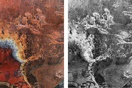
Mark’s paintings yesterday inspired me to a flurry of work with the junkyard abstractions that I introduced last week. As I mentioned then, it’s the color as well as the abstraction that I find fascinating. To explore this a little bit systematically, I went through basic preparation of a number of the images to get a sort of baseline treatment. That involves a choice of overall contrast and saturation, and in one case a slight shift in color balance. Later I can investigate more complex possibilities that might involve manipulations of portions of individual images, or variations in the hue-tone relationships.
As I was engaging in this photoplay, I still found myself attracted to black and white versions. A few images I found interesting in both saturated color and completely desaturated, but with most I had a definite preference. In the example shown above, I think I like what I feel as the drama of the monochrome version. Of course, I could have done a better job with the colors, and most likely I’ll try again.
Actually, I print many of by “black and white” images not in the most neutral grays I can achieve, but in tinted tones that can have an interesting impact even if the viewer is not consciously aware of the “deviation.” The example above is not so subtle, but gives an idea of the possibilities. I like the warmer color and other associations that come with it. This morning, getting ready for a ski day in Yellowstone, it makes me think of an old, scarred buffalo hide.
I’ve put up a first set of images on my web site under the title Patina. I’d be very interested to hear what you think about both the color and the BW images. Although exciting, this recent work has also been a little disappointing. Even though it’s still in progress, I could wish it were better. I just feel the images are not as strong as I’m convinced they could be. One thing that’s clear to me so far: I need to go back and bring home more junk.

Steve,
I love this junk. Color or B&W: why do you need to choose? I think the images side-by-side are fantastic. The stereo fusion is out of this world — interesting thing is that B&W dominates there, but the color creates depth.
The first one, a school of flying fish over a coral reef.
The second one, a decaying body with its face covered with powdered sugar but exposed internal organs.
Hey Birgit,
That second description is pretty interesting.
Steve,
I now had a chance to read your text. Why are you talking down your own work? I think the first color image is fascinating.
You have described some technical issues. Let me ask, what are you really trying to say with this work? Considerations of black and white or color should be secondary to the statement or discovery that you want to make.
Steve, I like your new work very much. If you want to get really adventurous, here are some other things you might try (since you’re already dealing w/ selective color manipulation):
a.) Try pasting one B&W image into the mask of an adjustment layer, and use that to remove all saturation from parts of another underlying color image.
b.) Possibly do the same thing (paste an image into a mask), but use the mask to combine one of your representational images w/ one of your patina images. One image could be B&W, and one could be color.
Steve
I’m pleased that my work inspired you “to a flurry of work” and your mention of “freedom and playfulness” would suggest a light and happy mind at the time of the work – I think both can be superb friends to creativity.
I sense an oriental feel to the new work, and I can’t put my finger on why, but the images all make me smile.
The images on your site from top to bottom take me through a journey as if from one world to another – from an audio point of view I am taken to a music world of UNKLE.
http://www.discogs.com/artist/UNKLE
(this has links to UNKLE sites too)
There is a delicacy that may convey the ‘oriental’ impresssion.
Steve,
I am a lover of color and so it takes a lot for me to prefer black and white, if given a choice. However, I find it extremely hard to choose between the two in this series (and why do you think it has to be either /or?). Both are compelling. THe black and white are more graphic, by that I mean, they seem like more careful designs. Whereas the colored ones seem more free form, “accidental” or found, rather than the intervention by you the photographer being apparent.
So I echo Karl’s question – what do you hope to achieve with this body of work? You may not know yet, so it may be hard to answer that. I am not sure where the source of your frustration is and that would help in giving you feedback. I agree with your last comment – for me clarity often comes in the making and reflecting back on the image, rather than trying to figure it out ahead of time. just make more and and one of the following will happen:
1.the direction will become apparent,
2. you will be more satisfied with them,
3. you create a beautiful new series about which you feel proud,
4. you become totally sick of them and frustrated and chuck them to the side.
Any are possible. My vote is the beautiful series and it seems to me you are on your way!
Birgit,
I can’t see what you see in these, and I think I’m glad of that, especially about the second. But the fascinating thing to me about these abstracts is that every viewer has his or her own associations that are at least as important to their reaction as what is “really” there. Please give your imagination free rein!
Karl,
I tried the cross-eyed stereo viewing to very interesting effect. I’ll have to play more with that.
Your question is a good one: what am I trying to say? The answer is, I don’t know. At the moment I’m purely following my intuition as to what seems interesting, and trying to learn how I (and others) respond to various aspects of the images. If this project follows the typical pattern, I”ll eventually develop a sense of what I really want to accomplish with it. At that point I may go back and re-work earlier images, or go out and make new ones with my new eyes.
David,
I don’t know if I’m that adventurous. It will be interesting to try, but I guess one of the constraints I’ve set myself for now is to work within more or less conventional photographic techniques, in particular working with one image at a time. Even so, your ideas are good ones to try because I may either A) get some ideas for more conventional manipulations, or B) fall in love with the result and throw away the conventions.
Mark,
The oriental impression you remark on is one I welcome. In addition to the contribution Birgit notes, I think of Japanese wood block prints as characterized by relatively large fields of relatively flat color, and also having some linear or calligraphic qualities I am always attracted to willy-nilly.
It’s interesting that your abstract paintings with their created surfaces still refer to discernable real things. My images are of real surfaces, albeit altered up or down in color saturation, but the “abstract” shapes and lines don’t refer to anything real at all. In both it’s the interplay of reality and abstraction that can be powerful.
Leslie,
Our comments crossed, but I see you were thinking along the same lines. Except I would say frustration is too strong, it’s just that I’m not settled yet, but that’s OK. I’m hoping for your outcomes 1, 2, and 3, but there will probably be a bit of 4 along the way.
Your question is a good one: what am I trying to say? The answer is, I don’t know.
I think asking this question too soon in the process can bring everything screeching to a halt. I’d recommend “what am I exploring here?”, or better yet, “what is it that is engaging my curiosity here?”
I think asking this question too soon in the process can bring everything screeching to a halt.
David,
Absolutely, I agree. Let me try to phrase it a different way. What I try to do with my work is ask myself, do I feel I am trying to discover something, or am I just trying to cover space and pass the time? If the former, I attempt to trust in the artistic process itself and not interfere with thinking or doubting when I am away from the easel. So why should I ask of Steve a question I avoid asking myself? Shrug. I think he gave the right answer.
Steve,
You should rig up a stereo viewer with a prism. Stereo photography used to be a big thing, but I have never seen it explored for its artistic possibilities (outside of the visual science laboratory). I made a major discover about stereo and art. One day I will have to share it.