David Palmer’s show at the William Turner Gallery in Santa Monica opened last weekend. I’ve been intrigued by David’s work since I first saw it on his web site, and I’d been pestering him for an interview, which we finally did by email. I found it a fascinating view into the ideas and materials and process of David’s art making. It came out long, but it’s all good stuff. Just cowboy up and read it!

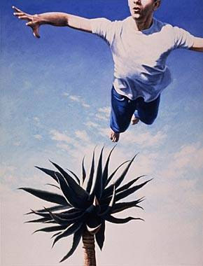
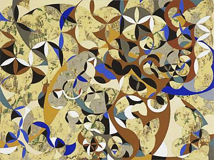
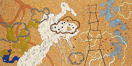
Major Motion Picture (Forever Almost Falling, 2006)
Steve:
You have grouped your recent work into two major projects, “Subcultures” followed by “Forever Almost Falling.” The division reflects a change in media from painting to linoleum, except for two linoleums included in “Subcultures.” There are other formal aspects, such as the appearance of dots (small, dark holes) and spots (small disks) in place of the larger lenses and other circle-based forms. The larger shapes seem to become more organic, and because they live or swim in a background that is linoleum rather than painted, they seem to inhabit a simpler space.
Can you say something in general about the transition from one project to the next? Are the pieces strictly divided chronologically? How apparent to you was the transition at the time? Did a change in concept drive the change in medium, or vice versa? There is certainly an overall continuity of concept, despite the various changes. Do you consider these projects to be expressions in different media of the same concerns, or is there a significant evolution of your conceptualization of what your work is about?
David:
I tend to think of my work in series’, never as individual pieces. At certain points I’ll go back over what I did, take a look at it in context, and regroup things in a way that makes sense to me in retrospect. Sometimes this is for artistic purposes, and other times it is in order to present the work in a cohesive way to an audience. It’s usually a combination of the two. When I shift from one project to another I’m very aware that I’m pursuing new territory, but I don’t know where it’s going to lead. It’s like beginning a new journey. I may take some time gathering information for the trip, but once I start it takes on a life of its own.
One series leads to the next, and that’s true of the individual works within them as well. It’s as though the working process generates seeds of ideas, and those grow into new works, which in turn generate their own seeds. Mixed in with this is all the stuff that comes from outside the studio, like things I read, films, conversations, and observations. But since I’m constantly involved in the process of making and thinking about art, these things are all seen in that context. I have volumes of journals full of ideas that may or may not find their way into my work. Sometimes they’re immediately applicable to what I’m working on, and other times it could take years to find a use for them.
In terms of the series’ on my website, here’s a short synopsis of how they evolved.

Attempts at Flight #16 (American Dreams, 1992)
The earliest work there is grouped under the heading American Dreams, and is just a small sampling of images from that period of 10 years or so. It was in fact made up of a lot of smaller series’, such as the Attempts at Flight paintings (I did over thirty of them), the Divining paintings, the people with snakes, and so on. I looked at what I was doing during that period as a sort of Dream Realism. The paintings were meant to be very realistic, but not in the way a photograph or a view out the window is realistic. They were meant to feel real in the way we experience images in dreams, or in memory. The name “American Dreams” came about in 2001, when a curator asked me for a title for my upcoming museum show.

LAX #17 (LAX, 2001)
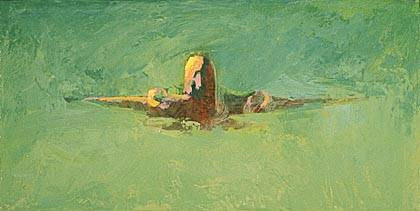
During the time I was painting the American Dreams images, I worked as a digital artist on the film Air Force One. Our crew used to go down to the airport and watch the planes land. Seeing them made a big impression on me, and I starting including airplanes in some of my paintings, such as JFK. I was also feeling the need for a shift in my work, and ended up doing a whole series, LAX, in which I used the planes and various color fields to capture the surreal experience of seeing them appear at the horizon and come in to land. This was part of a move for me away from realistic representation.
When flying, I always try to get a window seat. I can spend hours watching the ground move past down below. It’s like one amazing continuous painting. I have sketches in my journals going back at least 20 years of rivers, roads, farms and cities seen from above. Quick notations about something I wanted to capture someday in my work.
When I decided I was ready to do so, after the LAX paintings, I started looking at satellite photos and maps, and thinking about how I wanted to paint these aerial views. I already had a title, Flatlands, and I knew that these would be abstract works. But I didn’t want to paint them using all the techniques I’d used in the past. I went around thinking all the time about what different methods I could use to get the paint on the canvas. One day I was in Home Depot looking for a sander, and I happened to walk down the flooring aisle. I saw all these linoleum tiles, with their different colors and patterns, and one of those cartoon lightbulbs appeared above my head. I bought a few tiles, took them to the studio, and started cutting them and trying to figure out how to make images. I glued the pieces to a panel, hung it up on the wall, and realized I’d found my new medium. Then I discovered Linoleum City, an incredible flooring dealer here in L.A., and it became my favorite art supply store.

Flatlands #51 (Flatlands, 2002)
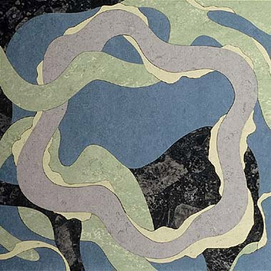
Over the course of doing the Flatlands work, I started noticing the similarities between aerial views of the earth and images of the microscopic world. In a sense, both of these worlds, the macro and the micro are invisible to us under normal conditions. The series evolved from being just about aerial views to being about micro views too, and I was exploring ambiguity of scale and point of view. Things that could be read in more than one way. In a sense I was doing this in the American Dreams paintings with meaning and metaphor, encouraging multiple readings, but here it was taking place on the visual level as well. The earliest works in this series were literally based on satellite photos, but my process very quickly became improvisational. Like playing jazz.
I tend to use a solo exhibition as an opportunity to take a look at a body of work, try to get a sense of what I’ve done, and think about what to do next. If there’s going to be a shift in direction, it often starts taking form then. That’s what happened when I had my Flatlands show in 2003. I had been thinking about what it would be like to do paintings that explored the territory I’d been discovering working with linoleum. The ambiguity of scale, the increasingly organic forms, and also the edge quality that occurs naturally with linoleum by cutting forms out.

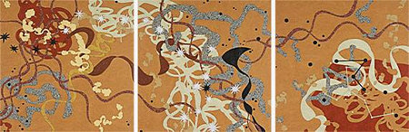
Search Engine (Subcultures, 2005)
After the show I started painting, and went back and forth for awhile between making paintings and linoleums. I wanted the two mediums to inform each other, but the paintings were the new medium at this point, so I was doing more of them. Before long I had enough paintings for a show, but I had in mind that my next exhibit would contain works in both mediums, so I started doing linoleums again. The paintings in this series were very different from the way I had painted before, and had more in common with the Flatlands linoleums that had preceeded them. But they were also different from the linoleums. They were naturally more gestural, and the edges had to be defined deliberately rather than simply resulting from the medium. And when I went back to making linoleums again, I found they they had been influenced by the new paintings! Much more gestural than the Flatlands linoleums, getting further from aerial imagery and much more into the imaginary microscopic realm.
I arrived at the title for the body of work, Forever Almost Falling, from something I read in Kevin Kelly’s book Out Of Control. Here’s the quote: “… if a system rests on the crest balanced between rigidity and chaos, then you’d expect its adaptive nature to pull it back onto the edge if it starts to drift away…A self-reinforcing sweet spot… It is the same forever almost-falling that poises the chemical pathways of the Earth’s biosphere in purposeful disequilibrium.”

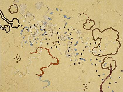
Tibet (Forever Almost Falling, 2007)
It’s basically about how nature constantly improvises, finding a stablity of sorts by riding on the edge of chaos. It’s a lot like making art! So this was my working title for the series, and it gave me a framework for thinking about what I was doing. Eventually I had enough work for two or more shows, but it turned out that my gallery here in L.A. didn’t respond to the paintings, and just wanted to show the new linoleums. So I decided to use Forever Almost Falling as the title for the show of linoleums.
For the website I created another category, Subcultures, to present the paintings that preceeded the work in the show. There were a few interim linoleums, including Tipping Point and Cascade, that were from that earlier period (and they’re not in the exhibition), and I’ve left them in that section for now. So even though I had originally seen all the work in both FAF and Subcultures as being part of one series, I’ve split them into two for presentation purposes. I want visitors’ attention to be directed more toward the work in the current show, and chronologically it is the most recent.

Siena (Forever Almost Falling, 2006)
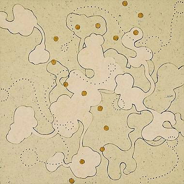
The rows of dots you mentioned are a recent addition to my vocabulary in this medium. I had been looking for ways to reintroduce drawing elements into my work. When my wife and I were in Italy last April, I was blown away by something I saw in Siena. The floors outside the Duomo were inlaid marble representations of saints, all done in grayscale. And the artists had drilled little holes in the marble, creating dotted lines to define some of the features. When we returned to L.A. I immediately went to the studio, got out my Makita, and started drilling into linoleum.
Steve:
It seems that the idea of system is fundamental to both the how and the what of your work. A system implies not only entities but a network of connections among these. You work on multiple pieces at a time, and I gather that what’s happening in one will affect what’s happening in others. Can you give a specific example of that interaction? When you got the idea of holes from Siena, did you go back and alter older pieces? Is this process what you mean by poising your activity on the crest of disequilibrium, all things moving together to keep the momentum of ideas from collapsing or disintegrating into separate bits?
In the linoleums themselves, there are interacting networks consisting of the overlapping, elongated organic shapes with bulbous sections (reminiscent of neurons synapsing on each other), the implied relations among dots of a color (made more explicit in “Kevin Bacon”), and the lines of holes weaving in and out. Are there some design principles, some rules that govern these networks and the interconnections?
David:
When I paint I do work on several pieces at once, but with the linoleums I tend to work on one piece at a time. More specifically, I work on them in batches, in the sense that I’ll bring a bunch of them up to a basic point of completion, one at a time, and then I’ll glue that batch, and clean them up. Then I’ll sketch out the linear elements on each of them and drill the holes. The different working methods are probably determined by the logistics of working with the different materials, cutting out shapes as opposed to mixing and applying pigments.
But there are a number of ways that the pieces do interact. For one thing, whenever I cut a shape out of a piece of linoleum, I have a negative shape left over. Often the leftover shape is more interesting than the one I thought I was creating. So over time I end up with lots of leftover shapes, and I’ll use these in other compositions. They are a source of surprise, and help to prevent me from overly preconceiving the images. And of course there’s also the fact that, like with paintings, one image leads to the next, so a train of thought is set in motion and I follow it.
When we got back from Italy, after seeing the marble floors in Siena, I immediately went to the studio to try creating dotted lines in the linoleums. I was tempted to drill into the pieces I’d already completed, but decided against it. I had one piece that I was going to discard anyway, so I used that as a test, just to make sure it would work. Once I saw that it did, I used the drilled dotted lines in all the new pieces that followed. The first one I did this way is called Siena. I deliberately kept it pretty simple and low-contrast, because I wanted to see the effect of the lines, and not have them overpowered by color contrasts. As a rule, I tend not to go back and rework earlier artwork. If I have an idea I want to explore, I’ll integrate it into new work moving forward.
The idea of poised disequilibrium doesn’t really apply so much to finished work, since when it’s done it’s done, but more to work in progress.
Regarding design principles, I don’t consciously employ any in this work. It’s all very improvised. But I do think that what happens, over time, is that you are constantly developing and refining your perception and intuition, so that of course comes into play. In terms of rules, that’s another matter. Each work (or sometimes groups of works) tends to generate it’s own set of rules, and discovering what those are is part of the process of creating the piece.

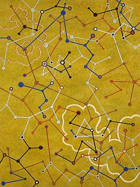
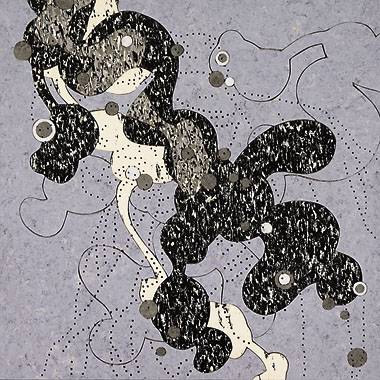
Kevin Bacon (Forever Almost Falling, 2007)
When I had the idea for Kevin Bacon, for example, I knew that I wanted a series of networks where all the nodes were connected. But I didn’t have a sense of how the different networks would connect with each other. At some point I realized that the networks, which were different colors, would connect at nodes that had one color nested within the other. So where a green and an orange network join, you’d have a node made up of two dots, a green and an orange, one encircling the other. Once I came up with that simple solution it created an underlying logic for the whole piece. It was all improvised, but there was a conceptual structure holding it together. The finished piece makes me think of a subway map. A train system designed by a crazy person :)
The idea of systems and networks has been driving much of the work in this series, but I’m conscious of not wanting to just illustrate concepts. It’s more that the concepts inspire certain types of forms and relationships, and I allow them to find their way in.
There are many many ways in which things can be connected. They can be connected physically, either directly or through a network. One thing can be nested within another. Things can be connected temporally, as parts of a sequence. They can be part of a grouping, and their connection can be based on proximity, or similarity. Those are just a very few examples, but they’re the sorts of things that are in the back of my mind when I’m working.
Steve:
I love the sort of fractal idea that things look similar at the scale of the landscape seen from a plane and the microscopic scale of cells in the body or molecules in the cell. One difference is that the landscape is well-described as a “flatland,” whereas the biological systems are truly three-dimensionally entangled. Most of your linoleums seem to adhere to strict overlapping like river over land, or road over field. Only “Major Motion Picture” and “Kevin Bacon” more clearly build into the third dimension by interweaving shapes. Do you think explicitly about the dimensionality?
David:
When I started working with linoleum, my idea was really driven by viewing landscapes from above, in map-view. Things flatten out from that vantage point, even though the land itself is very dimensional. Biological systems are dimensional as well, and tangled, as you mention, but I think of the top-down microscope view as flattening that world out too.
I’m interested in representing depth, but have limited myself to certain visual devices. I use overlapping, primarily, as well as color contrast, but have forbidden myself from using shading, lighting or perspective. I want this to be a symbolic world as opposed to a literally representational one, and these are some of the decisions I’ve made to keep it in that realm.

Babel (Forever Almost Falling, 2007)
However, I have found lately that the space I’m creating is more of a floating space than a strictly top-down view. As a result, there are sometimes indications of up and down, gravitational forces, and a more tangled dimensionality. I’m also finding myself allowing certain representational elements to reappear in my work, after totally eliminating them for awhile. One example of this is in Babel. The white splash-like shape is the exhaust trail of the space shuttle Challenger, which exploded on takeoff.
Steve:
You mentioned the linear element that enters automatically due to slight gaps between the linoleum pieces. In some of the newer pieces — “Tibet” and “Kevin Bacon” and “Babel” — you give this boundary a width of linoleum, while in “Saint” and “Macbeth” you invoke line with no contrast of materials on either side. Has the importance of line changed through the series? Do you think about line independently of the shapes bounded by it?
David:
Yes, there is already a certain linear quality that occurs naturally at the boundaries of shapes, and I’ve been encouraging that by varying the line width, and making sure there is enough of a gap to for it to read clearly. But as I work with these materials that lend themselves so naturally to creating forms with color differences, I find myself wanting to employ another, more subtle (and in some ways more abstract) way of defining form, by use of just line.

Saint (Forever Almost Falling, 2006)
I first tried this out in Major Motion Picture, where there are some shapes that overlap other shapes of the same color, and where they do so the shape is defined only by line. I did this again in the Grace triptych, and as you mention in Saint and Macbeth. It’s especially interesting for me now that I’m also employing that drilled dotted line I brought back from Italy, as now there are two kinds of line interacting.
My vocabulary in this medium is expanding. I started out by deliberately eliminating many of the devices I was so familiar with from painting, but I’m slowly reintroducing some of them. It was important at the beginning to start fresh and not rely on old habits. But now it’s time to integrate my earlier discoveries with the ongoing new ones.

Beautiful work, David. I find it extraordinary to see such a broad range by one artist. What strikes me especially about the collection as a whole is your use of color, which provides a continuity across the pictures.
Attempts at Flight seems to come directly out of a dream I often have. How did you get inside my head, anyway?
I won’t be able to actually read the interview until later when the kids are in bed, but I feel in no hurry to be honest. This post is a visual feast in itself. Incredible.
David,
This is a great way to use linoleum. Bold colors and very expressive. I also like some of your principles (this one in particular):
“As a rule, I tend not to go back and rework earlier artwork. If I have an idea I want to explore, I’ll integrate it into new work moving forward.”
I would like to know how large your works are… Karl tells me to take a picture of an individual with the painting in the background to show relative sizes, and I keep putting it off – but something like that will be good for works like yours (especially Kevin Bacon). The web screws up the size aspect of most images unless you have a basis for comparison.
When I looked at Babel, I thought that I was strapped onto the underbelly of an airplane looking down at wheat fields on a moderately sunny day. My favorite work in this set…
Hi Karl and Sunil. Thanks for the kind words.
The works range in size from 15″ square (Siena, Saint) to 12 feet across (Major Motion Picture). Kevin Bacon is four feet high (the linoleum, not the actor), and Babel is four feet across.
Here’s a photo of Major Motion Picture in my studio, which gives a sense of the size.
the picture in your studio is gorgeous
Hey, Kevin Bacon would just about work in my bathroom. Do you do commissions for actual floors?
Ha! You know, I think the idea of doing floors would be really cool. But there are a bunch of technical problems I’d have to work out, especially having to do with the seams (which I leave deliberately wide), and the thickness differences between the various materials. Plus there’s the liability issue. But who knows, it could be interesting.
I think floor art is an awesome concept. Who has more space on their walls? Plus the ideas growing out of the Flatlands concept naturally want to be horizontal. I think you should invent games to be played on Kevin Bacon or Saint. Or maybe you could start with doormats. For robustness, is it possible to laminate some kind of clear sheet over the linoleum?
Floor mosaic is a great art form. David, do you think you could express yourself in small pieces of stone? The linoleum work has a wonderful musical quality to it. Building your compositions in mosaic would be like working with individual notes. Also, the floors could last thousands of years. You describe working back towards the vocabulary of painting gradually. In Rome I saw a mosaic still life that looked like an oil painting. It is a medium with a lot of possibilities.
As far as other mediums, the possibilities are endless. Who knows? As the moment I’m catching up on some reading, getting my studio organized, and of course enjoying having the exhibition up.
David,
I love all this work, and I think that is not often the case when an artists moves from representational to nonrepresetnatioanl. As I am sipping my coffee I am trying to think who else does that in ways that work for me…. I stayed up too late and can’t think. Richter for sure, but who else?
I am particularly interested in how you think about working in series. I read carefully your thoughts on the transition from “American Dreams” to the LAX, and it seems that the LAX series was sort of what allowed you to “force” a transition into something completly different. I work in series also and often find the transition between them kind of painful. Leaving what I know well into the great unknown, the abyss :) Not that bad, but I always end up hanging on to the previous series for awhile until I feel more comfortable in the new work. And now I am working three different series at once, which I wonder about – not the most efficient but it keeps my mind jumping in good ways.
So the LAX series seems so different form the other two, even in the way you lay on the paint. They are painterly, impressionistic, quickly painted (by appearance)…look like they could have been done on the spot. I get the intellectual connection between the plane and then looking out of the plane. But I really don’t see the visual connection between that series and the linoleum. This is not a criticism, I am just trying to figure out how that happened in your process. Or maybe it’s just like you said, an “aha” moment in the hardware store (the shower and exercise bike work for me) It’s all very mysterious I am sure, but if you have any other thoughts about that transition, I’d love to hear them. And when you look back on the three series, what do you think about the LAX series? Of course you are not really “looking back” on much as the cuts on your hands are probably still pretty fresh from the linoleum! Who do you see as your artisitc influences for the linoleum pieces in particular?
Ok, enough rifling of questions at you! Congrats on the show – wonderful engaging work. I wish I could see it in person. I am not sure I would want them on the floor, by the way.
The pictures do portrait music.
Someone immensely wealthy should commission David to do mosaic floors. Of course, the stone cutting would have to be done by an Italian stone mason working for David.
David,
I will be honest and admit that I have not read the entire Interview. I usually just like looking at the work.
I should also admit that I do not like Linoleum. In fact soon after we bought our house I stripped out all of the linoleum in our kitchen and bathrooms (along with the wall-to-wall Shag Carpet).
I am not sure if this is why I am unable to appreciate your work in the way others here have. Overall, my viewing experience remains consistent with the material, limited mostly to the surface. Is the Medium the Message? I doubt that it is, as you strike me as a more thoughtful and ambitious person.
Of all the works, Search Engine is the most appealing to me. I sense a commotion similar to Guernica. I am also reminded of Polke, who often just blows me away, but of course his playfulness can achieve a depth that makes me Shudder.
I happened to look up Duchamp’s readymade concept earlier today, and it just struck me now that the linoleum fits that to some extent. Not as complete as a urinal or bicycle wheel, but pre-made color and texture–though with many choices thereof. Duchamp even claimed paint comes ready-made in a tube and almost fits the concept, so definitely linoleum would, in his mind at least.
D,
I actually dislike linoleum as a floor covering myself (ripped a lot of it out of my house), but it only affects the images you’re viewing through the way David handles it. Some linoleums are similar to paintings of the same transitional period.
Leslie,
For me the transitions are not so much painful as welcome. Sketches and notes for the (still un-named) Flatlands series can be found in my journals from 20 years ago. They were inspired by looking out of plane windows, and also by an exhibition of Aboriginal paintings I had seen here in Los Angeles. I was excited about the imagery, But I was very involved with the American Dreams paintings at the time, and I didn’t want to dabble. So I just kept the Flatlands ideas incubating in the background until I was ready for them.
The LAX paintings are less different than you might think from the American Dreams stuff. Keep in mind that they are tiny paintings, some only 6 x 12 inches, so seeing them on the web the same size as a 5- or 6-foot canvas is a bit misleading. The airplanes appeared in several larger paintings, like JFK, before I decided to do a whole series of them. It was very enjoyable doing a bunch of them quickly. I knew they were the last representational images I would paint for awhile.
I wouldn’t say there is a direct connection between the LAX and Flatlands work, except to say that one is the end of a long phase and the other is the beginning of a new phase. As I mentioned, the seeds for the new work had been incubating in my journals for quite some time. The “aha” moment happened regarding the linoleum itself (I had assumed the Flatlands series would be paintings), but the conceptual framework and the imagery developed slowly over time.
There is a fairly linear progression, I think, from Flatlands > Subcultures > Foreever Almost Falling.
As far as artists who have gone from representation to abstraction, or vice versa, besides Richter a few I can think of are Diebenkorn, Jennifer Bartlett, and David Hockney. But I wouldn’t say any of those artists directly influenced this body of work in a huge way (though I do like them). The strongest influences were probably Aboriginal paintings, satellite photos, AAA maps, and microbiology images.
D, until I started working with it, I wasn’t that crazy about linoleum either.
I wouldn’t say that the medium for me is the message, but it certainly does affect the way the imagery develops. Especially regarding cutting as opposed to applying paint. I guess I think of it as a constraint of sorts.
There’s also something satisfying to me about taking a material everyone’s used to seeing on their bathroom floor, and transformomg it into an aesthetic experience. It’s a bit of a surprise for people when they realize what they’re looking at. And I think of flooring material as pretty appropriate for representing the surface of the earth, which is how the Flatlands series began.
I’m very excited about this work. But of course I’m not trying to convince you to like it :)
Steve, that’s a good point about Duchamp. The colors and textures of linoleum are readymade, though I do tranform them into something else. And of course painters used to grind their own pigments, so tubes of paint are readymade compared to that.
Probably the biggest link between Duchamp and myself is that both urinals and linoleum an be found in bathrooms. But that’s just a coincidence.
JFK, 2000, oil on canvas, 48″x60″
What is Linoleum? Linoleum is oil paint. Or more exactly, it is a form of oil paint on canvas.
David is making oil painting collages. David could make his own linoleum, just as he could grow his own flax, press the oil, purify his own pigments, and then grind them with oil to make oil paint. To choose to work with linoleum is in some ways no different from choosing to work from tube colors. It’s a practical choice. It influences the work. But it is no less valid a choice of materials than others. Once could say “I don’t like house paint” (which was once oil paint) “therefore, I have doubts about oil paintings.” That would be absurd, but only because of what has been done with oil paint. Until I saw this work by David, I also thought “I don’t like linoleum,” but now I see this is also absurd. It’s not the material linoleum that is the problem, it is the previous unimaginative use that bothers. David’s work changes all that.
Steve,
What do you think of a stone and auto-junk mosaic?
It already happened to me. My first car. Parked by the side of the road in Death Valley while we hiked off to climb Corkscrew Mountain. Came back to find someone put a huge boulder halfway through our windshield. Amazingly, guitar and wallet still in the car. Bits of glass trickling down all the way back to the Bay Area, crick in my neck bending to see through the unshattered corner. I’ve never been tempted to combine rocks and cars since.
Linoleum could… I was going to write “Linoleum could be made of gold and I would not like it”, but then I changed my mind.
I agree with you Karl that I should be able to rise above my experiences with Linoleum (and the glue and the plywood).
When I looked at this work, I almost immediately consulted the label for a title. In some cases the title helped: I saw cloud formations, parched tributaries, a Tower, Italy, etc. “Kevin Bacon” made me think of the guy with the funny haircut who is married to the woman who has been in movies that I cannot remember. Born on the 4th of July with Tom Cruise? He also likes music and is maybe in a band with his brother. And of course, he is the reference point for Everyone Knowing Everyone. Which one is Kevin? Which one is Kyra? Which one is David? Which one is me? Ahh.. the constellations have reversed from above to below, a social mapping. But…
As I mentioned above I find myself mostly on the surface, with the Design. So when I consider the linoleum as a material with properties (yes, with oil, pigment, etc.), I ponder its attraction mostly as a veneer.
What do I mean? In the painting JFK, it seems important to know if the plane is taking off or landing. Discovering the pattern determined by the second plane amongst the clouds makes the boy’s position more precarious.
David,
The painting in your comment is about as smooth a transition from American Dreams/Attempts at Flight to what became the LAX series as one could possibly imagine.
I think I chose the green LAX image because of the less conventional color and what appeared to be greater emphasis on the paint as surface. Did it feel that way to you, and what this a precursor to another change in direction?
David.
And another element of JFK that I enjoy is how the whispy clouds that front the larger plane suggest that the boy has climbed a very tall ladder. No wonder he is looking down.
Steve, when I did the group of little LAX paintings I was consciously moving away from the more narrative figurative work I’d done immediately before. I chose a theme from that series, and did an exploration of color and iconic imagery. Not only was the paint handling a little looser (much more apparent because of the small scale), but I was also sanding through layers of paint to get the atmospheric quality.
I don’t think the LAX paintings were so much a precursor to the Flatlands stuff, as a way to give myself a fairly simple project to work on while I was figuring out some issues about how to approach the next body of work. Before I even started the LAX paintings, I knew I’d be making a big leap very soon into Flatlands.
D, I should mention that while I was working on two large airplane paintings side by side in the studio, JFK (without the boy) and an equal-sized LAX, JFK Junior died in that plane crash. It got me thinking about the painting in a different way, and the boy on the ladder was added in.
David,
Somehow your work seems to me to be the culmination and leap away from various bits of the 20th century that linger in my brain. I see Matisse’s swimmers and Odilon Redon’s long-necked creatures (as well as the little cinema science fiction creature whose name escapes me).
I am also convinced that if one is to work in shapes, linoleum is the perfect media — paint slooshes, even when it’s applied with an eye toward vertical lines. Linoleum makes those carved verticals that are incisive, serious, as paint wouldn’t be. Wasn’t it O’Keefe who said something like “the 20th century is all about shape.”? And what better way to deal with shape on the wall than with carvings?
And too, of course, you are taking the dream of flying — which has a history that goes back as far as written records (Icarus, da Vinci), recording its culmination in modern airplanes and “as seen froms”, and then you impress those tiny footpaths on all this, those map lines drilled through all that iconographic “stuff”. While the dream of flying seems universal, only in the last century did humans actually fly. It’s as if you have compressed some 20th century iconography into its own history. Your choice of media, choice of subject, place in historical times — all seem perfectly aligned.
And oh, yes, I like the colors, too…..
Steve,
What is it to “cowboy up”, anyway?
I know what it is to “pony up” (as in, “your part of the bill comes to $999.99, so pony up”) and I even know two kinds of “belly up” — to the bar and the dead man goes….
But I never ran into “cowboy up.” Does the phrase indicate we are in for a long ride? Or, that we should hold our horses while you laid out the land?
Whatever it was, thank you for a great interview. I like having my small world expanded in this way.
The phrase means essentially: quit complaining and get on with the (perhaps difficult) task at hand. Although the interview doesn’t actually take too long to read, even the appearance of difficulty makes it easier to drop something from our busy lives, especially on the web, which encourages the quick skim.
Wasn’t it O’Keefe who said something like “the 20th century is all about shape.”?
I often enjoy thoughts simply stated but this retreated O’Keefeism is… ridiculous.
Ridiculous but provocative!
One thing I found interesting in the interview is that the linoleums seemed to be largely shape-oriented at first, but with more recent David is exploring line in various ways.
D.
Don’t you think the simplest most ridiculous statements (however badly paraphrased) can often set off all kinds of cascading thoughts and imaginations? At least for me, in the visual arts (as opposed to texts), mostly I can only make sense of really simplistic stuff. And often the simple-minded ideas become the impetus for my visual strivings. Complex text generally stirs my thinking/verbal brain, which can obliterate visual thought.
And who was it that said (another paraphrase, sorry) that some artists like Kandinsky had the most foolish ideas but out of them came glorious art?
And Steve, you are right about the lines — maybe the 21st century will be all about lines????? Ok, I’ll go away.
June,
The only thing I am certain of is doubt. Seriously.
Oh, _certainty_!!! That’s an entirely different matter.
David,
From the text I get a sense of an almost obsessional devotion to art, but no sense of you being out of balance. It is an interesting combination, something like the realism and un-reality of Attempts at Flight #16.
It is interesting that looking up, focusing on the airplanes (and sky) lead you closer to abstraction. Then you chose to take the view from above and depict the flatland. Linoleum, ready made oil paintings in a sense, is a neat choice. I wonder how much your selection of the title “Flatlands” itself helped you make the selection.
I saw those inlaid marble floors in Siena, but I do not really remember the holes — they are coming back to me, a bit, but it might only be suggestion. Anyway, your drill patterns reminds me a bit of the way that the egg tempera painters made impressed decoration by stamping patterns into the burnished gold grounds of their icons.
This interview format is an interesting contrast to the presentation of art on your site. Instead of clicking through a series, we move across the series as we scroll down the interview. The text (which I ignored for a long time) plays an important role as a visual buffer, aside from making good reading when I was ready for it. I like the feeling of having to move a bit (scroll) to see the next image.
David, I left a comment on Steve’s Art and solitude post saying that I get a feeling of solitude looking at your work. That feeling, now that I am aware of it, is strengthened by spending more time focusing on your art. The feeling of being alone is manifest in the American Dreams series. At a psychological level, the other work also gives me a feeling of loneliness. It may in part be because you are gradually moving from more realistic work to the abstract, which I feel less at home with. It may be because your artistic focus is detached from people, especially since 2000. Do you ever feel a loss in this respect? From the interview, I get no sense of regret from moving from human themes to the geographical or microscopic. Can you imagine yourself returning to painting people?
I wonder how much your selection of the title “Flatlands” itself helped you make the selection.
The idea of using aerial views as a point of departure, and of their relation to depictions of aerial views, like maps, came first. The title Flatlands came after the visual idea, but before embarking on the series itself. It gave me a sort of poetic framework, into which other things, like microbiology, eventually found their way.
…your drill patterns remind me a bit of the way that the egg tempera painters made impressed decoration by stamping patterns into the burnished gold grounds
Yes, I’ve always loved that, and have thought about it in relation to painting. But seeing the holes drilled in the marble, which itself is an inlay, gave me the idea for drilling into linoleum.
…I felt a strong feeling of solitude looking at your work…The feeling of being alone is manifest in the American Dreams series.
My American Dreams paintings were about the internal world we create and inhabit. That world is constructed from memories, dreams, and secondhand experiences, like books and films, and is, I suppose somewhat solitary in the sense that it’s a personal and partly fictionalized space.
…your artistic focus is detached from people, especially since 2000. Do you ever feel a loss in this respect?
Not at all. First of all, there is no shortage of people in my life, so it’s not like I’m lonely or anything. Also, I think in a sense the abstract work is somewhat more universal than my figurative stuff, in that I’m playing with the idea of how everything is connected in so many ways. I mean the paintings were dealing w/ psychological archetypes, so they were somewhat universal as well, but in a different sense.
Can you imagine yourself returning to painting people?
I can imagine it, but it’s not on the immediate horizon. I am starting to bring more real-world references back into the work, as I did in Babel. But if I did, by some chance, include people it would be in a different way than I used to paint them. It’s not that I don’t still like looking at paintings of people, but my curiosity is pulling me in a different direction at the moment.
I don’t think these are lonely despite the abstraction and lack of people. The forms are not only decidedly organic, but so whimsical that they seem to be inviting the viewer to smile or even laugh. Compare Saint (last) or Major Motion Picture (first) with Angela’s bug mural.
The forms are not only decidedly organic, but so whimsical that they seem to be inviting the viewer to smile or even laugh.
I’ve never been able to suppress the urge to clown around, whether it’s with abstract forms or by putting a bird on my head :)
there is no shortage of people in my life, so it’s not like I’m lonely or anything.
Your work never gave me the feeling that you are in solitude. It is more the impression that the work conveys outward to me as a viewer. I feel the solitude. That’s neither a criticism nor a complaint. It is an interesting effect. I wonder to what extent others feel it. Reading through the comments above, I don’t pick that up at all. But then, I didn’t verbalize the idea either until I read Steve’s post.
David,
Let’s imagine for a moment that lots of readers agree and say “Yeah, I feel the solitude as well.” That would seem to indicate a dimension of your work that you perhaps have not focused on intentionally. I wonder if that might become something of interest in the future.
…Can you imagine yourself returning to painting people?
Now that I think of it, I have! How did you like my picture of Kevin Bacon?
Man,
Did I say I like scrolling? This post has a LONG comment section. I’ve got to scroll up again to look at the image…
…Okay, I would say, regarding Kevin Bacon, that the finished piece makes me think of a subway map. A train system designed by a crazy person.
But seriously David, looking at the American Dream images and at your self portrait, I think you have a special ability to depict people. I hope you return to this one day.
Let’s imagine for a moment that lots of readers agree and say “Yeah, I feel the solitude as well.”
The main reaction I’ve gotten to the work from that period, besides laughter, is people saying that the paintings remind them of dreams they’ve had. Especially the flying paintings, which I think you mentioned as well, but the others too.
I think you have a special ability to depict people. I hope you return to this one day.
Well, thank you. I’m not ruling it out. It’s just that there aren’t enough hours in the day, and whatever I’m doing I tend to immerse myself in it. We’ll see where the road leads.
David,
I think it is the combination of the work and the text that does it, gives the feeling of isolation. There is a progression, leaving the realm of humanity, going into the sky, looking at Earth through window, looking through a microscope. That’s why I think Steve’s presentation of the whole is interesting.
Anyway, how much does one of these linoleum major works cost, roughly speaking? Well, don’t answer, I’ll use my imagination . . .
Anyway, how much does one of these linoleum major works cost, roughly speaking?
There’s a range. Major Motion Picture just sold for $16,500, Tibet and Kevin Bacon both sold too (the show is going well), for $4,850 each. The little 15″ ones are $1,250. A few of them have sold, but there are still a bunch available.
Well, it looks like I answered before you changed your mind and asked me not to.
You’ll have to check w/ the gallery about shipping to Holland :)
Excellent David! You are going to have to quite the day gig one of these days . . .
We’ll see. Only problem is w/ cash flow. The work in the show goes back to late 2005. Even if everything in the show sells (which would be great), it still doesn’t even come close to covering my studio and living expenses for that period. If I’m going to live off this I need to figure that part out.
More Linoleum, less Siena?
Seriously, timing would seem to be important. At a certain moment, it might be absurd to quit the day job, at another time, it might be absurd not to. There is an element of risk, certainly. I’d like to know what Ed would say on the topic, of timing in an artist’s career.
Seriously, timing would seem to be important. At a certain moment, it might be absurd to quit the day job, at another time, it might be absurd not to.
I’m hoping to move from the former to the latter, but it hasn’t happened yet. Keep in mind that I went for years depending on unreliable art income to live on. The day gig is a fairly recent, and welcome, thing. I even have health insurance, which in the U.S. is considered a luxury :)
PS – Karl, remember that whatever the work sells for, I only get half.
David,
If you applied this level of devotion and creativity to a scientific career, you would have a big lab with lots of grad students and post-docs, a big grant, etc, not to mention the health insurance. I can say that with some certainty. But as an artist, even selling the work for a good deal of money, one has to struggle for a living wage.
There is something not quite right with the system, clearly. Ed on his blog wrote
Dealers wouldn’t even have to try to be charge if many artists didn’t reflexively value their own artwork way above market realities
The problem seems to be that artists will be valuing their work “above market realities” if they try to use it to earn a living wage. From an economic standpoint, this is no way to run a viable art world. Who is at fault? It’s fun to blame the dealers and collectors, but ultimately the responsibility comes back to us as artists. I think that the appropriate response is to make work that is so powerful that people cannot help but buy it. That’s trying to see the situation in a positive way…
I think that the appropriate response is to make work that is so powerful that people cannot help but buy it. That’s trying to see the situation in a positive way…
Karl, that’s unfortunately only half of the equation. The other half is that you need to make the work quickly enough that when it does sell, the money is enough to live on. If you spend a year on an incredible painting, and it sells for $20,000, that’s great. But where can you live on $10,000 a year? Or even $20,000 (if you sell direct)? Certainly not LA or NYC. If you lived in an inexpensive part of the world, it would be that much harder to find a market for your work.
In order to live off your work in a major city, you’d need to sell a painting for that price (with gallery split) pretty much every month, without fail. And if a month went by when you didn’t, you’d have to have enough $$ in the bank to keep painting, and not go out looking for a job.
It isn’t about it being anyone’s fault. It’s just basic economics. If a gallery completely sells out an exhibition, they split the money with the artist, who is very happy about their successful show. That’s their gross income for the month (both gallery and artist). The following month the gallery has another show, producing another month’s income, and the artist goes back into the studio for a year or two to produce enough for their next one month exhibition.
So the task for the artist, it seems to me, if they want to make a living at it, is to not only produce compelling work, but to produce it quickly enough that there are enough sales to live off over the long term. And to get it into as many markets as possible. It’s not just about art, it’s about business.
Even though I understand this, I haven’t been able to actually do it. For one thing, it takes a long time for me to create the work, especially since I’m not just doing the same thing over and over again. And then the other thing is getting into enough markets, which sounds easy, but in my experience isn’t.
PS – Karl, so tell me more about the big lab and the grad students :)
David,
I was thinking about this point also, mass production. The paradox, as you say, is that an artist needs to mass-produce originality. Since that is impossible by definition, something else has to give. Either the artist gives up on the idea of making it economically, or somehow the normal rules of economics get suspended when someone decides that the work is “hot” and then the price goes way up.
About the lab and students, in science you would be paid for the equivalent of making the work getting the exhibition up in the gallery. You wouldn’t on top of that be expected to do a magic trick and sell everything in multiple markets. You would have a group of dedicated and well trained people to help you in the work you needed to do.
The obvious solution, of course, is out-sourcing. This raises the question, can a culture outsource itself? I don’t think it can, and I think this may account for the survival of artists in our society.
Karl, regarding outsourcing, many successful artists design their work and then have it fabricated by others. Not just big sculptures, but paintings too. Damien Hirst had a show a couple of years ago of figurative oil paintings that were completely painted by assistants. His reply, when asked about it, was “does an architect build his own buildings?”
Regarding giving up on the economics, that’s what I’m doing at the momemt. I have no immediate plans to quit my day job. This past year, in addition to creating the work for my show (which I’m delighted is doing well), I recreated half of NYC in the computer (as part of a team, not all by myself) for the next Spiderman movie, and right now I’m painting a zombie rat for a film starring Will Smith. What could be better?
I get to work with people who are much smarter than me, I have health insurance, and I know that I can pay my rent and buy linoleum. So I’m not complaining. Whatever money I make from this exhibition will be reinvested in art materials and tools, and help w/ future studio rent. And Judith and I will go out for a really nice dinner somewhere :)
David,
I meant to mention some time back (30 or so comments ago), I am really bowled over by your sheer productivity “despite” having a day job. that is inspirational to me and an indication of your discipline, devotion for your art (ie plugging away in the studio rather than doing other stuff you might want to do in that moment), and a great example of “how it’s done.” Congrats on your show and the phenomenal sales!
Thanks, Leslie.
Actually there’s not usually anything I’d rather be doing when I’m in the studio. It’s a pretty satisfying activity in itself. Though I did start playing volleyball at the beach again the morning after the opening.
“there’s not usually anything I’d rather be doing when I’m in the studio”
It shows!
Karl,
RE You wouldn’t on top of that be expected to do a magic trick and sell everything in multiple markets
I heard that initially, little attention was paid to WATSON and CRICK’s 1953 Nature paper on the Molecular structure of nucleic acids; a structure for deoxyribose nucleic acid and that Lucky Jim had to tour the United States giving endless seminars to sell his work.
…Lucky Jim had to tour the United States giving endless seminars to sell his work.
Is he still around? Maybe we could all pitch in and hire him :)
Here he is:
http://www.cshl.edu/URP/images/06_watson_dinner.gif