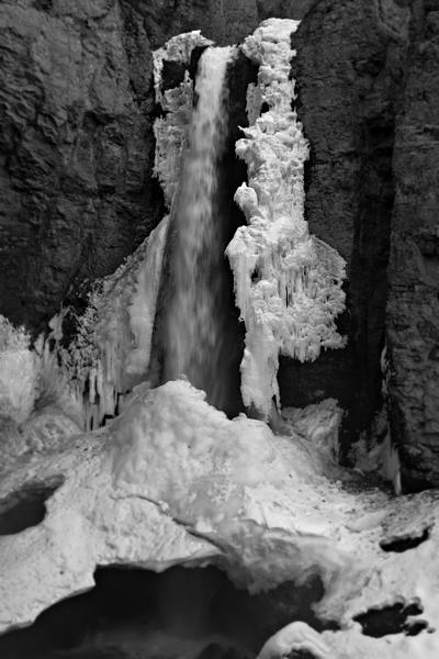
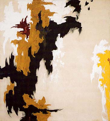
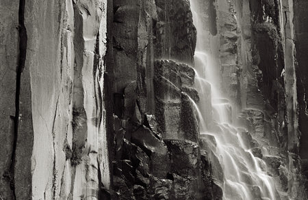
Richard reminded us recently about the painter Clyfford Still, and it seems I’m still under the influence. Not of Still, but of whatever it is that makes me make pictures that look like Stills. Last Saturday in Yellowstone we hiked in to Tower Falls and I made the photograph that heads this post. I did not have Clyff in mind while on location, but I find the result strikingly similar to these:

My image is literally an abstraction by virtue of presenting a visual fragment removed from its surroundings. That’s true of any photograph, but it’s a matter of how much one chooses to separate out. Perhaps a more conventional selection would be the following:
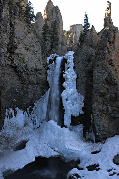
Most people would probably prefer that wider view, as well as the color, but it’s just too much like a standard tourist snapshot for my taste. I’m not trying to document the site or show you how beautiful it is or remember it for myself. There are truly a million images that could serve those purposes. I don’t know how many there are like the first I showed. I’ve never seen one remotely similar, and my guess is there are none I would consider interchangeable, i.e. expressing the same understanding of the waterfall.
My lead image is not a final version; they almost never are so near to the time of capturing. I’m still working out what it means to me, which of course is all tied up in how it looks. Actually, what I think I would like best is something I didn’t get around to on site — the downside of hiking with friends, who were already heading home by the time I quit. But I can approximate it by cropping on the computer:
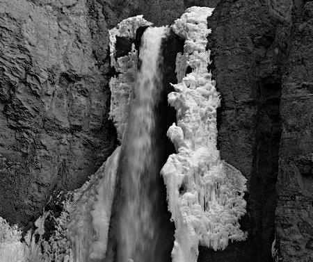
With the horizontal format this is even more like Still, and it’s also more like another waterfall I showed before:
Even though I don’t like Still’s work especially (no doubt web images don’t do it justice), through the writing of this post it’s become a permanent part of my visual experience. I certainly want to visit the Denver museum when I have a chance. Exactly what we have in common, I’m still wondering, but it feels deep enough that I’ll be exploring it for a long while.

The Stills do not do much for me. To my eyes, the second one is funny – the shadow of a devil with a beard plagued by extraterrestrial yellow growths. The first one is ominous, I alternate between seeing the shadow of a person, split into half with her head cut off and the shadows of two Klu Klax Klanners whispering two one another. I am emulating the artist’s type of outburst. As Richard told us, Still is famous for having denounced museums and galleries as Nazi gas chambers. As Serge G. put it in his comment: I suppose to burn all these paintings on the backyard.
Steve,
Clyfford Still is too abstract for me (as is Cy Twombly), but when you point out elements of the abstraction that could be imbued with meaning, it takes on a whole new tone… The parallels drawn by you between the photograph of the frozen water / roaring torrent to the Clyfford’s painting is remarkable…
As remarkable as it is, this has also been one of my personal issues with abstraction -they can be interpreted in any way you like… sometimes the flexibility is godsend, other times, it could be so loosely construed to fit current fancies and whims that it is theatrical…
Your photograph is superb and I would be interested in your experiments with cropping and other adjustments with color and brightness…
Your photos are studies of textures.
Steve,
Of course: How can the Waterfall not be the central element?
But, as I look at these images, what interests me most is Everything Else. I think you gain a lot in the final image by how you have the water Off-Center.
Sunil,
I find meaning elusive in Still’s work, but since I first saw them, I have thought of his paintings as being vertically oriented, and that certainly makes sense to me in thinking of them as western landscape abstractions. But according to Donald Kuspit “the broad, seemingly limitless flatness of his paintings has been compared to the wide open spaces of the prairie” (Still was born in North Dakota).
Regardless of their source, the shapes that Still uses are similar to ones that appeal to me in the context I’m working in. I would love to know more about what Still himself thought about them and where they came from.
Birgit,
Yes, texture as well as tone is important in differentiating regions of the picture. Still’s paintings were also quite textured, though I’m not sure how much the texture varied in differently colored regions.
D.,
You have an eye attuned to the Everything Else. Did you follow the reference to an eye-tracking study about that I mentioned on Dion’s post?
Even though I don’t like Still’s work especially (no doubt web images don’t do it justice)…
Years ago I was visiting NYC with my sister, and we went to the Museum of Modern Art. We walked into a room full of color field paintings, and she asked me to explain what was good about them (that’s what non-artists think we learn in art school, how to tell good art from bad art). I said, “well, first of all, you don’t look at them from across the room like this.” I brought her over to one of them, so it completely filled her field of vision. She stood there looking at it for a couple of minutes, and then said, “ohhh.”
Still and falling water
Steve, is the frozen water the Still water? It’s not moving.
It takes one to know one. There’s more…
David,
so it completely filled her field of vision
Does this mean that an abstract painting has to be large?
Does this mean that an abstract painting has to be large?
No, it means that things need to be viewed in ways appropriate to what they are intended to convey. The very large color field paintings are very different when seen from close up. If you just look at them from across the room you don’t get much of an experience.
As far as Clifford Still’s paintings, I’m just saying that it’s a mistake to form an opinion of them from seeing them on the web. They look different in person.
The first painting of Still’s shown in the post is more than 9 ft x 13 ft in size. The second is roughly 5 1/2 ft x 5 ft.
Steve,
I like that the waterfall in the last picture is off center but that it is more in the center in the first picture.
The symmetry in the first picture gives me the sense that I am looking at a living being (vertebrate).
In some way your extraordinary photos diminish the depth and potential meaning of Still’s work. Does nature always do it better?
Birgit,
That’s a wonderful suggestion about a backbone, especially with the reversal that the water would be backbone to the flesh of the rock! I think that, in abstract or unclear images, there is a strong tendency to see human forms–we’re hard-wired for it. Consciously or not, that contributes to our overall reaction to such a work. Thanks for looking long enough to notice and articulate that idea.
Richard,
I wouldn’t go so far as you, but I do find that the authority of “real” nature in an essentially “straight” photograph lends something special to the abstraction. That we can react to it in multiple modes is a great part of what attracts me, at least, to this type of image.
I just realized that the ripped, torn shapes that are in both my waterfall and Still’s paintings also appear in the image from my first post on A&P (From the shadows):
And the ripped wallpaper there makes me wonder if Still was perhaps influenced by 30’s collage work. I haven’t looked much, but here’s one of Kurt Schwitters dated 1937:
I agree with David about seeing abstract work in person. Twombly does nothing for me in reproduction but I can look at him for long periods of time in person. Still, abstraction is not for everyone (pun intended ;). At the Phillips Collection in DC, they have a room of Rothkos, which is more how he intended them – a sacred space of sorts. I think there’s a Rothko chapel somewhere in texas. I would go there and sit in that room and soak in silence. Sometimes it is nice to look at wide open spaces and let them surround you. I am reminded of David’s empty studio when I think of it that way. What also gets loston the web is the surface texture (or lack there of) .
Steve,
I like the connection to Schwitters. The slick surfaces of photos sometimes get in the way of feeling that ragged, rough feeling of collage or the irregular surface of a painting. It can be distancing to me, like even if you take a photo of the roughest most worn space or surface, I can’t get IN it because the suface of the photo is so regular. That just struck me as a barrier for me when I look at photos in general. Are there any photographers who purposively disrupt that smooth surface?
On another note, I agree that the waterfall is akin to the rips in the walls. Nature ripping through the land. There is something about the elements keeping things moving, despite our best efforts to keep them intact (like wallpaper that always peels).
Just wanted to say that the comments that you’ve evoked with your words and work, Steve, have been wonderful. There’s something to the community of artists that this post is channeling as well as reading that I find almost breathtaking. Thanks.
Leslie,
That’s a very interesting point about the smooth surface of photographs. They support very well the illusion of being merely a window through which you see something in the world. As far as breaking up that surface, I don’t know of anyone other than some painting on photographs, such as Karl once posted on.
Once you have that idea, and with collage in mind, it seems natural to make a collage of torn-up photographs, perhaps with other elements as well. One could, for example, aim for a cubist effect of viewing something from multiple perspectives. Or, by crumpling and re-flattening the paper (colored paper or photograph itself), one could get some of the 3-D texture of the rock in my first waterfall. Or just give a slight rumpling and buckling to get the different rock texture in my last waterfall. There seem to be great possibilities, but I don’t know of any work along these lines.
But — I am now reminded of Carl Chiarenza, who creates normal black and white photographs of torn paper under high contrast lighting that are typically suggestive of landscapes. On his web site I found a couple very close to the look of the basalt columns in my last photograph:
Hmmm, I think I may have to post another photo that is really close to that last Chiarenza.
June,
I also find the comments a tremendous stimulus. If it hadn’t been for Leslie’s comment, I would not have thought of Chiarenza, which is a large, rich body of work I want to look at again. The first time I heard of Still was through a comment of Leslie’s.
OK, here’s my other image from Palisade Falls (the last one in my main post). It even has a tiny waterfall for D.
Steve,
I both paint on photographs and then stitch them — but of course, they are printed on textiles rather than on the highly processed photographic paper.
If you like, I would print one of yours on some silk and we could compare the different effect. As I said before, even the smoothest silk (silk charmeuse) can’t give the crisp effect that photographs have on paper, which is why I often paint after printing — both to achieve a better resolution and to get a photograph to come closer to what I want it to be rather than what it is in itself.
But if you want to play with some different effects, let me know.
June,
The idea of wearing one of my waterfalls or one of your landscapes on a silk shirt has me drooling! Even as a T-shirt…
I do think the texture of silk would add greatly to the appeal of many images, including mine in this post. The sheen seems very appropriate for the rocks and water at Palisade Falls. I don’t have a good sense of the level of detail that can be obtained, but that’s not always important. In fact, I’ve been doing a little experimentation recently with deliberate blurring, though I haven’t done that with any finished prints yet.
The idea of a shirt makes the fabric concept sculptural. Lot’s of possibilities… Let’s think about this.
Steve,
Alas, to paraphrase a famous truism; “I don’t do clothes.” Actually the truth is I _can’t_ do clothes. So we’d have to enlist the aid of someone who actually sews (as opposed to me, who merely “stitches”) to get the full sculptural effect.
There are some fine artists who do wearables and who sculpt their dyed fabrics, but I have enough trouble just managing the flat semi-frieze look.
The printing process I use necessitates a flat fabric — it’s the same printer that photographers often use — an Epson 7600. (I understand that the blacks were not satisfactory on the 7600 so the 7800 came out to fix the problem. That allowed me to buy the 7600 used. but I digress)
So what we could have is a comparison of two flat wall pieces — fraternal twins, as it were.
June and Steve,
I am eagerly looking forward to the results of your collaboration.
June,
Would the print be washable? If so, I’ll gladly do the sewing myself. I’ll have to get a pattern. Naturally, I’d pay for the material and printing cost. But maybe we should try with a smaller piece first, anyway?
Steve,
The epson 7600 is pigment based (like acrylic) rather than dye based, so it is washable. It doesn’t stand up to rubbing,though, so it’s better to wash it by hand. The pigment sits on the surface of the threads rather than, as with dye , bonding chemically to the fabric.
The largest width I can go is determined by the printer — 24″. Length is pretty open, although the fabric starts eventually to slip as it goes through the rollers and that stops the printer. And of course, multiples of, say 24 by 60 are possible — think kimono fabrics (which are actually 18 inches wide, I think).
The longer pieces require a rolled backed fabric, which I generally buy commercially. (The smaller pieces can be backed at home and fed through the printer).
I don’t think I have any rolls at the moment that would be suitable for wear, since I don’t do wearables. But if we get really into this, I could get some — I need some heavier silk anyway. But I can easily do smaller pieces for 2-d purposes. I just need a relatively high res photo.