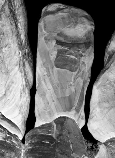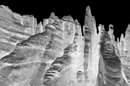
On my way to Anasazi country recently, I stopped at Arches National Park, where I stayed the night. Next morning before dawn, I was off to an area known as the Devil’s Garden, which I had never visited. It turned out to be one of the weirdest landscapes I’ve ever seen: a few trees and other plants sprinkled among mostly bare reddish sandstone, eroded into bizarre shapes determined partly by crack systems. Although the day before I had ignored the more famous features, I immediately got to work making pictures. Almost as quickly, the metaphor of bones came to me. These rocks were like internal structural elements somehow made visible at the surface. I knew the series would have to be titled Bones of the Earth.
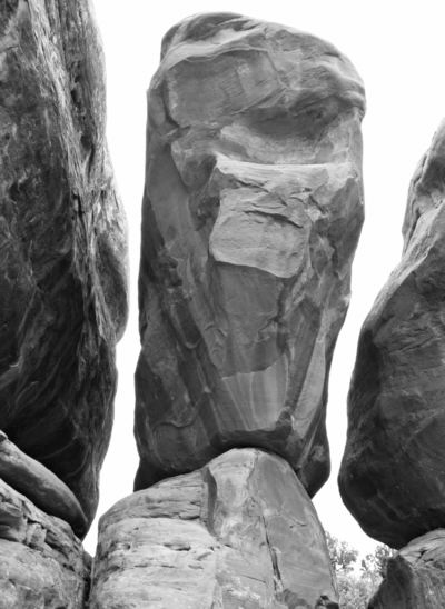
I haven’t had a chance to do more than the most cursory processing of the images so far (I’m away from home again this week). But I did try an idea I had while thinking about them on the trip: invert black and white. This is way stronger manipulation than I’ve ever done in the past. But it creates an image that is clearly alien — which I thought appropriate — and also makes it seem that the base color is more white than dark, in keeping with the bones concept. Below is what the normal version of the lead image looks like.

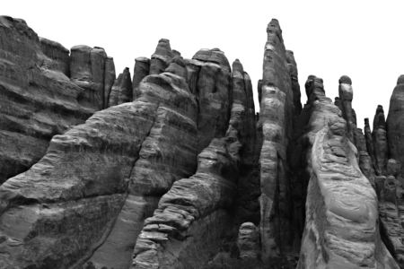
Some areas would have to be called ribs:


I am curious about your reaction to the inverted images. At this point I’m still “playing” with that treatment, unsure whether I want to use it or not. Does it strike you as pointless distortion? Is there more to it than shock value? In terms of pure tonal design, do you have a preference for normal or negative?
Somehow the weirdness of these rocks makes them inherently abstract, and they invite abstract treatment. Sunil, are you out there? Imagine these rocks as a weathered old face, what would you do with it? Can you get me some color?

Steve,
Personally, I like normal better than negatives. That said, the treatment that you have given the first image in terms of tonal intensities seems to be visually different from the one given to the second one rendering the first image in an eerie disembodied ‘hanging rock formation’.
In contrast the negative filtering on the second image seemed to remind me of visual representations of ocean floor depth soundings undertaken by oceanologists. The urge to repaint the first image in shades of burnt umber with highlights of flake white remains strong in me especially when I see stirrings of a weathered face in the rock face in the first image… Waiting to see more pictures from your travels (I went to your website hoping to see more pictures from your last trip but it looks like you are still working on them)… .
Sunil,
Yes, the tonality of the second selection is bad, I just didn’t have time to work on it before leaving. When I return, I’ll send you some possibilities that you may be interested in trying your treatment on.
Steve,
What I see in your negatives (inverted images) is disturbing, although not necessarily in a bad way.
I read them as x-rays, which is a kind of thrice removed from the reality of rock. It moves the rock/bones into the 2-d-ness of a thin transparent membrane (the film); it also makes them a human (if not necessarily soft) artifact rather than something set apart or alien. Or perhaps, alien in the way that contemporary medical tools are alien rather than in the way rocks can be alien.
I’m not sure I “like” the negatives (although I very much like the postivies). But that’s not to say I don’t respond to them.
Pure tonal design? hmmm, the photographic effect is of light (not a painterly white); so that changes my whole concept of tone. Unfortunately the second photo in particular makes me think of nuclear irradiated structures.
I see a buddha in one of the weathered rockfaces in the second positive photo. And certainly the first could be a kind of portrait. But I can’t imagine color on the negatives — Sunil is a good choice of advisors, as his colors resonate like the negatives do.
I obviously am not against humanizing or anthropomorphizing the earth structures, but the light is almost too weird for me. Maybe if I had some kind of analytic hook to hang on to…..
Steve:
The first image in your post had me going for awhile. It sure looked like a negative, but it had for me a spectral quality suggesting that you had come upon a massive outcropping of radium. That, or you had strategically positioned lights among the rocks. My eye, however,kept going back to the shapes at the bottom of the image and how they had a definite black/white reversal about them. Then I read on.
The balanced rock keeps casting its spell even though I now know. It’s almost like one of those diagrams where one moment it’s a vase and the next two facing human profiles.
I’m kinda new in these parts and somewhat chary about dispensing advice, but I have one comment about those shapes at the bottom. What if they were dodged black so as to create a kind of screen over which the spectral shapes would float. For some reason I’m thinking “Close Encounters of the Third Kind” where the space ship looms in all its glory over the dark shape of the Devil’s Postpile.
Steve, I think I prefer the negatives, but I find it kind of distracting seeing the positives right there with them. Forces me to compare them rather than seeing them on their own.
Have you ever tried infrared? You can get film for a regular camera, or have a digital sensor converted. Gives a feeling somewhere between the positives and negs.
Steve:
Darned if Ribs doesn’t take me back. I hark from a time when the fruits of American enterprise were heroically displayed. One of my favorites was a mural, perhaps at the local train station, of locomotives writ large, poking out at the viewer from their respective tracks. Leading the pack was a GG1, designed by Raymond Loewy (or Lowey, depending upon your source of info) looming like a blunt and motive sphinx. There’s something about your shot that makes me think that, with a little patience on your part, the formation will make its way to where you are standing.
Thanks to all for your comments. Jay, I appreciate your discretion about advice, but I always like to hear plenty, will run with any thoughts that strike my fancy, and blithely ignore anything that doesn’t. I will experiment with your explicit (darker bases) and implicit (oncoming locomotive feeling) suggestions. Whether or not I end up liking them, they strike me as serious and plausible and likely to suggest other ideas to me as I work on these images.
Unlike some artists, for better or worse, I am willing to throw sometimes half-formed things out for reaction. Probably premature in this case, not because I’m too likely to be influenced by others, but because I hadn’t done enough work to provide good fodder for comment. I will be working more on this series, you haven’t seen the last of them…
David, I’ve never used infrared film, but could simulate its effect digitally. It wouldn’t make much difference in the rock, but would make the bit of vegetation lighter in the original, hence darker in the negative, which I think would be good.
June, thanks for the X-ray comment, it means I haven’t got things right yet, I want these rocks to appear as solid objects, not ghostly traces. I do have a hook for you, which I’ll get to in time. Just a little hint: it came up in your own recent post. Not trying to be coy, it’s just that the idea is worth presenting properly.
Steve:
Thanks for your response.
It seems to me that the best times on A&P come when people engage in discussions of each other’s art in the making. The civil and genuine tone employed is a tribute to the founders of this site and to be fostered.