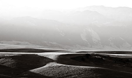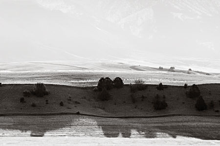
Funny how things come together sometimes. After casting about for a while, rejecting various topic possibilities, I finally settled on one I’d had in mind for some time, although I hadn’t prepared images or written anything. After typing the title and while I was uploading images, I noticed Doug had just posted on influence. In part, this post is about what I can do here in Montana that is as much as possible like those fabulous images of California dunes (Oceano, Death Valley) by the Westons and many others (see examples here and here). I’m not exactly striving to copy, but I am deliberately letting that influence wash over me and through me. I love the forms of those high contrast black and white images, both the three-dimensional dune forms and the two-dimensional shapes in the plane. I look at those images often.
But there is another goal with my series, although I had not quite formulated it sharply until Birgit’s recent post. In addition to the dune-like undulating fields in the foreground, most of these images have the Bridger mountains in the background. But the mountains are serving not so much as subject as to bring out the light-filled air of early morning.

Perhaps I am saved from mere recapitulation by living in a dune-free environment. I also think that having the combination of two goals (not to mention others) forces some degree of originality on me. (There are doubtless photographers out there with the same main goals I’ve stated; I’ll be on the lookout for them.) Meanwhile, do you think that it’s possible to reconcile these two ideas, to depict at the same time sculptural, almost abstract form and intangible light and air? Much of the power of the dune images comes from their simplicity, their focus on a single idea. And if it is possible in principle, how successful are the images here?

Ummm, Steve, you pose an interesting question.
I’ve been reading about Cezanne and one of the standard comments on his work is that while the impressionists painted air and light, he painted solid form. I’m inclined to agree.
The shadows in your Bridger Mountain photo above anchor and make shapes, but that isn’t quite the same as making solid forms. Perhaps the two are different and the shadows are the substitute for rock with roots.
Steve,
Yes I think it is possible, and the top one is amazingly “striped” for lack of a better word. the two worlds of foreground and background seem so separate that it has a surreal quality. there is so much space and depth in the foreground and then we almost hit a flat wall. It almost looks fake, like one of those screens behind an anchorman to give the illusion of space behind them! I can see why this challenge compells you. It is an interesting way to approach space. I think the connection to Cezanne is interesting and valid. even he couldn’t avoid atmospheric perspective in his Mt. St. Victoire paintings, right? So for as much as he was about solidity, he also seemed to be flattening out the space in major ways – the shapes are solid, but the sense of 3 D form disappears in lots of areas in his work.
Steve:
I’m fascinated by the light sources in your work. In these images there is no sense of recession for me – even though angels would not fear to tread in the distant mountains. For some reason I see the dark foregrounds as hurdles over which the light seems to jump like steeplechase horses.
June,
I am interested in the shadows for both the 2-D shapes and their revealing of 3-D form. Does their relatively flat effect arise from their large area? Does an impression of solid form come more from smaller scale modulations a la Cezanne, as you also seem to apply to massive landscape forms in your John Day work?
Leslie,
There is indeed a scrim effect due to the shape of the land here. I’m looking from a ridge first across lower fields, which then rise up, creating the wide foreground the shadows. After that, the rise is slow toward the mountains, so in only a little height there’s a much greater horizontal depth of air, all scattering light even if it’s not particularly dusty or misty (if it is, you can’t even see the mountains).
Jay,
I love your poetic analogy, which seems to be related to my leaving in the bright fields in the nearest foreground. I like the idea of a movement also from foreground toward the back, though of course the light itself is coming from the sun just rising over the mountains. I had thought of cropping to start with dark shadow at the bottom of the image, but I think I like having three main strips, rather than two.
Steve,
Your pictures are amazing. I would love to see them in a larger format.
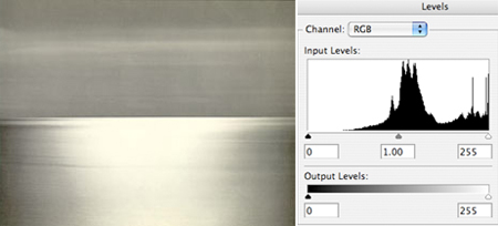
I compared the ‘levels’ histograms of your photos to those of Brett Weston. In all cases,the histograms have most of their bars at the extremes. However, in contrast to Weston’s photos, yours had a lot of information in the bright region that I could access by sliding the lever.
Is it an advantage of digital photography that there is more information in the more overexposed regions? I don’t know proper photographic jargon to express myself better.
Birgit,
That’s an interesting question to investigate, I hadn’t tried comparing the histograms (graphs of how many pixels in the image at each brightness level). There is no advantage for digital, in fact film can normally capture more information in the highly exposed regions. However, in either the printing or the conversion to jpeg images for the Brett Weston web site, information was lost at both dark and bright extremes, as you noticed. I would love to see an original print, which is the only way to judge.
Steve:
Do you wear jodhpurs? I can imagine you, like Cecil B. DeMille, with a riding crop in your hand, moving objects around the landscape with a flick of the wrist. Every little shrub and outcropping seems to assume its place to better suit your point of view. You either have an imperious command of your motif or one of those paparazzi cameras that can be held out of the window of a moving car.
Jay,
Well, I can assure it’s not digital manipulation. I do sometimes go so far as to remove a stray telephone wire, but I never add or move things. Rather, I move myself until I like the view. And it’s a personal principle never to wear jodhpurs (I have used a crop, though). [By the way, I cleaned up the comment trail, just to avoid confusion.]
Steve:
I was seeing you out there on location with all of the landscape elements watching you, anxiously awaiting your commands.
The only way I could see it working for me would be to compile coordinates of places where it all lines up, except perhaps the light or the weather. Then I would maintain fresh batteries and a vigil.
This brings up an element of my photographing style — as opposed to my photographic style — that some people are surprised by. I seldom stay long in one place waiting for the “best” light or for elements that might be moving to be in their “best” configuration. I may wait a little bit, especially for a cloud coming or going, but I’m more likely to move on. Then I know I’ll be seeing something different and potentially more to my liking. I’m not (usually) rushing, I’m just exploring. No doubt I’ve missed some great photographs by moving too soon, but I would have missed others by staying put. As I get to know a place better, I can more easily predict where I’ll want to be when, so stakeouts are still infrequent.
Steve,
This photo by Sugimoto, copied from the web,

lacks pixels at the darker brightness levels.
Do you think that the image shown here is just a sloppy jpg presentation of the original file?
Or could the skewed histogram of the photo be intentional, giving the picture an creative flair?
I love this series from Sugimoto, and I’m sure the histogram reflects the photographer’s intentions. The overall lightness and the soft grays suit both sea and sky very well. They are not meant to have the drama that would attend deep blacks.
This makes an interesting comparison with my series, in that both are dividing the frame into two major regions: sea/sky for Sugimoto, and fields/mountains, or more accurately, fields/air-before-the-mountains for mine. Thanks, Birgit, for giving me something else to think about! :-)
Great! One does not have to adhere slavishly to using the full brightness spectrum.
I love that picture too.
Oh they are lovely relaxing to the eyes… I probably use them as backgrounds for my own works. Could you please post one with colour?