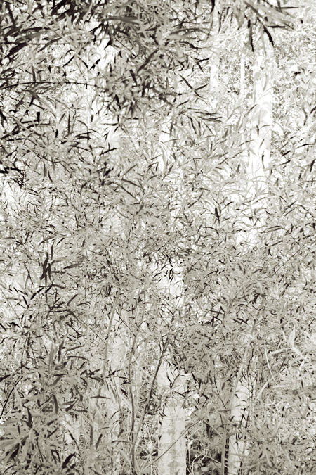
To my surprise, I discovered in preparing this post that I’ve scarcely mentioned my major project, called Sourdough Trail, which is a series of photographs taken near a short stretch of trail along Sourdough Creek here in Bozeman, Montana. Photo projects never die, but this one is, I would say, in decline. I visited quite often over the course of a year, but slowed down considerably in the following year. I had started the project just after having an epiphany of sorts about the use of focus; specifically, I fell in love with the possibilities of out-of-focus areas that were fairly complex in subject matter, such as foliage. (I recently looked back at the image that first impressed me that way, and it didn’t seem so special at all, from today’s perspective.)
So I was interested in complexity for this very pictorial reason, as well as others. The challenge was to find order in the woodland chaos, but that turned out to be easier than expected. I am usually consciously considering what I’m looking at, but I’m also seeing it at a gut level, and I’ve found that an intuitive sense of appeal is a good indicator of what matters to me and what “works” for me. That’s what I listen to. There are plenty of reasons I could give for capturing the images I do, but ultimately it comes down to that gut appeal. I think that very fact illustrates one of the themes of the series, that fleeting glimpses of complex realities can still have a redeeming, dare-I-say-it Zen-like integrity to them, even if they’re very different from the beautiful, very simple images more commonly associated with that mindset.
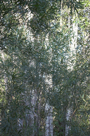
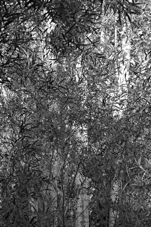
The history of this particular image relates to Sunil’s recent post on what one does with an artwork that doesn’t. The image was captured a year ago, in the form shown below in color. I took a first look at it, converting to black and white, a couple days later, with the intermediate result shown in the second image below. I’m pretty sure I didn’t give up on it then, but I did ignore it for a year.
Then I made another photograph along Sourdough Trail that was intended, in part, to have a similar, very light feeling to it. That recent one hasn’t proven satisfactory, though it did remind me of a direction I’ll pursue in future. More to the point, it served as the prompting I needed to return to the willows.


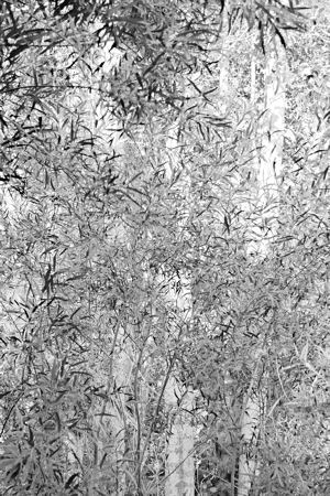
My first move was to lighten everything: a straightforward operation, though a non-trivial one, since different tones are lightened by different amounts. That yielded the third image, below. This felt much closer to my original idea, but as so often I found it difficult to lighten sufficiently; there’s something about darkness and rich blacks I really love. Finally, to evoke a sunnier feeling, I applied a tone-dependent tint I had created sometime in the past; it looked good to me here, yielding the image this post started with.

The image is not really final, though; the next print or jpeg could always be handled differently. Just now, for example, I was investigating the effect of slightly darkening the lower right corner in various ways for better balance. This would be the first local adjustment for this picture — previous operations applied to the whole image. The jury is still out on that (literally), as it is on the tinting, which is stronger than I’ve done in the past.
Incidentally, this image is like an inversion of another in the Sourdough Trail series (click the 3rd image in reading order). Taken a year earlier, that one has the cottonwoods not as the lightest areas, but as part of the dark background behind the bright willows.
So to alter Sunil’s question, have you ever let something sit, then come back to it to make it much better? Are you willing and able to let something lie dormant a long time? (Comments on the images are, of course, welcome as always. I’d even like to hear if you prefer the original color version, but please break it gently.)

Steve,
I compared your first image with the ‘inverted’ one in the sourdough trail series. What a huge difference! Glare of sunshine versus ethereal lightness. What a challenge to fine-tune this image combining your sense for exquisite texture with Zen-like-integrity.
To convey its delicacy at a resolution of 72 pixels/inch in itself must be a challenge.
I like the colors, the bluish green of the willow leaves and only a little yellow green where the light hits.
But to my sense of beauty, the colors hide the special (japanese elegance?) feeling embedded in the image. The BW is too harsh. The softer tint of the first image enhances its dancing motion.
Steve, the thing I love about the top image is the ambiguity of the space, and the resulting ethereal, floating quality. Most of the image sits right on the picture plane, but there’s a secondary sense of spatial depth. The two readings create a tension, which I find very satisfying.
I’d be interested in seeing a series of these.
David,
The sense of space created by a 2D object like a painting or photograph is one I’ve only recently begun thinking about, as came up not long ago with my waterfalls, and earlier with Jay regarding other landscapes. I am trying to be more aware of it when photographing because, as you point out, it can really influence how effective an image is. I don’t have any consistent goal in general, and sometimes find myself liking very flat representations, sometimes ones that open to engulf the viewer. Your notion of the tension between these is a very helpful thing to think about, and I think it will especially apply to the future direction I alluded to.
David,
Earlier, you said that
In Steve’s photograph, you find the secondary sense of spatial depth satifying.
Would you allow this secondary sense of spatial depth in a painting?
David,
Earlier, you said that “A painting is a flat object, therefore it should represent itself as a flat object and not attempt to depict the illusion of depth.”
Birgit, that wasn’t me talking.
That was me paraphrasing one of the concepts of Abstract Expressionism, which Karl claimed was a non-conceptual art movement. I was making the point that there were concepts inherent in both Abstract Expressionism and Impressionism, and I listed two for each.
Sorry if it was confusing. My own ideas about art don’t really include those sorts of rules.
David,
I am relieved!
Oh come on, Birgit, I thought you knew me better than that :)
Birgit,
You put it well about the the colors, which I also like in the original image, but which distract from the shimmering effect of the tones. And it seems to me that the color version gives a much clearer sense of layering in depth, without the ambiguity that David liked.
David,
I don’t know yet how quickly artists change their mind. Honestly, I was horrified. I thought that you had recently flipped out. Sorry!
Steve,
The ambiguity is inspirational. Reading Erle Loran on Cezanne (thank you June and Jay for discussing the book), I am thinking a lot about perspective.
Honestly, I was horrified. I thought that you had recently flipped out.
No, it’s been awhile since I’ve flipped out. The last time was at least a few days ago. But then I started thinking about how to describe to Karl what I was thinking, and well, it sort of brought me back.
PS – Birgit, I went back and looked at my earlier comment about how paintings should be flat. Here’s what I had at the end of the comment:
(excerpts from the upcoming book Poor But Ernest Attempts to Paraphrase the Concepts Of Impressionism And Abstract Expressionism, by David Palmer)
When I make a joke, I guess I have a bad habit of doing it a bit deadpan. But I do try to leave a trail of breadcrumbs…
All that unnecessary suffering on my part about one of my mentors failing me.
Birgit, I had no idea. Glad we talked :)
Steve:
I guess I’ll start talking and see if it goes anywhere.
First, this appears to be a new issue as I’m used to seeing a more clearly stated separation between your stance as the photographer and where the picture as such begins. It’s like you’re surrounded by a lot of little things on your way to something bigger. That’s the way it feels to me: the real focus and attention – and maybe intention – is on the distant and ethereally washed trees. They do not announce themselves as the weighty items that they are, but take on all the more meaning to the composition by their airy sense of non commitment. They are gods and fronted by a heavenly host of little pointed beings. Have I gotten anywhere yet?
That may be balderdash, but I think I see a point in it. I caught myself spinning a little narrative, or maybe better, a set of roles for things to play. Reminds me of pantheistic forest cultures where every rock, stream, branch and leaf has a spiritual identity and where the forest dweller is in a constant conversation with his and her environment, and every part of that environment communicates.
Is the foreground foliage hogging the conversation? Just the opposite, perhaps, as your need to modulate their presentation and deal with them as the necessary elements that your eye recognized them to be, has changed and elevated the trees. They are now compelling as they are also more sensed than seen.
In regard to flatness, I just caught David’s comment and I agree heartily. And, again, to trot out our favorite whipping boy, Cezanne achieved that synthesis of flatness and depth by a careful correlation of brushed elements, both in terms of relative sizes where the big distant things tend to be of a similar size to small near things and the entire span from near to far is in considerable chromatic agreement. In that sense I most like the image that fronts your post as being most in keeping with the nature of the content. But I feel, as I gather do you, that something needs work. I can see the darkening of the corner as beneficial, and I wonder as well if the canopy effect at the top might be provisionally cropped out so as to simplify the foreground and flatten it.
Jay,
Thank you for the very thought-provoking comments. I can see this will be pushing me to some new places, which is exactly what I’m looking for from these conversations. D. might consider it a lack of commitment, and I’d have to agree, but at this stage I’m still learning what this image, and even this series, is about. Perhaps the more clearly I come to conceive that, the more commitment the pictures will show, both future ones and future versions of this one. With this picture, to this point, I have been guided by a more or less intuitive and somewhat lame sense of what seemed “right” or “nice,” not by a clear conception of what the picture is about. Though I’m wary of the formulated phrase, I don’t think the picture is in danger of being pinned wriggling to the wall.
Your idea of the greater-than-apparent significance of the light cottonwood trunks in the background makes a lot of sense. Not only is that consistent with the earlier picture, but also I was conscious of this newer trend as emphasizing the higher key more than the darker elements. In general, I want to start using the whites in a more positive way, even though I’ve tended to think of them as a kind of negative or absence. Kind of odd, since I was just telling myself that I should also think of photography as drawing with shadow rather than light, but anyway… While working on the image, I was very aware of the trunk upper right as being much more than background for the leaves.
Of course each forest element has its spark of spirit, we don’t even need to discuss that! I’m glad the thought occurred to you looking at my picture.
Your remark on separation of myself and the picture is quite intriguing; I can only say I intended nothing biographical/allegorical. Intent may not count for much, but the interpretation doesn’t ring true to me, if I understand you correctly.
I’m not so sure I want to crop the upper willows, darker and nearer. As you say, it would flatten the image further, perhaps too much. (Anyone can experiment with this easily by using the side scroll bar to move part of the image out the top of the browser.) But I will be looking at the possibilities from a new angle, for which much thanks.
Lightening the left top leaves would make the picture more austere by emphasizing the vertical planes of the white cottonwood.
Steve,
I look at your website from time to time and for some reason the two most striking series that you seem to have developed were Patina and Anasazi places. The former for the abstractness of the subject that was appealing and meaningless at the same time captivated me a lot and the latter for the strong narrative that came with the crevices of the great rock that the ancients ‘naturally’ inhabited. I looked at the Sourdough trail again this morning and it did not evoke too much in me until I noticed that on clicking the photos I was introduced to the haiku that accompanies each photograph. That made my morning worthwhile and the images took on a deeper meaning and a stronger tone than just ‘pictures of foliage’ as I had originally perceived them to be. Thank you for the addition of the verse.
Steve:
This is getting richer.
It was elevenish when I wrote that and I had a bad case of indigestion from too much calamari and catfish poboys washed down with an Anchor Steam. As such, it is now time to review what had issued from my full but suffering self.
Let me start with “stance as a photographer”. I was going to respond that I mean only where you stand to shoot, but then saw the statement for the complexity that it contains. I tend to use my camera as a recording tool and lose sight of a camera’s identity in others’ hands. For many, cameras are extensions of their very selves and where their hearts go so too their cameras. Boy, am I uncomfortable with that last statement – but it’s true enough often enough. Does it apply here? Please forgive me, but if I were a physicist, I might want to supplement the mathematical and numerical representations that I find in nature with something immediate and that touches more of me. And as a physicist, I would bring a rational approach that would temper and inform my emotional responses. I would, perhaps, be looking for the camera location that provides quality data and that allows me the best shot at a clear result. That might suggest standing back a little. But then I am not that physicist (all caps with an exclamation mark). But, if I were, I might find a headlong dive into the confusing welter all the more exhilarating.
Today’s take on your picture is somewhat Japanese. I can see the foreground as a screen that hides yet reveals the cottonwoods. I’m used to seeing Japanese screens in terms of flat patterns and depictions that establish a resonance with the foregrounds and backgrounds that they modulate. As such, the overhanging foliage at the top adds one term too many to my imagined relationship: I look too much at the screen and not enough through it. But you may reasonably retort that Japanese screens can have all sorts of images from big monkeys to ship-borne Dutchmen, and I will come back by saying that they all live in the thickness of the cloth and for a dialog with what lies beyond them.
Your thoughtful approach is most tempering to a person, such as myself, who would throw the camera in the air and see what came out in the proof sheets.
Steve:
One more comment about the physicist thing: in college I found myself among a lot of Outing Club people. These climbing, caving and canoing daredevils were mostly involved in the hard sciences.
Jay,
I’ll willingly sign on to the notion of heart and camera going together. The brain comes along for the ride, but never leads the way. I don’t think being a physicist makes any difference in my approach, though it helps in problem-solving tasks involving understanding of light, camera settings, etc. As far as maximizing “quality data” or a “clear result” in some documentary sense, I’m actually more often working in the opposite direction.
Thanks for your observations on screens and flatness. I’ll have to think more about that.
When I first started photographing, I did more stuff like throwing the camera in the air, and Leslie and June are right that doing something different can generate new ideas. But even if one of those shots turned out fabulous, I don’t think I would find it satisfying. I wouldn’t have the pleasure of going through the process and really engaging with the scene in the way I normally do. It’s the heart part.
Steve,
Your (final?) version reminds me a bit of a textile artist — Dorothy Caldwell — who embroiders tracks, sometimes randomly, across the face of her very large pieces.
They tend to be white tracks on dark or black, the reverse of yours. But the leaves, as you have manipulated them, become more and more like mark making (an honorable artistic term) than like foliage.
It seems to me you’ve achieved a cross between representational and abstract that’s more striking even then many of your other photos. It’s quite eerie and wonderful.
June,
Thanks for the link to Dorothy Caldwell. Her last quilt there has a hill that reminds me of the one Andrew Wyeth’s Snow Flurries. I’ve always thought if I could get as much character into a simple hillside I would indeed have accomplished something. I think the idea of tracks is a key one, tracks being the trace of life, whether people, cows, birds, plant growth patterns, etc.