In my current studio phase I’ve been experimenting with an idea that goes back a while, but was most recently brought to life by a show I saw that included the painter Michael Haykin. I’ve been wanting to find a way to combine images in a way that yields something that is more than the sum of its parts. Probably most artists have considered making a Cubist-like multi-perspective image, but as June found out in her struggle to make Cubist biscuits, it’s not at all easy. I certainly haven’t had much success myself, but this time around I do feel I’ve learned something that will affect future work.
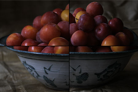
The plums above represent my first attempt to start from scratch with this concept. To limit the possibilities, and following Haykin’s approach of separate canvases for each view, I decided to limit myself to simple grid-based combinations. The four quadrants are taken from separate photographs. The angles of view and magnifications vary, but are not dramatically different. I first tried leaving larger gaps between the quadrants, but ended up with this nearly touching format for now, because it’s easier to see the image first as a whole (though an odd one), while at the same time emphasizing that things don’t quite match up across the joins.
What — if anything — is the point of this? To me it’s related to Karl’s discussion yesterday of visual perception. The eye sees only a part of a scene at one moment, but normally darts around and integrates different views into one perceived whole. My four-part (harmonious?) picture forces notice of the individual parts again for their own sake: here is a bowl; here is a bowl on cloth; here are plums. Aside from directing attention to parts, the image seems to encourage examination of the edges, as one tries to figure out how the parts go together.
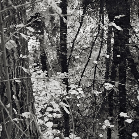
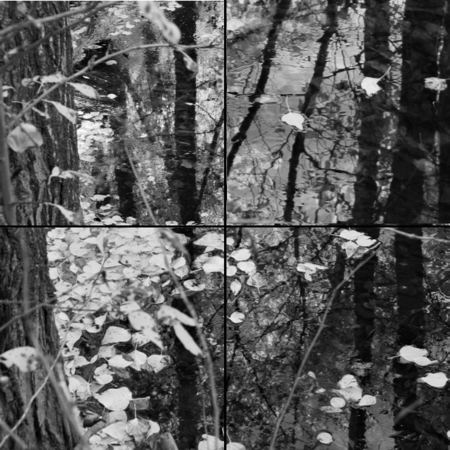
My next trial was based on an existing single, rather complex image from my Sourdough Trail series. I extracted four squares of different original sizes, re-sized them to match, and then put them together (click on the image for a much larger version). As you can see from comparison with the intact picture below, I gave greater weight/space to parts of the watery reflections I especially liked (upper right) and played with the composition of the small squares for better individual effect.

Once an image has been split spatially, there’s no reason it couldn’t be split over time as well. Separate pieces could be in different light, or from different seasons, or with different arrangements of objects (e.g. a tree branch could be fallen or blowing in the wind in one of the pieces).
What I realized in these exercises is that breaking an image up in this way tends to make it more about relationships. Of course, relationships are present among the elements of any intact image, but a degree of active attention is necessary to be really aware of them. This new method gives both parts and whole, leaving the viewer to do the integration in a no longer unconscious way. The viewer is more actively/consciously engaged in the construction of the picture.
Unless, of course, the viewer just looks away because the picture is too weird to be worth dealing with. Is that how it was for you in the examples here? Or even if one bothers, is the effort repayed in a better appreciation of the subject? From these experiments, I think this is achievable, but it will take more work and a better understanding of the process to get good results. Any suggestions?


Steve,
As you predicted, people react differently:
Looking at the enlargement of the second picture, my immediate feeling was: I am looking through church windows (a big window composed of smaller ones with different motifs and colors). Very beautiful!
In contrast, Troels’ said ‘highly disturbing’ as he walked away.
Steve,
I like this idea with its Cubist overtones. I’m going to try it.
My immediate response is to try to think of ways to arrange images in addition to the quadrant scheme. Comic strips occurred to me… as well as storyboards, but then I started getting nervous about whether those would still qualify as ‘photos’ and whether a viewer might not begin to object to being guided through an image and forced to see only my favorite parts.
That’s when I began to appreciate your rationale for the four quadrants.
I can kind of remember some elaborate images that were produced with massive amounts of Polaroid pictures. One scene appeared to be 3 or 4 people sitting around a table playing scrabble. As I remember it, it was almost life sized and showed the entire scene, but also showed details and variations of hands, faces and scrabble letters/words. It gave a very strong sense of the passage of time and a wandering biological eye.
Steve,
I like the direction here a lot.
Visual perception has an amazing ability to “fill in.” Another approach to the black lines you have between images might be to blur the individual photos around the edges, such that the viewer would “fill in” the details between the images, the ones that don’t quite mesh.
Splitting the image helps in building and exploring relationships of the elements, I agree. However, if the photos are very complex, it becomes more difficult to build these connections. Perhaps images with fewer elements might be easier to visually reconstruct across the breaks.
Scott,
Regarding the elaborate images, you might be thinking of David Hockney. I had seen something of this in the distant past, but not recently until just now. With that many parts one starts to get a different effect, somewhat impressionist in feel.
Birgit,
I think most people find the original stream image disturbing. Especially in a small version, it’s hard to figure out what’s going on with foreground, reflections on the water, and object under the water. I think I started with this one because I had already used smaller parts of it, and I wanted to see if they could be put back together in some way.
David Hockney….With that many parts one starts to get a different effect, somewhat impressionist in feel.
Steve, my feeling is that the Hockney photomontages are a direct outgrowth of Cubism, and in fact are much more successful than the Picasso and Braque paintings/collages that tackle the same problem. They really do give the sense of (and are the direct result of) our process of perceiving things in samples, from various angles and over time, and trying to integrate them into a cohesive whole.
I can kind of remember some elaborate images that were produced with massive amounts of Polaroid pictures. One scene appeared to be 3 or 4 people sitting around a table playing scrabble. As I remember it, it was almost life sized and showed the entire scene, but also showed details and variations of hands, faces and scrabble letters/words. It gave a very strong sense of the passage of time and a wandering biological eye.
Possibly/probably Hockney? – who hasn’t really been bettered at this
One point is that some of his insight came from looking at Chinese scrolls. I’ve worked on one of the Emperor Kangxi’s Southern Inspection Tour scrolls of 1698 from that he studied. It has a very different – yet completely coherent – understanding and use of perspective than we are used to in Western art – such as seeing different sides of the same building within the same scene – among many other things (size/scale is another one)
It’s also important as far as frames and edges go (a big problem with photographs in particular – even when they are “shopped up” and recombined). The scrolls really aren’t framed or viewed in the same way we are generally used to – Hockney also let this influence the way he put his joiners together
I was inspired by Hockney’s photomontages when I was in college in the late ’80’s. I made a large montage of the neo-gothic archetecture at the University of Chicago. What I didn’t really appreciate until the other day is that one of the things I liked about the montage was that each photograph was completely in focus, so looking across the whole, there were no areas of blur.
Whoa…there’s other posts here besides the one on altered states! I’ll have to come back later and read them ;-)
David,
Yes, I’m sure you’re right about Hockney’s interest in dealing conceptually with Cubism. My impressionist remark just reflected that, with the many photographs used, not exactly matching in tone and color, the pictures sometimes had a very shimmery feel which reminded me of Monet
Tim,
Thanks for the bit about the Chinese scrolls. Right now I’m reading Gary Snyder’s Mountains and Rivers Without End, which takes off from such a scroll. I see Hockney has made a film about that study, but I can’t find it locally. Do you know of any related resources on the web? Or do any of the other Hockney films touch on that?
I’m not sure how far I’ll pursue these efforts, but it has been instructive. For Scott or others who try it, I think that for the few-panel non-Hockney style here, it works much better with a real, largish work than it does in a little web jpg. At least for my purposes, I want each part to have sufficient size and integrity to stand on its own. I think the plums don’t work that way, but I’ll certainly do it differently if I go back to it again. Likewise if I do a forest scene like the one shown. But even if I don’t do much more explicitly in this vein — can’t say at this point — I think I’ve developed a different feel for looking at relationships of parts and whole, and I might end up framing “normal” photographs differently as a result.
Interesting concept here, Steve. While spatial splitting and the resulting montages are useful and unified only when the characteristics of each image have similar averages (similar to what Karl was talking to – absence of blurring in all pictures to similar uniform levels), the temporal splitting and montages that result could be useful to study the same matter over a span of time. It will be an interesting project if you could photograph the same four spots year after year, combine them to form the same montages and see how they span out temporally. Maybe a project on the side. This is an interesting concept.
Thanks for the bit about the Chinese scrolls. Right now I’m reading Gary Snyder’s Mountains and Rivers Without End, which takes off from such a scroll. I see Hockney has made a film about that study, but I can’t find it locally. Do you know of any related resources on the web? Or do any of the other Hockney films touch on that?
The film quite good – if a little 80’s in production values… We actually had it at the local library and I watched because I was working on the particular scroll he studied when it was at the Met but was now donated to our university by the owner and I was photographing it section by section in detail
(a slightly later scroll is also interesting – which Hockney also picks up on – because by that time western art perspective had been introduced to China, so when the original Emperors grandson had his own Inspection Tour scrolls made, they combine – sometimes jarringly – chinese and western perspective.
He does write about chinese vs western perspective in a few places in his books and in articles, but it’s all scattered about. As well as about how the scrolls lack a traditional “western” framing (among other things, although they have a top and bottom, a perfectly painted scroll should mean you can unroll it and open any section you chose and what you see is perfectly self contained, unroll it another six inches and get the same experience, with a part of the scene you have just viewed along with a new section etc.
BTW my own favourite of the scrolls was an almost abstract ink painting of bare (In winter) prunus branches – scroll is about 20ft long. Stunning. But unfortunately it was worth about 1.8 mil….
rather like a lot of the immersive landscape (and your other) stuff….
Steve,
Do you have a haiku for the montage here? I did enjoy the ones you posted for the individual photos on Sourdough trail…
Sunil
Two-minute version:
yesterday’s harvest
from the plum tree down the street
which one shall I eat
Steve, I really like the first example of the bowl of plums. The photo itself is beautiful and reminds me a bit of a Chardin still life. As I look at it, I get the fanciful idea that something is hidden under those layers of plums. The feeling reminds me a bit of seeing that third pear, lurking in the back.
Did you know the plum is the Literati symbol for perseverance? I wrote this poem down at the art museum about three years ago, it comes from a Chinese scroll which depicted a plum branch:
I snap off a branch to sing to
and fondle
at evening my paper is still unsatisfied
and very cold;
several times I have slept alone
but not soundly,
I just must wait for the moon to look
together with me.
Xiang Shengmo, 1638
I like your haiku, too!
Tree:
And which art museum might that be?
Steve:
First thing that hit me when I looked at the two before/after photos is that the bars separating the four panels tend to be intrusive. What would it look like if they were removed and the four panels butt-ended?
Jay,
I got a similar feeling and had a similar question.
Jay,
Cincinnati Art Museum although they recently completed renovations in the Asian galleries and the scroll has been put away.
Jay, Karl,
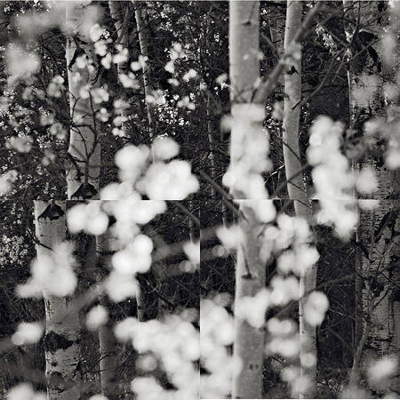
Yes I tried the gapless presentation first, as well as a wider separation. The thin dark lines are about what you might get if these were stretched canvas panels butted to gether. Regrettably, I don’t have most of the trials available, but here’s a version of a different image with no gaps.

Steve:
Thanks. Seems to me that the shifts in perception now work at a less announced level. The boundaries catch my eye in a subtle fashion.
Tree:
A very good museum indeed.
Image manipulation within the context of human perception is extremely interesting to me, the images and reference to Hockneys film about the Emporers River Journey remain incomparable for its accessability to this area of theory. The images of the trees and the bowl of plums are likewise very stimulating, I would like to be able to offer an insight into the shift of perception experienced through the pinhole camera technique; We have become so dependent upon all reproduced images being sharply focused and yet question the value of a graphic mark or a figuratively executed painting, the pinhole image is so impressionistic in its attributed softness and yet so “correct” in its rendering of verticals and horizontals, perhaps this apparent dichotomy relegates the pinhole image into an “unprofessional”, or somehow less sophisticated appearance to the point where it is used for “dream” or “mystical” photographs.
Jonathan,
It is a fascinating question how our expectations from experience and culture influence our interpretation of images. We have expectations of phtographs through their use in journalism, school textbooks, and non-fiction generally. We are expected to treat them as transparent windows on the real world, and that’s what we generally learn to do. Anything different looks “wrong.” I have never used a pinhole camera, but I’ve seen beautiful examples of its use. It’s one of several influences that have led me to experiment more with unsharpness in my own images.
This different appearance of pinhole photos is perhaps as much a plus as a minus. We may question it, but that very fact implies we are engaging with it, noticing its difference, and possibly being affected in a new way. I definitely look longer and think more about the pinhole photos of Tom Ferris (they’re not on the web, unfortunately) than I would at ordinary photographs of the same “ordinary” subject matter (e.g. barbed-wire fences).
You’re quite right, I think, in considering pinhole photography something that can jolt us out of our perceptual ruts in a similar way to what the divided views do here. Quite possibly it’s a more effective way in general. Is that the appeal of it for you?
Steve,
Initially my attraction to pinhole techniques emerged during an earlier seminar of an M.A.Fine Art Practice in London, my work was then sharply figurative and the commentary about my work from the seminar floor suggested that my persuit would be satified by photography rather than eye to hand mark-making techniques (drawing).
I wrote the comment off but an exhibition of the work of Barbra Ess curated by Susan Hillier at Camden Arts Centre, Arkwright Rd at that time (2000) influenced my opinions.
My first Pinholes were cameras that convert easily from glass lens instruments into film holders with a very narrow aperture fitted, once I had overcome the technicalities I was able to see how Bill Brandt possibly concieved his landscape, or at least, how I read his work on landscape. Ansel Adams f64 group, by using a larger format camera perfecting the gaze into detail, or perhaps a more contemplative view.
As an introduction to the visual approach of some photographers, understanding this technique is very useful, and not in a didactic way…Perhaps Instructive would be a better word choice,
The aspect I most appreciate is less of a visually aesthetic attribute more of a visceral element : the ritual,or process during the slow exposure time one imagines the receptive emulsion or pixels pick up incidental aberations and express another layer of something, that of time passing. It is only the smaller formats that give a very soft edge and vibrant colour but even these images present a sublety worth exploring.