The dunes have a fall towards the Great Lake that is difficult to capture in its full steepness.
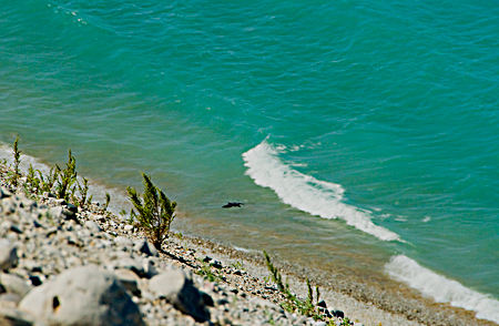
Below a raven and crashing wave:
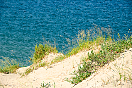
A few feet away from the edge:
Less than a 45 degree angle:
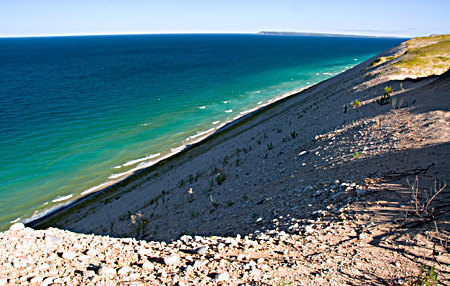
Study of perspective and color.
a multi-disciplinary dialog
Posted by Birgit Zipser on August 24th, 2007
The dunes have a fall towards the Great Lake that is difficult to capture in its full steepness.
Below a raven and crashing wave:

A few feet away from the edge:

Less than a 45 degree angle:

Study of perspective and color.
Filed in landscape,photography

The blue-green waters in the first picture is heavenly.
The 45 degree angle picture is a bit disorienting as the water seems to jump up to you right at the end of the dunes – no gradualness – but that is what you get with that angle – I guess.
Very strong contrasts in the third picture. Did you tweak the contrast in that?
Had it not been for the green grass, it could as well have been methane seas on Titan.
Sunil,
The glare in picture 3 is real. The gravel on top of the dune was very brightly illuminated while the west side was still in deep shadow during the early morning hour.
I process the raw digital images in AP using curves and hue/saturation. I then sharpen high-resolution pictures with ‘smart sharpen’, but for the web, I sharpen more heavily with ‘unsharp mask’. I may have sharpened this web image a little too much.
Looking with my eyes, I also see a curvature on the horizon.
The combination of slopes is indeed disorienting.
When I photograph sun reflecting from the water (not shown here), I often think of what you said on June 15th
Sunil:
Your methane comment is so right. Last there we found signs spotted about warning visitors not to smoke while swimming.
Sunil,
What colors would you put on your palette to paint this sand and water?
Birgit:
Funny thing about that dune. Being unconsolidated as it is, and facing into the prevailing winds and pounded by the waves, you would think it gone by this time next year. But there it remains. But, please, no explanations! I prefer to believe that the sleeping bear keeps it in its dreams.
Birgit,
Ah, thanks for explaining the glare. But I do have to concede that the ‘unsharp mask’ PS feature used in the third picture may have been a shade too much – of course, you are the judge and this is just my amateur critique. Every once in a while, I find myself tripping up over the ‘unsharp mask’ after I excitedly take pictures of whoever streams in through the front door.
Now that you mentioned it, I did notice the curvature in the horizon… Interesting.
Today I was sitting with a friend in the NYC subways (coming in from Flatbush, Brooklyn) and I was remarking to him that I find a great variety and character in the faces stepping into the train on the Brooklyn side than on the Manhattan side. He looked at me quizzically and did not know what to say. I let it rest.
Sunil,
That is what I like about NYC when I came to live there from Germany in 1965 and now, when I come there, in my commuter marriage.
Birgit:
Another thing. In the first image, the blued shadow of the dune meets the blue of the lake mediated by the diagonal surf line. My passion for cropping is belied by the shagginess of my front lawn, but I wonder about a focus on that particular relationship in the panorama. I would suspect that you may not care for cropping as your photographs usually are inclusive of as much of the experience as the camera can take in, while cropping implies a casting away.
The strong diagonals in these compositions, together with the relative emptiness of half of the image, create an unbalanced feeling. The fall-off induces vertigo. I think the blur of near objects contributes to the effect.
Sunil:
Might not those be the same people? I have heard that “A Big Apple a day keeps the doctor away”, but by five, perhaps, Manhattan has taken its bite.
Now I see all the comments. I agree with Sunil about over-sharpening of the last.
Birgit,
Hmm… what would I use to paint this scene…
I think it is a very complex picture with a lot of blue greens, but at a first cut, I would lightly glaze cerulean blue over white gesso for the sky. The background water which seems to be a deeper blue than the foreground, and I would use cobalt blue deep. For the expanse of water lapping the shore, a cobalt turquoise blue with hints of phthalo blue and shades of permanent green deep (the crests would be flecks of titanium white). The shore would be a mixture of flesh, flake white, burnt umber and permanent green light (grass). I am not sure if I can do justice – easy to describe it here…
Jay,
I would not want to keep the doctor away – the love of my life – my wife – is a physician.
Sunil:
Excellent completion of that train of thought. But, you know, the Big Apple can get quite saucy.
Hey! No fair! You guys get to include visuals in your comments. I want to do that too.
Big Apple can get in your hair and I want to include visuals too.
I just do not know how to embed them here.
A picture is worth a …
Jay,
Do you suggest to crop the first picture like this? I checked the original for the color of the cropped wave. It is indeed darker than the ‘crashing wave’.
Steve,
I manage to insert the picture from my dummy post into my comment # 17, but it I cannot save it. Help! Perhaps, I can figure it out too.
Jay,
Join A&P.
Birgit:
You drive a hard bargain.
I didn’t receive the cropped image that you mention. But, on your site, I did mention a cropped example that I threw together but don’t know how to get to you. I could embed it in an e-mail if I had your address.
zipserb@msu.edu
Steve
Thanks for verbalizing the method for creating the feeling of vertigo:
(1) Strong diagonals
(2) Relative emptiness of half of the image
(3) Blur of near objects
Steve and Sunil,
I agree with Sunil about over-sharpening of the last.
I will try to restrain my over-sharpening passion.
Sunil,
Thanks for the advice on colors for the sand and water:
1) cerulean blue
2) cobalt blue
3) cobalt turquoise
4) phthalo blue
5) permanent green light and deep
6) titanium white
7) flake white
8) burnt umber
9) permanent green light
Karl,
Any further advice on color?
David,
I ordered the Liquitex color mixing guide that you mentioned yesterday. Do you have further advice on colors?
Having too many pigments can be counter-productive, I think. Each pigment has its own personality, it takes time to get to know it. Here is a list for landscape painting that will go a long way:
RED
burnt Siena
YELLOW
raw Siena
nickel titanium yellow
GREEN
viridian
BLUE
cobalt blue, a warm blue
ultramarine blue, a pure blue
BLACK/WHITE
zinc white + titanium white, approximately equal amounts
bone black, ivory black, vine black, whatever
Red and yellow ochres are also good, they are quite different from the Sienas, more opaque. But to begin with you don’t need all four, better to get to know a pair.
I would NOT try to make your own lead white under any circumstances whatsoever.
I was out most of yesterday, but here’s how to get pictures into comments.
1. First, the image has to live on the web. If it’s not there already, put it on any site you control (anyone can get a free blog or photo sharing space you can upload to). If you wrote the post or have a dummy post, it could be uploaded to the post. To get the URL to use to reference it, insert it into the post, then find it in the html. Don’t save the change!
2. To get the image into the comment, just include a line like the following:
3. Since images are common in spam, occasionally an image-containing post is mis-identified as spam. Let an admin know and we’ll fix it.
I’ve added a note on this to Posting Guidance (right sidebar).
I like your post. Especially the raven and the waves. I know how you feel about Ravens so nice to include it the colors are vibrant and fun. Since I’ve climbed those dunes the angles are inviting. Picture one I might think of cropping the rocks and keeping the raven and waves and the angle??
Love the colors. thanks for posting it. Sorry not to have been able to catch up and share it in person. You are an inspiration!