Steve received an e-mailed picture taken by me during a recent trip and suggested that we do a collaboration around the theme of waterfalls, and do so in the form of two posts. In the first, I hereby display some images and describe my path to them. We then discuss a reworking of one of the images by Steve. This will be followed by another post where he displays and I perform a makeover.
My Images
Ohio is the home of the gentle cataract. The peculiarities of geology and topography promote a stepwise progression of falling water. We stand in awe of any fall that we look up to. In the White Mountains of New Hampshire the water responds differently, the result of a hard geology that wears with effort. This results in smooth transitions, punctuated with boulders of various sizes.
These two environments present themselves very differently. Here one looks across the water for the most part, the included image notwithstanding, while the perspective is more vertical in the mountains.
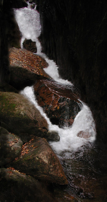
This post features images taken at Buttermilk Falls, outside of Cleveland, and the Flume in the White Mountains. The Flume is essentially a slot canyon formed by the selective erosion of a basalt dike. Water falls vigorously through a steep succession of boulders and slopes.
A word about my approach: the camera captures a multiplicity of detail that the eye would tend to weed out on the spot. Photo Shop is a quick and dry sort of dark room and it allows for a further shaping of an image away from the contingencies of the moment. I can dwell on a given shot and try to articulate more fully whatever prompted me to take it in the first place. Sometimes this process clarifies and condenses as when I am working on a portfolio image. It can also lead me away from specificity toward something more personal. Then I often find the image assuming a novel identity. At times it can seem that I am changing it to match an internal template, as though I am looking at my own mind.
Buttermilk
The photograph below is an example of this process. It was taken from a small bridge just upstream of the falls themselves, and is typical of the flattened stream beds in these parts. I was attracted to a kind of role reversal: a few feet further and the water is white and foamy as it falls over darker rock. Here the water makes it’s way in dark pools and rivulets and the rock itself reflects brightly. Furthermore, it is a welter of suggestive features and subtle details.
The first image is as taken, and the second as processed.
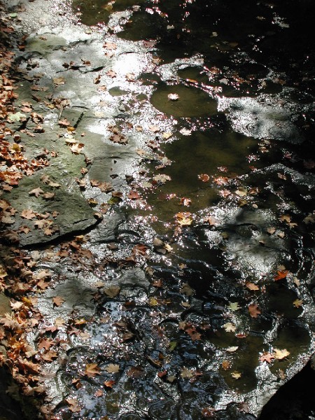
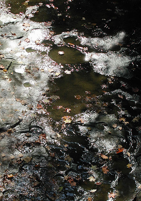
The scene did not satisfy me as taken. There was something there that needed to be shaped. I began the process by cropping the image. Then I erased small artifacts, like glints and leaves, that detracted from the overall quality. The magic wand and the stamp functions were used to isolate areas for more attention and to transfer colors and textures from one spot to another. somewhere along the line I began to sink into my work and the quality of mind matching appeared.
Flume
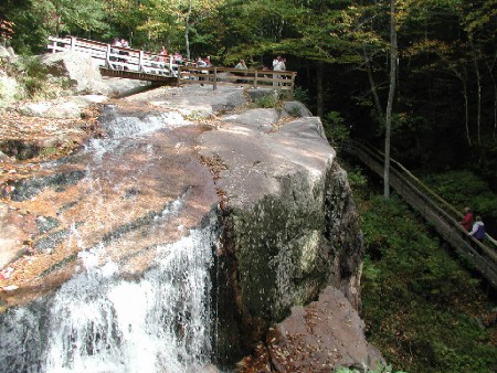
The waters of the Flume fan out over a ledge before assuming a quieter course down hill. The view had a lovely kind of breadth to it, but consisted of a patchwork of more and less interesting areas. I essentially transfered some of the better areas elsewhere in the image, creating what was for me a kind of dream scape effect: the view overall has a logical progression to it, but one which dissolves in places. The people on the bridges are insubstantial and perhaps wondering what just happened. Overall I feel a Westernized Orientalism in this piece.
The first image is the scene as shot; the second as modified.

The next example is heavily modified. I spent time moving water highlights around, darkening walls, removing leaves and generally trying to simplify. I feel that it might be wearing too much lipstick.
The Discussion
Steve’s thoughts
One thing Jay and I seem to have in common is an approach that involves continuing to learn from the image as we work with it. I found the “mental self-portrait” he uncovered fascinating. It’s a great example of what some might see as mere inanimate landscape coming to express something quite deep and personal.
One of Jay’s photographs that especially appealed to me was one of the Flume. Here is how I first saw it:

This image is probably most meaningful to Jay as shown here, not only an appealing picture but one recalling a place he enjoyed. But the memory aspect has little impact on me, since I’ve never been there, and in fact I am little interested in memory aids even of places I have been. But it did appeal to me very much in a more “abstract” sense, and I really wanted to see it in black and white, which often has the effect of decreasing the specificity and opening the door to further associations.
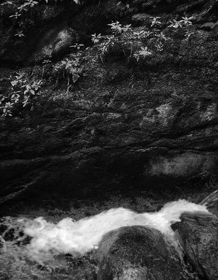
I like the result for its play of tones, especially on the wet boulders (note that because of the high contrast, these depend quite sensitively on your monitor settings). I like the top half and the bottom half separately, which set me to musing on the juxtaposition of low (earthly) rough turbulence and high (spiritual?) delicate stasis, separated by intervening darkness. The plants and ground cover in the upper half are reminiscent of brighter stars against the Milky Way.
Jay Replies
There’s an economy of coloration in the Flume. It’s as though every hue is hard won. I decided to accept what was presented, color and form. With the exception of some gardening in the upper portion and coiffing the rapid, I left the image pretty much alone. Steve’s version compresses the scene into a gray scale. At first his version bothered me until I re-read his explanation. While it is far more than a memento, the image for me has little symbolic value. Steve altered it to achieve a new synthesis to match his response. The water below and the string of foliage above are indeed in an evocative relationship. I would like to see Steve darken the intervening rock face to make it more of a void and give the foliage a more spectral and star-like quality. Also I think that the image would need to be re-shot on location in a larger format so as to allow for a much bigger print to be made. And the image seems to demand a sharper focus than I was able to achieve with my elderly Olympus.
We have been discussing appropriation on A&P, both in a practical and ethical sense. I accept appropriation in its many forms as being part of the overall compilation that we are here on Earth to perform. But this exercise did not go that smoothly for me. Everything in this collaboration was done with mutual consent, yet some instinct inside of me was growling at the intruder, come to snatch a child away. I believe that one best confronts an emotion like that. An effective therapy might be to have people modify my stuff in abundance, until my mental adhesions are Rolfed away.
Steve’s new versions
Since it is Jay’s image, I can’t do less than see what his suggestion looks like. Below, I’ve made adjustments that are not too dramatic — I’m not straying too far from naturalism — but have the effect of implying greater separation of lower and upper spheres.

That concept could be carried even further by separating the two halves while keeping them juxtaposed, along the lines discussed in a previous post.
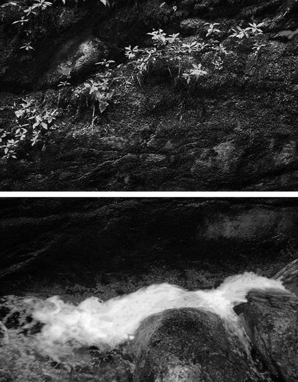

Of all the pictures shown, I prefer the color version of the flume. Of course it is the always-pleasing green/red complementary color arrangement, but I feel that the lushness of the moss is truly lost in black and white, where then it becomes a mottled/pebbly texture too much like the pebbly look of the rocks in the foreground. The B & W moves toward the funereal, with the water becoming a dead body, or an Edward Gorey fainting damsel. The color version seems like a secret place; the B & W like a foreboding one. There’s a ton more to say here about other issues of the post but I’ll let others jump in.
The “issues of the post” indeed, Martha — they are myriad and fascinating.
Jay, your Photoshopping of the first photo looks so much like you that I would have called it a Jay without knowing who did it. I’m not fond of it, but I recognize the artist whose mind was working on the image.
Oddly enough, my favorite of the flume is precisely the opposite of Martha’s — the color seems a bit sentimental. The final one/two where Steve separates but makes a whole of the two parts pleases me most. Don’t ask me why.
Finally, I’m exceedingly fond of the Photoshopped composite of the ledge. The very muddling of realism, while maintaining a photographic form, delights me. I like the confounding of expectations, the impossibiility of the scene, which nevertheless looks like it’s almost possible.
June:
Just did that business again where I generate three paragraphs of crafted response, only to discover that I hadn’t logged in.
Three sentences instead:
The ledge image is a step forward for me in that I think I may have done the proper things with it – “proper” in this case being highly subjective.
would you care to elaborate on why the first image is so me?
OK that’s two sentences. But no. it’s three.
Martha:
Looks like the flume image is creating a “more taste – less filling” debate.
Might be that the “memento” comment of Steves applies. The color version acts on my memory and brings forth a number of associations that make up a corner of my being. Put on a fake beard and my alter ego, whose concept of nature is all mosquitos and things that go bump in the night, much prefers the gray scale version for its sense of remove. This alter ego is not to be confused with Steve, who sleeps on the ground, or June, who I have seen covered in mud in some cave ( just to clarify that it wasn’t wrasslin’ mud).
Picture 2 is a metallic version of picture 1. Is there a verb for this AP process? Metallicated? Metallurged?
Picture 4 is fun. Am I invited to walk on a salmon fillet or in an Escher-like structure?
I agree with Martha about picture 6 and 7. Picture 7 looks funereal to me. Picture 6 reminds me of our East Coast and Japan. The foliage clinging to rock gives a sense of peace that is in contrast to the rapids below.
Birgit and Tolla:
How about metalphysical?
I am diabetic. Image #4 reminds me of how things come across when I am having one of my rare hypoglycemic attacks. Everything becomes spatially and temporally disconnected from each other. Still fun.
Martha,
Your funereal reading is very perceptive, with a lot in the image to support it. Aside from the very important heavy blackness, the plants above could be taken as flowers over the Gorey dead body. This is not something I was at all trying for — in fact, I have positive associations with black — but it’s certainly there. Looking back at Jay’s color version, I sense similar possibilities there, though the color works against it, as you say. Whether I would have responded this way to the actual scene, I can’t say.
June: Re: the color seeming sentimental. I could agree with you on that; I was thinking it reminded me of Rothko horizontal bands of color, and I guess to like it because it reminds me of a 1950 painter is indeed sentimental of me.
Other thoughts re: #2 and #5:
#2 has been zoomed to stress the brown puddle which starts then seeming figural. Its one eye made me think of Odilon Redon’s cyclops, and then in picture #5, due to the dark background and small white “figure” at the top I started to think of Redon’s Saturn Eating his Children. Again, I’m sure these associations spring out of my personal background and are not universal, but I think there is a vague something there that many might agree is in the Symbolist family.
At any rate It’s been fun debating–thanks for letting me put my two cents in.
Martha:
Odd you should say that as #5 is of a feature called Saturn Falls.
If only that were true. Actually Goya wasn’t on my mind especially when working on that one. I was intent on simplifying the image down to some irreducible level. But a spectral quality began to appear, almost as though the spirit of the waters was rising in phosphorescence.
Oops right you are it was Goya not Redon. I think it’s also “devouring” his children. So strange that that was the name of the falls. The other spectral part, for me, was that the white water looked like a hand surrounding the rock, like a spectral King Kong…
Martha:
Odd you should say that as a plaque identified the rock in question as “King Kong Boulder”.
Just kidding. The Flume folks wisely refrain from naming features.
Jay,
Next you’re going to tell me that feature #6 was not named “Milky Way over dead ghost” canyon.
Steve:
Odd you should say that.
I believe that you can take credit for Milky Way Over Dead Ghost. However, I can attest that Bullets Over Broadway is a very funny movie and that Mars Bars look more like the posted image than do Milky Ways. Mars Bars are also unbearably sweet, which may account for some of the comments.
viagra for order lamisil viagra…
news…