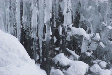
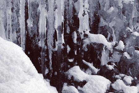
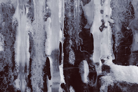
Posts from Sunil and from Jay have described their use of Photoshop manipulations. So I thought I’d show a bit of what happens — or could happen — to one of my images when I process it. To keep it simple, I’ll discuss a single photograph taken last weekend, a close view of a portion of frozen Lost Creek Falls in Yellowstone. Above is the “straight” version, i.e. how it looks when the simplest possible treatment with “no” adjustments is applied. The lighting from the partly blue sky gives it the bluish cast. My usual conversion to black and white, with contrast and brightness adjustment (“curves”) yields the result below. By “usual” I mean usual approach; the actual adjustments are different for each image.
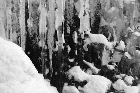
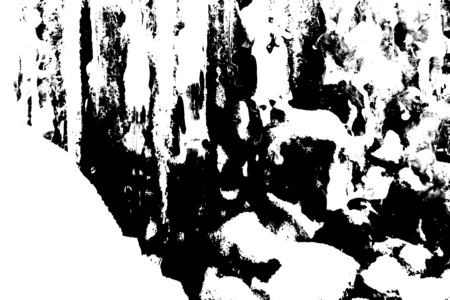
I like the above for its abstract qualities, the interaction of dark and light tones. But, at the same time, it remains quite representational, clearly a picture of ice and snow. If I were to greatly increase the contrast, I would get a much more abstract composition of black and white, with only a little gray:
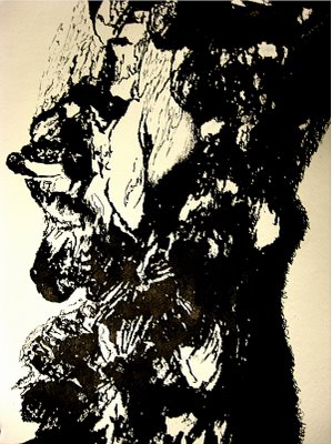
This immediately reminded me of Sunil’s recent drawing, especially if I rotate it:

On the other hand, lesser contrast gives an intermediate level of abstraction. Playing around with such versions may lead me to see an image in a new way.

But for now, I’ll go back to my usual and experiment with a bit of tinting, in this case reddish in the dark areas and bluish in the midtones. The version below is exaggerated in color saturation; I usually prefer a level of toning that you might not be aware of at all, but that would probably have an impact on your response to the image.
Traditional photographic “abstracts” are typically of quite small areas. The image above can be cropped in many ways; here’s one that emphasizes mostly the midtones and the shapes and texture of the ice.
Aside from the removal of the slight natural coloration or the slight tinting, the adjustments made are only in the choice of how dark or light to make different levels of brightness in the original scene. Nothing peculiar such as solarization (reversing part of the grayscale) was done. Of interest to me in this exercise is the possibility of controlling the level of abstraction in a simple way. This example may not have been the best, it’s simply one I was looking at very recently that seemed appropriate to experiment with. Do you have a preference for any particular version? Or ideas of other treatments that might appeal to you?

Steve:
I took the opportunity – now what do I do with the image?
Jay,
Let’s see it! There are a few notes in Posting Guidance on putting the image in a comment. The easiest for members is to create a dummy post; I call mine “Steve’s comment images.” Upload your image and insert it as if in a real post. Then get the image URL by copying it from the HTML view of your post (click HTML in the toolbar at top). This is the URL you can use to put the image anywhere, including in a comment, using the HTML img tag. Remember, the image should be at most 450 pixels wide.
If that doesn’t make sense or doesn’t work, just email it to me and I’ll insert it.
Manipulation of my emotions! I enjoy looking at the details in the blow-up with the reddish-blue tones without having to mentally shiver.
I copied Jay’s idea and messed up your image like crazy on the attached file. I don’t know anything about photography/photo editors so it was opened in three different editors (as I tried to save it in a recognizable format) and I messed around with it and I got it looking perfect/incredible/“humanly perfect form-shape” (as Laura (Riding) Jackson might say), but then I messed it up somehow. So you’re getting the fell-from-grace version.
Anyway, I don’t really know what I did with the image. Cropped it, did something with gradients, did something with midtones.
[Note: Image and text from an email from McFawn, posted with permission. -SD]
Birgit,
Yes, the idea of trying out the warm red part of the tinting was to make it less cold.
McFawn,
Thanks for sharing your variation. It’s hard to recognize the original, even knowing it. Yours seems to incorporate more line, irregular though it is. It reminds me of peeling paint on a rusted car body, another subject I always find evocative.
Steve:
My apologies, but WordPress ground to a halt and timed out in the middle of my response. Will keep trying.
Steve,
I think you are really on to something here — both in the concept of abstracts (abstracting from the original by use of various photoshop acts) and in the process by which you are refining your vision.
I find that last manipulated photos to feel like bones — maybe it was the carcasses I saw in Yellowstone, but they have that sense of fragile whiteness, with holes that evoke former ways of being.
McFawn:
Looks like we’re singing from the same hymnal – yet the results turned out so differently.
June,
Bones, what a thought! I don’t know if that would ever have occurred to me, but it has a rightness to it that really makes me appreciate the picture far more than I did so far. I think that idea will definitely be in mind as/when I work on a more final version.
This highlights the reason for my fascination with (partial) abstraction: it seems to open the door for many enriching associations.