Seems like everybody is making a book these days. Lower prices and improvements in quality have made publish-on-demand an intriguing proposition. Reviews are mixed, but I’ve reached the point where I’m interested in giving it a try. Since I tend to work in projects, there are several bodies of work that are candidates for books. I’ve decided to look first at the smallish number of images in the set I’ve called Winter Water, some of which have been placed on my not up to date web site, or discussed here and there on A&P.
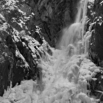
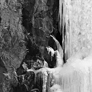
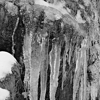
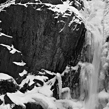
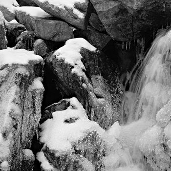
A book is necessarily presented as a linear sequence of pages, though a reader (is it still a reader if there are only photographs?) may not follow that order. Nevertheless, assuming one image per page for maximum resolution, it’s an interesting question to consider what sequence might work best. It’s akin to hanging pictures in an exhibit. As I am neither illustrating a narrative nor providing a guide to Pine Creek Falls in Paradise Valley in late November, I am not bound by the order in which the photographs were made or the physical layout of the falls. Considerations include interesting pictorial relationships, pacing, and the overall impression desired. None of these is at all well-defined, and I come up with a different order every time I sit down to it. I make no claims for the latest version shown below; in fact, I’m asking for your help.
 1
1
 2
2
 3
3
 4
4
 5
5
 6
6
 7
7
 8
8
 9
9
 10
10
 11
11
 12
12
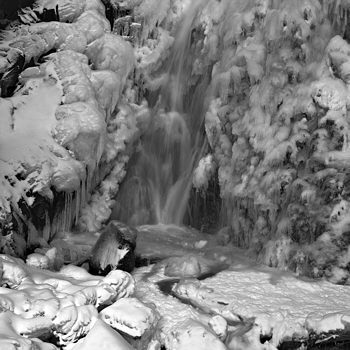
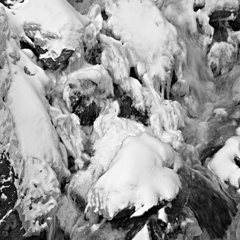
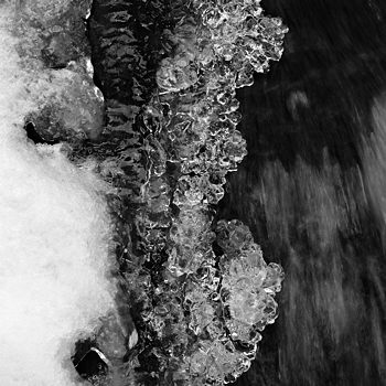
I was amused to discover, just now in preparing this post, that the first three images are nearly adjacent in location, going downward from near the top of the falls. This is not, I think, a very good idea, but it’s certainly less obvious when the layout is horizontal. Another aspect of viewing here is the ease of scrolling through the entire set in approximately two seconds. I only wish I could provide you with wine and cheese to encourage you to sip and nibble, with a palate-clearing bit of bread to take between images. Ah, well…
I am very interested in any and all comments or suggestions regarding particular images, the sequence, or the overall effect. Things that work for you and things that don’t. Especially things you notice that might be prompted by the sequence. Thanking you in advance…

Steve,
My mind wants to make a sequential narrative no matter what you do with the images. Or if not sequential, then analytic: “these are close-ups, these mid-range, these distanced.”
I find a certain charm in the apparent order as it breaks up after the first 4 or so — down and closer in — but then scrambled around. It’s fun to note that my automaton brain set up an order, only to have it destroyed.
And you are right — I do need a bit of wine and cheese between each image, to slow me down. Alas, it’s 9:45 AM and I have miles to go before the cheese.
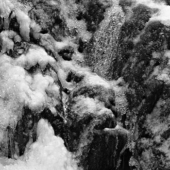
The images seem much more abstract when I start at the bottom (of your set here on the screen) and move upward. But pretty quickly I’m seeing frozen waterfalls rather than abstract shapes.
There’s a lovely iciness that runs through all the images. What is it that you want to convey to the “reader?” At times I saw the In and Out-ness, close and distance as a perception that I enjoyed, but that too broke down.
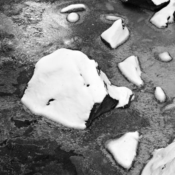
I think some kind of rhythm that could be read by a person at 9:45 AM might be helpful — set up a rhythm of materials, a way to connect connect them besides the obvious subject matter. The snow covered rocks kind of stop me — they are different from the other, more crystally pieces. Perhaps they are a centerpiece, or an end piece, or the beginning image?
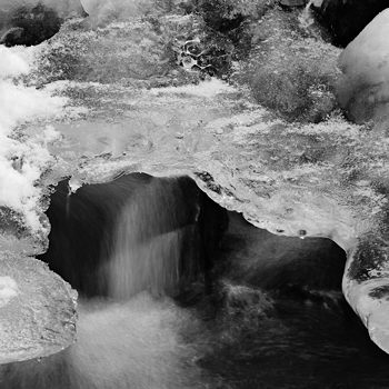
The mystery of the images with deep interiors and overhanging snow and/or ice are another grouping that could either be used as offsets for the more overall images of snow/ice (first this, then that) or grouped. I rather like first this/then that/ then this again — a kind of innie, outie rhythm, that goes back and forth from the contrasts of the movement inward back out to the overallness.
Just meandering here, while I get my morning together.
Steve:
Speaking simplistically and without any particular sense of a controlling narrative, I wonder if a greater interleaving of distance and closeup images would do something.
Also, there are images that relate to a particular place in time – these mostly the distance shots – and closeups that are largely generic in their impact. Among these are the icicles and the snowy rocks in the stream. Presented with these my thoughts go to various localities around here where such things are to be found.
Personally, I think that you have two books in the offing: the close ups as evidence of one approach and the full water fall(s) as another.
I may have just produced a truncated version of June’s points.
In my mind, your photos go from the general to the specific. Which I not only happen to like, but I need. If I start at the bottom, I have no idea what I am looking at, because it is too abstract for my brain to wrap around. But once I see the recognizable falls, or distinguishable water, my brain knows that the others are water.
So again, I think it matters what you are trying to convey. If it were MINE, I would move from general to specific every several pages. I do this in quilting often. The overall quilt gets your attention, but adding small details in the design or the stitching itself is intended to suck you in, to make you linger and have that wine and cheese.
And I hope you let us know when you do publish so that we can purchase a book.
Gayle
Thanks all for the comments, there are some great points to think about later when I have some time. If there are natural groups, should they go together or be split for variety? Spreading them out could be a way of creating a rhythm — I find musical analogies very telling here. And Gayle, I specifically did start with a larger scale picture to set the general context. Glad it works for you. In an actual book, there would also be title, a page of statement, and probably a cover image that would also help that way.
Steve:
Do I remember that you compose haiku?
Hmmm, I only did haiku for the Sourdough Trail project before. … OK, ten minute version, one for the series as a whole:
Steve,
I had fun arranging the pictures into a sequence, introductory first page, page 2 and 3 facing one another….and finally, a conclusion page.
I am sending them by email.
Birgit’s layout:
Birgit,
That’s great, you’ve used a really powerful layout option. I hadn’t considered it before because of the small number of pages, but maybe a really thin book makes sense. (I have plenty more images, but I don’t want to get repetitive or boring.)
What’s striking about your layout is that most pairs seem to almost match up across the gutter, except for the first pair, which anti-matches, i.e. dark meets light and vice versa. I like the choice of conclusion image, but I don’t think I like the first one in that position. It’s one of my favorites, but as a microcosm of the falls seen as if through a gap in this universe, I wonder if it wouldn’t work best late in the sequence, after developing the distant/close-up opposition that June and Jay pointed out.
Although meant for the book layout, your presentation is actually tending toward the two-dimensional quilt that Gayle would be at home designing.
Steve,
In pairing, I did attempt to find matches, but different sort of matches – by texture, by luminosity, by opposites (in texture, last pair).
It would be a very thin book. Perhaps, a thicker book with different chapters will ‘show up’?
For me, the introductory and concluding images make a marvelous frame:
The first image, not at all obvious, serves to entice. An alluring woman (kind of a old-fashioned image, alluring boy?) would not want to show all attractions right up front. The concluding image is the opposite, a wonderfully robust finale.
I do love the first image of yours in my sequence.
I am looking forward to your book.
I am not sure that the comparison with the quilt works. A quilt is a large image, all there for the viewer to let the eye rove and be captured by wonderful details. In a book, it is the sequence of images that propels.
My daughter’s father-in-law suggested to have a slide show, detailing the growing-up of the young couple for the evening before the wedding. At first, I designed my presentation chronologically but then Troels scrambled the sequence and it became marvelously funny and was enthusiastically received.
Birgit,
I totally agree that in a book the sequence propels; and as June said, one tends to constructs narrative willy-nilly. I just meant that on a web page your layout is like a quilt in that you can see all the images at once. Maybe I should lay them all out on a table and see how my eye roves, and evolving paths should be respected, like the architects who put sidewalks where footpaths have sprung up.
The seduction metaphor is also dead-on. The famous photographer Susan Meiselas once told a photographer presenting images for her review: “Make the series like a stripper, decide at which picture you want to reveal the concept.”
Regarding your pairings, I find your thinking and the results quite compelling, except that it doesn’t seem to work so well for the last pair. In such a case I might be able to substitute one of the images with another not shown here. (Among others, I left out the famous chocolate chip cookie, though I nearly included it in a different cropping.)
The standard book is a limiting form. I am, in fact, planning to send these to a potentially interested magazine editor as loose images that can be rearranged at will, so the viewer can play with them as you did. In the past I have also made accordion-style books where not only pairs, but the whole sequence can be unfolded.
Steve and Birgit:
There is a continuation of a flow or feature across from one panel to the other. it’s a good answer to the question. This quality registers with me when the panels are close to each other, but I wonder how it would be when they are placed on separate facing pages.
Steve,
I did miss the ‘chocolate chip cookie’.
The last pair was not supposed to harmonize but instead present a contrast of textures to ‘shake up’ the viewer.
I like your idea of and evolving paths should be respected, like the architects who put sidewalks where footpaths have sprung up.
I don’t think that
is enough of an approach. The stripper is part of a business that already did the advertising for her. Doing a book, there has to be something intriguing about the cover page or first picture to capture people’s attention before worrying about revealing the concept later on. I apologize for being argumentative today.
Steve,
I just love your work and look forward with great eagerness to your posts.
I spent a long time in publishing and worked for a company that did highly illustrated books. From this experience I suggest two things:
1. Yes — take the images out of the computer and spread them out someplace where you can look at a long sequence and shift things around as your ideas about the sequence evolves. Things look different on paper than they do on the screen. (I have my writing students do this with their texts — it’s always a great revelation to them.)
2. Bear in mind that the right hand page (the odd numbered pages, your right hand as you’re looking at the book) is considered the stronger position. This is why all the ads in magazines are on the right hand page.
As the project evolves, you also might want to think not only of how things pair across the gutter (if there are facing images) but also of the pieces in signatures — that is, in units of 16 pages. Publishing is built on signatures and subdivisions thereof (8 pages, 4 pages). That might help with the pacing and orchestration of the content.
Initially, when I was looking at these and my mind was imposing a narrative,it seemed that the images moved from frozen to fluid.
Melanie,
Thank you for the insight about the right page being stronger. Whether I’ve sensed that intuitively or not, it helps to be consciously aware when doing layout. I’m wondering, by the way, whether it would seem odd to sometimes have paired images on opposing pages, and sometimes just a single image on the right. I have seen that in some photo books. The mere fact that it’s not consistent implies that pairing or not has significance.
Your frozen/fluid has added to the plethora of binary oppositions in play here: distant/close-up, abstract/realistic, flat/in depth, coarse/fine texture, general/specific, luminous/dark… In part, the great variety within the black and white subject (and medium) is the message. But in the end I don’t want only the variety to have been the point, I want the viewer to feel that he or she has been taken on a bit of a journey. Perhaps like a docent-led museum tour that has highlighted some of the best pieces, and also hinted at the rest of the collection.
Continuing spinning my story of Steve’s waterfall pictures:
The glimpse of a waterfall shielded by a veil of ice crystals invites us to join in, first picture. Viewing the next pictures we marvel at the forces of nature: Flowing water surrounded by frozen water in its different manifestations. Finally, the concept emerges in the last pair of pictures: Water freezes in micro and macro crystalline structure: snow, amorphously hugging the underlying rock and large ice crystals asserting their own macroscopic structure. This lesson on the two different manifestations of frozen water, illustrated in a grandiose Montana waterfall pictorial, is concluded by a final picture showing a rock covered by snow and surrounded by horizontally streaming water.
The first and last pictures form a framework (1) first introducing the waterfall idea and then allowing us to separate from vertical water flow by showing, more or less, horizontally streaming water; (2)showing the two different properties of frozen water, formation of macro and micro crystalline structures.
Steve,
I received your two photos. They are inspirational in different ways. In the snow picture, in my mind’s eye, I can see wild animals running the tracks through an open mountainous landscape; in the forest picture, I enjoy the differences in lighting promising a beautiful day to come.
I am off constructing.