It’s approaching two years since I first created a web site, and I’ve decided it’s time for a makeover. With my original site, adding a new image required also creating a thumbnail version and editing a file. I was running out of space in the navigation area to list more projects. And on a new monitor I was distressed to see how garish the banner color became. So I’m re-building. I want the new design to be: 1) simple and flexible for me; 2) simple and easy to use for the viewer; and 3) responsive to browser settings such as window and text size.
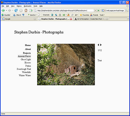
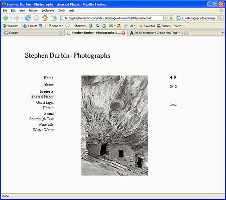
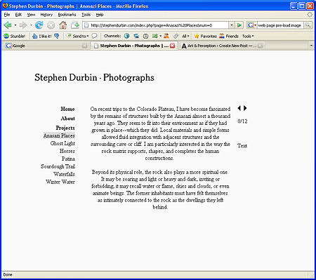
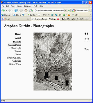
I’ll spare you the technical details, though I’m more than happy to go into anything there’s interest in. Here I’ll just illustrate a couple of features of the current version. The following screenshots show that, for a given browser window, other elements don’t move around when switching among images of different aspect ratio, or to the text associated with the given project. They also shouldn’t move when switching projects or to an image with a caption (currently only Sourdough Trail images).
The next screenshot (at the same scale as the others) shows the re-positioning that takes place when the browser window is reduced in size. I want the site to work with small windows, but be able to open up and breathe a bit when the window is larger.
I’m still working on a number of details, plus getting ready to update existing projects and add new ones on Cottonwoods and Gallatin Valley (my local landscape). Meanwhile, I’d appreciate any comments you might have on the new site. I’d like to hear about even the tiniest, niggling frustration or dislike! There are several things that I suspect might come up, but I’d prefer not to direct your attention to anything particular, and see what strikes you. In general, what features do you like in an artist’s web site? Any favorite examples?

Steve,
I admire your thoughtfulness in engaging in this work. That said, I will admit to enjoying the variety I find among websites. I have a few things that stop me (or make me back out fast) — black backgrounds, flickery ads, blinking lights. But mostly I enjoy whatever is presented and I like thinking how what is presented tells me something about the owner of the site.
I grant you I have a big screen, so the irritations that can occur with smaller screens don’t get to me. But I find it fun to compare sites with their people (like pets and their people) and maunder about with the comparisons. Now I suspect I’m going to have to do the same with yours.
Your original one was so spare that it fairly frightened me — austere, I thought, even a bit distant. But when I compared it to the Steve I got to know here, I began to see it as a way to contain an exuberance and delight that threatened to overspill boundaries (I’m thinking about your post about having too many projects).
So looking at a new version will be interesting too. I know, I was supposed to look before I wrote, but sometimes I’m just contrariwise.
June,
Yes, the variety is great in both senses of the word. One inevitably reads a site as a representation of the artist, as indeed one should (while keeping in mind that there are limitations of all sorts that also shape the designs).
If you found my site scarily spare before, I fear it’s even more so now. I wanted to eliminate almost everything but the images themselves and what is needed to view them. There is a distance in that attitude, though perhaps also some humility. There seems to be an inherent tension between holding off the viewer and wanting the choice of whether to approach to be fully theirs.
It may seem a trivial detail, but I chose the font for the main logo partly for a comfortable/friendly feel (it’s the same as before, but I did a complete review of other possibilities).
Steve,
I prefer the vertical organization that you use here. I have a similar organization in mind for my own.
Steve.
Feels tight. Suggestions:
> move your (smaller) name further up and into the corner.
> give more space between text and image.
> larger images.
Birgit,
Do you mean the vertical format as on A&P, with vertical scrolling to view images? I do think a blog format is a convenient and intuitive one to work with, in fact I’ll be helping a local artist set up a blog-based web site.
D.,
Thanks for the suggestions, I’ll do some experimenting along those lines when I have a chance later. The larger images is one I’m undecided about; I want the loading time to be as little noticeable as possible (I definitely see it on my recently-acquired DSL connection). I do pre-fetch, but possibly I should further compress the files. Also worth experimenting with. These are “92%” jpg’s.
Steve, I like the layout very much, and the way you have it reconfiguring when the window is re-sized works well. Here are a few thoughts:
1.) When you click on “text” you get text, but it’s a bit counterintuitive that you have to click on the arrows to get back to images. Better to have the word “text” switch to “images” when you’re viewing text. Best if it could take you back to the last image you were viewing, but I’m not sure how to code that.
2.) I agree w/ D that it would be good to see the images larger, but I also understand your concerns about loading speed.
The way I get around that on my site is to have an “enlarge” link w/ each image that opens the enlargement in a new pre-sized pop-up window. I also have it set up to open the enlarged view if the image itself is clicked on.
A painter friend of mine deals with that a little differently. For any given image, clicking on the image zooms into an enlarged closeup of part of the image, and clicking on it again brings you back to the original state. I understand that for photos you’d be less interested in showing a detail, but perhaps clicking on the image could take you to a full-screen enlargement (without other text and links), and clicking on it again could bring you back to the original layout.
The good thing about these approaches is that it allows viewers to see the images quickly, but gives them the option of a closer look.
3.) In the “About” section, or in a separate “bio” section, it would be good to find out more about you. For instance, the fact that you work with Artificial Intelligence is a very fascinating thing, and perhaps there are other biographical elements about you, your life and where you live that you could include. Also, a photo of you, even if distant, shadowed or out of focus, would be a great plus. People always want to know about the artist.
4.) For now, having “Projects” as a heading with individual project links below works well. As you get more projects, you may want to convert “Projects” into a rollover that reveals the (longer) view of project links when activated, and leaves them hidden when in normal mode.
Steve,
By vertical, I merely meant having the ‘Home, About, Projects etc’ organized in a vertical column next to the picture. I prefer this to your earlier, horizontal banner displaying the different options.
I like David’s suggestion to provide for the ability to zoom across the images or to enlarge the image. A picture such as Sourdough waterfalls, pic 4, is difficult to comprehend from a low-resolution image.
The text/image option is wonderful.
Brent, a young friend who is teaching me web page design, encouraged me to keep my window 600×600 pixels wide. I like that your window can be shrunk down to 628 pixels wide and still be fully usable.
What is the opinion on to what extend IPhone, Blackberry users will look at artists’ webpages? If not now, how far into the future should one plan and keep one’s pages appropriately small?
I very much like the coloration of Anasazi Places, pic 5, 7, 11.
Thanks for all the comments, I’ve adopted some already and am looking into others. I’ve made a smaller name logo and added spacing around the image (at least if window size is larger than minimum) as per D’s suggestions. I don’t want the logo to be too small as a graphical element. I’ve implemented David’s idea on the Test/Image link change, including the return to last-viewed image after reading the statement. (I did leave the forward/backword arrows when the statement is up — seem OK?)
It appears there’s strong interest in larger images. I’ve resisted partly because of the (not too big) inconvenience of preparing two web versions, and partly viewing a large image with any technique I can think of interrupts the flow of a sequence. But I’ll probably make this available in some form.
Birgit,
Thanks for the clarification. I also think the vertical navigation is a bit better, especially as I add to the number of projects. I may run out of space eventually, but not too soon. I don’t feel the need to put up all my projects by any means, just those I think will be of most potential interest. I also don’t begin to put up all the images in a project, and it’s long past time to replace some of the ones currently on view with newer and better.
For viewing on small screens like mobiles of various types, a full screen image will be essential. I guess they’re getting more capable all the time (don’t even have a cell phone myself), but I wouldn’t design an artist’s web site around those requirements yet. In any case, I’m sure there is or will be a mechanism for alternate presentation on different devices, so one would offer an alternate web page, not have to create a single one that works for all devices.
Steve,
Here is an example of categorizing vertical input further http://www.taroyamasaki.com/. I prefer the pastoral setting of your horse series over his horse documentary.
I bought my first low-tech cell phone a couple of weeks ago so that my daughter and I can talk – I am seldom at home and she prefers to talk while in transit. For other communications, I am still wedded to my lab top – skype and all.
Steve:
I wish that I had something more to say, but the site looks fine. It is simple and clear and blessedly free of gimmicks. I would assume that you may have capacity issues that restrict the number of carried images. It would be grand to see more of your stuff – especially as you are marketing.
Jay,
I’ve been making improvements over the last few days, and I’m more or less satisfied with the design for now. But I’m nowhere close to my allowed capacity on the web site; it’s my personal capacity (i.e. free time) that’s lacking. However, I did just start putting up some of the cottonwood images. It was easy!
I’m not exactly marketing seriously, but I do sell prints on request, hence the mention of prices on the web site. But speaking of marketing, I’ve read some interesting thinking about marketing for artists lately. I’ll be posting on it soon.
Steve:
Did somebody mention artificial intelligence? I myself muster whatever artifice I can to produce artifacts – but methinks something else is meant. My eyes and mind tend to bounce off of the subject for lack of requisite wit. But it seems an endeavor fully at the forefront.
You may have already written on this, but do you draw any connections between your research and art? It would seem that insights into AI might be gained from a fuller understanding of one’s own behavior.
Jay,
That’s a good question, and one I’ve gotten before. You’ve prompted me to finally get around to responding.