
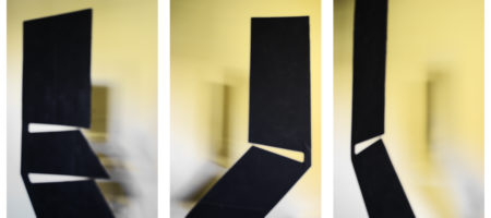
Jerry Rankin is a Montana artist who seems able to come up with completely new ideas in every project he undertakes. Only a few of these from his career are available on his web site. Recently he created two sculptures, variants of a theme, that have no precedent in anything he’s done before. Of thin, flat, black steel, they are very simple in design, being straight-edged boomerang-like shapes with one or two slots, respectively, cut into them. Yet they are intriguingly rich in perceptual surprises. I had the opportunity to borrow the cardboard maquettes, thinking I might try to illustrate these effects. Instead, I discovered an unforeseen aspect of how these objects relate to their surroundings.
I mounted one of the maquettes in my study, and took down the pictures from the wall behind to remove distractions. I set about trying to capture what happens when you look edge-on at the piece, seeing both sides at once, one with each eye (and only with that eye). Each side is a horizontally flipped version of the other, so the brain can’t fuse the two images into a consistent representation.
I never succeeded in that effort, but I soon became aware of the captivating shadows cast on the wall. The window opposite was actually a rather complex light source, due to the distribution of bright and dark areas outside. I also had a tungsten lamp in the room which cast a warmer light on the sculpture and on the warm-colored walls. The result was a shadow with multiple overlapping penumbras whose darkness and color depended on the various angles and the distance of the maquette from the wall. Fascinated, I played with a number of arrangements, as you can see below. Note that in these images I have exaggerated the color variation, though it was already quite distinct to the eye. I should add that my impression of the colors seen on two different computers varies significantly, so I’m not sure how it will appear to you. Ideally, the warm color is more that of a lemon than a peach.
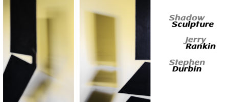
As you can guess from the title page in the set above, I went so far as to mock up a bi-fold card, which has the two triptychs printed back-to-back. If you have strong powers of spatial imagination, perhaps you can visualize that after opening the front title page, you see (on the left) the left image of the upper panel facing (on the right) the left image of the bottom panel. Other images appear as the second fold is opened.
A great strength of these sculptures seems to be in their stark, hard-edged minimalism, so I felt a bit odd with my softening, complicating, and adding color. But I really enjoyed the lively interaction of sculpture and shadow, which brings out some of their quirkiness. Though in several ways similar to a more monumental, severe, elegant, and conceptual Ellsworth Kelly I saw a few weeks ago in Minneapolis, they possess a friendlier personality, and, perhaps, a more engaging depth. I’d definitely choose the Rankin over the Kelly for my garden, if both were to be had at appropriate size.

Ellsworth Kelly: Double Curve, 1988
My questions are about the status of the photographs in relation to the sculpture itself. Whether or not of interest in its own right, is such a study useful in appreciating the sculpture? Are the photographs distracting from the subject? As audience, would you rather experience the sculpture directly before viewing any such photographic interpretations? As the sculptor, would you prefer, for publicity purposes, a simpler, more direct image?

Steve:
Verry interesting…
I tend to see faces in the laundry basket – thus illustrating where I’m coming from. But, instead of a stark minimalism in Mr. Rankin’s work, I’m seeing some Muppet-like first responders – might be laptop computers with mouths where hinges usually are – agape at their shadows. The one in the middle especially seems threatened. Such timidity! Afraid of one’s own shadow indeed! The human face of minimalism.
Jay,
I shouldn’t be surprised, after all the faces seen in rocks, cars, etc. But somehow, the thought never quite reached consciousness with me. Even the hinge interpretation–quite strong even though the actual sculpture is flat, in a single plane–was not evident to me at first glance. I suspect it’s because I’ve been working to do the opposite for photography, i.e. see the 2-D shapes that will lie in the print plane, derived from the 3-D subject before me.
Steve;
I think the images operate primarily as abstract photographs; there is not much info about the sculptures….I don’t have a sense of their 3D form, or the material or scale.
The color in the photographs is dominated by the strong contrast in value, white to black, and the color change from the light sources is minimal, a bit of slightly cool light in a few places, against the overall warm yellow. The shadows seem almost gray.
To emphasize shifts in color from different light sources we need to see color passing from one light condition to another…like a white wall, or anything, passing from a warm to a cool light, or from a red to a green light…etc. Here’s an example, a Vermeer, where the white wall in the background passes from warm to cool….subtley but with a powerful effect in creating a sense of space and presence.
http://www.essentialvermeer.com/catalogue/young_woman_with_a_water_pitcher.jpg
An interesting notion is that of ambient light. This is to suggest that there is a general overall level of light in a space, and lights of different colors are introduced. In 3D modeling software you can specify the color of ‘ambient’ light, which then makes strong color contrasts with individual lights of a different color. To wit…if the ambient light is blue, and a strong yellow spot light is played on a red object, the lit area will have an orange cast, while the shadows, lit by blue light, will have a violet cast.
In a sunlit landscape the shadows are ‘lit’ by the light of the sky….blue….note the strong blue shadows of the impressionists.
Also…contrasts of color are enhanced and made emphatic by minimalizing the contrast of value. Again..look at the impressionist to see overall contrasts of light and dark are so much less than in earlier painting.
Bruce,
Yes, it was definitely my intention to make abstractions playing off the sculptures, rather than illustrate them. That’s part of the reason for the defocus: without detail, it’s not clear there’s even a wall. I can almost imagine it’s just objectless light, or something aura projected from the black “monolith.”
Steve:
Just wondering what Mr. Rankin’s take is on this…
He likes them quite well, as did the gallerist for his upcoming show, but I don’t know how he would answer my questions. For that matter, I don’t know how anybody else would answer my questions…
Steve:
I’m inclined to answer with “just depends”, but that’s hardly helpful. Sculptural photography can be problematic. One variable can be thought of as dimensionality, with an extreme being a homogeneous sphere and the other a virtual plane. The sphere presents robust opportunities while the “plane” – understood as having at least some thickness – presents the kind of issues with which you are dealing. And of course there can be fronts and backs, etc.
Speaking of gallerists (I just love that term.), committing one’s work to a given space and sensibility is usually inevitable, and the dealer will want to present things so as to maximize the sales potential.