Well, it’s very difficult to post today. I’ve been too busy drawing to write very much; furthermore, I can certainly not manage handling any comments. I’ve hardly had time to comment on anyone else’s post for the past 48 hours. For example, Leslie wrote an excellent post on artistic changes of opinion, and I’d love to chat on that most interesting topic, but it’s no use. When it comes to a choice between the talking, whether on the internet or in person, or art, the talk goes.
Archives for January, 2007
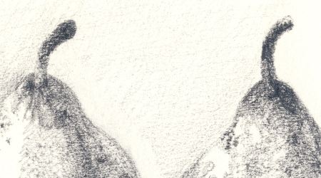
three pears
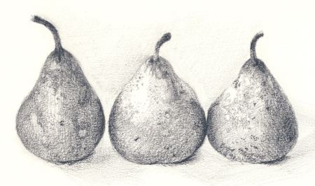
I decided to start drawing again on a serious basis and I today I wanted to try to capture the texture of these pears. I wanted to see if I could make come out in the drawing the complicated texture these pears have. I think got some of the feeling of these slightly shrunken and beaten up pears. The challenge is to capture that without paint. I wanted to see if something that I could paint I could also do it in pencil.
Art about art and doing a 180
I used to hate artists who refer to art historical images, whether through appropriation or more subtle reference. It struck me as elitist and dull. Why don’t they make their own images? And aren’t they attracting a really limited audience? But now I myself have started a new series with the aforementioned dreaded art historical references, and I am fascinated with other artists who do it.
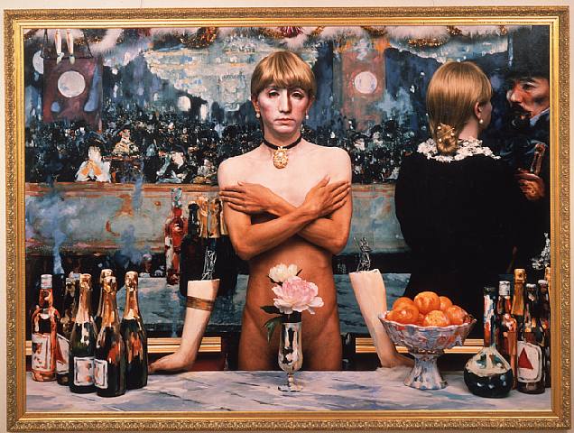
Yasumasa Morimura is a Japanese artist who recreates scenes from famous paintings and inserts himself in the “protagonist” position. His end products are photos in which he pretty faithfully reproduced the painting, but with himself in it, often as a woman.
Learning How to Resolve a Painting
For some of us, resolving a painting is more difficult then it should be. Once started, I am not able to see what I am doing with a clean mind. There are elements that I fall in love with a try to work around them, but never seem to get the entire painting to work. Recently I discovered that a painting that was testing my identity as an artist (another way saying, gave me great doubts about my ability) only needed for my scrape out the one thing that I thought was working for me, in order for the the rest of the painting to come alive.
Occasionally or almost always, the paintings become overworked. Knowing when to stop is a good thing. I have tried all of the little tricks you can use to play with your mind, like hiding the painting in a closet for a week, the black mirror, turning it upside down etc. Anybody have any other ideas?
Back to the Garden
From my latest review:
Taking a look around “Garden: Delights and Detritus” – a show of artist’s books, drawings and mixed-media prints by Ithaca College professor Susan Weisand – one is immediately struck by their visual eclecticism. Weisand’s work uses a wide spectrum of techniques and materials, typically combining several to create a single image. Similarly, she arranges, layers and re-uses different motifs and styles in a collage-like manner, giving her seemingly timeless natural subjects a distinctly contemporary feel.
More here.
I would appreciate any feedback on my artwriting.
Stylistic diversity
 On the last day of 2006 I made several pictures of grasses in the snow. They were in a field near the woods I’ve been frequenting for my series of Sourdough Trail photographs. Although that series is concerned with complexity, at least in part, the grasses were classic studies in simplicity.
I feel that I am as much drawn to minimal subjects as complex ones — certainly when it comes to photographs I would like to own — but few of my own images are minimalist ones. Is it possible to encompass both complex and simple images within a single, coherent style? Or do they represent ways of looking at the world that are too different? If you saw both kinds of images in the same show, would you sense that the artist did not have a “mature vision”? Do you work in different “styles” at the same time?
