Posted by Steve Durbin on May 27th, 2007
I recently received an email from Jay Hoffman, which I may as well quote here.
Question: is there a category on A&P for the kind of comments that might be sparked by a topic, but which may have a broader informational potential? While scanning through posts and comments I remember coming across a question about preservation. It was only later that I recalled a local institution, The Intermuseum Conservation Association 216-658-8700, that deals with such issues and will discuss over the phone. By then I had forgotten within which post this matter belonged, and didn’t want to throw it out there wily nilly.
This brings up a point which has come up from time to time, but hasn’t been effectively addressed yet: how do we make the accumulating pool of useful stuff on A&P available without requiring that people wade through the ocean of, let’s say, less useful stuff. Not that I’m blaming anyone; in fact, the latest failure is mine (find it if you can). But Jay’s message sparked an idea that might be successful, mainly because it doesn’t depend on me or any other editor. Here it is:
more… »
Posted by Steve Durbin on May 27th, 2007
This is a resource post. Please add comments describing any useful information about conservation materials or techniques. Links to other online resources are welcome, especially if you say a word or two about what is available at that resource. Links can also be to Art and Perception posts with relevant information. If the information is in a comment rather than the main post, please link to the comment, which can be done by copying the link under the comment date (or the name of the commenter from the sidebar comment section).
Posted by Steve Durbin on May 27th, 2007
This is a resource post. Please add comments describing any useful information about any art-related books you have enjoyed or found useful. Links to other online book resources are welcome, especially if you say a word or two about what is available at that resource. Links can also be to Art and Perception posts with relevant information. If the information is in a comment rather than the main post, please link to the comment, which can be done by copying the link under the comment date (or the name of the commenter from the sidebar comment section).
Posted by Steve Durbin on May 22nd, 2007
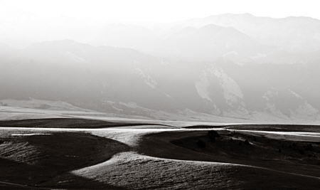
Funny how things come together sometimes. After casting about for a while, rejecting various topic possibilities, I finally settled on one I’d had in mind for some time, although I hadn’t prepared images or written anything. After typing the title and while I was uploading images, I noticed Doug had just posted on influence. In part, this post is about what I can do here in Montana that is as much as possible like those fabulous images of California dunes (Oceano, Death Valley) by the Westons and many others (see examples here and here). I’m not exactly striving to copy, but I am deliberately letting that influence wash over me and through me. I love the forms of those high contrast black and white images, both the three-dimensional dune forms and the two-dimensional shapes in the plane. I look at those images often.
But there is another goal with my series, although I had not quite formulated it sharply until Birgit’s recent post. In addition to the dune-like undulating fields in the foreground, most of these images have the Bridger mountains in the background. But the mountains are serving not so much as subject as to bring out the light-filled air of early morning.
more… »
Posted by Steve Durbin on May 16th, 2007
I can’t remember how I heard of it, but I recently picked up a book by the British artist and writer David Batchelor called Chromophobia, published in 2000. Batchelor’s thesis is that color is “the object of extreme prejudice in Western culture” and that this has gone unnoticed. I was curious about this because, though I have had my flings with color, I choose to present my photographs mainly in black and white.
Here’s more:
Chromophobia manifests itself in the many and varied attempts to purge colour from culture, to devalue colour, to diminish its significance, to deny its complexity. More specifically: this purging of colour is usually accomplished in one of two ways. In the first, colour is made out to be the property of some “foreign” body — usually the feminine, the oriental, the primitive, the infantile, the vulgar, the queer or the pathological. In the second, colour is relegated to the realm of the superficial, the supplementary, the inessential or the cosmetic. In one, colour is regarded as alien and therefore dangerous; in the other, it is perceived merely as a secondary quality of experience, and thus unworthy of serious consideration.
more… »
Posted by Steve Durbin on May 15th, 2007
It’s that hair-pulling but hopefully insightful time when I have to write an Artist’s Statement. I’ve done this before for particular projects or shows, but this is the first time I’ve tried to write a general statement about myself as an artist. The purpose is to provide information to interested visitors at the gallery I’ve recently joined. So my audience is the general public, or at least that part which would visit an art gallery. I feel that’s quite a different audience from other artists (like you all), in turn different from a narrower group, such as photographers working in black and white.
I take the statement very seriously as a way not only to communicate, but for me to consider what is really important, perhaps defining, about my artistic endeavor. The tone of it is critical. I don’t want to be too “artsy” or intellectual, nor do I want to condescend. I want it to be straightforward, but at the same time I want it to entice and suggest rather than answer all questions. It needs to have a personal voice, to sound like something I would say, and ideally not like something anyone else would say. This is what I’ve got so far:
more… »
Posted by Steve Durbin on May 8th, 2007
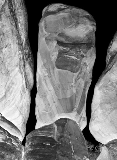
On my way to Anasazi country recently, I stopped at Arches National Park, where I stayed the night. Next morning before dawn, I was off to an area known as the Devil’s Garden, which I had never visited. It turned out to be one of the weirdest landscapes I’ve ever seen: a few trees and other plants sprinkled among mostly bare reddish sandstone, eroded into bizarre shapes determined partly by crack systems. Although the day before I had ignored the more famous features, I immediately got to work making pictures. Almost as quickly, the metaphor of bones came to me. These rocks were like internal structural elements somehow made visible at the surface. I knew the series would have to be titled Bones of the Earth.
more… »