What led to this post was a quick read of Jay’s comment the other day on the differing perceptions between an actual painting and the computer screen version of the image. A revelation occurred when I had a showing of my paintings at an arts fair recently: A lot of people responded very positively to the works upon physically looking at the works (these were the same people who had already seen it on the computer screens before and had not thought too much about it). They said that their feelings towards the subject/painting changed when they looked at the painting life-size. more… »
Posts by Sunil Gangadharan
Is Craft Art?
Recently, I had a good showing at an arts and crafts festival near my house and I blogged a bit about the show here. What caught my interest peripherally during the show and more as I think about it now was the prevalence of crafts into shows like these and the dilution of the power inherent in the crafts by the artisans that create these crafts by purposely subverting their wares to dress them up like art. Let me explain. Close to my assigned booth, I met this charming lady (she is actually trained as a silversmith) who made jewelry. Her booth was crammed with styrofoam busts of women wearing custom designed jewelry and the whole setup looked really nice and beautiful from far. During short breaks from the steady stream of visitors, I would go by her booth and marvel at the designs that she created in silver and grimace at some designs that she created out of glass/silver. The silver creations were exquisite, the design fetching and the pieces very compelling to look at and buy (in fact I even asked my wife to look at a piece but she later chided me on the price). The jewelry made of painted glass beads on silver strands with the glass over painted with strange designs seemed lower in quality compared to her silver works. On asking her the price of the painted bead based jewelry, she explained that she was slowly branching out into ‘art’ and the prices for these were almost double the prices compared to equivalent silver pieces. I remember walking out of the booth with a strange feeling in my head.
Firstly, the painted glass pieces with a bit of silver strands were not good as the hand made silver pieces (from a purely aesthetic perspective) but they commanded extra prices because they were considered ‘art’.
Secondly, it looked like glass was being used for a purpose for which it is not inherently suitable – glass is great when blown or stained, but when it is hand painted and added along with other beads to make tacky jewelry, it loses the freshness inherent to glass and it makes for bad craft.
It almost seemed like the market forces that congregate around ‘art’ is pushing people to create work that is substandard and at the same time giving them less time to be more creative at what they are trained and good at… At the end of the day, I also understood that she sold much more silver pieces than the ‘art’ pieces.
 Sterling silver jewelry
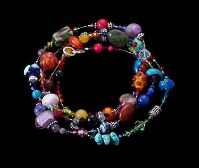 Necklace of glass beads
I was wondering why does she want to dress up her exquisite works under the word ‘art’ when her ‘craft’ can speak for itself (and very eloquently)? Why are craftspeople not proud to say that their work is ‘craft’ and keep trying to pay obeisance to art and try selling their works labeled as art? Is there a perception that when works are referred to as ‘art’, they are automatically elevated to another plane all by itself? Shouldn’t craft be on an equal plane? Is the word ‘art’ and by extension ‘artist’ over-hyped?
As I try and understand photography…
The one thing that has always struck me about photography is the fact that a good picture combines both the skill of the photographer and some amount of luck that the photographer has no control over.
The picture below will illustrate my point – in the first picture (taken seconds apart in the vicinity of the destroyed World Trade Center on Sept 27th), the woman is the strong one, the man grieves – in the second the man is strong – the woman grieves. The photographer did not do much other than just chance on these people watching a tragic event. (the artist was there at the right place at the right time – again luck – and got the right pictures).
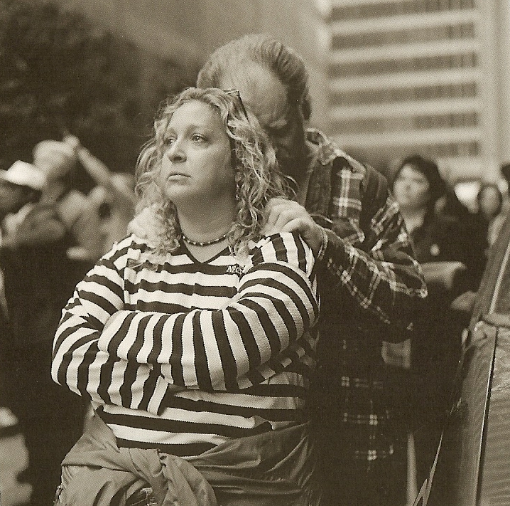
Photo courtesy: Kevin Bubriski
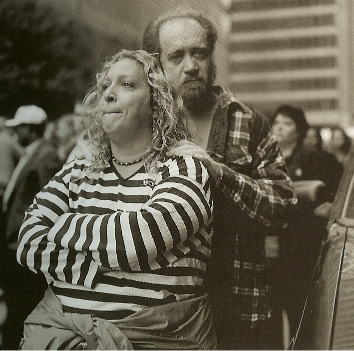
Don’t get me wrong, I love photographs – I look at photography books for hours on end savoring these moments frozen in time by the power of film. Among others, I love Steve Durbin’s work – but behind it all I have a feeling that great photographs is a combination of the skill of the artist and some element of luck. In some ways, I consider abstract expressionist painters the same way – as long as they get some of the accidental splotches of color to line up right and give the picture a unified whole feeling, it looks good; and luck owes a part to getting that accidental splotch of color in the right place on the canvas as was the skill of the painter…
What are your thoughts?
Thoughts on a gallery visit.
Every once in a while an artist comes along, pokes fun at our prevailing world order and gets away with it – even managing to sell the works exhibited – using satire as a scathing tool. In William Powhida’s work, he satirizes the ephemeral nature of the art world in an exhibition underway at Schroeder Romero in Chelsea. I had some time yesterday afternoon and decided to go by to Schroeder Romero to take a look at the commotion and I was not at all disappointed. William Powhida combines elements of painting (graphite and gouache is his medium of choice) and merges MAD comic style satirical musings on the art world in a tight graffiti format that really makes you think. I was reminded of Banksy‘s writings when I came across his paintings (if you want to call them ‘paintings’). Of course I was also reminded of those list formatted chain emails which manage to look at life in terms of ordered lists…
A drawing that caught my eye was the one where he laid out a set of rules for the artworld… Some of the ‘rules’ are reproduced below… (the punctuation/grammar has not been changed to reflect Williams’ work)
-
If you want to SELL this shit make it just like someone else whose ALREADY sold out Why?! A. Your dealer has a famous artist to compare you to B. It validates said sellout’s career. Collectors love that!
-
Ten years or ten minutes of work can sell for a million
-
Anything can be ‘editioned’. Repetition is your friend
-
Don’t make your ‘pitch’ at the gallery (or BOOTH). Follow the dealers to the BAR. You might get a show and a FUCK.
-
Once you do sellout make the same thing until the market collapses. Think ‘reiteration’ and ‘variation’. THAT HELPS!
-
Serious artists trying to make ‘art’ should be prepared to labor in OBSCURITY for twenty years
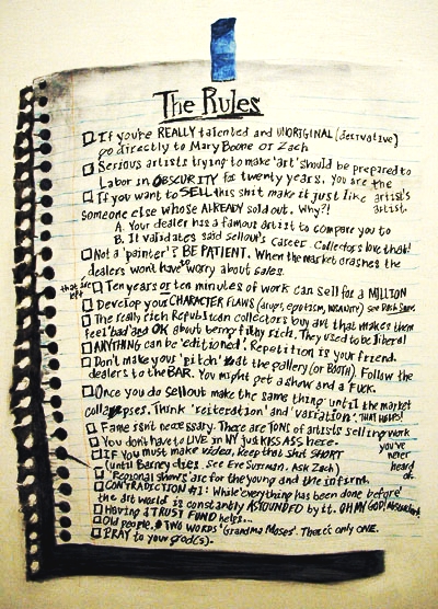
William Powhida The Rules 2007 graphite and gouache on panel 24″ x 18″
Another highlight of the show was an imaginary rendition of the future cover (2010) of the New York magazine (and ‘drawings’ of the complete article) that chronicles William’s eventual rise to stardom in 2010.
William Powhida The Bastard 2007 graphite and gouache on panel 44″ x 54″
His artist’s statement contains a playful but keen taunt to the publicity and glam that surround the artworld:
“my one man SOLO show, opens May 11th at Schroeder Romero. Those bitches hos HOOKERS, excuse me, are ecstatic to present my new work, which is destined to confirm my GENIUS and secure my reputation as the greatest artist ever. Now, I know that sounds a little presumptuous on my part, after all I haven’t been reviewed in The Times or sold anything to Saatchi, but it is true, I promise.” Read more here.
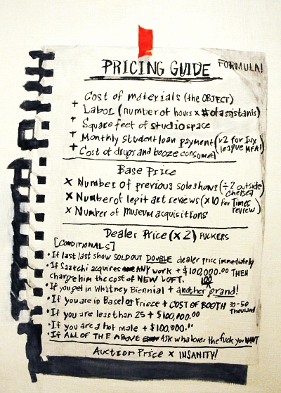
William Powhida Pricing Guide 2007 graphite and gouache on panel 14″ x 11″
By laying bare elements of the art world in such an unsettling manner to the viewer and having the courage to exhibit this is very brave – both on the part of the artist as well as the gallery. Most of the works were sold out – very well for an artist who is only in his 20’s.
On reflection, our world sure is a funny one. His art (which are in the thousands of dollars) and the perception it generates is interesting to think about – the former (his art) is nothing much to speak about, just a bit of carefully laid out graffiti on masonite. The perception it generates is affirmation of the fact that the artworld is indeed topsy-turvy with some of the ‘rules’ being brutally true whilst the fact that the works having been sold out also means that buyers do not really care the situation the artist was trying to satirize. Interesting indeed.
Gallery representations and your thoughts
It was with much elation that I read an email sent out by a fairly prominent gallery (which will remain unnamed in this post) in Chelsea, NY last week announcing that they were happy to represent my work. I had entered an art competition sometime back hosted by the same gallery and I guess I must have caught someone’s eye to be ‘noticed’ by the gallery’s director. This was about the same time that we were having our second child (we had a baby boy and all are doing well) and I did not bother to read some of the fine print that the same email carried. Once things settled down a bit over the weekend, I decided to check the attached legalese and found out that the gallery representation came at a cost:
- Basic One-Year Representation ~ $3K (10 feet of exhibition space)
- Standard One-Year Representation ~ $5K (20 feet of space)
- Premium One-Year Representation ~ $10K (40 feet of space and review in some NY art publication)
All of the above options include the following ‘perks’
- Allow use of words “represented by Un-named Gallery” on resume.
- Director reserves right to establish prices for work.
- Representation on the gallery’s online site (~ 8 images)
I remember being a little confused. I was under the impression that galleries who decide to represent an individual’s work do it out of two things: 1) An understanding by the gallery that the work would attract buyers and it does make economic sense to exhibit 2) Genuine appreciation for the artwork submitted…
Maybe I am being too idealistic, but other than the gallery looking out to pay exorbitant Chelsea based rents in this case, I fail to see how ‘fee based tiered representations’ like the one described above would really help artists like me…
What are your thoughts, experiences and advice? Are all galleries like this? Is this the norm to break into Chelsea (especially in a superheated art environment like the one that we are living in)? For some reason, I do not think so (but I am just an amateur with little experience venturing out into the art exhibition space)…
Cartoon of an ‘Overheated art district’
Musings on a gallery visit…
I visited a couple of galleries in Chelsea during lunch and one of the galleries that I stopped by was the Merge Gallery where Jordan Eagles is exhibiting his ‘paintings’.
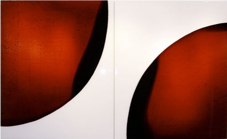
PHASE 1-2; 72″x44″; blood preserved on white Plexiglas, resin
As far as process goes, he uses cow blood trapped between sheets of UV resistant epoxy resin, lets the light play through the myriad textures formed out of the alternating layers of crusted blood of varied thickness and the result is pretty good. When you look at the work closely in person the alternating layers of deep red definitely lends the pieces a strange surreal beauty and looks mesmerizing – turn the lights down and the works start to glow refracting any available light through the layered epoxy resin. I enjoyed it in a surreal sense…