Posted by June Underwood on October 16th, 2008
[Note: This post also appears on my personal blog, southeast main. Jay has persuaded me to cross-post as an efficiency matter. I find it changes my thinking to do it this way, which is a different, but also interesting, topic. Hi all — I’m glad to be back.]
I’m thinking about edges. I have a theory — or rather a “notion,” (which is a theory that is so diffuse it has no edges) — but anyway…..
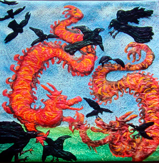
My theory is that a lot of textile art maintains its textilishness via its edges. And this is in spite of the hand-dyed fabrics, surface design with fuzzy results, sheer fabrics, and other fuzzying techniques of contemporary textile artists. The edges of quilted art are often delineated by the quilting ; sometimes they are even more clearly portrayed with zigzag applique. Applique by itself lends itself to clean edges, as do commercial fabrics. Piecing fabric together gives a seam line, which makes an edge, even when the fabrics are close in color and value.
The clarity of edges in textiles tends to pull the textile toward something I think of as “good design” such as can be seen in magazine ads and hard-edged abstract art. This clarity has a certain appeal –it’s clean, not mushy, not sentimental. Clarity has a sureness of feel about it (which is probably why it’s so popular in advertisements). It’s also good for a certain kind of whimsicality, of child-like sensibility. The “faux representational” look in textile art often derives from its clear, often hard, edges.

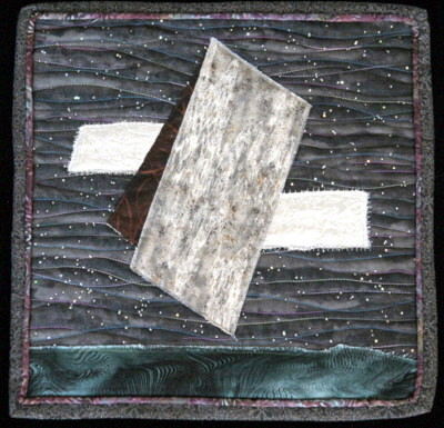
Arabesque, 40″ x 40″, hand-dyed cottons and silk hanks, appliqued and machine quilted
more… »
Posted by Steve Durbin on October 16th, 2008

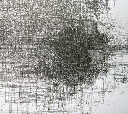
Complex #4 (detail), Nelleke Beltjens
There was a fascinating exhibit in Bozeman of drawings by three young European women–Nelleke Beltjens, Hedwig Brouckaert, and Jorinde Voigt–curated by independent art historian/critic/curator Peter Lodermeyer. Titled re/pro/ducing complexity, the multiple readings of which are all applicable, it consists of recent work that is varied, visually appealing, and intellectually stimulating.
more… »
Posted by Angela Ferreira on October 13th, 2008

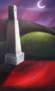
Title: Sorrow
Medium: Oil on canvas
Size: 100×60 cm
Posted by Steve Durbin on September 29th, 2008

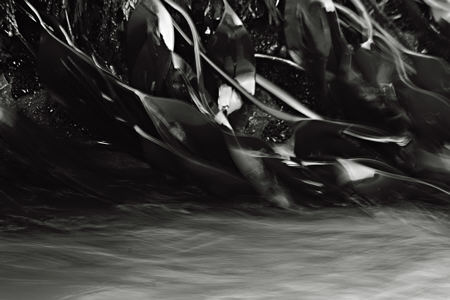
Most of my photography in Newfoundland was done within a few meters of the sea. I rediscovered there some of the rock and water themes I’ve pursued closer to home, though with important differences. For example, rocks are more likely shaped by the surf, and are as often wet as dry. New waterfalls are born every time a wave rides over a rock in the tidal zone. But the most interesting difference was the presence of living subjects at the rock/water interface, and of these, my favorite was seaweed.
more… »
Posted by Steve Durbin on August 31st, 2008
I recently came across an amusing web site called Wordle. It produces visualizations of the words making up a piece of text, with the size of a word in the picture reflecting its frequency in the text. I used it to create the representation below of what my previous post, “The Place of Story” (including comments), is about. (Clicking on the image will take you to a larger, more readable version in the Wordle gallery.)
more… »
Posted by Steve Durbin on August 26th, 2008
When we think of story we think first (at least I do) of short stories or novels. Of course, movies and theater and opera tell stories, and music and dance can also. Melanie’s Moby Dick series of fabric panels is closely tied to that story, though, as she says, not as conventional illustration. I’m beginning to think that story is a notion not at all confined to the literary arts. In fact, I suspect that stories don’t even require language–though it’s pretty hard to communicate about them without it.
more… »
Posted by Steve Durbin on August 21st, 2008
These are most of the completed panels in my Moby Dick series. They’re not exactly illustration — at least, I don’t think of them that way — but the people who’ve seen them always ask about the text that prompted the image, so I’ve included the relevant excerpts from the text.
The Pequod (Chapter 16)
All round, her unpanelled, open bulwarks were garnished like one continuous jaw, with the long sharp teeth of the sperm whale, inserted there for pins. To fasten her old hempen thews and tendons to.
more… »
