[ Content | Sidebar ]

Archives for artform

So you want to write a book about art? Interview with Lisa Hunter


plein air landscape painting
Painting From Life vs. From Photos
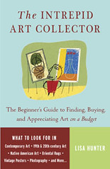


I want to expand my blog Art & Perception as a book. Lisa Hunter, author of The Intrepid Art Collector, gave me some excellent advice. [Note, this post was written before Art & Perception became a group blog]

Karl Zipser: We bloggers write what we want to write and act as our own publishers. When you want to publish a book, how does this affect what you can write about?

Lisa Hunter: Writers don’t like to hear this, but commercial publishers really want evidence that the book will sell. They’ll want to know if the author has a “platform” (i.e. whether he/she gives seminars, has a TV show, writes a syndicated newspaper column, etc.) They’ll also want to know what the readership demographic is, and what opportunities for PR exist. And they’ll want a “competition analysis,” which lists all similar books and explains why this one is different or better. At big commercial publishers, the marketing people can be just as important as editors in deciding what books to publish!

Karl: Are books about art a special case with respect to publishing?

Lisa: A major factor with art books is how expensive they are to produce. Color illustrations raise the printing costs substantially (and this is on top of reproduction rights fees.) Oftentimes, a book proposal is shot down because the book would cost so much that few people would buy it. I know this from personal experience. Recently, I had a great idea for a coffee table book that several editors loved, but no one could see how it would be profitable. Sigh.

Karl: Tell me about the writing process itself. Did you write your book first and then look for a publisher?

Lisa: Non-fiction is unique, in that you don’t have to write the book until you have a contract with a publisher. Acceptance is typically based on a proposal, outline and sample chapter. An agent who believes in your project — and who knows what publishers are looking for — is a HUGE help in getting editors to take the project seriously.

Karl: So you get the agent and editors to believe in you with a great proposal, etc, and then . . .

Lisa: Of course, once you have the contract, you actually have to write the book, and if you’ve never written anything 300+ pages before, that can be intimidating. When I was writing The Intrepid Art Collector, I was lucky because the chapters were all stand-alone. I could work on them one-at-a-time, as if I were writing magazine articles. After a while, I had my 80,000 words. For a more narrative type of book, an outline is critical to stay on track. And when writer’s block and deadlines build up stress, I recommend chocolate.

Vijgen in een Doos (figs in a box)


This painting fascinates me. Hanneke van Oosterhout has painted figs with personality. This is almost a group portrait. I sometimes wonder, “Does the world really need more still-life paintings?” This picture answers, “Yes!” Hanneke is pushing the limits of this genre.

Emaille Kopje (enamel cup)

Some time ago Hanneke van Oosterhout showed me an old cup that she had bought at an antique market. I thought to myself, “what a piece of junk.”


Hanneke took the cup to her studio and made this drawing. She then transferred it to a panel and painted it. Initially, there was a cloth under the cup (as in the drawing), but she was not satisfied with this, so she painted it over with white and light grays, adding a bit of raw sienna to the grey for warmth in the foreground (a color effect to bring the front part of the table/base forward).


Lately, Hanneke van Oosterhout’s still-life paintings have affected the way I look at things. I notice myself observing fruit and ordinary objects like ceramics in a different way. I see the beauty in them. Hanneke says, “That’s the way it is for me all the time. That’s why I am so eager to paint everything I see!”

Koninginnendag (queen’s day)

This painting by Hanneke van Oosterhout is in an interesting state (click painting to enlarge it). Originally it had a black background, but Hanneke found this an ugly combination with the orange colors. For this reason, she painted the background white, in order to make a new start with it. However, she painted the white thinly, and the background is not really white now, but has an interesting cloudy quality. Although not planned, this is a perfect example of the type of optical effect that can be achieved by painting in layers. The cloudy quality that results gives a feeling of mystery to the still-life which would not be there if the background were pure white.

I don’t know what Hanneke’s plans are for this picture. It will be interesting to follow how it develops, and if she decides to keep some of this accidental background quality, or make something different. I like the cool background grays that contrast nicely with the warm grays in the objects. What do you think?

Witte Aalbessen (white berries)

Here is a drawing of witte aalbessen that Hanneke van Oosterhout made this June (click the images to enlarge). The same day she transferred the drawing to a panel using tracing paper. Then she made an underpainting with acrylic.

The next day she over-painted all the berries with oil paint, a tiring day’s work. Why did she paint them all in one day? “Yes, the berries go away quickly,” says Hanneke. She wanted to capture the fresh, ripe quality of the fruit before the berries dried.

Some weeks later she over-painted the cup and the background in about half a day, again with oils. The result is shown here.

A detail shows the spontaneous but refined brushwork used to paint the berries — the shiny transparent skin and translucent interior. “That is the magic of these white berries, that you can look inside,” says Hanneke. “That’s why I worked so hard to paint them when they were fresh.” On the panel each berry is about 7 mm wide.

Two and a half days work is fast for a detailed painting like this. But is the picture in finished? You decide.

Overpainting


plein air landscape painting
Painting From Life vs. From Photos


This by definition must be done over some type of underpainting, in a system of working in layers. If the underpainting is like a base rhythm in music, then the overpainting is like the solo. The underpainting gives a context in which the paint-strokes of the overpainting become more resonant and powerful. When properly done, overpainting does not need to completely obscure the underpainting. It is precisely the interaction of the two that gives the most interesting effects.

Underpainting


plein air landscape painting
Painting From Life vs. From Photos


Underpainting gets its name because it is painting that is intended to be painted over in a system of working in layers. There is a popular misconception that underpainting should be monochrome, perhaps in gray-scales. In fact, a multi-color underpainting is much more useful. The colors of the underpainting can be optically mingled with the subsequent overpainting, without the danger of the colors physically blending and becoming muddy. If underpainting is done properly, it facilitates overpainting. If it seems that one has to fight to obscure the underpainting, it is a sign that it was not done properly.


Here is an example of an underpainting made in acrylic, by Hanneke van Oosterhout. It is fairly monochrome, but this is because of the muted colors of the objects depicted.

css.php