David’s Self-Portrait with Raven reminded me of this picture of a black bird that I carried in my mind: 
Archives for working
A composite in my mind’s eye (poetically) or (scientically) inferior temporal cortex.
Incongruity

One of my most powerful and influential muses both in my writing and photography is incongruity. I believe this is the case for two reasons. First, growing up gay in mid 20th Century America means you daily face living in a state of perpetual incongruousness. Almost every thought you have is incongruous with your surroundings and the apparent thoughts of most everyone around you. Your self-confidence, self-respect and development as a human being depends on embracing and owning your state of incongruity. As a child and especially as a closeted teenager and college student I was often called a non-conformist and an iconoclast. That was unfair to true non-conformists and iconoclasts because I did not choose to be so whereas they do. What appeared to be non-conformity and iconoclasm was merely the manifestations of my incongruous condition.
The second reason for my creative relationship with incongruity is Manhattan, my life-long environment. Environmentally, my home town provided a visual and cultural stew that celebrated and exploded with incongruity. As a child and closeted young man, I could swim in the waters of Manhattan with complete confidence and comfort. Who would notice my quirky little self in this ocean of intensely complex cultural, economic, political, racial and ethnic diversity and this visual cacophony and feast of discordant shapes, colors and textures?

So incongruity became my home and my muse.
I believe that New York is as important to the art world as it is because this city”s uniquely incongruous nature drives an unequaled atmosphere of creative energy and frenetic industry. I was recently asked why I “limit” my camera to New York. In fact, I almost never travel with my camera. My inventory of Manhattan photography is vast. And having traveled extensively throughout more than two dozen countries and countless cities and towns, I have but a few hundred old transparencies buried in a drawer somewhere.
The reason is that my muse is a very demanding mistress. Paris is a city of harmony and balance. London delivers an abundance of quaint, stately and a touch of the eccentric. Tokyo is an avalanche of uniformity and elegance. Bangkok is an ocean of golden spires. Amsterdam’s incongruity lies in the sexual antics hidden behind sparkling clean windows and compulsively neat little houses. But if I photographed these places I would feel like an adulterer.

For many reasons: Chance, the forces of chaos, competing cultural perspectives, subconscious manifestations of the city’s demographics–Manhattan’s is the queen of incongruity. My camera’s appetite for it seems never to be satisfied by the cornucopia of inharmonious diversity of architecture, styles and design. New York never disappoints in that regard. In most any direction you look in most parts of town, you will find bizarre, often inappropriate and jarring juxtapositions of lifestyles and perspectives that should make for one big jumble of chaos but instead it is in that brazen incongruity that the city finds an amazing visual harmony.
Tourists are often jarred by this as they discover that a wrong turn on a city block can transport you into an entirely different world after merely walking a few feet. Other than the city’s famous grid pattern, little else has been done in concert thanks to the egos and individuality of very wealthy men and the American habit of borrowing architectural styles and ornamental designs and decorative effects from several thousand years of human history which is no where more apparent than in this city.

On one city block you may catch glimpses of ancient Babylonia, Classical Greece, Medieval Europe, Art Nouveau Vienna, and Renaissance France. Some of these will be bizarrely newish, some aged through recent neglect and other parts deliberately made to look weathered over hundreds or even thousands of years. In fact, one of the most charming characteristics of this great lady with a passion for phallic symbols is that it is often impossible to differentiate between neglect and artful and deliberate antiquing.
I will be quite content to spend the rest of my life exploring this town’s details. I consider myself to be extremely lucky to have found a model who remains timeless, always changing and forever surprising. My work is completely a product of my environment. Incongruity. Except Manhattan is also the glue that holds it together, and I mean “it” in every sense of the word.
Painting from Imagination

Title: Paradise Garden
Medium: Oil on canvas
Size: 100×76 cm
Is grownups’ art art?

Painting From Life vs. From Photos
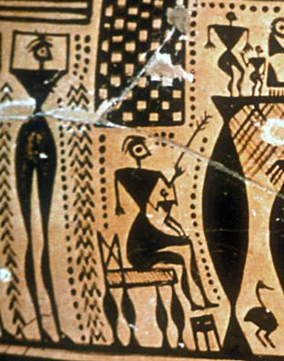
Detail from funeral pyre scene on an Attic Geometric krater, second half of 8th century BC

Man being eaten by a crocodile, first half of 21st century AD
The ceramic painting above I borrowed from Victor Bryant’s excellent ceramics website. The drawing on paper is by Fran, who is almost five years old.
The images are similar in that they both depict narrative scenes, and both make use of simple geometric shapes. The vase painting probably represents top quality artwork of its era, making use of a consistent representational system which covers this large vase and many others (presumably painted by many different adults working over many years). The children’s drawing is a one-of-a-kind sketch.
At first glance, the vase painting seems like children’s art made by adults. A key factor that distinguishes the adult work is the consistent repetition of patterns — across the detail, across the vase and across the historical period. There is a discipline here that is alien to the work of a child drawing as play. This use of repetition has substantial advantages. It imparts rhythm and complexity to the work that is lacking in Fran’s image. Repetition creates a decorative effect that masks to some degree the simplicity of the representation. For the sake of comparison, we can apply repetition to Fran’s image:
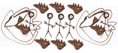
We can also isolate a figure from the vase painting. With these simple digital manipulation we have not transformed Fran into an Attic geometric vase painter, or turned the vase painter into a child. We have, I think, narrowed the gap.
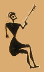
What I think is interesting here is that what presumably passed for fine work in the 8th century BC probably could be made by children, if they were compelled to work within a disciplined productive system (as the adults were).
Discipline and rigid compliance to style are factors that are quite contrary to our modern notions of art, however. Is the ancient vase painting art, or is it nothing more than systematized children’s decoration?
Visualization aids in the artistic process: an experiment

I’d like to describe a collaborative experiment that started from recent attempts to use simple image manipulation to aid in discussing visual art, such as painting (see comment 6 here) or fiber art (comment 12 here). Quite a few artists these days work partly or wholly digitally, and I wondered whether some of the advantages (like Undo!) could be carried over to an otherwise non-digital workflow.
In one of the posts mentioned above, June Underwood described her huge, inspirational, and ongoing project at John Day Fossil Beds National Monument. I proposed to cast myself as her assistant:
How to choose between fantasy and reality?
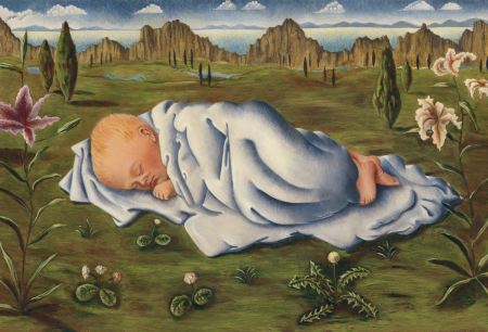
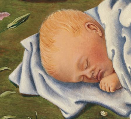
This painting of Françesca I made when pregnant with Nino (Fran was one year old then). We were living in Germany and I painted only an hour or two each day because I was too tired to sit longer (I was really big at that point).
It is based on drawings of Françesca sleeping, combined with my imagination. I find it wonderful to paint people.
Before I committed myself to still life painting I was working together with Karl using his rediscovered techniques of the old masters.
That is how I learned to use the different layers of paint in a simple and logical way.
I used to paint from my imagination, now I seem to have left that behind. How do you balance between reality and fantasy in your work?
. . .
Photograffiti
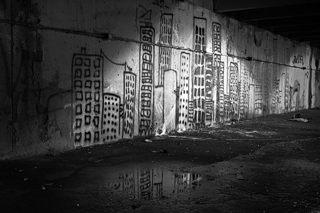
Despite recent posts here on the subject of art about art, by Leslie and by Karl, I hadn’t thought of the question in application to myself. Then I remembered that I did indeed have some photographs of art, at least if the gentle reader allows graffiti to be considered art. In any case, I was definitely interested in the personal expression represented by the graffiti. I was also interested in the setting, a half-underground concrete parking structure, and especially in the lighting, a mixture of glaring incandescent light and early morning daylight.
I made these images nearly a year ago, but still haven’t arrived at a presentation I’m happy with. I’m curious what you think of the following pairs of images. The first pair pits color against black and white. The color version shows the different tints of the two light sources, but the blacks feel richer to me in the monochrome image. Do you have a preference? For what reason?