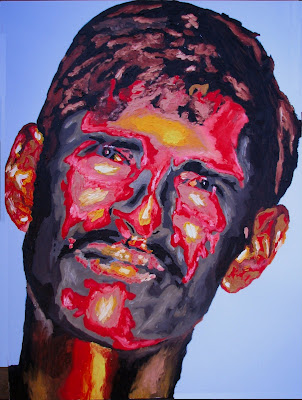
I love painting faces. I painted these over the last three weeks. This time both depict people from India. The first is that of a child pilgrim presumably attending the Kumbh Mela – originally photographed by Steve McCurry. The second one depicts a daily wage earner whose sustenance is ruled by the number of loads carried on the person’s head. They are commonly seen toiling on construction sites.
“Pilgrim“; 3ft X 4 ft; Oil on canvas

“Coolie“; 3ft X 4 ft; Oil on canvas

Sunil,
I have a lot of questions for you. Do you spend a lot of time searching the web for images, or do you mostly use one you come across in normal browsing? Is there anything particular that you look for? Do the images that inspire you to paint have some things in common? How often do you start working with one, only to discover you can’t make it work in the way you want to?
On spending time browsing: Most of the images that I use are really products of regular browsing – of course I have had this habit for a long time now (where if I run into an especially striking image that resonates with some idea that I have, I store it for ‘later’ use on the computer…). My computer’s hard drive is filled with these ‘found’ images… Another source of images is traveling… I try to photograph faces that interest me (after due permissions and cajoling sometimes)… I am currently embarking on a project that involves capturing faces of the homeless in and around Wall Street – I just have not found the time to do this…
Particulars that I look for: I am really not sure. I look for an evocative face that can carry the weight of a story. I always need my pictures to have some meaning… (need to get out of this bad habit ;-)
Inspiring images and common characteristics: Eyes staring directly at the viewer. No smiles. Creased skin, ruddy complexioned, highlighted hair – I guess… Black faces especially interest me…
How often do you start working with one, only to discover you can’t make it work in the way you want to: Because I paint after a ‘soul sucking 8-6 job’ (and after my son goes to bed), I really do not have time for too many experiments. Luckily I have not had to discard any of my canvases until now (of course this does not take into account three canvases that I tried painting my wife and all being dismal failures). Most of the time, I have a fair idea of the ‘final form’ before I start and I slowly guide myself there.
Thanks, Sunil. I was partly curious because your second painting especially seems a bit different from previous ones you’ve shown us, and I was wondering if you were following any different direction. The light background and large amount of blue make a nice contrast with other faces. I also like the black background of Pilgrim. One of the things I like and find striking about all of your paintings is the very interesting negative space around the faces. Though it may seem non-essential, it helps me stay with the pictures longer, looking around at all the parts. And the sharp lines dividing off the negative space are very attractive, and stand out because they are high contrast.
Sunil,
The fascinating thing to me about these works and your work in general is that though you relish wild, free color and clearly delight in loose, splashy brushwork, the essential character of your faces remains faithful to the person you represent. You manage to evoke their presence.
These are people. They are interesting, beautiful people. I can feel your feelings of compassion and indeed, love.
Technically, I might compare your style to Bonnard, but he seemed to evoke people shaped objects rather than actual beings. These are people I feel I could get to know. Thank you.
Steve,
Glad you liked these new ones. Yes, you are right the negative space in conjunction with the high contrast helps being out certain features better – in my view. No, I was not trying to experiment too much with the ‘coolie’, but I did try a little bit of a different tack with this one (especially with the umber and light browns and blue) – I did not like the effects too much in the photo but the original is pretty good.
Rex,
Thank you for the description – I could not have said it better… “relish wild, free color and clearly delight in loose, splashy brushwork, the essential character of your faces remains faithful to the person you represent” – maybe I should use that in a statement ;-). Yes, this is something that I like – to not lose the person behind the swirls of color that creates the perception of the person…
Yes, you are right the colors tend to be a bit ‘wild’ sometime…
I had not thought of Bonnard too much, but his definition of painting is something that I like… “Painting is the transcription of the adventures of the optic nerve”. Bonnard reduced the subject to visual forms that were sometimes removed from the original – I tend not to do so, but one of my illustrations of Mr. George walker Bush attempted to do this. I am flattered nevertheless.