I’ve been thinking about the planes on which we work, that is, the stretched canvas, the photograph, and the quilted textile. This is partly in response to my interest in analyzing quilted textiles vis-a-vis more traditional media, say, oil paintings. But my thinking has also been triggered by some reading I’m doing; I’ll reference the readings at the end of this post.
With stretched canvas, some questions revolve around how the picture plane is used (as a window, as a flat surface, or extended out into frontal space and rounded so there’s a back side to the image.) Abstract expressionism flattens space (harking back to some older pictorial practices), and that may be why the Ab Exs worked very large — while they don’t impinge on the viewer’s frontal space, they fill her vision completely, surrounding the viewer physically. Caravaggio is Frank Stella’s example of an oil painter who visually breaks the frontal flat plane, and Stella works at that process by physically manipulating the geometrics of the rectangular painter’s space. Other artists follow the ab exs but cut off the edges of the image, indicating that there’s more beyond the frame. (I’m thinking of Philip Pearlstein’s nudes, but there are innumerable other examples). And then there’s Robert Irwin, who ultimately rejected the notion of the frame, but even while he was working on stretched canvas, he played games with it. (At one point the dimensions of his canvas was 82.5 x 84.5 inches, appearing but not being square, with a slight ballooning at the center.)
So even before the question of how the planar rectangle is used comes the question of the size and shape of that initial working space. Once a decision on size is made, painters are limited by their choice (unless you follow Cezanne, who had a problem with a foot in his Pierrot and Harlequin and undid the canvas from the stretcher to add a bit to the bottom).
But photographers have a bit more flex. They can crop photos, thus changing the “canvas” size, and they can do so after they’ve got an image started. They don’t have to decide ahead of time what proportions their canvas will be; in addition, they can make very large or very small prints of the same image. The physical limitations for photographs are less stringent than for the stretched canvas artist.
The quilted textile artist has even greater flexibility than photographers in his use of the picture plane and the pictorial space he has available. For example, the space can be expanded. In works using patterns and blocks, extra sets can be added to any edge to expand the whole. When I do traditional quilts I use this process when I find my central motif is too massive for its chosen borders or when more fabric is needed to fit the bed I am working to cover.
But even without sets and blocks or the necessity to make the piece fit a prescribed setting, I find that expansion is sometimes useful. It allows me to use the whole of a serendipitous fabric, for example, while cooling and calming it a bit. Here’s an example:
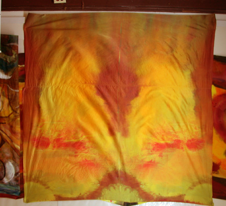
Miocene, dyed silk, in progress (1), 2006
This is an initial bit of dyed silk charmeuse. Charmeuse takes the dye brilliantly and thus often has to be tamed.
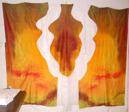
Miocene, in progress (2)
I began one evening by slicing the silk along its mirror-image lines. I didn’t know where I was going with the cut when I did it.
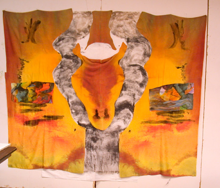
Miocene, in progress (3)
I lined the open space with a painted polyester fabric called “lutradur” and then added other elements. At this point, I had begun to comprehend what it was I had on my hands.
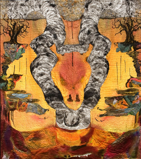
Miocene, finished, 2006
This is the finished piece. More was added to the bottom sides, and the piece was over-painted as well as over-laid with some collaged bits.
With wall textiles, it is also possible to cut down rather than enlarge the original, or even to make more than one item out of what begins as a single piece. I often begin work by dyeing mirror images. In the next series, you can see a finished piece from one side of a mirror image work plus the other unworked side along with a couple of its consequent outcomes. (Ultimately there were four pieces completed from the second side.)
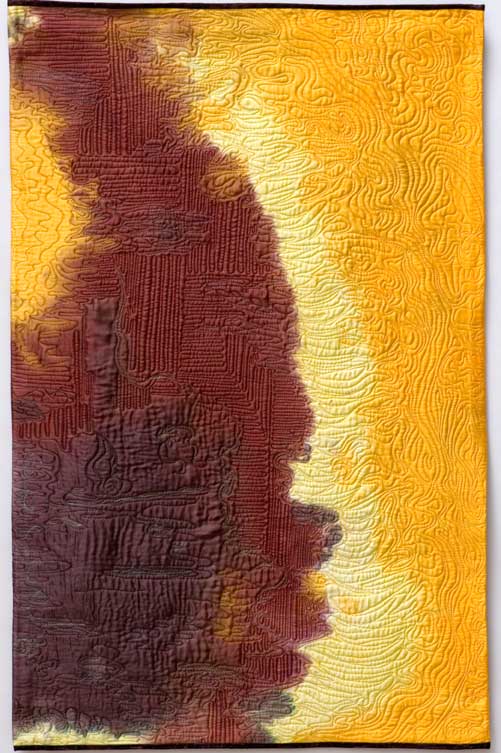
The Indeterminate Nature of Exhilaration, dyed silk, finished 2005
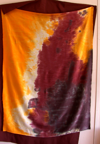
The Indeterminate Nature of Exhilaration mirror-image silk in progress
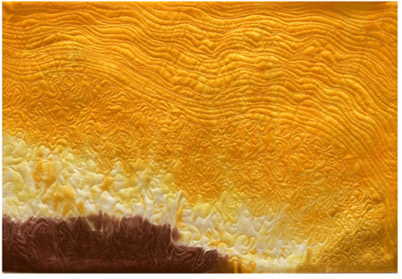
The Indeterminate Nature of Exhilaration 3 (AKA Dawn) 2005
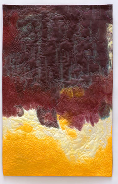
The Indeterminate Nature of Exhilaration 4 (AKA Storm) 2005
Of course, most monkeying with the picture plane on quilted textiles is not so extreme. On a smaller scale, edges, for example, can be straightened and cropped after the piece is stitched. This is done most frequently because of the stretching and slipping that happens during the dyeing, painting, and stitching processes, but it’s also very useful when some edge or other has a problem. Here’s a photo of a charmeuse pinned to a 5 x 5′ stretched canvas, just after the image has been painted with watercolor and soy milk medium. The work-in-progress is followed by its final stitched, squared-up, and cropped and bound incarnation.

The Mother of Us All, painted silk, work in progress, 2007
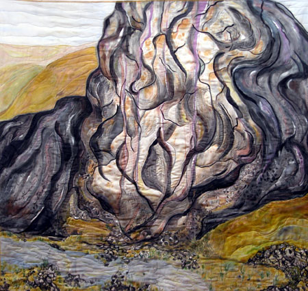
The Mother of US All, completed, 2007
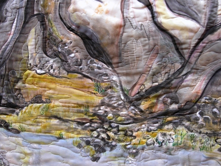
The Mother of Us All, detail, silk 2007
[The photographs of Mother are my own and thus don’t show the stitching as vividly as the pro photographer’s photos of Indeterminate do.]
Some books that cover interesting aspects of this question (although not from the textile point of view) are Frank Stella’s 1986 Working Space and Erle Loran’s 1964 Cezanne’s Compositions. Another book that we’ve spoken of that’s rich with information about the canvas plane and its limitations is Lawrence Weschler’s book on Robert Irwin: Seeing is Forgetting the Name of the Thing One Sees. I suspect that James Elkins has a book somewhere in his repertoire that addresses the question — he seems to touch on just about every other more-or-less art related topic. It is Elkins, in his Why Art Cannot Be Taught, who says that during art school critiques the question of the use of the picture plane’s space is one of the most frequently addressed topics.
So, what kind of elements go into your thinking about the canvas you will or won’t use? How do you decide on the size, shape, materials? And when you photograph, what goes into your decisions to crop or not and how big the final image will be? Steve crops for abstraction, I believe, and I know some photography gets greatly enlarged, wall-covering, viewer-surrounding. How do the limitations of your materials work for you?

June,
Fascinating post – I need to think a bit before I answer, but I must say the imagery conjured for mother (wip) is fantastical and echoes O’Keefe.
How did you get the gnarled finely detailed surface on indeterminate1? Do you go through some special dyeing process? I am interested.
Miocene does indeed take me back to a primeval earth… (if that is what you meant by the imagery?
I am also interested in how you managed to attach the cut pieces to the intervening (grey) fabric? Is it stuck on supporting canvas?
Sorry too many questions… but visually beautiful.
Sunil,
I love questions!
If I understand your question about “Indeterminate”, the surface gnarliness is created by the quilting stitches. Indeterminat was produced through a two step process — dyed and then stitched.
The top dyed piece (which looked like the other half just below) is laid on batting and a fabric backing, basted, and then, with a sewing machine, the stitching is done. The stitching is freehand (no pattern or drawn lines). It’s the stitching that can cause a lot of shifting — the sort of thing that makes cutting and cropping essential to the stitched textile art presentation.
Miocene is definitely about olden times (the miocene period being a subdivision of the Cenozoic era, which is the one we are still living in; the miocene was a mere 25 million years ago or so; the Cenozoic thus far is about 60 million years old).
And the cut silk gold pieces in Miocene were _sewn_ to the gray (lutradur) underlayment. The process is called “reverse applique”. You can use a fusible web or glue stick to attach such pieces, but experience tells me that sewing is more likely to stand up to the stress which flexible fabric can place on intersecting areas.
Thanks for the comments.
June,
That was useful… Going by the process described, this is a tough exacting task (especially to get tot he surface detail illustrated in the photo of ‘indeterminate’…
By the way, I bought Lawrence Weschler’s book.
Not to sound tongue in cheek with respect to the subject of your post, but cropping your pictures would help A&P get its right sidebar back – looks like it has dropped to the bottom of the page due to the width of some of the pictures…
Rich post with some great links.
I am one of those photographers who never crops. I came of age in the era of the filed-out negative carrier (so that the frame edge would show), and it has always been an instrinsic part of my process that what the camera sees is what I display.
Thank you for your scholarly post. The topic is in line what I will be thinking about this summer and I will buy the books from your links.
It was also great following how your created Miocene. Looking at the stained charmeuse, I played with ideas of what I was seeing and would have done. I would not have been so bold to cut into it but only dared adding to it. Miocene is powerful.
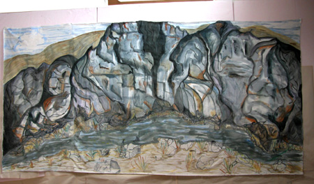
The mountain with the stream also speaks to me while cannot relate to the more abstract pieces.
Thanks, Sunil, for the tip about the widths–
After I reduced the size of most of the images, I checked the html and discovered that Indeterminate was still way oversized. It has an invisible border that misled me. Let me know if the sizes are OK now. I try for about 450 wide (but Indeterminate snuck in at much above that). I’ve reduced these to 440 or less.
And as for “respect” — I guess if I can steal my title from Frank Stella, you can work the word play on it <snort>
Doug,
I’m unfamiliar with the “filed-out negative carrier (so that the frame edge would show)” Can you talk a bit more about it? My photography knowledge is abysmmal.
It seems, though, that your method of making large quantities of images and then culling them fits with your idea of filling the frame with the image on the first go-round. You could have a variety of frames for each motif you were working on and choose the best among them without cropping.
Birgit,
Alas, I fear it is a scholarly post. I’ll try to do better in the future. I dearly love trying to sort out the intellectual perameters of my chosen media. And I realized (confession time here) that in doing oils, I have a weakness regarding the upper right hand corner — which in stitched fabric could get cropped off if it didn’t suit. It’s hard to crop the stretched canvas.
My initial cut into the silk was something of an act of desperation. I had to do something with the cloth and that was the best I could come up with. I was clueless when I did it, although once the central beast’s head (or vagina?) was revealed, it became clearer.
Your comment about the representational pieces vis-a-vis the abstractions intrigues me because those two and Miocene are part of the same series. (Indeterminate, the stitched silk whole cloth, was a lead-up to them)
I guess it depends on how you define series. But because I’m also interested in dialogue and communication, I keep wondering how I can present these disparate pieces and make the connections clear.
Scholarly was supposed to be a compliment. I feel like Doug that it is rich post that makes me think.
About your abstract pieces: The way I feel is that they are an odd combination of Clyfford Still (violent) and ‘decorative’. They lack what I see as your authentic awesome power. Wow, now I am in trouble.
Violent and decorative! Yikes, what a combo! I fear that yes, you are in trouble. Or maybe I’m projecting — it’s really me that’s got difficulties…..
Actually the question of “style” is a really thorny one, worse than “series” which I also have trouble with.
Unless I have a range of imagery and media that I’m working on at any given time, I’m apt to wander into distracted boredom. There’s something about the terror of trying to do Miocene as well as Mother that keeps me dodging and feinting (now there’s a whole different metaphor.)
I’ll take the compliment, though.
Wow, June!
I’ve been a little mused by your use of stitchery because I also can see the O’Keefe in your work. It has seemed to me that you might be trying to serve two masters in the fabric work that you obviously love and do so well, and the ever bolder approach to the rocks that you are taking. The one seems to be an outpouring of some primal response to the motif while the other demands patient handicraft in a seemingly detached mode. It’s like you went out and killed the beast and are now fashioning a lovely cape from its hide.
But that’s not a complaint much. I’m a little flummuxed, but not complaining. I’ve seen some of your earlier work taken, I believe from a train window, where the softness of the receding landscape gets a zing from the stitchery and the sense of a boiling three dimensionality that it brings. But if I remember, those pieces were relatively small and the stitchery was able to have a big effect relatively.
It makes me wonder about the big five by fives. It’s hard to tell from the photos at what remove one is from the work. The woven patterns come across with a fine calligraphy and enhance the surface immensely, but are they big woven patterns or relatively small?
And I guess that brings me to the subject of size.
Went to see an exhibit of Monet’s painting at the CMA last month and noticed a certain economy in his work. It appeared to me that he used a given number of strokes in a painting, and as he expanded into the vast paintings of the waterlilies, the size of a stroke expanded accordingly. Almost as though he enlarged without increasing the pixelation. You mentioned that you are circling some issues in your work – is this matter of the relation in size of stitch to stroke one of them?
Looking more at the abstract pieces, I see your power in the last one – The heavy maroon cloud hovering over the more delicate red, white and yellow.
It may have to do with what Jay mentioned – the difference in the size of the stroke, or width of the stitching here.
Hi Jay and Birgit,
Your comments have got me thinking hard.
Jay, the stitching that you describe as painstaking is, for me, part of what I think of as “power.” You have to imagine that I handle the sewing machine like some people handle a race car –brrrrrrroooooooommmmmm.
But the appearance of the work makes you think “painstaking,” eh?
Hmmm. While I’m at dinner I’m going to reflect on this.
Jay and Birgit,
I’m back and still thinking. When you say “woven patterns”, Jay, what are you referring to?
I added a detail of the Mother piece (as well as putting titles on all the photos) so you might be able to get a sense of the stitching within it. Your comment on Monet, Jay, is very interesting indeed. I’m acutely aware of the size of the brushes I’m using when I’m doing the painting. The stitch length is less essential to the look I’m trying to achieve, I think, but I could be wrong.
I haven’t changed the size or nature of my stitch, but two things change the way it looks on the screen. One is that when my photographer photographs the pieces, he lights them to enhance the stitching; “Mother” is a home-photographed piece, so the stitches are less visible. The other aspect is that when the image is more complex, the stitching doesn’t stand out as much. The plain background on the silk of the “Indeterminates” pops the stitches and they become in-your-face. In something like “Mother”, the variations and changes in the image itself hides the stitches somewhat. They still make texture, but of a more indefinite and modulated sort.
One of my questions really harkens back to Birgit’s “violence” and “decoration” — what I’m wondering is, if the media, the quilted silk, has such resonance of decorum and women’s work that it impacts negatively what Birgit sees as the Clyfford Still-like violence.
It’s a general problem, working in a medium which isn’t any more painstaking nor necessarily decorative than etching or Frankenthaler’s paintings — the medium itself carries a lot of baggage that may interfere with whatever message or concepts the artist might attach.
Well June, I must say that with the Indeterminates, my soul comes to rest.
Very satisfying. In these, your AE fondness truly shows. I very much enjoy the simplicity. I can only imagine the subtle richness that must be there with the real stuff. I find myself longing to touch these pieces. Very sensual, and very evocative of the outside kind of places that give me peace.
Thank you.
high praise, indeed, Rex. Thank you. I’m blushing.
June:
The “painstaking” comment comes from personal and literal experience: I was imagining you, like myself, hunched over a machine, trying to be as exact as one can while getting a backache. But it’s more like dances with weaves, eh? Cool and I mean it!
Maybe I don’t know from woven patterns. The term entered my comment as an effort to find some alternative to “stitchery” upon which I was locked.
June, I need to return to this discussion after I’ve recharged my triple “A’s”. But, in anticipation, allow me to pause with this observation. It’s like the rock formations describe the trajectory of blunt force while the stitchery traces the trajectories of life forms that live about them. There’s also something braille going on, a tactile response like that going through the fingers and body of a rock climber on a face.
Do I remember that your dad could kick out an overhead light?
June,
I’ve been thinking a lot more recently about your fascinating question of the picture plane, though I seldom did in my early photography days. The main aspect of that question for me is the two-dimensionality and what that means for a representation of 3-D space. It introduces immediately a certain abstraction, which is strongly influenced by choice of viewpoint. You’re right, I am very interested in the level of abstraction. I do have that–among other things–in mind when cropping, which, incidentally, is almost entirely in my original selection (I do sometimes crop after the capture, but rarely unless intended in advance, as with the square-format Sourdough Trail series).
As to size and materials (choice of paper), I usually don’t decide these in advance. With some images I develop a strong sense of what these should be for best effect, but I often like an images at a variety of sizes. The effects do change, though.
More about your wonderful stitching later, I’m still attending my conference today…
June:
I see now a question that I must ask. You mention an issue of decorum and “womens’ work”as countering your inner Clifford. That sets the stage for my query. It appears that many of these comments are orbiting around a perception of tension in these pieces. Do you feel a balance when you are working on these in the sense, perhaps, of some mental and or emotional concordance? I know that many things that I have done – good, bad or indifferent – are testaments to unresolved issues, and these irresolutions can run deep.
I feel that I may not be making my, or any, point here, or very many friends. But perhaps this is to acknowledge the impact that a resolved technical matter can have in helping to reorder one’s inner set-points for the better.
Jay,
I fear I can see this question going on too many directions. YOu speak of the _comments_ orbiting around tension, which would be an indication of a personal sense (on my part) of irresolution or tension or whatever.
And then you mentioned “resolved technical matters” which would be apparent, I would think, in the art itself.
The tension between the expected decorum of the quilt and the “inner Clyfford” is one which I think I’ve resolved (on the side of Clyfford, of course) but which continually comes back at me, partly because I exhibit with many people who started out as traditional quilters.
The questions and choices and decisions made by traditional quilters who are working at being the best at their craft are vastly different than those asked by textile artists working at being the best in their craft. But when a textile artist exhibits alongside quilters, the confusion of standards can be pretty ugly to behold. So there’s a tension which I live with, albeit uneasily.
My latest thinky project (what I do while I’m hand-stitching the textiles) is one in which I’m trying to sort out the questions/choices/decisions that accompany the two different activities. Quilters, for example, think of stitching to hold things together securely; artists think of the line that the seams and quilting stitches make and whether they are appropriate to the effect being achieved. Some tension arises out of the physical attributes of the material for the artist which won’t happen for the quilter, such as when I try to make my silk act like cotton or space my quilting lines too far apart to sustain the physical weight of the piece — in other words, most of the questions relating to materials have long been answered by quilters but are wide-open and likely to pop up as technical difficulties for those of us who are doing quilted art.
The tension with decorum and women’s work is societal, of course, and I’m not likely to sort it out much better than I have in the last 65 years. it’s a continual battle, particularly working with textiles, to be taken seriously by the art world, and that is almost directly related to old ideas of craft and helping hands at home and woman’s place. I don’t think that that’s an internal tension, but rather one of meeting external expectations with the unexpected. It’s is sort of silly, in an age when cow’s heads in formaldyhyde can be seen as art, that one has to discuss whether quilted textiles can be such, but there you are.
I doubt if I’ve answered your question, in part because I could see so many directions that it might be going. In fact, when I think of the piece “Indeterminate”, I see that the quilting lines themselves belie the gouge or fall of the colors. So the Clyfford-like violence that Birgit refers to gets undercut by the steadiness of the quilted lines. And that’s a factor that can’t be dealt with except by changing the medium — quilting lines are always lines and therefore have a certain decorum, even when one makes them curly ques or bumps. They will never smudge or work with values like paint or charcoal will. Or at least, as I think about them at this moment they don’t. I could change my mind about that.
Anyway, resolved tensions, unresolved questions, choices — I dunno. When I’m working, I’m generally just working — immersed in the matter of the moment, solving the problems I set for myself. When I emerge from the work, all the questions fly back up at me and so I try to answer them in the next piece I do — or deny them validity for my own work — or hope they’ll go away some day.
Sorry I can’t do any better than this blather.
JUne:
Your response has me reaching for another cup of coffee.
Where to set one’s teeth into this beast…
Look at a lot of work and one might be inclined to assign it a place relative to some established scale of standards or expectations. Your struggle – and I hope you don’t mind the term – cannot be pigeon holed in such a way.
I began to get twitchy about my last post wherein I asked you about concordance. It had a certain “How did it make you feel?” quality, which could have come across as going over some line. But I am glad to hear that the actual making has a flow to it.
But therein lies a rub. Part of the m.o.of critique is to find the right level of engagement. This is especially key in art where the personal and technical are so intertwined. Should we get all Van Gogh in these comments? Is there a bridge-too-far that should not be crossed? Not to infer anything here,as this conversation triggered a thought,but to acknowledge the old adage about art being the result of perceptions filtered through personalities.If or when I display anything on A&P and somebody asks me if I have had issues with my siblings or if I’m anal-retentive….?
somebody just walked by outside who looked like Sammy Davis Jr. Pardon,where were we?
My perceptions of what is going on in your work is, of course, going to be filtered through my personality. Gotta happen. my personality, or more accurately my predilections, dictate a response which I must then analyse in a resonant fashion. My response is to want your paintings to stand alone without further embellishment as I feel that they often reach a place where I, myself, seek to go. That colors my approach – but perhaps is beside the stated point.
For some reason “bull in a china shop” keeps running through my head. Yzat?
Heavens, Jay,
You are still thinking like that old bull???
I tease!
Nothing you have said has made me uneasy, defensive, or like I’m being run over by the animal that lurks within us all. In fact, I understand well the difficulty of knowing what comments can help and what can demolish the artist. You can feel easier, however, knowing that I’m an old hand at dismissing comments I don’t think apply, or working through ones that aren’t as positive as I would like. I have lived with a bunch of critics my entire life and I know that their views, however skewed by their own perceptions, can tell me something I might not know if they remained unsaid.
I actually didn’t know what you meant by your question. But here it seems to me you are saying you like the paintings as paintings, rather than as stitched critters.And that maybe I myself am pulling my punches by using the quilted textiles to hide my intensity or ferocity or visual violence.
That’s pretty straightforward — and it’s a thought I’ve had myself. I like the stitching myself but sometimes I suspect it interferes rather than enhances.
My ambivalence runs in two directions — one is rooted in my own inability to judge (which probably is also due to inexperience with the painting qua painting — I can pretty well critique the stitched work).
The other is that, as I said, most of my exhibiting and selling opportunities are within the stitched textile field, so I’m reluctant to give that up until I have some assurance that the painted work I do will stand up in the public eye. But that means that my focus is divided, a state with which I am increasingly dissatisfied.
Essentially, with the painting, I’m perhaps like a third year student, but one whose physical age requires a fast track learning situation. So I need to hear if the stretched canvas works better than the stitched work for you — and I also need feedback from others, since as you say, all we see comes filtered and so lots of perceptions help sort out the personal filters.
As for sibling rivalries, desires to marry our fathers, sordid past histories of various sorts — well, at my age they all seem rather boring. Much more fun is the question of brush strokes, volume and modeling, #5 stitches and #20 thread, and what color is celadon.
June,
Stepping outside and looking up at the cloud-covered sky – beautiful different shades of light and dark grey – I saw stitching the way you do it. The lines in the sky were a la June.
Ah, Birgit, you are attaining enlightenment<snort>.
In actual fact, once I got into the stitching, I saw all kinds of stitching lines around me. And now that I’m reading about Cezanne, I see leaves as dabs of paint.
Isn’t art wonderful?
Careful!
After a class about the interplay of peripheral and focussed vision, a student told me how thrilled she felt driving home and being aware of the Blur of trees passing by to the side. The thrill ended when she realized that she had driven through a red light.
June:
You understood me better than did I myself.
Bull that I am, it doesn’t take much to trigger a rumination. Aye, but is there madness in my methane?
We’re on the same page then. As you have seen, my stuff keeps crossing back and forth over that line that divides decoration and something more – so I deal with similar issues.
You know, while it might be frowned upon in some quarter, it might be possible to have one foot each in quilting as such and your painting. People do this kind of thing all the time. I have a hazy image of an artist who cartooned and did wonderful formal work all in the span of a single talent.