[ Content | Sidebar ]

Archives for materials

Sloppy Craft: It’s Getting Interesting….

The phrase, “Sloppy Craft”, the title of a recent panel discussion and a forthcoming exhibition at Portland’s Contemporary Crafts Museum, had to be checked out. Whatever could it mean? How could the Contemporary Crafts Museum have been drawn into featuring sloppiness? What kind of provocation was intended by the title? What are the implications of honoring such a concept as sloppy craft for art as well as craft?  Tell me more, tell me more.

A bit of background: when I was working textiles, I regularly engaged in a “discussion” with quilters (some traditional, some contemporary) about whether the stitching work done on my textiles ( specifically in construction and quilting) should strive for perfection. I always maintained that my goal was “competence.” My attention was entirely on the image and impact (on, I maintained, the art).  The craft was there only to hold it together and/or to add to the art. Hence my seams were not necessarily straight and the back of the art was decent but not flawless (I didn’t bury my threads, for example, simply tidied them). I used the quilting stitches as part of the design, which meant that they were generally not even in length and that they were heavy in places and light in others; this can make the quilted art hang wonkily, requiring heroic measures to make it perform well.

This is an example of a old piece of mine that I claim has “competent” craft:
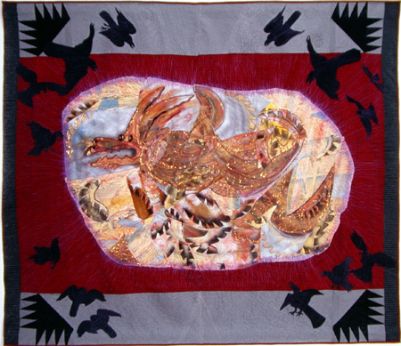
SophieEmergingwSophie, Emerging, 84 x 73″, 2002, Materials: hand-painted cotton, canvas, silk, stretch-polyester, felt. Methods: hand- painted-and-dyed, airbrushed and commercial fabrics. Machine stitched.

more… »

Green therapy, mud sketching on recycled paper!

The weather is been fantastically good, so in order to give an art lesson outdoors to the kids and enjoy the sunshine, I have taken them outside in the school playground/pound area for painting.

http://amadeo.blog.com/repository/98271/3990352.jpg

By dipping a paintbrush in the water pound, and mixing it with soil, you can create beautiful earthy shades, pretty much the same principle as watercolour.

By breaking grass and smudge it on paper you can make a shade of green, and by using a burned wood stick you can create some chalky black. Using only these natural pigmentations from nature you can create 100% organic art on recycled paper.

mud

mud2

I have made two organic sketches, one that I prepared at home in my back garden and another one I used for a quick demonstration how it works for the kids.

Here are some of the results:

mud3
Age 9

mud4
Age9

mud5
Age9

mud6
Age 10

For more school art lessons check out my blog at Life of a Mother Artist
More to come…

How do you feel about gold in art?

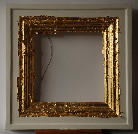
Frame in process of being gilded

Frame in process of being gilded


Gilding is easy, though it requires attention to detail. Gilding is also fun. I gild when I make my own frames. I recently went into the gilding process in detail on my own site. Not many artists gild or use gold. I sometimes wonder why.

Does gold have a place in modern/contemporary art? Would you use gold if you knew how? Or is gold something of a symbol on being not-modern?

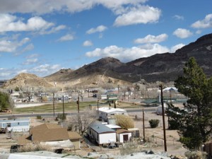
Decorative Elements, Beatty Nevada

One of my preoccupations in painting inhabited space is to see how people perceive and decorate their surrounds. In cities, it seems to me, conformity sometimes rules — or perhaps there’s too much unconformity to make sense of a singular type of decorative decorum. Whatever the case, I find that peering at small towns and villages gives me a certain kind of data; both individually and collectively, people seem to want to dress up, decorate, make order of what lies around them. And in places with few people, it’s possible to suss out what that decorative impulse consists of.

A particular caution that I remind myself of — looking at what people do to dress up their trailer houses requires a disciplined mind. My goal is to neither romanticize nor to satirize. I allow myself no irony about individual choices, although lots of irony can abound when examining communal structures (like bridges and mine tailings). What I want is to see what’s there without indulging in judgment.

So what is the predominate beautification element of Beatty Nevada ( 220 miles south of Reno, 110 miles north of Las Vegas, population 1200, where the Amargosa River surfaces, just for a minute, before being swallowed by the Amargosa desert [a subset of the Mojave desert])?

more… »

Pattern and Decoration, a reprise

“Pattern and Decoration” (P&D) is the name of an art movement that had its moment of visibility in the post-modern pluralism of the 1970’s and 1980’s. Its practitioners include Valerie JaudonMiriam Schapiro, Joyce Kozloff, Kim MacConnel, Tony Robbin, Robert KushnerRobert Zakanitch, and many others. P&D often serves as an unheralded theoretical base for the quilted arts that I am familiar with.

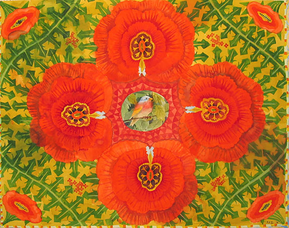
Robert Zakanitch, Red Watercolor, 34 x 36, 2007

Pattern and Decoration: An Ideal Vision in American Art, 1975 –1985 is the printed catalogue of an exhibit held at the Hudson River Museum in 2007 -2008. The catalogue has excellent essays by Anne Swartz, Arthur Danto, Temma Balducci, and John Perreault, as well as including short biographies of the artists and plates of the exhibited art. Most of the words which follow come from the catalogue.

more… »

Texture, the Internet, and Other Conundrums

I have just joined Facebook (thanks, D.) and of course, instantly found a group dedicated to a textile artist’s focus: namely, texture.

The photos of “texture” on the group site were close-ups, both of quilted fabric and of objects that showed as textured. I started through my photos and quickly realized that deciding on what shows texture is not as easy as might be imagined. Here are some possibilities from my files.

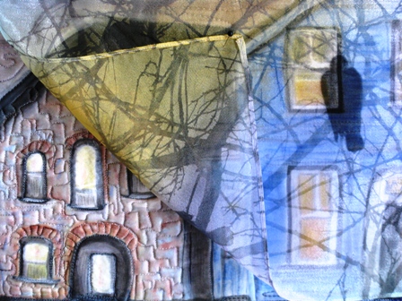
The High Note, JOU, Computer images on Silk, quilted, 12 x 12″, 2008.

The upper layer (of computer-printed sheer fabric) is turned back to show under layer. Normally the sheer would fall over the entire piece, showing through as it does on the right bottom. This dropping of the sheer obscures much of the texture while at the same time, contradictorily, adds to it.

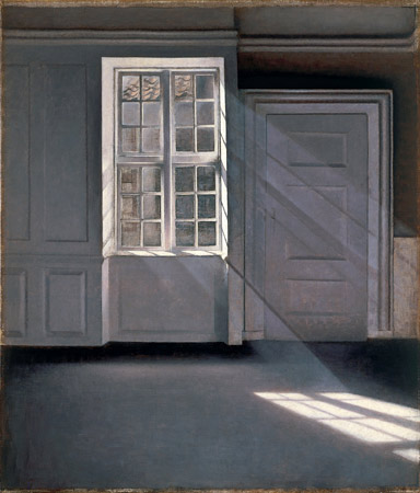
Vilhelm Hammershoi, Sunbeam (and various other titles), 1900, oil on canvas.

more… »

Comparing Media: Intaglio, Quilting, and Language

In a recent critique session of quilted art, conducted by two “fine” artists, I found myself having a “eureka” moment. Then, a few days ago, Jay and Melanie’s discussion of Jay’s intaglio technique on board and foamcore (published prior to this post) pushed some of my insights a bit further. All this was added into a melange of thinking I’ve been doing about where I am in relation to quilted art and painted art.

The eureka moment came through the phrase used by one of the fine art critics: the phrase was “working the surface.” “Working the surface” in the traditional fine arts means adding, deleting, scraping, underpainting and overpainting, sanding, gouging — all the kinds of things one can do that either uncover and/or add to a planar surface. It seems clear to me that Jay’s process of working his boards and foamcore are fine examples of “working the surface.”

With quilted art, “working the surface” seems to show up in two ways. One is what is called “surface design,” which basically alters the flat plane, by dyeing it, laying rust on it, discharging (bleaching) it, monoprinting on it, and even digging into it, tearing and unraveling the threadwork. This work sometimes adds texture (especially with elements applied to the surface (applique) or taken away from it (“cutwork” or just plain gouging holes). These kinds of working of the plane are singular, patterned for the effect in a particular work, not meant to be turned into a commercial design for fabric (the original use of “surface design” had a strong commercial element.) The other part of working the surface with textiles is the work of embroidery and quilted lines that make for a frieze effect; when stitches are pushed through the two layers of fabric and the in-between batting or wadding, the stitched line makes an indentation, beside which the surface becomes raised by the pushed-aside materials.

I have never heard the phrase, “working the surface” applied to quilted art before, but when I heard that and then saw the intricacies of Jay’s working of his surfaces, I realized that the language may give me new insights into what can be done with quilted art.

At the critique, the guest “critics” (very kind observant folks) looked at two pieces I had brought, comparing them.

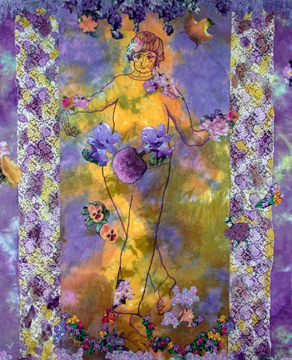
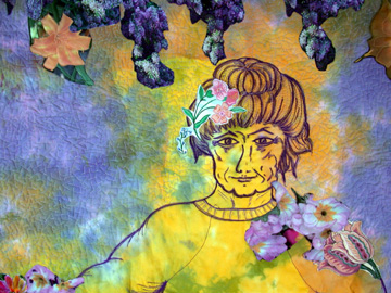
The first was one you’ve seen before: Mrs. Willard Waltzes with the Wisteria, 76 x 61″, 2003, hand dyed and painted cotton, embroiderie perse with computer-generated prints, and dyed overlays.

mrswwaltzesw.jpg

mrswwaltzesdetw.jpg detail

more… »

css.php