In a recent critique session of quilted art, conducted by two “fine” artists, I found myself having a “eureka” moment. Then, a few days ago, Jay and Melanie’s discussion of Jay’s intaglio technique on board and foamcore (published prior to this post) pushed some of my insights a bit further. All this was added into a melange of thinking I’ve been doing about where I am in relation to quilted art and painted art.
The eureka moment came through the phrase used by one of the fine art critics: the phrase was “working the surface.” “Working the surface” in the traditional fine arts means adding, deleting, scraping, underpainting and overpainting, sanding, gouging — all the kinds of things one can do that either uncover and/or add to a planar surface. It seems clear to me that Jay’s process of working his boards and foamcore are fine examples of “working the surface.”
With quilted art, “working the surface” seems to show up in two ways. One is what is called “surface design,” which basically alters the flat plane, by dyeing it, laying rust on it, discharging (bleaching) it, monoprinting on it, and even digging into it, tearing and unraveling the threadwork. This work sometimes adds texture (especially with elements applied to the surface (applique) or taken away from it (“cutwork” or just plain gouging holes). These kinds of working of the plane are singular, patterned for the effect in a particular work, not meant to be turned into a commercial design for fabric (the original use of “surface design” had a strong commercial element.) The other part of working the surface with textiles is the work of embroidery and quilted lines that make for a frieze effect; when stitches are pushed through the two layers of fabric and the in-between batting or wadding, the stitched line makes an indentation, beside which the surface becomes raised by the pushed-aside materials.
I have never heard the phrase, “working the surface” applied to quilted art before, but when I heard that and then saw the intricacies of Jay’s working of his surfaces, I realized that the language may give me new insights into what can be done with quilted art.
At the critique, the guest “critics” (very kind observant folks) looked at two pieces I had brought, comparing them.
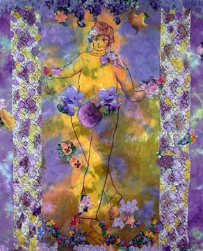
The first was one you’ve seen before: Mrs. Willard Waltzes with the Wisteria, 76 x 61″, 2003, hand dyed and painted cotton, embroiderie perse with computer-generated prints, and dyed overlays.
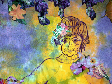 detail
This quilted piece has a strongly worked surface. The relief work of the quilted areas is combined with the hand-dyed mottled fabric and the graphically strong embroiderie perse of the appliqued/layered flowers to make a complex surface. My question for the critics was whether this was too complex an image, but they said it was very successful. What they also thought, though, was that the other piece that I showed, Mrs. Willard Dices with the Devil, lacked the very complexity of surface design that made the first successful.
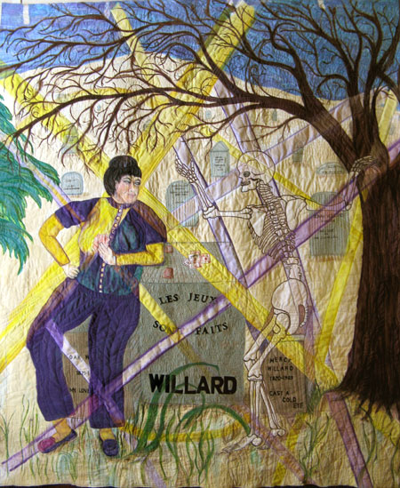 Mrs. Willard Dices with the Devil, 64″ x 80″, hand-dyed and painted and quilted on cotton.
Mrs. Willard Dicing isn’t completely quilted. This incompleteness was not entirely because I didn’t have time (although that figures into the problem). The real reason that it’s incomplete is that I couldn’t figure out what I was doing with the background, except stitching it because that’s what stitchers do.
I found the foreground tombstone relatively easy to stitch:
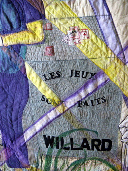
The flat front of the stone needed a bit of surface texture against which to place the letters, and the top of the stone provides some sense of perspective, useful in this semi-flat composition.
Mrs. W. wasn’t too hard to quilt because she had to be the most solid element of the surface. Therefore I had to leave larger areas of her body unquilted to make the surface stand up between the stitches.
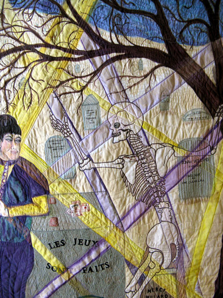
I even know how I will stitch Mr. Bones when I get a minute to do so — he’ll be heavily stitched in a shiny thread, silver or even clear polyester, which shimmers a bit when the light hits it. But the background –meaning the actual earth as well as the picture’s ground plane, stumped me.
However the concept of “working the surface” makes me realize that I need to add more variety in that ground; I needed to work the surface. I will probably do so in the form of added color as well as added stitching. And I might well do the stitching first and then pour on the color. Stitching before adding color means that the stiffening of the fabric won’t be such a pain when I am stitching it; and adding the color after the stitching could provide addition interest to the surface that a less complex set of values might lack. It was Jay’s gouging and then putting layers and layers of paint on his intaglio pieces that made me realize that I might be able to save the piece by doing this kind of work. With that idea, I think I can now bear to go back in and quilt more of the background, knowing that it will be further furbished with (I hope) subtle but interesting color. I also need to tone down the sky considerably, which I can do now that it’s stitched.
Which brings me to a last thought. One of the commentators on the piece said that I seem to have fallen between two modes of making art — the art which uses quilted surfaces and the art which uses painted surfaces. Actually he said it more bluntly: “June, you may have to make a choice between painting and quilting.”
This is the problem I’ve been wrestling with most of this year. Painting has a magical draw for me at the moment, but my contacts and communities are within the quilting arts. I hesitate to completely withdraw from the area that welcomed me and in which I am somewhat known. But I struggled so much with the quilting on Mrs. W. Dices that I was resigned to throwing aside the quilting art and completely immersing myself in painting. However, with the insights from various places that I’ve gained, I realize I was stuck not because I’ve been painting but because I simply didn’t know what I could do to save Mrs. Willard Dices with the Devil. Now I have an inkling of what might work.
So here’s a set of questions: do you work in a variety of media, and, if so, how do you justify the diffusion of focus that going back and forth between them can encourage? Have you made a difficult choice between media, abandoning one altogether? Is the brief essay above accurate in its views of the nature of “working the surface” as well as “surface design?” Are there other distinctions/comparisons between two different media that seem to illuminate as well as differentiate one another?
These are questions that I am mulling around as I am glaring at Mrs. W., still hanging on my design wall, waiting for me to move along. And I haven’t entirely abandoned the quilted art, although I find myself mightily reluctant to turn on the sewing machine.

I don’t really have the multiple media issue, in that I am only doing photography. I’ve also been attracted to drawing and watercolor, but given limited time, photography is how I choose to spend it. Similarly, our choice between quilting and painting, if you make one, may not be an identifiable decision, but rather a retrospective observation of how you’ve chosen to spend your time.
But I’m not sure there’s a real need to choose. Certainly Waltzes seems much more “painterly” than your problem Dices, and I think the same is true of many others of your quilts, which suggests that there is a real outlet in quilting for some of the painting delights. I suspect that most artists who work in multiple media tend to choose one or the other as more suited to a particular subject or mood. Certainly that’s how it is for me in the narrower choice of color or black and white in a given circumstance.
Surface treatment is something I’m getting very interested in, though it’s not a traditional concern of photographers, at least beyond the selection of paper surface. One of these days I’ll have something more on that.
Fascinating piece, June. Do you really believe the commentator when he says bluntly: “June, you may have to make a choice between painting and quilting.”
June:
Re: Birgit’s point – don’t you think that you may have made that choice?
June,
You have decided, and you have chosen both.
The difficulty — if difficulty exists — is not in you, but in the habits of thinking of the fine-arts critic who offered analysis from only half a loaf.
If you ask for an opinion from a specialist, you are going to get feedback rooted in that specialty. (I’m just back from having art quilts shown and judged at a local show and I got some silly “completely missed the point” feedback on certain aspects of the work.)
You have not “fallen” between two modes of making art. You are seeking a way to bridge two ways of making art. It is only to be expected that some works will accomplish that goal more smoothly than others; that some ideas, techniques, and materials will transfer easily between the forms and others won’t, that some pieces will be more succesful and some less successful, and that some people will get it and others won’t.
You have chosen both. It may be a challenging choice, but it’s not some kind of dithering or chickening out. I think it’s harder to create a smooth integration with things that are similar than with things that are dissimilar. (Often, the juxtaposing of dissimilar things is intended to be jarring.)
Not that you asked, but my impression of Dices is that the rays/bars of light seem to obliterate, rather than highlight, the titluar figures. And also, they lead my eye away from the center and the central figures, rather than toward it and them – but this may be an anomaly of screen viewing. I think one of the reasons that Dances is more successful is that the two titular characters are equally present, in balance, and in focus in the work.
Some things take longer to ripen than others. Dices may be one of those things.
Hi all,
Sorry to be so slow in my responses. Life overwhelmed me a bit this week.
Steve, when you said, “Similarly, … [the] choice between quilting and painting, if you make one,[the choice] may not be an identifiable decision, but rather a retrospective observation of how you’ve chosen to spend your time.”
This, of course, made me laugh because all the time I’ve been fussing and circling and kvetching about the quilt art, I’ve been doing the painted boards. The “decision” may be making itself, although I do like to think I have some say in the matter.
Thanks for your observations.
Birgit,
You asked if I believed that I have to make a choice between painting and quilting.
I think the choice has a couple elements: one is my age — I may be too old at 66 to jump around. It may take all the time I have left to gain facility in one mode, particularly if I want to go beyond doing the work to exhibiting it. The time factor is both how much lifetime I have left and how much personal time I have available. Exhibiting takes up an enormous amount of time and energy, and I seem to have less and less energy as my body ages.
The other is the matter of community, as I have spoken of. I’m reluctant to withdraw from the quilterly community; as I have been painting, I’ve found I have less and less in common with the artists using quilting as their primary technique. This may be just a function of my newness in the painting field — the questions I have are mostly circling that area — I have pretty much resolved the logistics of the quilting field, so I have less interest in the conversations about hanging rods and surface design techniques. But I still like the people….
So we’ll see if I have to make a decision between the two or if the decision, as Jay suggests, will be made without my direction.
Jay,
You said, “Re: Birgit’s point – don’t you think that you may have made that choice?”
You are probably right; I’m just hanging onto the comfortable hoping to have it both ways.
Hi Melanie,
Thanks for the consoling comments. I have never been one to go about my molehills in silence and acceptance, so it is probably true that I’m chewing at something already mostly settled and that I’m kvetching much too loudly. It’s one of my character traits — talking through problems is so much more fun than wrestling with them in silence (add snort!)
About “Dices,” — I resist the notion that the rays of light don’t work, although the piece doesn’t work and they are certainly part of the piece. But when I looked at it this morning, I thought that if I darkened and grayed the background considerably, the two primary figures and the rays would pop out and that might take care of the problem. The difficulty, of course, is in containing the darkening to the background — a bit difficult to do with unstretched fabric. But worth a try.
One observation that the critique seemed to highlight for me is that seamed textiles (like pieced or appliqued quilt art) depend upon a graphic-like quality — they tend toward the clarity of advertising (a lovely contradiction of style and meaning because quilts are traditionally warm and soft and uncommercial seeming).
the graphic quality of quilted art isn’t true of quilt collaging, of course, but in much of the other high art that is quilted, I see tidy outlines and clarity of contour. Massing of color and shapes become really important.
On the other hand, painting is about smooshiness of edges, about grey dripping into the blue that edges into the green that inveigles its way into the naples yellow. The contradiction between the graphic quality of the two figures and the rays of light and the painterly whole may be where this piece, “Dices,” falls apart. So I think I might graphic “Dices” up a bit, by clarifying foreground and background.
Of course, it’s easy to say I’ll do this. Doing it, successfully, may be something else.
Thanks, Melanie, for your thoughtful response.
tulle.
you probably already know this, but tulle is handy for graying down an area (and only one area). It also tends to blur what it covers a little bit, so the beneath parts get a little impressionistic. And it comes in a lot of colors and so can be blended by layering.
There’s a woman in my SAQA group who’s going from painting to fiber, and I’m finding it extremely interesting to hear from passengers moving in different ways along the continuum.
Thanks, Melanie. I don’t think tulle will work here but I’m filing away the idea for future reference. Let us know what the opposite direction is seeming like for your SAQA friend.
June,
Being of similar age, I support my energy by spending time and money coddling myself. Several years ago, I shopped around for a knowledgeable physical therapist to help me with an old sport injury. She in turn introduced me to a private trainer and an osteopathic physician for acupuncture and osteopathic manipulative therapy.
In addition to an exercise program, hobbled together from Yoga, Pilates and Matt Furey’s ‘combat stretching’, I make myself relaxation files, first solely based on imagery borrowed from the Swiss Dancer Eric Franklin, and now including other ideas to, for example, support my ‘Biopsychotype’ inspired by Joseph Helms “Getting to Know You’. I make my own relaxation files using the freeware Audacity and I listen to them in my IPOD Shuffle.
June,
If you check in at this thread, I’m not sure where to post it otherwise —
I raised the changing mediums question at the SAQA meeting tonight. As it turns out, there are several people who have come to fiber art from other fields (including one sculptor whose practice includes lost-wax bronze casting).
The conversation didn’t get much further than agreement that “composition is composition” and variations on “somehow the aesthetic of fabric is different” and “there’s something about the tactlity of fabric…” Curiously (at least to my naive understanding), there was some disagreement about whether “color is color.” Then the conversation skittered off into the advantages of dying and painting fabric, and moved on from there. But I think it’s the kind of thing that will yield by circling-around. I’ll keep you posted.
Hi Melanie,
I think it’s amazing that no one in fibers has tried to suss out the comparison you and I are interested in. I have heard comments (mostly snide) like “Why doesn’t she just paint?” And I have heard lots of (what seems like) blather about being true to the “material” — usually spoken by someone whose work is flat as a pancake, stiff as a board, rectangular, hung on the wall and looks like, well, a painting.
But none of these comments really get at much of anything for me. So do keep me posted! And I will keep circling. I’m thinking about seams and contour drawing at the moment as contrasts to mushy edges and painting from the center out.
I wonder if, ultimately, it will come down to something as prosaic as “different tools for different purposes” and/or the somewhat mystical “it just felt right.” I’m in the business of articulating things, so I’m always trying to ferret out explanation, but there are mysteries to the procedures that move us from hmmm to ah-ha.
I think sometimes that being able to rest in the mystery, to have faith that something will come of the exploration and to be equally comfortable with the things we call successes as with the things we call either noble efforts or failures, is the Great Good Goal. Easier said than done. [insert a smile and a wink]
The perennial question that comes up in fiber art is this notion of falling between two stools. People like resolution, like things to be one thing or clearly another thing: useful or beautiful, painting or quilt, over the sofa or on it. But it’s a continuum, isn’t it, with many point between the poles.
I started something this morning for which I decided that green is the right color to represent love. Pink/red showed up first, of course, but (aside from the hokum) it’s “not right” in the context of everything else that’s heaped up on the sort-the-fabric table. It doesn’t feel like a decision so much as a realization. I know I could give a list of reasons for the choice because a host of reasons crowded in as soon as the yes-idea appeared, but would they genuinely address the fundamental alchemy– How do you think of these things? Why do you choose these particular things — and not others — to realize the idea so that others see/hear/taste/touch/smell it as well? (however imperfectly)