Often our lives are made more difficult by greater choice. In photography, the choice of color vs. monochrome was not necessarily easier in the past, but at least it had to be made by the time film was in the camera. With digital capture, you can change your mind at any time. Some photographers, as far as I can tell, use only color; a far smaller number are all about black and white. Some, like myself, dither. Not to complain, but this is a constant issue in ways it wouldn’t have been before. Reminded of it by both the previous post and recent experience, I here present the latest dithers. Prepare yourself: I’ll be asking for opinions…

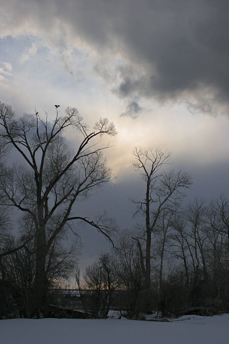
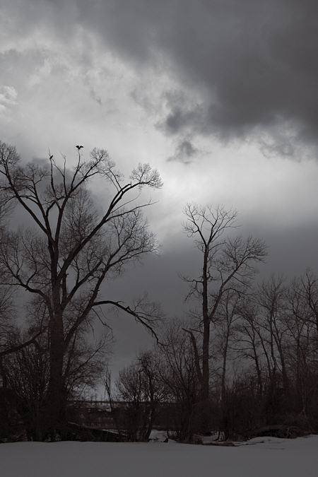
The above image is part of my Cottonwood series (though not (yet?) among the few image on my web site), but it’s also part of an ongoing interest in birds (probably to be christened a project soon) and skies (likewise). Perhaps it’s those multiple roles that cause me to hesitate on the color question. For skies, it may be best as above, but for cottonwoods or birds I prefer the “monochrome” (actually slightly tinted) version below. The irreality of B&W makes it, to my mind, more mysterious and intriguing. Without the attraction/ distraction of color, perhaps one notices the birds sooner, and perhaps even the similar shapes of the outspread wings and the light area of the sky.

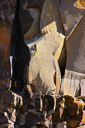
I worked that image just today, though it dates from a couple weeks ago. A more recent capture is yesterday’s rock face:

With this image, I think I prefer color. Perhaps it’s because the basic image is already rather abstract, and hence has no need of removing color to make it less real. Though as far as that goes, the color version is unrealistically saturated; the rocks are suggestive, but not that colorful.

I’ll have more to say about the rock image–from a slightly different perspective–in a day or two. Meanwhile, I’m curious about your own reactions to color/no color in the instances presented. Is your preference fairly general, or dependent on the particular image? Does the choice of one or the other seem to have any clear meaning or association for you?

In both of these cases I prefer the color image. But that is in no way a general preference.
In both of these photos, the color adds a lot of valuable information. In the Cottonwood photo, there’s a luminosity to the color image that doesn’t exist in the b&w. Those subtle shifts in color temperature, from the blue glow of the snow and clouds to the yellowish light at the horizon and cloud fringes add depth, and really capture the way the landscape feels at that time of day. It carries an emotional charge that I don’t feel from the b&w. For me the image isn’t about the birds, but they are a nice secondary focal point in both versions.
In the rock photo, I also find that the color adds depth and surface information that increase its appeal. The way the surface colors shift as they go from light into shadow makes me look more closely at the forms, and I feel I experience the scene in a richer way.
Color is a funny thing. Sometimes it clutters up an image, and removing it clarifies the forms (or in other cases adds mystery). But color can also add lighting and depth information, and there are emotional responses to color that are probably coded into our DNA.
I’d have to say that whether color adds to or detracts from an image would have to be decided on a case by case basis.
Steve,
I have to agree with David on both counts — that I prefer color in the two images on this post, and that case-by-case is probably the only way to sort out the question.
I would add that in the first set of images, the cottonwoods without color are far more sobering, even menacing, than they are with the color. My attention shifts from the pinkish/gold glow of the sky in the first to the starkness of the trees against that dark and ominous cloud in the second. I think you can make a decision depending on what you want to say.
And you are right that the color maintains the abstract quality of the rocks. I like it.
I too vote for color.
I love birds sitting on tree tops as in the first photo. The rock in color looks like a sculpture.
David,
I very much agree with what you say about color and its effects. In the first picture, I especially like the merging of warm and cool both high and low in the sky. The problem for me is that in color it seems very ordinary. Perhaps lovely in a conventional sense, but too similar to too many other images to grab my attention long. True, novelty for its own sake is not much better…
June,
Thanks for that point, I agree that the emphasis shifts away from the sky in the monochrome version. I alluded to an interest in skies, but I think in effective photographs they’ll be a larger part of the image; here my primary interest is in the trees.
Birgit,
Perceptive of you to think of sculpture with the rock, I’ll be following up on that very soon.
Ever the contrary one — I like the b&w, especially for the trees & birds, especially if it’s for the birds (as it were). The birds seem more distinct in the b&w — I don’t know why.
The rock formation seems to suggest narrative in b&w — devotees at the feet of the goddess, or some such — and, curiously, seems more abstract in color.
(I do fear this is unhelpfully idiosyncratic — walking around the quilt show yesterday I found myself thinking “I am so over color…”)
Thanks for the Times link. Although it wasn’t touched on in the article, I’m troubled by the colossal waste that all this choice represents. On the up side, it made me think about how constructive limits can be — how they focus attention and push resourcefulness. But, again, this may just be a habit of thinking from writing — most writings are improved by cutting 30% to 50% of the blather.
melanie,
I wonder if it’s not writers especially, and artists generally, who appreciate the advantage of constraints. They can feel it quite immediately and personally. In any case, that is one of the reasons I like B&W as my default mode. But as Pascal observed regarding a letter, it requires time to do as much with less. In the present example, I think David’s right about the sense of “luminosity” being less in the B&W version; this could be improved, but would take more care than I’ve yet lavished on it to compensate for the loss of color (blue-yellow) contrast in the sky by locally adjusting the purely tonal contrast.
(Ideosyncratic is good.)
At first look, my association with the rock image was ‘Egyptian art’.
The closest that I ever got to Egyptian art was at the Met and from reading novels playing in Ancient Egypt. Both, the vertical design suggesting figures and the luminosity of the yellow may have inspired that association.
Aren’t we all a little tired of bare trees now that, in our northern hemisphere, they are displaying their spring leaves?
ack, ack flowering trees — where’re my sinus meds…
Steve:
My, what a little tint can do. Scrolling back and forth between the two cottonwoods images produced a thought. The top shot Is highly associative: I tend to be there with the birds on a blustery morn or eve. The b/w version takes me out of Montana and into a more artificial setting where a different mindset applies.
The rocks present a different issue for me. I love the shape of the land in those parts. Instead of rounding down to mush, the rocks are knapped and spalled by the elements into sharply defined edges and planes. The monumental is everywhere. But your Anasazi (sp) series powerfully illustrates the contribution that a least human presence can make in the life of an image. Here the cliff is left on its own to tell the tale. Something meteorological, biologicaL or artifactual is waiting to appear. But I’m well aware of the challenge that such mocking rocks can throw down.
As to color, the rocks looks retouched and quite successful. The cliff face can’t compete with the cottonwood for content and the color tends to fill the glass. But I might suggest Photoshopping eyeballs onto the rocks for a mighty nice added touch.
I also flashed on Egyptian art with the rock “figure” that seems to have one of those cone shaped headresses, and feels like a sandblasted/lost its face kind of thing.
The black and white cottonwoods I flashed on Bergman and “The Seventh Seal”, waiting for Max von Sydow to enter stage right. I don’t know where that leaves the color cottonwoods; “Fargo”? woodchipper in distance?
First I have to say that I don’t like the second image at all — it’s so much “tourism” and the angle is so straight, not to say banal; it’s like I have some resistance to it. I can almost see a “Visit the ancient quarries” tag line somewhere near. Could be that our (my) psyche became contaminated with too much of this exotic stuff, I’m making a commercial link involuntarily. Anyways, these are general impressions, and I cannot testify for the technical execution.
The second image is better with color, I think. You can see that there is so much light there, that the lack of color appears “unnatural,” debilitating, almost ridiculous. It’s sort of obvious that something is missing.
The first image in my opinion is better in b&w. This is a case when less is more: the photo is about mood, gloomy and dark, and decolorization adds solemnity and emphasizes the mood (although flattens the image a little bit).
Hmm, seems the figure came through very clearly, I wasn’t quite sure of that. I’ve just started thinking more about that, as mentioned in today’s post.
Elijah,
Thanks for your comments. I’m especially interested that you felt color lacking more in the second case, although I would have thought both monochrome versions about equally “unnatural.” Both scenes are, in reality, rather subdued in color. By way of experiment, I’ve exaggerated the saturation in the color version of the rock face.
The frist is a very evocative romantic image reminiscent of the style of Caspar David Friedrich and friends…I really prefer the colour image, in both.
The rocks are beautifully detailed in the colour image…abstract but also sculptural
lynne, thank you for sharing your impressions.