This is an exercise in filling the Art and Perception news hole, deja vu or a naked bid for attention, take your pick.
A technique in these architectural paintings – and something which has appeared in previous posts – is the use of underlying intaglios or raised portions. Such a pattern can act to hold a design that comes through whatever terrain of filler and paint is later applied.

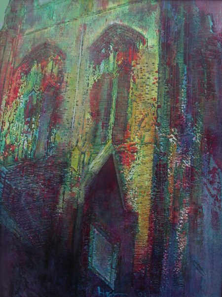
I swim at Notre Dame College, a school whose modest campus is dominated by an imposing main building. This began as a shot, in white board mode, of a corner of that structure. This was then traced out on plywood with whatever appeared as black becoming a raised area. This was then followed by a period of back and forth with opaque colors and glazes. The structure ended up as both firm and dissolving.

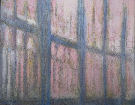
The previous exercise led to this image of the interior of an unknown perpendicular cathedral. It employed the same methodology as the prior image, but an attempt was made in this case to deal with transmitted light. I kept applying ever lighter tones until the image almost disappeared. This was followed by some darkening. The cathedral, rendered in raised surfaces, continued to reassert itself throughout this assault.

I could swear that I shared this image before, but I can’t find it in the annals.
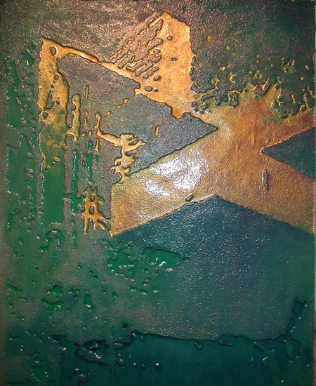
It is clearly Fallingwater, one of Frank Lloyd Wright’s most famous commissions. The architect had specified that a goodly portion of the building would be covered in gold leaf. Budgetary limitations unfortunately prevailed. In a spirit of charity and with a bit of gold luster I was able to add this touch. For this painting I went with incised Foamula.
I don’t have a thematic question to pose, except to ask what question you would pose here if you were I.

I’m rushing off to sit in on a thesis defense, but I wonder if there’s a question/conversation about the impact of the sculptural elements on the color fields (is that the right term?) similar to the discussion of the quilted line that June so beautifully explicated? (which may be on RCC, I tend to get blurry about what I’ve read where when I read things on the screen. There are fewer physical clues to feed eidetic memory (at least that is so for me))
Melanie and June:
Best I review June’s explication. June, where did you put it?
Are you suggesting that we talk about how the Notre Dame walls tend to dissolve? If so, I’m in. That painting was resolved through a hit-or-miss process, as elements took their respective places without my exercising or developing any firm guiding principles. The image ended up looking like some country cousin of a Monet facade and I left it like that. But I had quickly gotten into how the various bits of business, derived from the original b/w photo, exerted a sort of pulling back to the plane of the wall, thus tending to keep the patches of color from wandering off too far.
Jay,
It’s easy enough for me to add digital files to a hard drive, but what do you do with your prolific production? I hope these works find homes.
Your pictures on plywood seem to have more body and lightfulness than the Foamula; I like their texture better, and somehow the light seems more like it could be coming off the surface rather than be in it. Architecture appears to be especially suited to the intaglio technique, the relief has a real basis.
I googled for the bit about line by June and found this:
http://www.artandperception.com/2007/09/the-line-as-quilted.html
There must have been a recent comment (the post is from 9-28-07) that brought it forward just in time for me to stumble across it.
I think I was thinking something simple (yet I can’t quite articulate it) about the shadows and texture that are created by quilted lines — and how or whether the incising of your various boards (Foamula!) serves a similar purpose.
Initially, I seduced by the ex- and im- pressionist palettes of the first two pieces, but the more I look at the Water Falling on Foamula, the more I’m intrigued by the slickness of the color in the indentions and the intensity of the light and shadows on the low ridges of the relief. (The way it’s coming up on my monitor, they look almost like outlining.)There’s something crisp and urban about it that seems appropriate to the subject. (Is the white in the central area in the painting or a reflection?)
As melanie suggests, there must be a whole taxonomy of ways the medium texture, here intaglio, interacts with the painted layer. Quite similar to June’s treatise on quilted line with painted fabric or cut shapes, except there the line comes last, while in Jay’s case it is first.
Guys:
This is my third attempt to respond: my comments are getting dumped. I’ll try later.
Steve:
I respond in short bursts.
The Foamula is somewhere between forlorn and foregone. It is only when one covers it with something stiff and resistant that it stands to last. So far varnish has worked, along with applications of plaster, Portland cement etc. Its greatest utility appears to be as a mold in that it is easily worked and tends to behave halfway well with a variety of pour-and-set materials. It is very permanent as a material.
Melanie:
In that the foam and I stand for something together, then I’ll admit to being suburban and somewhat crispy. The white in the central area is indeed a reflection, and a reflection upon my propensity for things shiny. Steve has given up suggesting better ways for me to photograph objects.
steve:
The use of raised areas on board is more like using a fork while the foam is like eating with one’s fingers – they both have their moments, but the one is more refined.
First of all, Jay, may I say that I missed the nakedness which you say may be part of the “exercise.” Darn! Next time I’ll look sooner (add snort).
Secondly, thanks, Melanie, for looking up my old post. I’ve been a bit swamped lately and saw the message but you did the work before I got to it.
Third, Jay, I think I’m missing some vital tech-speak in your description: “The previous exercise led to this image of the interior of an unknown perpendicular cathedral. It employed the same methodology as the prior image, but an attempt was made in this case to deal with transmitted light. I kept applying ever lighter tones until the image almost disappeared. This was followed by some darkening.”
I don’t know what you mean by “transmitted light” which seems to be contrasted to the work on the piece above. Maybe it’s the difference between opaque and transparent paints, in which case I guess I am following. But I thought I’d check.
Finally, do you decide to do “frieze” work — raising the surface — or “incised” work — gouging out the surface because of the subject matter or the nature of light that will be raking the surface or some other reason? I guess I’m even curious as to whether you are thinking “raising or cutting away” (the black areas on your first piece or “gouging out, with the positive space being that which is gouged rather than that which is raised?”
With the quilted line, there is always the positive/negative space question vis-a-vis raised space and stitched line. It’s sometimes confusing to me, something I actually have to rationally work out. Other times it simply is intuitive.
Finally, Melanie, the quilted line is a bit more diffuse, softer, in its nature than Jay’s foam and wood intaglios, I think. I can sometimes get something closer to that sharp edge if I use a fusible batting and silk, but cotton batting and fabric tend to be more limp. Even if the cottons are “packed” — that is, filled with extra batting as in trapunto — they have rounded edges that soften the line.
I see I’ve made two “finallys” in the above comment. Tells you something of my changeable nature.
And I’m in the midst of finishing up a post that continues this conversation about Working the surface of our art. I’m hoping to proof it one more time and publish it this (Saturday) evening.
June:
You didn’t miss much.
Reflected vs.transmitted in the sense that the Notre Dame bell tower is treated as basically a stone and brick surface from which light bounces to the eye, vs. the cathedral interior in which I tried to deal with the sun’s rays passing directly through glass. In the first painting I made a big deal of using glazes in the hopes of softening up the look of the brick. I found little need to do that in the cathedral painting.
there is no orthodoxy surrounding my choice of the “innie” vs. the “outie” approach. The Fallingwater painting might have worked on board just as well. All in all the creation of bumps and plateaus seems more to my nature. But then you might remember, some years back, my putting up a painting of the Cleveland skyline with a lot of criss-crossing power lines. That was a foam painting and the lines stood out rather well.
I hope you caught my wish that you write a book – either a tome or an account of your adventures.
re: the putative book — I’m waiting for a stenographer to take down my immortal thoughts.
And re the light — here I thought you had some kind of mysterious process of painting that would bring us to light reflected _and_ light passing through. It’s an obsession of mine — sort of like Through a Glass, Darkly and/or Plato’s parable of the cave. Take your choice.
June:
Immoral sells better.
Ah, as though I were living in a glass house – or studio. Actually, I have issues with my choices there: through a glass darkly puts me in mind of an empty beer bottle and Plato can have his caves for all I care anymore. None of which has anything to do with your point.