Now for something completely different from my usual inanimate landscapes. Probably almost every photographer in Montana has done horses at some point. They were actually a major subject of my first photos when I started up with digital photography, and starred in my first self-assigned project (not on the web site; I guess it’s still in progress). But they were eventually neglected as I mostly pursued my long-term interest in landscape and abstraction. Then I saw some postcards of the Horse Nudes portfolio of Kathe Lesage and realized what I’d been missing. Last weekend I had a chance to do something about it.
In fact, horses offer a fabulous opportunity for abstraction, though I’m certainly still learning how to do it in a way that works for me. On the scene, there’s constant movement and no opportunity to contemplatively frame a view. I know better now what it’s like for Doug Plummer photographing his dancers. I aim for things that catch my eye, try to anticipate, take a lot of frames, and edit afterward. This project has virtually my only off-tripod work.

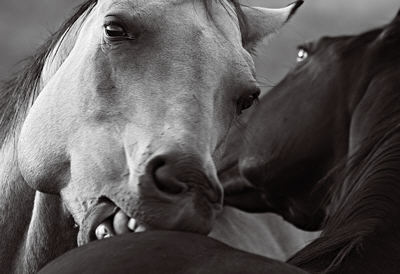
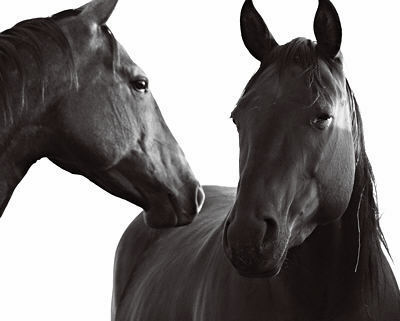
I’m just beginning to think about the shape of this project. Here I show a couple kinds of images that have caught my interest. One involves interaction of the horses with each other, as in the lead-off image where the two are scratching each other; despite appearances, this is definitely not anger or attack.
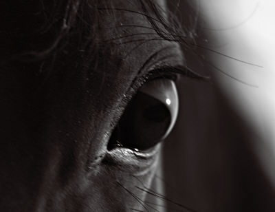
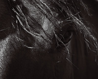
The other kind is more about interaction with me, and tends to focus on eyes. Even though I don’t offer food, the horses (at least some) like to be petted and scratched, and they nuzzle, nibble, or lick me (especially if I’ve been sweating). There is actually a fence between us, which I’m sorely tempted to cross, but I haven’t yet located the owner and asked permission.

There’s a lot more to be done here, and I’m sure the images will change as the project develops. The ones here represent the only processing I’ve done so far, so I’m just getting to know them (there are almost 300). At the moment, the project feels very exhilarating in its difference from my other ones. It’s so new, I haven’t even formulated questions yet. But I’m very interested in any comments you might have.


Just a quick glimpse and I am off packing.
Different horse moods, horsing around:
Playing, harmonious interaction, wide-eyed and my favorite,the messy-hair horse.
Not having been around horses much, I can relate to the last one because it looks like a person.
For me the first picture displays a lot – white versus black, good versus evil, flaring nostrils and wide eyed fear, splayed hair indicating hints of sexual tension, the strong jaw of the white horse not betraying its gender and the white teeth almost taking a bite out of the other – a very dynamic, tension filled picture that lives with you.
The others did not affect me to anywhere near a similar degree.
Glad you started off on this project. Look forward to seeing more..
I agree with Sunil. The first photo really grabs the viewer, especially the fact that it feels like the horse is looking right at me/you.
I think horses are a fantastic subject (and one I’d like to explore myself if I get the chance). I’m sure you’ll learn a lot in the process.
I’m curious about the whole abstraction idea and would like to know more about your thoughts on that.
‘Horse Nudes’ sent me down memory lane.
I vaguely remember ‘Perrudja’ by Jahnn (1894-1959), a book that I read as teenager in which the main character had erotic feelings for his horse.
De.wikipedia says that Hans Henny Jahnn’s works remind of Surrealism in the painting.
Steve, it looks like a great project for you. Most of the photos I’ve seen of horses (not that I’ve looked at that many) have been of the whole horse, or a “portrait” of the head. The idea of getting in close, and especially capturing the interaction between horses, seems like it could tie in well with the work you’ve been doing with landscapes. I think it’s good that it forces you to abandon the tripod. You’ll discover more things that emerge without calculation.
Steve:
Before I let this post slide by without a comment, let me say that that first picture is terrific. I’m sure that you took that shot from across the crowded room, yet it seems that you are next in line for an equine nuzzle or two. Let me guess that your focus experiments with the pears are bearing fruit in this, another topic. The horse on the right is very nicely blurred, and in a manner that draws attention to the eye, which,itself, draws my eye back into the composition. The light, too, is provocative: sunset? A very special place where horses revel and dream?
I like these horses very much, esp. the first photo — which is nicely balanced between sentiment and function on the parts of the horses. You know that little squeeze or the noogies you give a friend when you’ve been rubbing their back for them?
And it’s interesting to look at the eyes. Naive artists have a tendency to put people eyes on their horses, and these horses DO have people eyes! The camera can’t lie! Normally horse eyes are the eyes of prey, set to the side and slightly bugged so they can see all around in case a cougar is creeping up. But these horses might be relaxed enough to be telling stories, as at a cocktail party. “And then I said…”
Prairie Mary
Well, the abstraction thing is a grand concept I’m still working out, and probably will be posting more on before too long. One aspect is just the emphasis on strong shapes and relatively large tonal regions (somewhat like color fields). This may be somewhat more obvious in the examples above, where these aspects have less distraction from the dramatic curves and emotion. Another aspect is the generalization to the degree that associations with completely different subjects can come into play, as in the “landscape” I show below.
Yes, there really is a connection with the landscapes, sometimes fairly directly, as with the above image that reminds me of June’s hills:
Jay,
Good observation! Yes, I’m playing more with blur, as I was with the pears. You’re also right about the light, but it’s not sunset but sunrise light.
Mary,
I am fascinated by the eyes. They’re so big that I can sometimes see myself and the landscape in them. Maybe I’ll include one in a future self-portrait post.
“One aspect is just the emphasis on strong shapes and relatively large tonal regions (somewhat like color fields).”
Just like my houses :-)
These photos are good, Steve. I’m curious about the background in the first one. Is this whiteness intentional? I used to struggle with white skies in my black and white photos.
Tree,
Probably the whiteness is due to overexposure, though there might well be some detail there I could capture–don’t have it in front of me now. Though anathema by Ansel Adams standards, I think going to a white sky can sometimes be interesting, though I think it’s less appropriate for yours. I haven’t decided whether I should try to recover some sky detail here. It might be OK in some images, but I don’t especially like having inconsistent skies.
Yes, your houses have large, flat color areas, which contributes to that monolithic quality Jay mentioned. A good foil for ornamental detail, something you can really work with. I think it’s a similar perceptual dynamic:
obvious symmetry points to asymmetries
large, flat areas point to details