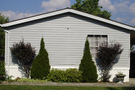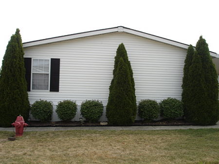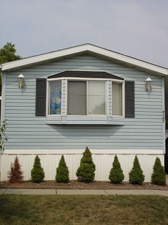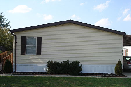
I’ve been working on a series of photographs of the homes in my neighborhood. This project started after about three years of walks with my dog at different times of the day and encompasses a whole gamut of thoughts and feelings that I’ve had towards my home.
The more I saw the same things every day, the more meaning all of it took on for me until I had to get my camera and take photos. I suppose there’s a lot I could write about but I want to focus on two ideas regarding this project:
Anyone who studies Art History (as I did) is made abundantly aware of the importance of Classical and Neoclassical ideals in art and architecture. It doesn’t matter if you love it or hate it, it just is. One day it struck me, a bit humorously perhaps, that even manufactured homes (so antithetical to “natural”) in the Midwest can follow the same guidelines of symmetry and orderliness. If the homeowner has “Classical” yard ornaments, even better.

There’s something about a straight-on look at these homes that intrigues me, the solid unbroken colors in particular, which remind me of an abstract painting. At the same time, there is a blankness, almost emptiness that I’m trying to capture. Ideally, I want a bright blue sky to offset the homes but in my area, that’s not always so easy to get. I feel I have a long way to go with this project but I’m enjoying the process.

Now for a couple of problems I’m having. One is no matter where I position myself, no matter how I hold the camera; almost all of the photos have a slight upward look to them yet what I want is literally a straightforward shot. I thought about using my tripod but haven’t yet, mainly because I’m not sure it will solve the problem as the height of the tripod can be confining to my goals.

The other issue is I can’t get exactly what I want in the shot. Ideally, I want just the home with nothing extraneous on either side of the shot but again, no matter where I position myself or the lens, I end up getting too much or too little. I’m wondering if a wide angle lens will solve this problem?

Tree,
You’re tapping into a very powerful dynamic with your emphasis on symmetry. When we see something that looks mostly symmetrical, we immediately start examining the details to check how well things match and how the symmetry breaks down. That draws us to elements that we search to find meaning for. The dead bush is not only humorous, but might be an allusion to a hidden rot; will the bushes die off to the right, one-by-one? Will that little fire hydrant suffice if a fire starts? Does that Roman(?)-style planter mark an effort to publicly claim an aesthetic sensibility?
I don’t think you’re giving us simplistic answers (rather, my questions betray my own prejudices), but you’re helping us see and think about these places. I found myself much more engaged than I usually am with photographs in the common flat postmodern color style, which these resemble.
Tree:
Some thoughts.
Do you use Photoshop? There might be a useful feature if you do. Go to “crop” and place a crop box around your image. In my program the toolbar then shows “perspective” with a check box. Check on, and you will find that the corner handles on the crop box can now be freely moved. This allows you to adjust the shape of the box. It will correct back to a rectangular image When you click in the box. But the image will reflect the choices made when you moved the handles. This is primarily designed to allow you to adjust for keystoning. You have a keystoning issue and this should help.
On the technical side, the upward tilt (called keystoning) will always happen if the camera is tipped back from vertical. To deal with this (if you want to), you can take a larger view with vertical camera, then crop out the lower part you don’t want. This results in a loss of resolution, as you’re throwing away information. Alternatively, you can adjust the image with a computer program like Photoshop (super-expensive) or GIMP (free). In any case, you should feel free to crop if you feel that improves an image.
Changing the lens to wide-angle would only let you take the picture from closer to the subject, but would not change the composition much. (In your photos, the subject is mostly in a single plane; if you start including foreground elements, then the compositions available would be more influenced by lens focal length.)
Tree:
I wasn’t done.
Houses with few windows,like the ones you have photographed, tend to have a monolithic quality all out of proportion to their manner of construction. In my mind, such structures are a good foil to a minimalist kind of landscaping. My question would be: are you choosing to shoot formal landscaping treatments over flower beds and the like as a personal choice, or do you find that most homeowners in your neighborhood tend toward spare landscaping solutions when setting up their properties?
Tree, I think Photoshop is the answer to all three of your problems.
1:) almost all of the photos have a slight upward look to them: Jay’s suggestion about the crop tool is the way to go. If you position a corner of the crop marquis on each corner of the face of the building (with “perspective” checked”), and then use the handles on the sides (not the corners) to move the marquis out away from the building, you can choose your cropping and you’ll get perfectly rectangular alignment.
2.)Ideally, I want a bright blue sky to offset the homes but in my area, that’s not always so easy to get.: Shoot some blue skies separately, and drop them in behind the buildings using Photoshop. This is pretty easy to do using layer masks.
3.)no matter where I position myself or the lens, I end up getting too much or too little: Shoot too much, and crop.
I know Steve feels that Photoshop is expensive, but I guess that’s relative. It’s an essential tool in my work as a painter, and I think it would be even more-so for a photographer.
David’s right, Photoshop is essential for many, especially if they’re doing graphic arts work beyond photography, or if they want to rely on the many published tips and tutorials. I personally find all the functionality I need in Picture Window Pro for $90, and a good help forum is there also. Photoshop is roughly $600 street price.
Steve:
Depends what street.
I’d give my right arm for Photoshop. But that would be counterproductive.
Will definitely look into Picture Window Pro.
Jay, the photos here are just a fraction of what I’ve taken over the past couple of months. A lot of the homes’ yards are overloaded with ornamentation which in itself is begging to be photographed (the St. Francis of Assisi that lights up at night? Hells yeah!).
My original intention was to capture the yard ornaments with the home but in order to get all of this in the frame the decorations are lost in the photo and despite everything, I’m wary of doing a series of just lawn ornaments.
I’m very selective in my choices of homes. Some of them are just too nice to fit my needs, so I skip the ones with tasteful window boxes and charming porches. Others don’t challenge me for whatever reasons.
It’s all very subjective and follows my own possibly weird logic. I’ll know I’ve succeeded if others get it.
I really appreciate all the great tips here. Steve, how can I learn more about GIMP?
Steve, I wanted photos that depicted a purity of symmetry but now I’m not sure that’s possible but I’m starting to like that too because dead bushes, Spongebob Squarepants “curtains” and fire hydrants create a tension I enjoy.
David, I’m not sure I could do that with the blue sky. It just feels like cheating to me, and removes some of the challenge for me which I enjoy, but it’s an idea I’ll keep in the back of my mind.
I’ll continue to post photos and my thoughts on my own blog regarding this project.
Keystoning. I don’t think I’ve ever heard that term before but how perfect because the keystone is an important architectural element in the Neo-Classical style.
Jay, what street and how do I get there?
David, I’m not sure I could do that with the blue sky. It just feels like cheating to me…
Some people might claim that you’re already cheating by using a camera :)
Certainly, just do what you feel comfortable with.
It is fun how symmetry is foiled by a fire hydrant, a dead bush, a ceramic pot, one instead of two windows, 2 instead of 3 bushes…
Humans foil the best of plans, don’t they Birgit? ;-)
Tree:
It’s called the educators’discount. As I remember, the Photoshop came in at about half price.
My son Matt uses GIMP. Whether it corrects for keystoning is another matter.
“some people might claim that you’re already cheating by using a camera :)”
I’m not touching that one.
:-)
Tree:
I magic wanded your sky in the first image with Photoshop and inserted a deep blue sky. Sharp.
Tree, I want to ask you about something, but you should feel free to not answer, especially at this point in your project. You’ve noticed some symmetries and partial symmetries in prefab homes and it’s interesting that at least some people try to make their landscaping equally or more symmetric. In your view, is this a natural human tendency? Are the homes represented in your pictures the norm or the exception? Or is the symmetry not so much the point, which is simply neatness?
By the way, for what it’s worth, I think it looks better with a little showing at the sides, even if not symmetric; it almost underlines the appearance of the home as almost independent of its surroundings — one’s own castle.
Just Google “gimp” and you’ll find all you need. It’s open source software developed for Linux, but now available for most computers. From my quick glance it looked like it would handle keystoning, but I’m not certain. It is less capable than other programs, but it is free. By the way, I forgot to mention that Picture Window Pro is only available for Windows.
Cheating is for you to define. I don’t think you need blue skies, though washed-out white (#2) I like least. I’d like to see Jay’s effort.
Tree,
I was out all of yesterday and did not get a chance to catch up here, but I am glad to see you here with your first post. I hope there are many more engaging discussions like the one presented above. While, I lack the technical depth to comment on the tools used to alleviate the problems raised by you, I must say that a lot of my photos were cropped and keystone adjusted by using free software called PAINT.NET. Not too sure if you have used this.
Also, your post of ‘homes in the neighborhood’ gives a lot of backdrop and relevance to the post on your blog that did not have the reasons for your motivations in this direction. Thank you.
Hi Jay, I’d love to see what you did. I have some photos on my blog that have a really nice blue sky. Hit or miss, I suppose.
Steve, I need to think a bit before I answer your questions. Although here’s what I can share off the top of my head as far as landscaping (and by extension, lawn ornamentation) goes:
Most of the landscaping was put in with the home and has nothing to do with the homeowner; in a way the bushes are pre-fab, too. The people who live here don’t have a lot of money and many take pride in their homes. Not sure this is the right word but there’s a bit of pathos to people who live on the edges of society and work to create a sense of beauty in their tiny patch of yard, no matter how tacky or silly someone else may think it looks. I think they just want to find some happiness.
Maybe I worded this wrong; I definitely want something showing on either side of the houses, I just don’t want so much that it’s distracting from the central image.
I hope I didn’t offend anyone with the “cheating” comment.
Tree:
I don’t know about pathos. You don’t have to be rich to light your little candle. I have known people of extremely modest means who have created and shared beautiful things. Right across the tracks from my son’s place in Lakewood is a small bungalow that is beautifully painted and adorned with botanical splendor. The resident may or may not be rich, you can’t tell – and she does all of her own planting and nurturing.
You don’t have to be rich to light your little candle. I have known people of extremely modest means who have created and shared beautiful things.
It can work both ways. You only have to take a walk through parts of Beverly Hills to see what happens when you combine bad taste and big money :)
Thanks for the tip Sunil.
I didn’t write anything on my blog about this because I wasn’t sure where to start or end. And I was feeling lazy the day I posted the photos. I’ll be more focused in the future.
David:
Beverly Hills is a paradise of inspired dwellinghood compared to Shaker Heights. While good architecture can be seen, I find myself preoccupied when there with the inequity of expenditure to effect.
Tree:
I will figure out this picture-in-the-post business real soon now. Meanwhile just give me your e-mail address and we can go from there.
Tree:
Also, you mention a blog. How do I get there?
Jay, hopefully you can click on my name and you will be magically transported to my blog. It’s not a very impressive or professional site but it’ll do for now.
http://www.eyebetree.blogspot.com
smithks1@cinci.rr.com
Tree,
Thanks for the great photos. Coming from the desert, where spare reigns but not classical formality, I found this work startling. You have made us look again at the most banal sorts of home-scape. And again and again.
The issue of class and yard decoration comes out of a desire, I think, for order. If you haven’t much money, then you take a real pride in having well-cut grass and trimmed hedges. There’s a disorder in poverty or near-poverty (at least in this country) that can only be held back by rigid adherence to specific standards of appearance.
In my case it was my Mom’s pride that we never appeared in un-ironed clothes! Our yards, alas, were a mess.
Oh, and Tree, Photoshop Elements might make a great program for you. It’s about $100 but can often be found cheaper. Essentially it does all the things that Photoshop does except the upper-end professional work. And it is apparently easier to learn. I have friends who swear by it. You might check it out.
Jay taught me about fixing the keystoning problem and has made a genius of me as a result. Well, at least he’s made my unsquare work look square.
Tree.
You may appreciate Todd Hido’s work.
http://www.toddhido.com/
June:
Coors makes Keystone beer. I realize that this has nothing to do with the subject at hand, but I thought you’d like to know.
Actually, the keystoning function can work in reverse and gives some interesting effects. With a little keystoning I was able to turn one of Steve’s waterfalls into a gray winter sky with a little turbulent curlicue at the bottom. Sorry Steve – I couldn’t help myself.
Sorry, Jay, I can’t help you either.
I’ve always liked Todd Hido’s work. I would say it’s less focused on subject and more on aesthetic aspects than most contemporary color photography.
Ah, perfection.
Under Todd Hido’s writings, I found this verse:
which reflects some of the photography on his site.
I went through those thoughts and emotions many, many years ago and read the accompanying literature. As a hobby, I imagined photographing cars defiling landscapes.
How depressing that each generation goes through these thoughts and emotions like a broken record repeating the same track. What is new?
Conversing with Troels on this subject, he objected to ‘depressing’ (above),and suggested ‘fascinating’.
Birgit:
Is an old thought directed toward a new circumstance a new thought?
Sure, given that the repertoire of motivational behaviors of humans is limited.
Thanks for the link, D. Just took a quick look and will return when I have more time. Some of his photos have an odd familiarity to them and I see he’s spent time in New England so maybe that’s why. Some are depressing as hell to me.
June, thank you and I like what you wrote about taking pride in yards and such. It’s intriguing how each yard is it’s own little world.
I hope to spend tomorrow checking out photo editing programs. Thanks again for all the info on that.
Keystone beer. Well that brought back repressed high school memories.
Tree:
were those memories repressed – or were you simply Keystoned?
Jay, probably a little of both.
Thanks, too, for the Todo Hido reference. Tree, it will amuse you to know that I was sure I recognized a derelict house from Port Townsend, which sits just inside the Puget Sound in Washington State. But all that snow — well, it’s more likely New England — or maybe Pennsylvania.
Tree, your comment that each yard is its own world is fascinating, given the spareness and conformity among the yards. That spareness makes each bit that’s a little out of place or odd all the more poignant.
Has anyone noticed that the yards that used to be open for children to roam through at will are now almost all fenced in? Go down an alley in a modest suburb sometime and take note.
June:
Cleveland Heights is the litigation capital of the USA. Should a kid run across your yard and trip, then you’ll have a tot tort. Fences tend to establish a certain legal protection. That said, the mail delivery professional can do the whole thing without touching a sidewalk.