Over the course of the last year I have made a number of cut wood letters. I have done so in order to gain process experience and to find the right combination of typefaces, dimensions and treatments in search of a decent question and answer linkage.
Watch a presidential debate and see the tangled relationships between the moderator’s questions and the varied kinds of responses. Messy and devious as it may become at times, the question and answer relationship is a fundamental aspect of the intellectual process. As such it calls out for plastic representation.
The final solution will likely be a tangled mass of big block letters. In the meanwhile I’ll settle for an equally tangled mass of this last year’s experiments.
These are three photos of one piece.
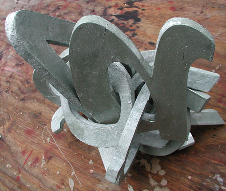
I’m still looking for the right colors. Early on I was giving each letter its own hues and patterns. This raised the visual density, but detracted from any clarity of intention. When undecided, I usually fall back to aluminum paint.
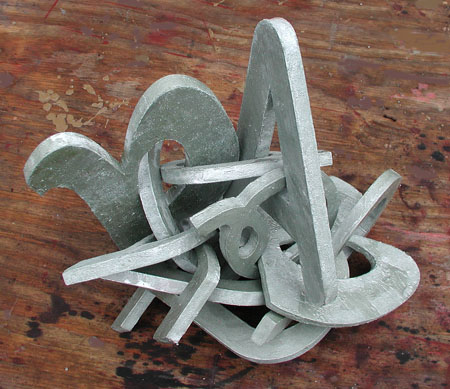
This piece offers a degree of freedom as one can rearrange the components to taste. One objective is to have the various edges assume a worn and somewhat distressed quality. The rearrangement and the wearing I tend to see as parallel to the dynamics of Q and A.
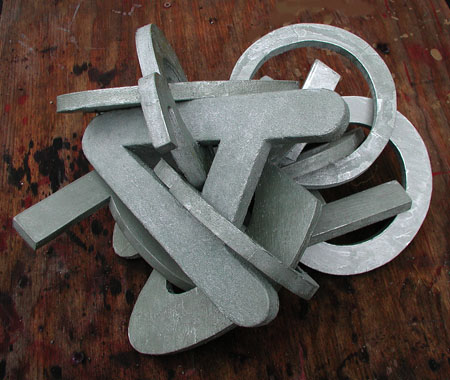
It’s all angles, nooks and crannies, and I like the effect. Whether or not it has much to do with its subject is open to debate. You lift the whole thing by a letter and slowly let it drop into a new configuration. Perhaps one of those falls best represents the underlying thought.
Your ideas and suggestions are most welcome. And, yes, you have seen some of these shapes covered in mud in a previous post.

Jay,
I always wince when I see letters and words used in incoherent ways in art. Somehow trying to make the standardized forms of text become meaningful through visual means makes me want to go read a good book.
Now that I’ve insulted you, I will admit that your verbal comments make your visual art less painful to me. Instead of thinking about A’s and O’s and ?’s, I get to think about tangles of comments and curiosities and queries and results.
Your visuals, in other words, resemble the textual meaning.
But that begs a lot of questions — the first being, how are they art (not meaning, not propaganda, not essay, etc.)?
And so, my first reaction is that I want more differentiation, perhaps through color or shading or some such, between the various intertwined forms. But that’s a quick personal observation and I could be persuaded otherwise.
June:
I put this up because of the questions.
Wincing seems to come with the territory. Destructured units of meaning can have that effect. There’s a kind of stop and shop quality to appropriating things like these letters. It’s kind of pop art without the pop.
That’s why I think I’ll finish this quest off by either casting the net wider and using material from a number of sources, or narrowing down to the simple and styleless block letters that I mentioned. It’s really the crash, tangle and chew that I’m after.
As I said, the letters in question were variously painted and in a fit of quailing swoon I reached for the radiator paint. But there are a lot of ways of doing this thing.
Jay,
I love your entanglements,recent photographic and here, sculptural. They are far more interesting than the presidential debates that remind me of kids fighting in a sandbox.
How big are these pieces? I would stay monochrome, silver, red, whatever.
Birgit:
The largest single element is about ten inches long, so the whole bundle is a few feet on a side and varies according to the drape.
Jay
I think I need a photo that does a bit more justice to the sculptural content of your entanglement — could you set it up with a plain background and with lights that would show the shadows, etc? And take another bunch of views from various angles. And provide a sense of scale?
This may be asking too much, but somehow I want to pick that thing up and look at it, roll it around, try to make visual sense (beyond letters and your statement) of it. Maybe I’m just frustrated by the way sculpture shows on the internet — it’s worse than textiles.
Anyway, I’ll keep looking and pondering — something will hit me in the nose and I’ll wonder why I ever thought differently. photo #1 is starting to grow on me…….
Jay, I think they should be red, white and blue. Maybe even stars and stripes. Or if not that, perhaps something else to suggest that, like the words of politicians, these letters are supposed to convey meaning, but in fact are just wrapped around themselves.
Or perhaps they could hang on the wall (or sit on pedestals) as they are, with a red tie hanging beneath each one :)
In synesthesia, people see letters as colors. It might be interesting to play around with that (if it doesn’t take too much away from the original intent).
D.
And the letters should be serifed and a grand orational air should prevail. The red white and blue is also a good idea with two provisos: blather knows no national boundaries, and I once did a routered map painting of Washington, D.C. using r, w and b and it was thought to be a little obvious. But when has that ever stopped me?
Tree:
The synesthesia phenomenon could be a good source of colors. I know that I tend to see red with some of the q’s and a’s out there.
In terms of intent, Tree, I must admit that my intent is to make some sense of the little voice in my head that told me to go forth and do such a thing as this. So whatever idea or suggestion that puts some meat on this bare bone of an concept is most welcome and will be seriously considered.
When Synesthesia came up once before, I thought of doing a post on the phenomena: ‘color and letters’, ‘colors and music’. Perhaps someone else will do it some day.
blather knows no national boundaries
That’s true. Maybe the best approach, along those lines, is to paint each letter with the flag colors (and flag patterns, maybe) of a different country.
Birgit:
Synesthesia fascinates me. Like the religious epiphany, synesthesia is enthusiastically described, but something that I have never experienced. So I might be a bad candidate for that post. But I have the beginnings of something about numbers and letters – Robert Indiana, Jasper Johns and a host of others come to mind.
David:
If I had the moola, I would do these letters in colored plexiglas. There is no end to the possible laminated effects and the changing criss-cross hues. In the meanwhile I’m thinking about how to effect your suggestion.
Jay,
I’m sure your ingenuity can come up with a way to capture that useful E, but is the L lost? And how about that sneaky S, so dear to my heart?
Steve:
They remain free range, except for the “E’ which should be considered on a case-by-case basis. How about it indeed. I always thought you were a sneaky essed kind of guy.
Jay,
You overestimate me, I’m only half essed. Anyway, you may be saved by serifs.
Jay,
Would this add up to any meaningful word? I see more vowels than consonants…
How did you connect up the pieces together? I do not see any join marks? When I first saw this, I was reminded of Indian sculptures where intertwined freely moveable parts were carved from a single block of sculptural material.
I know about the Hampi ruins about 300 kilometers north of my home in Bangalore where a complete moveable 20 foot stone chariot (spoked wheels and all) was carved out of a single block of stone and were used for temple festivals in the early 1300’s.
http://wikitravel.org/en/Hampi
Sunil:
Looking back over the post I realized that I had not spelled out what I’m spelling out. What I’m going for here is a call and response kind of thing involving the question/interrogation/inquisitive gesture, coupled with a given form of answer. In the interests of simplicity I’m going with “Q” and “A” as two enclosed letters that can be hooked up together. The design parameters are highly constrained – you can’t just use any typeface and size, as one may not be able to pass through the hole of another. Furthermore, it appears that the thought construct is not self-evident.
As it is, this project is tied to one degree of literalism or another. This was pointed out by June, who is sensitive to the use of words in this kind of context: the pro’s and con’s of text. Art with too many labels and descriptors can be stale. For years I myself have circled the use of words and letters in paintings and constructs like the one in question. They’ve never been juicy in a Basquiat kind of way, and have ended up unresolved and in storage.
Intricate things, with independently moving parts, carved from single blocks can be a challenge and a profound form of art. Wielding a scalpel, I am going to try again this year to fashion a chronometer from the Thanksgiving turkey. Last year I was just finishing up work on the mainspring when my opus was snatched away and eaten.