Below is a sketch for a plain and simple red circular object that I plan to make when the weather improves. My ambition is that it will hang in a state of minimalist implacability.
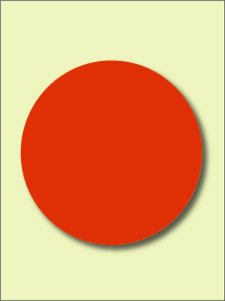
Why do I plan to do this? It has been on my mind for awhile and represents my usual mixture of ambition and sloth. Also it is in some respects a response to recent discussions of “perfection” and “beauty”. I’m looking to make something that is ambiguous in reference to either term.
How so? A circle is the simplest of shapes and admits to no variation except the extend of its radius. As a geometrical figure with infinite degrees of symmetry it is perfect. As for beauty, the usual comparisons of more or less, better or worse that inform the word do not apply – there are no better circles. Moreover, one can make a circular object quite simply and with a high degree of uniformity thus bypassing most issues of facture.
The chosen color refers to conventions surrounding love and pain which both tend to employ a blood red. This started out as a pie chart with a dividing line, but a deepening realization of the inextricable commingling of both sensations in the human condition made the line superfluous. I find no comparative value in this choice as the red simply suits the subject.
So there it is: The Ratio Of Love And Pain. How would you propose to critique it?

Jay,
I met the Bishop on the road
And much said he and I.
“Those breasts are flat and fallen now.
Those veins must soon be dry;
Live in a heavenly mansion,
Not in some foul sty.”
“Fair and foul are near of kin,
And fair needs foul,” I cried.
“My friends are gone, but that’s a truth
Nor grave nor bed denied,
Learned in bodily lowliness
And in the heart’s pride.
“A woman can be proud and stiff
When on love intent;
But Love has pitched his mansion in
The place of excrement;
For nothing can be sole or whole
That has not been rent.”
So said William Butler Years, in 1932, in his poem, “Crazy Jane Talks with the Bishop” And so quoted June Underwood, in response to the question, “How would you propose to critique it?”
Your perfect circle has a shadow, which drops the infinite degrees of symmetry to two. But I kinda like it anyway.
Jay,
Early 20th century, Kazimir Malevich painted a black Circle, heralding the coming destruction of Western Europe during the World Wars and genocide.
A century later, you paint a a circle whose ‘chosen color refers to conventions surrounding love and pain which both tend to employ a blood red’.
I am looking forward to a century that thinks about Love and Pain rather than Death.
June:
Heartrending in this case. Fair and foul are on both sides of the line that I deleted. To be affirmed in my decision by William Butler Yeats is heady stuff.
Steve:
You’re right, the shadow does set limits. However, I meant by “geometrical figure” something taken in the abstract. As such, it might be argued that the circle can be turned any number of degrees around its center of rotation and remain symmetrical. Then again, we can dispense with the entire “infinite” reference and be the better for it.
Birgit:
With a name like Malevich it’s got to be black. He could have gone for red and still have been more or less on message.
It seems that my implacable plaque works better as an associative utensil than it does as a work of art. How about it’s a kind of mirror that reflects thoughts?
Jay,
Doesn’t its shadow and the color of its shadow against the color of the background make your spinning red circle into your work of art? Geometry and art, minimalism and poignancy?
But when you get right down to it, It really is just a bunch of squares, even at this Resolution.
Birgit:
The shadow was added as a sign of impending thinghood. And while I haven’t envisioned the plaque as spinning, it is an interesting notion. But if it spins for you as is, then we can dispense with the required mechanisms. For sure, the eye, or maybe our eyes, Birgit, tend to scan this object in circular motions, and may account in part for your and my kinetic response.
“Geometry and art” might also transmute into “mathematics and art”. I have been told that an elegant equation is a thing of beauty to a mathematician. As for “minimalism and poignancy”, would you consider Malevich’s black circle as being poignant, or is it the
emotional connections of the title, The Ratio Of Love To Pain? Frankly, I could propose any number of dualities as virtual and undivided pie charts. Perhaps I am being called upon to go into Spencer Finch mode and put up a long row of circular disks, each with a title indicating a different blended duality. Heck, I could put up one disk and represent it as a pie chart that incorporates a puree of as many terms as the walls will hold. Just give it that slightly brownish color of the blended universe.
D.
Aren’t we all?
Jay, I guess I’ve spent too much time in art galleries. When I see a red dot like that, all I can think is “sold”. A big dot would mean a big sale :)
David:
Something, then, like the ratio of size to profitability.
Jay–this reminds me of a post I wrote regarding the process of trying to create a formally perfect sphere. As far as critiquing this, my only comment would be–is it worth making? The conversation and considerations about it almost make its physical existence superfluous. We get as much out of talking about it as we would out of seeing it. As for the process of making such a thing, the striving for an ideal might make it interesting, but a perfect red circle lacks the improvisation and element of surprise that makes most art worth making.
A circle is so elemental–it is present in almost everything and therefore has no particular allegiance to anything. How could you give life to it?
McFawn:
The DeKooning exercise would be useful if it were conducted entirely by hand with no tools. As a form of meditation it sounds like an Indian practice that I heard of in which a brick is made into a mirror through painstaking effort.
Sloth may overcome ambition in which case I will content myself with thinking really hard about making the circular object. Truth be known, such a tightly crafted piece would start to go bad almost immediately – unless one were to introduce the element of distressing, thus creating a context of “once was faultless”. I recall seeing an Ellsworth Kelly painting that had suffered a minor puncture wound. The whole effect was killed dead. Better, perhaps, that it had been used as a dart board so as to change the terms of its presentation.
But I can get lost in a circular format: there’s nothing much for my eyes to catch and mind and eye begin to swim about within.
And, actually, making the thing would be utterly trivial. And I believe that the product would best be approached in a spirit of meditation; not looking for improvisation or surprise, but rather seeing it as a kind of blank upon which one might project one’s musings about love and pain.
Speaking of meditative, slothful things, I used to take a piece of notebook paper and fold it and unfold it until it became so soft it was like tissue…this is what I did in school. I tried to impress my neighbors in study hall with it.
It ended up being a good activity for a frustrated writer.
McFawn:
You would be referring to pulp fiction.